In Hostinger Reach, your email templates are generated using AI prompts. You can create, refine, and personalize your templates directly within the AI chat interface.
After generating a template, you can either:
- Continue editing it manually in the AI chat, or
- Use the Edit Mode to make quick tweaks and add your personal touch.
The Edit Mode allows you to refine your content easily — perfect for polishing details, adjusting tone, or updating sections without starting from scratch.
When to use edit mode
Use Edit Mode when:
- You already have a template generated by AI.
- You want to make minor changes (e.g., update text, links, or formatting).
- You prefer a visual editor rather than continuing in AI chat.
Entering edit mode
To start editing your AI-generated email template:
- In the AI chat mode, click the Edit button in the left upper corner.
- Once edit mode is selected, click on any element in your template that you’d like to edit — such as a text block, button, or image.
This will open the element’s editing toolbar, where you can customize its content and appearance.
Editing controls in the template sidebar
When you click a block in Edit Mode, the sidebar displays editing options for that block type. Controls are organized as follows:
• Text blocks: font, size, color, alignment, padding, and layout options.
• Button blocks: text, background color, corner radius, padding, width, height, and alignment.
• Image blocks: change image, add link, resize, corner radius, margin, and image fit options.
Controls are grouped by category and displayed in collapsible sections. Less frequently used options are collapsed by default — click a section header to expand it. This keeps the sidebar focused on the most relevant settings for each block type.
Besides editing individual blocks, you can set styles that apply across your entire template from a single panel. Open Template styles in the sidebar to see a live preview of your heading, body text, and button style, and adjust:
- Fonts — separate font families for Headings and for Body text and buttons
- Colors — Template background, Text, Button color, Button text, Link color, and Button border
- Button border width (px)
- Button corners
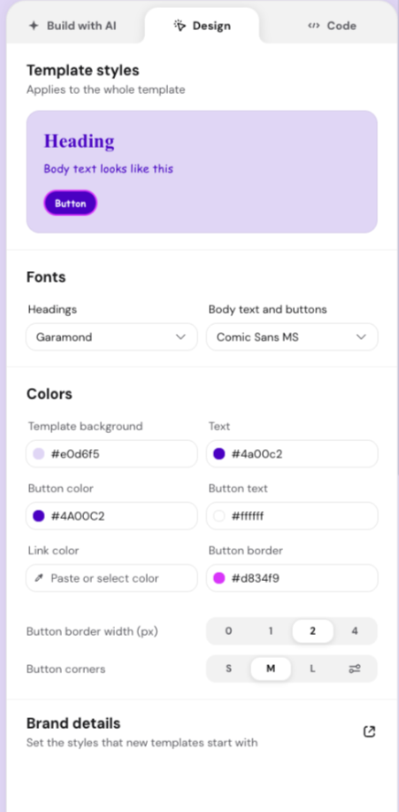
The panel opens pre-filled with the styles your template already uses, so you’re adjusting a real starting point rather than building from scratch. This makes it much faster to re-skin a template to match your brand, since you no longer need to update every section and element individually.
All block types follow a consistent layout: primary content options at the top, layout/spacing options below.
Editing text blocks
When you select a text block, you’ll see several customization options appear. You can either:
- Click the entire text block to apply changes to all of it, or
- Highlight specific text with your mouse to edit only the selected part.
Available text tools
- Font – Choose from optimized fonts designed for consistent display across different email providers.
- Font size – Adjust text size to fit your design and layout.
- Formatting – Apply bold, italic, or underline styles.
- Alignment – Align your text to the left, center, or right.
- Lists – Format text as a bulleted list, numbered list, or list with dashes.
- Emoji – Insert emojis into your text.
Colors and background
- Text color – Change the color of your text.
- Background color – Add or modify the background color behind your text.
Both color changes can be applied to the whole block or just the selected text.
Adding links
You can turn any piece of text into a clickable hyperlink:
- Select the text you want to link.
- Click Add link and enter your URL.
By default, links appear underlined to signal they are clickable — but you can adjust the style if you prefer a different look.
Personalization
You can make your emails feel more personal by inserting recipient-specific details like first name, last name, or email.
When you send your campaign, each contact will see their own personalized information automatically.
Layout options for text blocks
You can adjust the overall structure and spacing of each text block using these layout settings:
- Width & Height – Control the shape and positioning of the text area.
- Padding – Add or reduce space around your text within the block.
- Corner Radius – Round the edges of a text block, especially visible when a background color is applied.
These options help you align your content and create visually appealing layouts with balanced spacing.
Editing buttons
Buttons in your email templates can be fully customized in Edit Mode to match your brand and design.
When you click on a button, you can:
- Edit the button text – Type directly into the button or use the text editor toolbar to apply basic formatting (bold, italic, underline, alignment).
- Change the button color – Under the Colors section, adjust the background color and border color to match your campaign style. The color change applies instantly, so you can preview your design in real time.
- Adjust layout and size – Under the Layout section, customize the button’s:
- Corner Radius – Defines how round or square the button edges look. Higher values create more rounded buttons.
- Padding – Controls how much space surrounds the button text.
- Border Width – Set the thickness of the button’s border, in pixels.
- Text and margin – Controls the spacing of the button itself.
- Width & Height – Set the button’s dimensions to fit your email layout.
- Horizontal alignment – Position the button in your email layout (left, center, right). Changing alignment updates the button’s position in the email template.
Editing images
Images in your email templates can also be customized directly in Edit Mode. When you click on an image, three main editing options appear: Change Image, Add Link, and Layout.
Change image
Click Change Image to replace or update the image in your template. You’ll have several options:
- Generate an image – Describe the image you want, and AI generates it for you. You can optionally choose a style (Realistic, Illustration, Flat design, 3D render, Minimalist), a layout (Banner, Horizontal, Vertical, Square), and attach a reference image. Each generation returns 4 variations to pick from.
- Upload your own image – Choose a file from your device.
- Select from your uploaded images – Pick an image you’ve already used in previous campaigns.
- Free Images – Search for royalty-free photos by entering relevant keywords.
- Link Image – Paste a public image URL to load an image directly from the web.
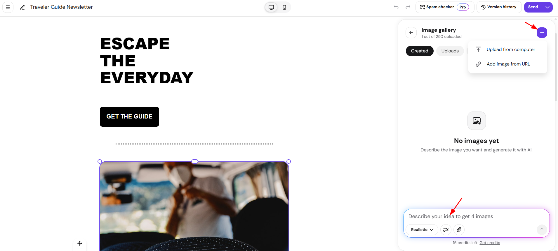
Once your image is selected, it will automatically appear in your template. Images you generate are also saved to your image gallery under Generated, so you can reuse them later without regenerating.
Add link
Use Add Link to turn your image into a clickable element. When recipients click the image in your email, they’ll be redirected to the link you specify (for example, your website or product page).
Layout options
Under Layout, you can fine-tune how the image appears in your email:
- Resize with your mouse – Click the image and drag from any of the four sides to adjust its size.
- Width & Height – Adjust the size and proportions of your image.
- Corner Radius – Round the edges of the image.
- Margin – Add blank space around the image.
- Horizontal align – Align the image (left, center, right).
- Vertical align – Align the image (top, middle, bottom).
- Image Fit – Choose how your image fills the designated area:
- Contain – Fits the entire image within the area; may leave empty space.
- Cover – Zooms and crops the image to fill the entire area.
- Fill – Stretches the image to occupy the full space (may distort slightly).
- None – Displays the image at its original size, without scaling or cropping.
These settings allow you to achieve the perfect balance between visual appeal and layout consistency across different devices.
Feature of inserting new sections
A powerful feature in Edit Mode is Insert Section.
When you hover between existing sections of your email, you’ll see plus (+) icons appear. Click the + to add a new section in two ways:
Add section with AI
- Type a short prompt like “add a customer testimonial,” “insert a product grid,” or “create a bulleted list.”
- AI will instantly generate a section that matches your brand style and design, keeping your template professional and cohesive.
Add pre-built section
Manually insert ready-made elements, including:
- Text – Click a text block to open its settings in the sidebar:
- Font, font size, formatting (bold, italic, underline), and alignment.
- List style (bulleted, numbered, or dashed) and emoji insertion.
- Text color and background color, applied to the whole block or just selected text.
- Add link, to turn selected text into a clickable hyperlink.
- Personalization, to insert recipient details like first name, last name, or email.
- Layout: width, height, padding, and corner radius. Margin can be set with a Small, Medium, or Large preset, or individually per side — Left and Right stay synced to Top and Bottom while Apply to all sides is on; turn it off to set all four independently.
- Button – Click a button to open its settings in the sidebar:
- Button text, editable directly or with basic formatting (bold, italic, underline, alignment).
- Colors: text color, background color, and border color.
- Styling: padding, border width (px), and corner radius.
- Add link, to set where the button points.
- Layout: width, height, horizontal alignment, and margin — Left and Right stay synced to Top and Bottom while Apply to all sides is on; turn it off to set all four independently.
- Image – Click an image to open its settings in the sidebar:
- Change image: generate an image with AI (with optional style, layout, and reference image, returning 4 variations), upload your own, select from previously uploaded images, search Free Images, or link a public image URL.
- Image fit: Contain, Cover, Fill, or None.
- Add link, to make the image clickable.
- Alignment: horizontal and vertical.
- Styling: corner radius.
- Layout: width, height, and margin — Left and Right stay synced to Top and Bottom while Apply to all sides is on; turn it off to set all four independently. Images can also be resized by dragging their corner or edge handles directly in the template.
- Video – Click a video to open its settings in the sidebar:
- Video link: paste a YouTube or Vimeo link to add or replace the video. Changing the link also replaces the thumbnail.
- Alignment: horizontal and vertical.
- Colors: background color and border color.
- Styling: border width (px) and corner radius.
- Layout: width, height, and margin — Left and Right stay synced to Top and Bottom while Apply to all sides is on; turn it off to set all four independently.
- Heading (3 heading versions) – Headings use the same sidebar controls as Text blocks (font, formatting, alignment, color, personalization, layout), with each of the 3 versions using a different default size and weight.
- Spacer (Small, Medium, or Large) – Adds blank vertical space between sections. Choose a size when inserting it; spacers don’t have further sidebar settings.
- Divider – Divider elements support color, thickness, and spacing. Click the divider in your template to open these settings in the sidebar:
- Line color: Set the divider’s color using a hex value.
- Thickness: Choose 1, 2, 4, or 8 pixels.
- Spacing: Choose a Small, Medium, or Large preset, or select the custom option to set individual Top, Bottom, Left, and Right values. Left and Right stay synced to Top and Bottom while Apply to all sides is on; turn it off to set all four independently.
- Layout (2 or 3 columns) – Adds a 2- or 3-column row. After inserting it, click the plus (+) icon inside a column to add elements to it.
After inserting a layout section (2 or 3 columns), you can continue building your email by clicking the plus (+) icon inside the columns and selecting the elements you want to add.
Additional edit mode features
Delete / Duplicate / Reorder section
Click any section to see these options:
- Delete section – Removes the section entirely from your template.
- Duplicate section – Creates an identical copy of the section directly below it.
- Reorder section – Lets you drag and drop the selected section to change its position.
Undo / Redo
Use the small Undo and Redo arrows to reverse or reapply your latest changes.
Save Changes
Always click Save Changes once you’re done editing.
Saving is required before you can send a test email, return to AI chat to continue editing with AI or continue creating a campaign .
Version History
Back on the AI chat, you can use the Version history button to revert your changes, both manually saved and AI changes.