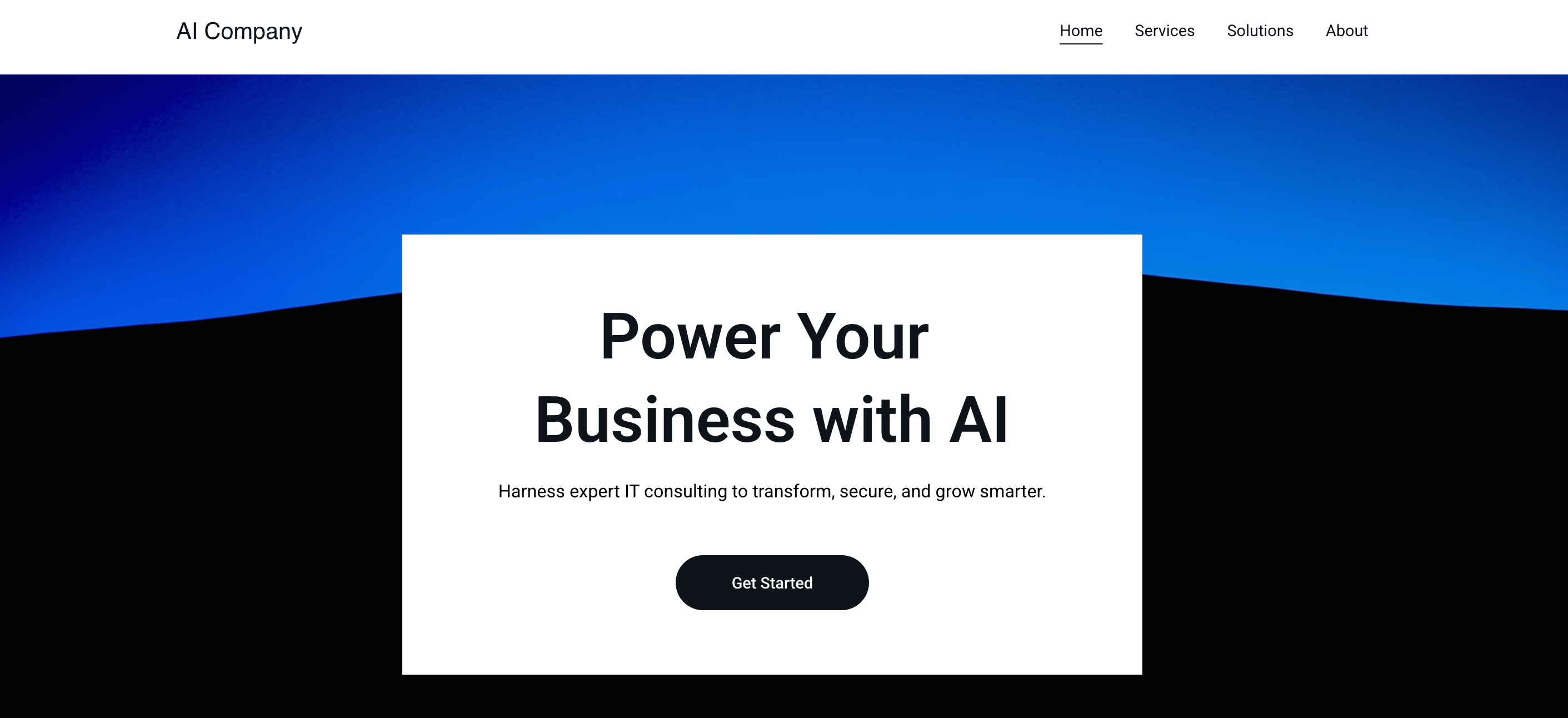
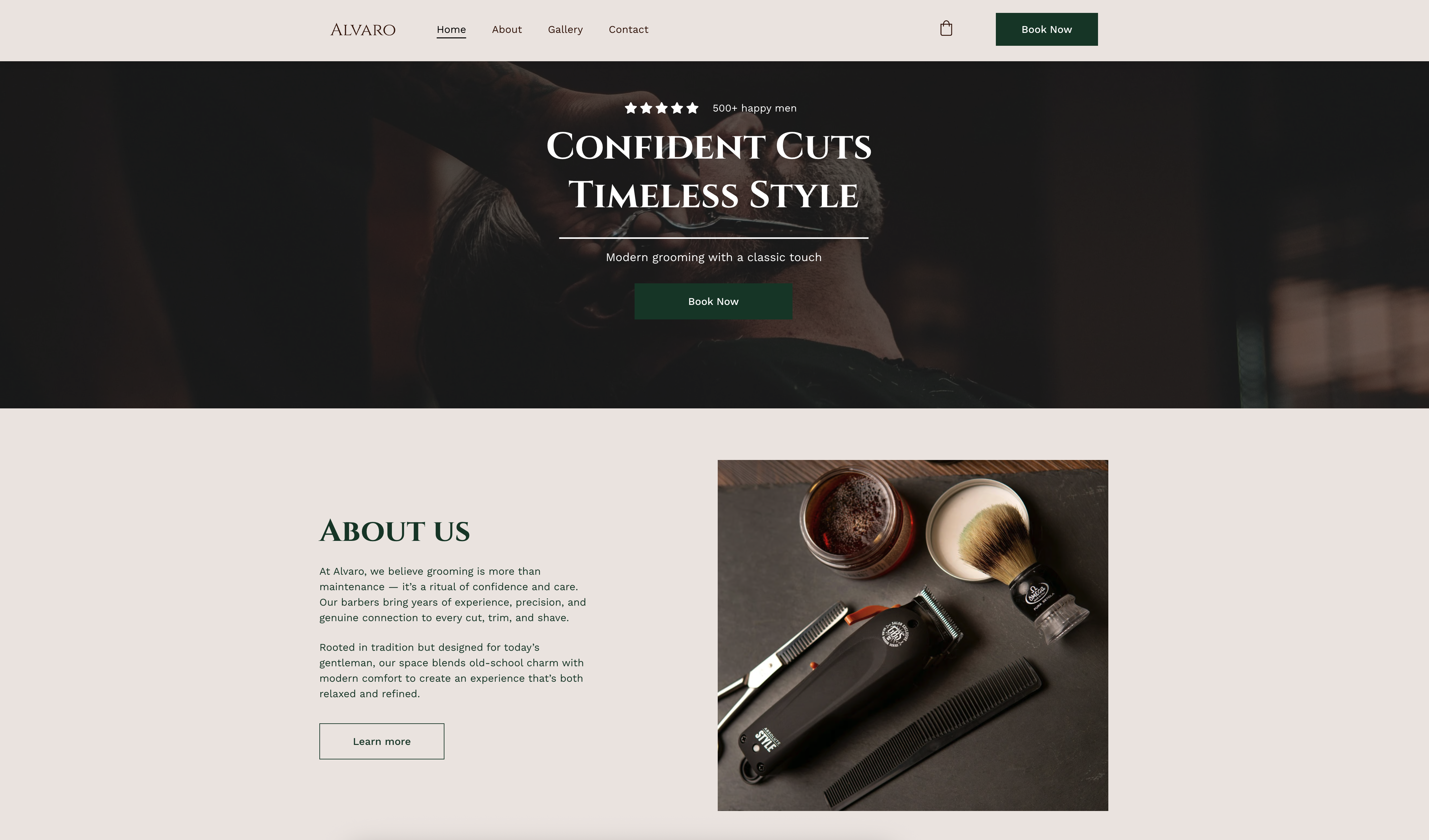
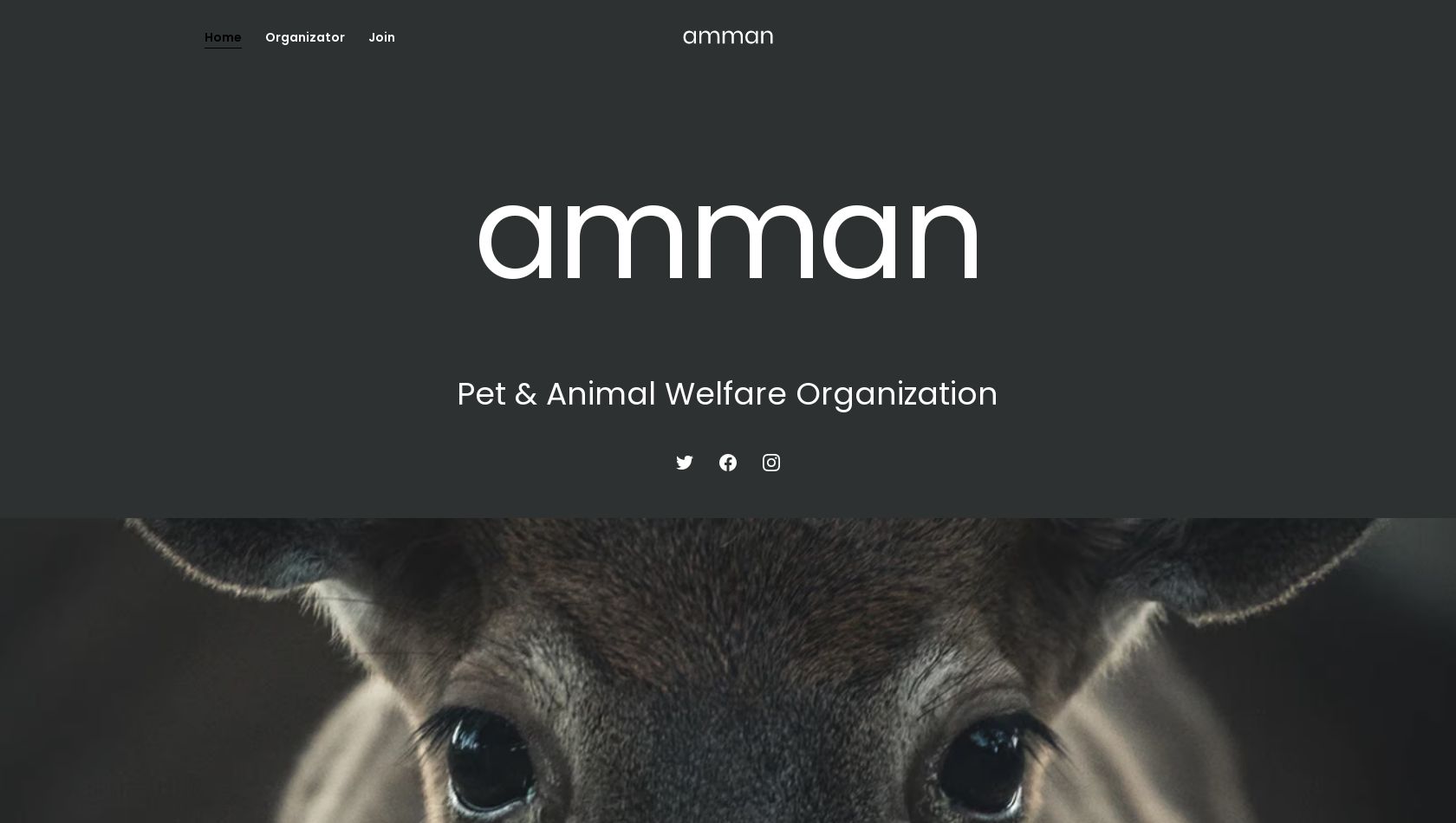
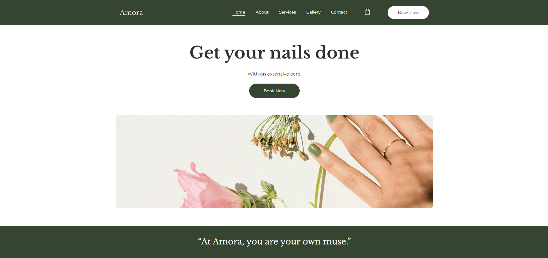
11 Popular Website Layouts and How to Choose the Right One In 2024

11 Popular Website Layouts and How to Choose the Right One In 2024

A good website layout can help guide user behavior and improve conversion rates. On the contrary, a bad website layout can confuse users, leading to a higher bounce rate and poor user experience overall.

This article will explore 11 popular website layout examples, helping you choose the right one for your website idea.

Download Glossary For Web Beginners

Website layout refers to the arrangement of visual elements on web pages, like text and images, to create an appealing user experience.

A good website layout is the basis of your web design. It brings together page elements and negative space to align with your goals and resonate with your target audience.

Why Your Website Layout Matters

Choosing the best website layout for your project is more than just a matter of aesthetics. In fact, it can significantly impact various aspects of your website. The right layout can:

Your website layout can also help your brand and business stand out from the competition. Hostinger’s web page builder has different website layout ideas to choose from, ensuring that all key brand elements are highlighted in the best possible way.

11 Website Layout Examples

Choosing the right website layout is key for engaging your visitors. Let’s take a look at 11 different website layouts, the projects they are best suited for, and their pros and cons.

1. Single-Column Layout

Hostinger Website Builder Elisha template layout

Best for: bloggers, writers, and informational websites, especially those focusing on long-form content

Single-column layouts are easy to design and mobile-responsive. They often result in faster load times and easy navigation, contributing to better SEO rankings.

To optimize a single-column layout for SEO, break up text into scannable sections using headers and sub-headers. Provide alt text for images and incorporate keywords naturally into the content.

Many personal blogs use single-column layouts to keep the reader focused on the text and images.

Pros:

  • Enhanced readability
  • Mobile-friendly
  • Faster load times

Cons:

  • Limited space for additional features
  • May appear monotonous

2. Grid Layout

Hostinger Website Builder Millen template layout

Best for: eCommerce websites, online magazines, and portfolio sites

Grid layouts use a matrix of rows and columns to organize content on a web page. This type of website layout can effectively organize information without cluttering a page.

Grid-based website design often involves a complex visual hierarchy that handles various content types like text, images, and video. This layout works well for eCommerce websites and online magazines where multiple pieces of information are displayed simultaneously.

For best SEO results, organize the grid layout using proper HTML semantics to help search engines better understand your content. Additionally, optimize images and other media files for faster load times.

Pros:

  • Organizes multiple information neatly
  • Handles multimedia content
  • Flexible design options

Cons:

  • Can appear cluttered if not designed well
  • May require more computing resources to load

3. Full-Screen Layout

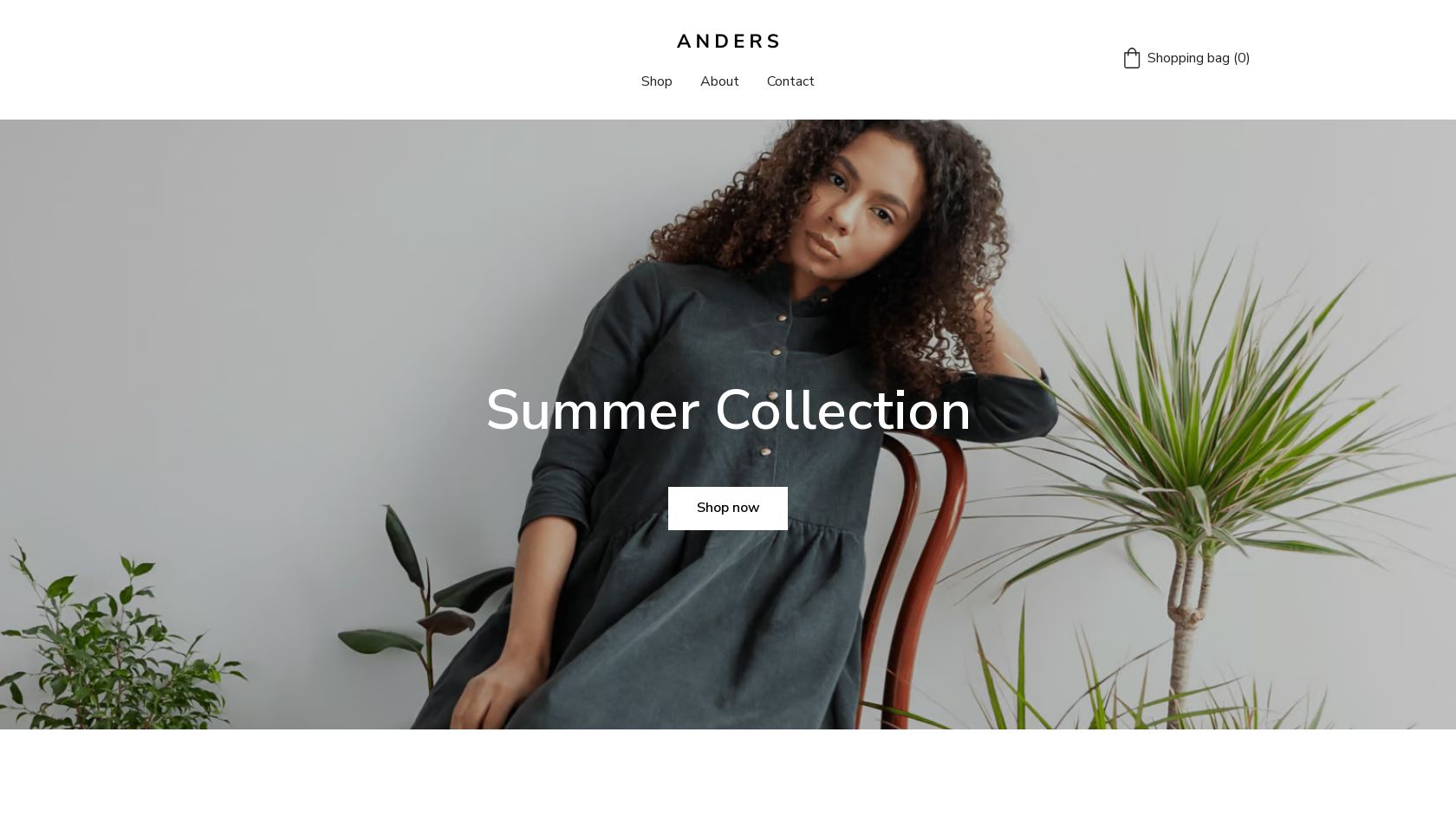
Hostinger Website Builder Elisha template homepage layout

Best for: photography portfolios, landing pages for marketing campaigns, and high-impact presentations

The full-screen layout design uses high-quality images or videos as the focal point. Since this layout idea takes up the entire page, it results in a powerful, immersive experience.

Full-screen layouts are often used for websites that aim to instantly capture the user’s attention. For example, portfolio websites frequently feature a full-screen photo on the homepage to engage visitors immediately.

However, a full-screen website layout can be more demanding for the system. Remember to optimize multimedia files for quicker load times. Also, ensure that the text overlay on images or videos is accessible to search engines.

Pros:

  • Eye-catching
  • Creates an immersive experience
  • Showcases high-quality assets

Cons:

  • Potentially slow load times
  • May not be mobile-friendly

4. Fluid or Liquid Layout

Hostinger Website Builder Presson template layout

Best for: business websites, online portfolios, and eCommerce stores

Fluid layouts use relative units like percentages to adapt the website’s structure and design for different screen sizes, unlike static layouts. This adaptability makes the fluid page layout design one of the more mobile-friendly website layouts.

Ideal for modern websites with dynamic content, fluid layouts optimize content organization based on screen size, balancing aesthetics and usability.

Many business websites and online stores choose this design to ensure their site aligns with responsive layout principles.

Pros:

  • Highly adaptable to various screen sizes
  • Provides a consistent experience across devices
  • User-friendly layout design

Cons:

  • Design can break if not tested properly
  • May require coding skills

5. Magazine Layout

Hostinger Website Builder Good News template layout

Best for: online magazines, news websites, and editorial platforms

Inspired by traditional print publishing, magazine layouts are ideal for content-rich websites. This layout is often used for sites with numerous long-form articles and pages that follow the same visual pattern.

This layout is excellent for online magazines or business sites that need to display abundant information in an organized, easily digestible manner. Medium, for example, implements a magazine layout to create a reading-friendly environment.

Pros:

  • Can present a large amount of content in an organized manner
  • Excellent for storytelling
  • Ensures consistent design across pages

Cons:

  • Can be cluttered if not well-designed
  • Complexity can affect load times

6. Split-Screen Layout

Hostinger Website Builder Shaw template layout

Best for: corporate websites, product pages, and dual-theme websites

A split-screen layout is excellent for contrasting two different but complementary pieces of content. It divides the screen into separate sections to tell a story uniquely.

Some corporate websites use split-screen layouts to juxtapose product images with informational text.

When using the split-screen approach, remember to pay attention to the typography and layout. Make sure there is enough contrast between the text and the image for good readability.

Pros:

  • Versatile storytelling options
  • Simultaneous display of complementary content
  • Unique visual impact

Cons:

  • May confuse the user if not well-organized
  • Requires more effort to keep both sides balanced

7. Asymmetrical Layout

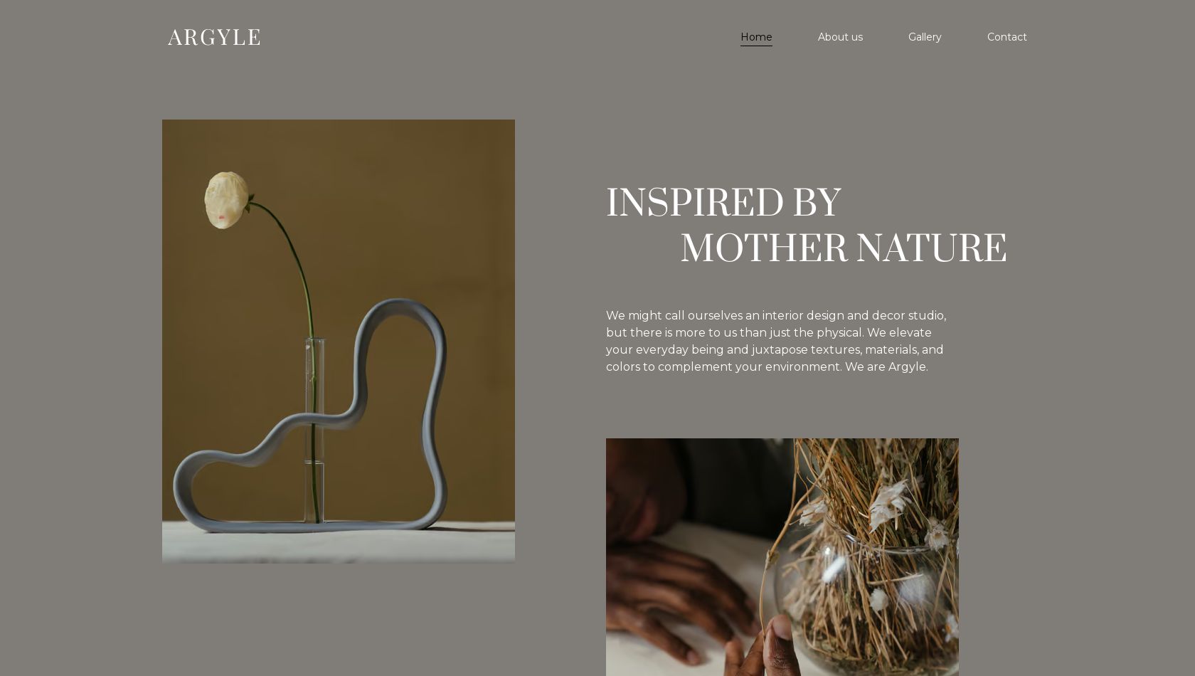
Hostinger Website Builder Shom template layout

Best for: creative agencies, art galleries, and avant-garde enterprises

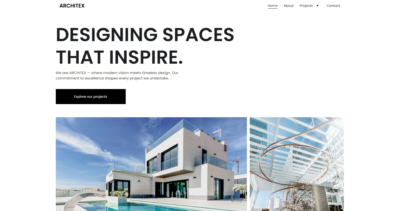
The asymmetrical layout is an edgy and modern design that is deliberately imbalanced. This approach is perfect for creative agencies or experimental websites that want to make bold statements.

Many high fashion websites use asymmetrical layouts to present a unique and compelling visual story. If you want to create unique hero layouts and direct users intuitively around your site, this website design layout could be for you.

Pros:

  • Bold visual statement
  • Allows for creative expression

Cons:

  • Can be distracting if not well-executed
  • May not be suitable for all types of content or industries

8. Card Layout

Hostinger Website Builder Mina template layout

Best for: social media platforms, content discovery websites, and eCommerce platforms

This page layout consists of different “cards” that act as containers for specific content types. It’s one of the more navigational layout techniques, relying on effective website arrangement to guide users around the page.

The card layout is highly modular, allowing for various layout variations. It’s ideal for content discovery platforms, online stores, and social media sites.

Pros:

  • High usability
  • Easily adaptable across devices
  • Balances user experience and layout

Cons:

  • Can get monotonous
  • Not ideal for detailed content

9. Alternating Layout

Hostinger Website Builder Dovile template layout

Best for: storytelling websites, corporate narrative pages, and educational platforms

Alternating layouts shift the position of visual elements and text to create a zigzag pattern, supporting common page-scanning behavior. To achieve this, use alternating background colors for different sections or position primary content on opposite sides of the page.

These web page layouts are excellent for storytelling websites or sequential content presentations. Corporate storytelling pages also often use alternating layouts to guide the reader, resulting in an immersive user journey.

Pros:

  • Engaging visual flow
  • Excellent for storytelling or sequential content
  • Focuses on content hierarchy

Cons:

  • Can be confusing if not well-executed
  • May require more design and development effort than a more basic structure

10. Featured Image Layout

Hostinger Website Builder Knapp template layout

Best for: travel blogs, photography websites, and portfolio sites

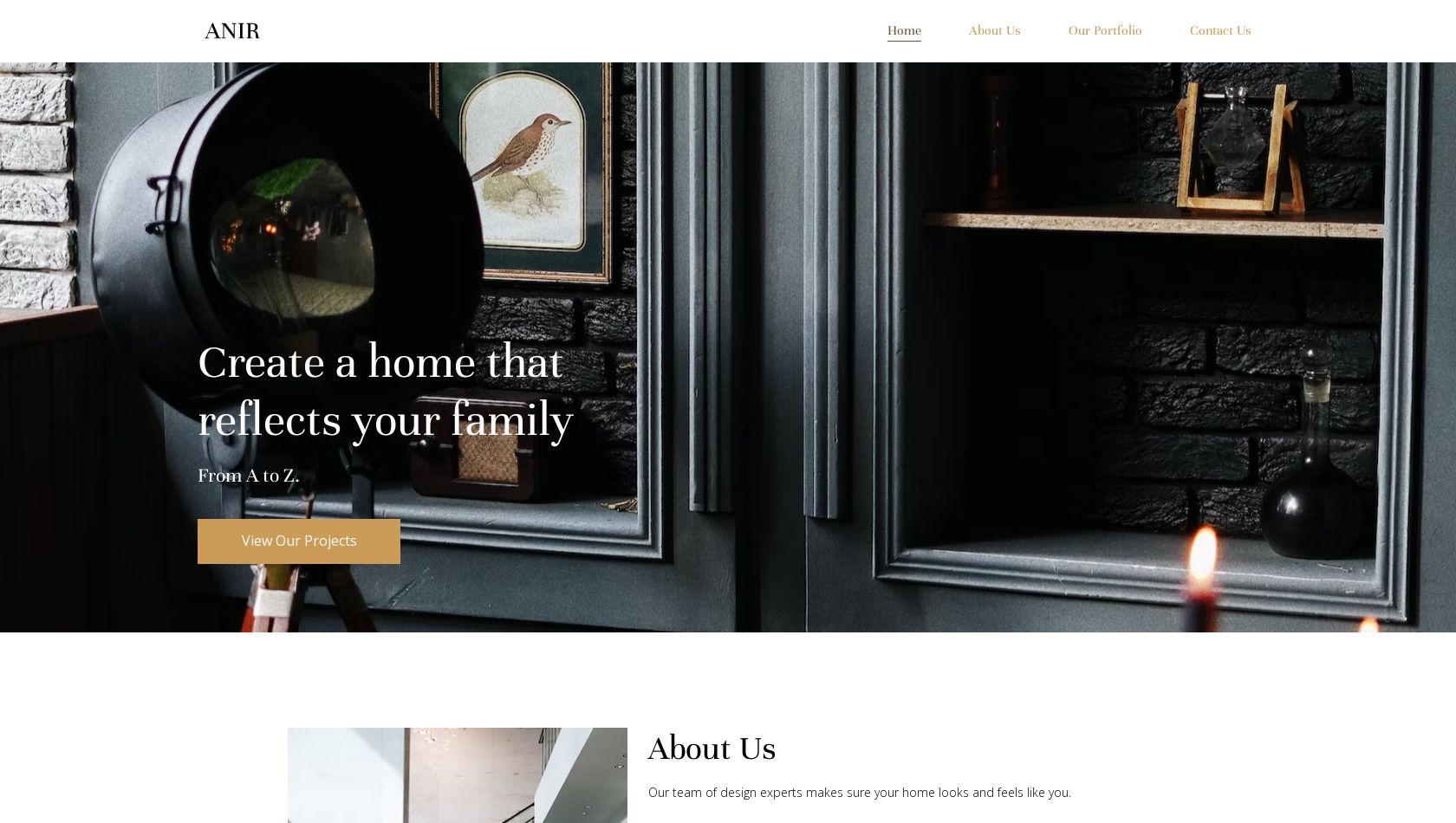
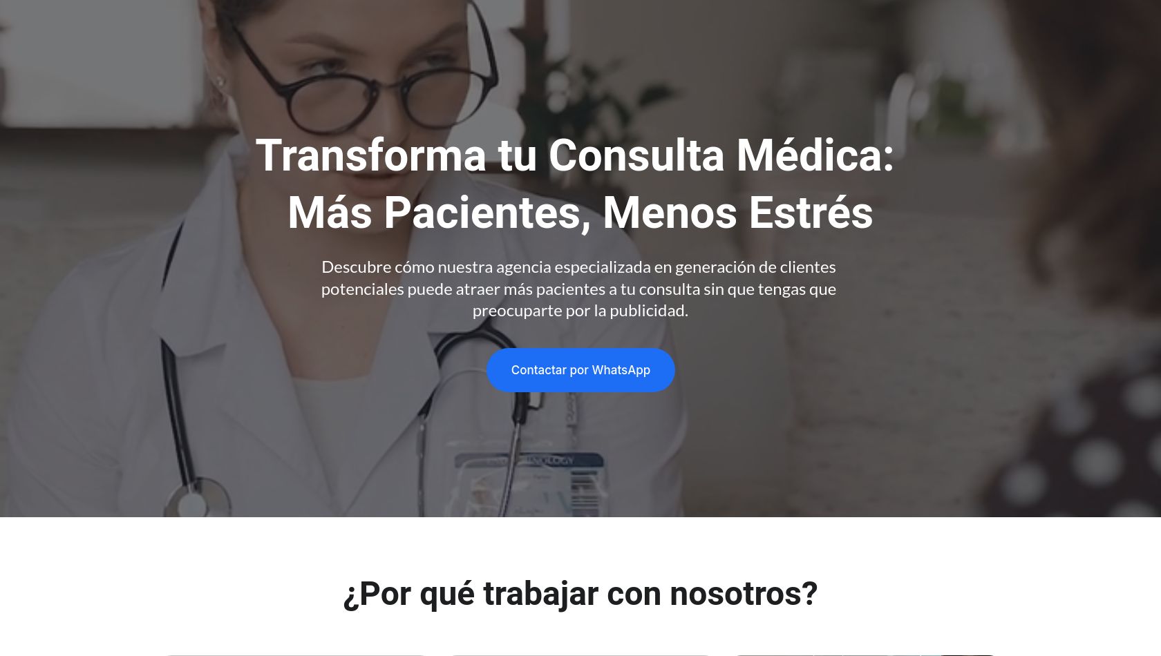
This layout showcases a prominently featured image, typically dominating the top or center of the screen. With a featured image, visitors can get a sense of the brand when they land on the site.

Travel blogs and creative websites commonly use a feature image layout, but almost any business website can benefit from an impactful featured image. Web designers with portfolios can also benefit from a hero section that leaves a strong first impression.

Pros:

  • Strong visual impact
  • Effective for visual industries

Cons:

  • Requires high-quality pictures
  • Can distract from the text

11. Z-Pattern Layout

Hostinger Website Builder Ginza template layout

Best for: landing pages, form-based websites, and minimalist designs

The Z-pattern layout follows the natural reading path of left-to-right and top-to-bottom. This page layout is commonly used in marketing to direct user’s attention to the call-to-action (CTA).

To effectively use this page layout, keep text sections relatively short. You can also include icons and animations, like arrows, to guide the reader through the page.

Pros:

  • Natural reading flow
  • Effective for calls-to-action

Cons:

  • Limited in terms of design creativity
  • May not be suitable for content-heavy websites

How to Choose the Right Website Layout

Choosing the perfect layout for your own website isn’t a one-size-fits-all situation. The ideal layout aligns with your goals, speaks to your audience, and amplifies your brand’s voice. Here’s a detailed guide to help you make an informed decision.

Analyze Your Content and Goals

Make sure you fully grasp your website’s content and objectives.

The purpose of your website should guide your choice of layout. Are you looking to share information, showcase a portfolio, sell products, or engage users in some other way? The right page layout can drastically improve user engagement and time spent on your site.

For instance, if you’re running an online magazine, a grid or magazine layout may be the most efficient way to display multiple articles and images on a single page. This lets you present more content at a glance and encourage exploration.

Create an inventory categorizing each content type that will appear on your site. Knowing your requirements helps you eliminate unsuitable layout ideas.

Understand Your Target Audience

Your layout should cater to your target audience’s behaviors, preferences, and pain points. Different age groups, professions, and cultures may interact with web interfaces differently.

Creating an ideal client profile can help you understand what your audience appreciates most in a site layout.

For example, a website targeting senior citizens should opt for a simple, easy-to-navigate layout with large fonts and straightforward menu options over a complex, flashy design.

Conduct user research to understand what your audience values in a web layout. Analytics tools can also provide insights into visitor behavior. Additionally, A/B testing different layouts can help you identify which design choice your users prefer.

Evaluate Branding and Identity

Your chosen layout should be functional and align with your brand’s visual identity. A cohesive design with consistent colors, typography, and overall aesthetic fosters brand recognition and trust.

For example, if your brand is minimalist and modern, a cluttered, color-heavy layout will conflict with your brand identity. A simple, clean layout better serves your brand’s message.

Develop a style guide that outlines your brand’s design elements, like a color scheme and typography. Ensure your web layout adheres to this guide to maintain consistency across all channels.

Consider User Flow

A good layout balances aesthetics and usability. Planning the user journey is essential for keeping your visitors engaged. The layout should guide users intuitively through the website, directing their attention to the most important content first.

eCommerce sites often employ a Z-pattern layout to direct the user from the logo to the central hero image and then down to a call-to-action, mimicking the natural way we scan content.

Use wireframes to plan the user flow visually before settling on a layout. This will help you identify any navigation issues early on.

Prioritize Responsiveness

In an increasingly mobile world, your website must perform well on desktops, tablets, and smartphones.

A responsive design automatically adjusts to the screen size, ensuring a consistent, pleasant experience on different types of devices. For instance, all of Hostinger Website Builder’s website templates are mobile-responsive.

Test your chosen layout on multiple devices and browsers to verify its responsiveness. Tools like BrowserStack help you conduct these tests efficiently.

Conclusion

A well-chosen layout can enhance user engagement, brand aesthetics, and overall website performance.

Text-heavy websites often use single-column or magazine layouts, while eCommerce websites lean toward more visual layouts, like card or vertical split screens.

By learning about the 15 most common website layout examples and their respective use cases, you can now make an informed web design decision that best aligns with your business or personal needs.

Website Layouts FAQ

Find answers to common questions about website layouts below.

How Does Page Layout Impact Web Design?

Page layout is critical for web design as it affects usability, mobile-friendliness, and SEO. A well-planned layout can improve user engagement, lower bounce rates, and enhance the site’s search engine rankings.

What Is a Focal Point in Website Layout Design?

The focal point is where you want to direct the viewer’s attention, often using elements like large headlines or pictures. A strategically placed focal point is instrumental in guiding user behavior, such as leading them to a call-to-action (CTA) section or button.

How Do Mobile Devices Affect Website Layout?

Mobile devices require responsive designs to ensure the site looks good on smaller screens. A mobile-responsive layout is user-friendly and favored by search engines, improving your site’s SEO.

What Is White Space in Web Design?

White space refers to the unoccupied areas in a design layout that help separate content and improve readability and focus. Effective use of white space can also contribute to a cleaner and more organized layout, making the site more appealing.

How Does Visual Hierarchy Affect Page Layout?

Visual hierarchy in web design guides the viewer’s eye, prioritizing information in a layout. It can be achieved through color, element size, and positioning. When done right, it improves the user experience by making the site more intuitive and easy to navigate.

Author
The author

Matleena Salminen

Matleena is a seasoned Content Writer with 5 years of content marketing experience. She has a particular interest in emerging digital marketing trends, website building, and AI. In her free time, Matleena enjoys cups of good coffee, tends to her balcony garden, and studies Japanese. Follow her on LinkedIn