15 Bad Website Design Examples: Web Design Mistakes to Avoid and Improvement Suggestions
Jan 21, 2026
/
Prasasti P.
/
15 min Read

Creating a good website is crucial for online success. However, it’s equally important to learn from the mistakes of others. Therefore, understanding what constitutes a bad website design is the first step toward creating a good one.
To help you recognize what to avoid during the website creation process, we will look at 15 bad website design examples. By examining these examples and understanding the common web design mistakes they represent, you can avoid repeating them and create a better user experience.
Download website launch checklist
What Makes a Website Bad?
A bad website is one that fails to meet user expectations, hinders navigation, or presents a subpar user experience. These websites exhibit poor design choices, ranging from slow loading speeds and non-responsive layouts to cluttered interfaces and inconsistent branding.
15 Common Web Design Mistakes With Bad Website Examples
In this article, we’ll explore 15 bad website design examples found on a fictitious website called The Bad Website. Each example will be expanded upon, providing insights into specific design flaws and practical improvement tips to help you create a good website.
Keep in mind that a bad website is different from a weird website, as the latter is designed to challenge traditional web design norms. Browse our list of weird websites to understand the difference and find unorthodox inspiration.
1. Poor Navigation
The Bad Website has poor navigation, making it difficult for customers to find their desired products or information. The absence of clear categories or labels confuses users – a common web design mistake.

Users arriving at this website might encounter a maze-like structure where products are listed without logical organization. For example, there are no links or sections specifically dedicated to a specific product type like smartphones.
Potential users would end up aimlessly clicking through various pages without clear direction. This will result in a higher bounce rate – the site loses many potential transactions.
Improvement Tips:
One crucial improvement aspect for The Bad Website is to design a clear and intuitive menu structure. Create well-organized categories that accurately represent the different types of products available. Ensure the menu is easily accessible and prominently displayed on each page, allowing users to navigate the website effortlessly.
In addition to the menu, incorporating breadcrumbs can greatly assist users in understanding their current location within the website’s hierarchy.
Breadcrumbs provide a visual trail of the user’s path, making navigating back to previously visited pages easier. This feature enhances the overall usability and helps users maintain a sense of orientation while exploring the site.

Lastly, consider utilizing heatmap analysis tools like Hotjar or Crazy Egg. These tools visually represent user interactions, showing areas of high engagement and potential usability issues.
Analyzing this data can help you pinpoint specific website navigation challenges and inform optimization efforts.
2. Slow Loading Times
Another issue that The Bad Website has is slow loading speed which is a common mistake in many websites. This issue can harm the site’s success since it affects many important aspects.
The ideal loading time for a good website is under two seconds. Anything more than this will increase the chances of users leaving the site.
In The Bad Website’s case, many pages contain unoptimized images with large sizes contributing to extended loading times. Users are met with constant waiting and delays when browsing the site’s content, ultimately leading them to abandon the site in search of faster alternatives.
Improvement Tips:
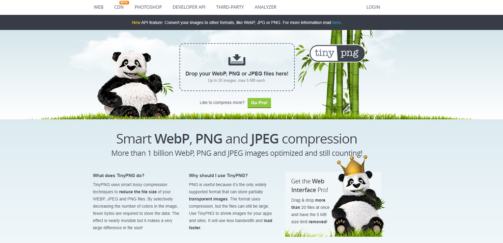
The Bad Website could benefit from optimizing its image size and format. Compressing images is a great way to reduce file size without compromising quality. TinyPNG is an example of a free tool that can optimize images for your website.
You can also use the common image sizes as a guideline. Here are some image size recommendations that should work well on a desktop with a 1080p screen size.
| Image Type | Image Dimensions (W x H) | Aspect Ratio |
| Background Image | 1920 x 1080 pixels | 16:9 |
| Hero Image | 1280 x 720 pixels | 16:9 |
| Blog Image | 1200 x 630 pixels | 3:2 |
| Logo (square) | 100 x 100 pixels | 1:1 |
| Thumbnail Image | 150 x 150 pixels | 1:1 |
Using efficient image formats such as JPEG or WebP can significantly decrease the time it takes to load. This optimization ensures a faster browsing experience for users.
Additionally, implementing caching techniques can greatly improve loading times. Utilize browser caching to store static website elements such as images, CSS, and JavaScript files on the user’s device.
This enables faster subsequent visits as the browser retrieves these elements from the cache instead of downloading them again from the server.
Suggested Reading
Read our tutorial to learn more about website optimization tips.
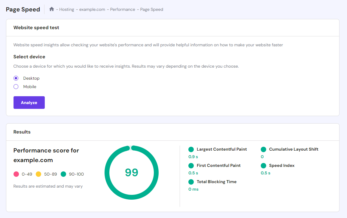
Don’t forget to check your site’s load time using tools like PageSpeed Insights. Alternatively, Hostinger’s hosting service users can check their site’s performance directly from hPanel.

3. Non-Responsive Design
The Bad Website has an unresponsive design and a lack of mobile optimization – another common web design mistake. The lack of responsive design makes it difficult for users to browse products or purchase on their smartphones or tablets.
The website also fails to adapt to different screen sizes, leading to distorted layouts, misplaced elements, and compromised user experience on mobile devices.
Sticking to only one device type is an outdated design approach. According to Statista, mobile devices account for more than 50% of web traffic worldwide. This means The Bad Website may lose around half of its potential customers for not being a good mobile site.
Improvement Tips:
The Bad Website must prioritize mobile responsive design to address these issues and ensure a seamless browsing experience across all devices.
The site can use CSS breakpoints and media queries to define different styles and layouts and improve mobile responsiveness. By incorporating media queries, the website can adapt its design and functionality based on specific breakpoints, ensuring a smooth and consistent experience on different devices.
Prioritizing mobile-first design is also crucial. Starting with a design tailored for mobile devices and progressively enhancing it for larger screens ensures that the mobile experience remains user-friendly and fully optimized.
Consider responsive frameworks like Bootstrap, which streamline development by offering pre-built responsive components and grid systems.
Testing the website across multiple devices and browsers is essential to ensure consistent mobile responsiveness.
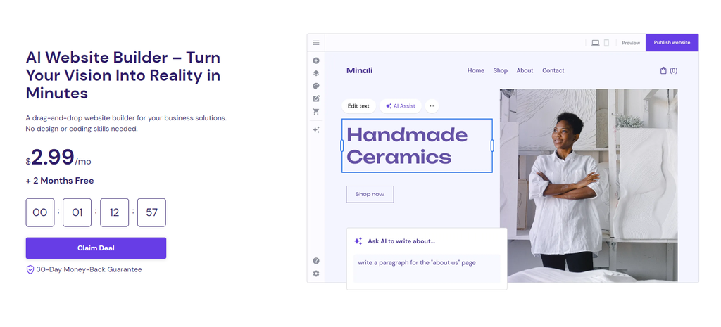
Solutions like Hostinger’s website creator are also an excellent option for building a new website. They ensure your site is mobile-friendly without needing to tinker with complicated technical settings or code.

4. Auto-Playing Media
Another bad website design approach is having auto-playing audio or video without user control on your web page.
Many badly designed websites try to be more interesting and interactive by adding these elements without realizing they are intrusive. Auto-playing media disrupts the browsing experience and may create a negative impression.
The Bad Website also falls into this trap. When users land on the main page, a video showcasing the latest gadgets starts playing automatically with loud music. Even worse, some pages on this website make users auto-download files without any prompt.
Improvement Tips:
The Bad Website must avoid auto-playing audio or video to fix user experience flaws. Alternatively, providing clear play buttons or indicators that allow users to initiate the playback themselves is a better approach.
This ensures that users actively choose to engage with media content, maintaining a more user-centric approach.
A website with an outdated design might also suffer from the overuse of animations. This element might seem good to make your site look more interesting, but often times it is disruptive and will negatively affect the site’s performance.
The golden rule when incorporating media elements like videos and animations is to ensure they are purposeful, relevant, and add value to the user experience. Avoid excessive or distracting elements that detract from the content or overwhelm the user.
Remember that large media files can also negatively impact the site’s loading speed. Therefore, we recommend using them sparingly and optimizing the media files before adding them to the website.
5. Unreadable Fonts or Poor Typography
The Bad Website suffers from a lack of readability and legibility, primarily due to the excessive use of different font styles, unreadable typography choices, and random choice of color scheme on its elements.

These design flaws hinder users’ ability to easily read product descriptions and navigate the site. This will result in a poor user experience and an increased bounce rate.
The first issue contributing to the site’s poor readability is the presence of too many different fonts throughout the website.
The inconsistent use of fonts creates visual confusion, making it difficult for users to distinguish headings, body text, and other important elements. This lack of uniformity disrupts the natural flow of information.
Unreadable fonts that are too small, excessively decorative, or lack proper contrast with the background can also strain users’ eyes, making it difficult for users to comprehend the information.
Improvement Tips:
TechGizmo can fix this issue by reducing the number of different fonts used throughout the website to create a more consistent and cohesive visual experience.
Select a few complementary fonts for the headings, subheadings, and body text to establish a clear hierarchy and enhance readability. A professional web designer typically uses only three fonts for a single site to maintain consistency.
Choose readable fonts and ensure appropriate letter spacing for easy legibility. Pay attention to the font size, adjusting it to a comfortable reading level across different devices. Additionally, select clean, simple, and well-suited typography for the website’s branding.
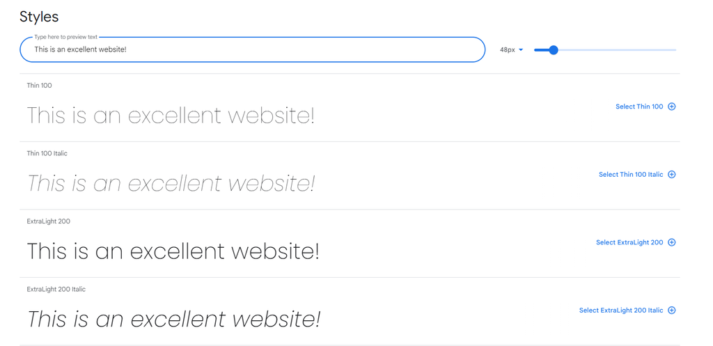
Some of the most common and versatile fonts you can use include Roboto, Libre Franklin, and Poppins. You can get these fonts from the Google Fonts website and check how they look in different styles.
Furthermore, choose good color schemes that enhance readability, ensuring that the text stands out distinctly. Incorporate ample white space between elements, enabling the content to be easily scanned.
6. Lack of Search Functionality
The absence of a search function is a major drawback. Many users visit websites with specific products or information in mind. Without a search bar, they are left to navigate through the website manually, often leading to unnecessary clicks and wasted time.
The absence of a search feature forces users to rely solely on navigation menus or manually scroll through web pages, making it frustrating to use the website.
Improvement Tips:
The Bad Website should consider integrating search functionality on its website to address this issue. The best practice is to place a search bar in a visible location, such as the navigation bar or header.
A search feature becomes even more crucial for an eCommerce site, as it helps customers easily find and purchase the desired products. This feature will significantly enhance the user journey, boost customer satisfaction, and increase conversions.
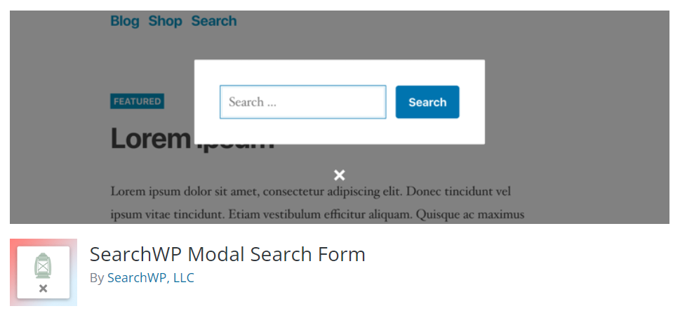
If you run a WordPress website, plugins like SearchWP and ElasticPress are excellent tools to improve the built-in WordPress search feature.
7. Excessive Pop-Ups or Ads
The excessive use of pop-ups is common in bad web design practices. The Bad Website bombards users with multiple pop-ups interrupting their browsing journey, often promoting sales, discounts, or newsletter subscriptions.
In addition, the presence of irrelevant or distracting advertisements can negatively affect user experience. Ads irrelevant to the website’s content or target audience can create a sense of clutter and detract from the website’s purpose.
Improvement Tips:
Even though showing ads on your website is a great way to generate revenue, having too many can result in poor web design. Therefore, consider limiting the use of pop-ups to crucial moments and ensure they offer value to the user.
Strategically implementing them at appropriate times, such as during checkout or when users are about to leave the website, can be a better approach.
Make sure to provide clear and compelling messages in the pop-ups, offering relevant incentives or useful information. Limiting ads and popups will improve the website’s design and user experience, making it look more professional and easier to use.
8. Cluttered Page Layout
A cluttered layout is a telltale sign of a poorly designed website and can significantly impact user experience and overall usability.
Web pages with cluttered layouts create a negative impression and hamper users’ ability to navigate and comprehend the content effectively. Additionally, The Bad Website also has an inefficient use of white space.
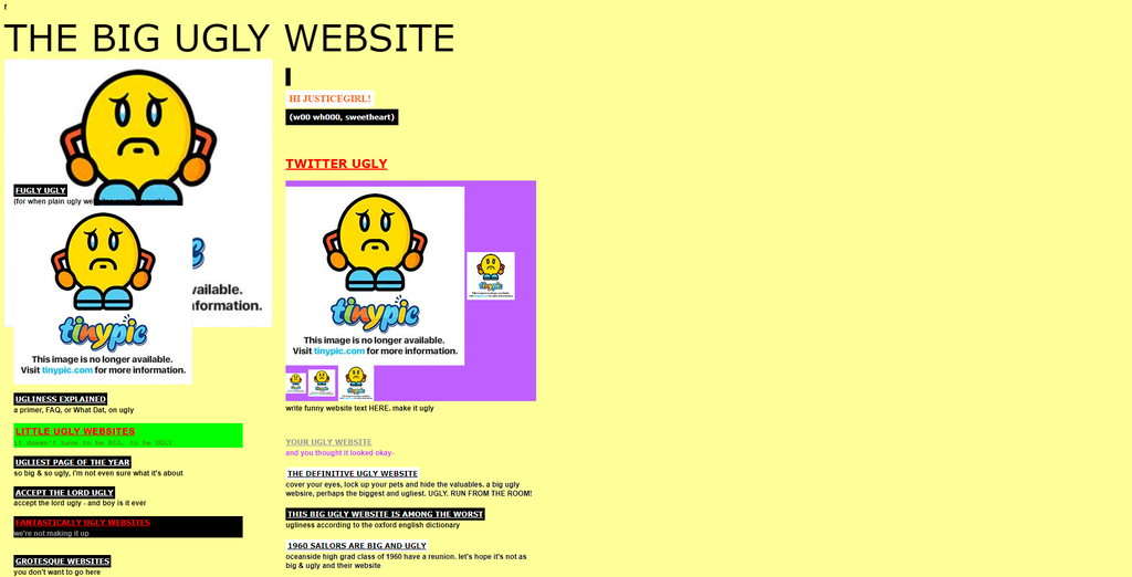
Because of these issues, users may find it difficult to focus on the most important content and abandon the website altogether due to a poor browsing experience. This issue is also well-represented on the main page of The Big Ugly Website – a site specifically designed to appear cluttered and unappealing.
Improvement Tips:
There are several steps to take to make The Bad Website look less cluttered. First, streamline the web page layout by removing unnecessary elements and reducing visual clutter.
Focus on presenting the most relevant and essential content to users, prioritizing what is important to them. Embrace a minimalistic design approach that allows users to easily digest the information and navigate the website.
Establish a clear hierarchy in the design by organizing content based on its importance and relevance. Use visual cues such as headings, subheadings, and white space to create a visual flow and guide users’ attention.
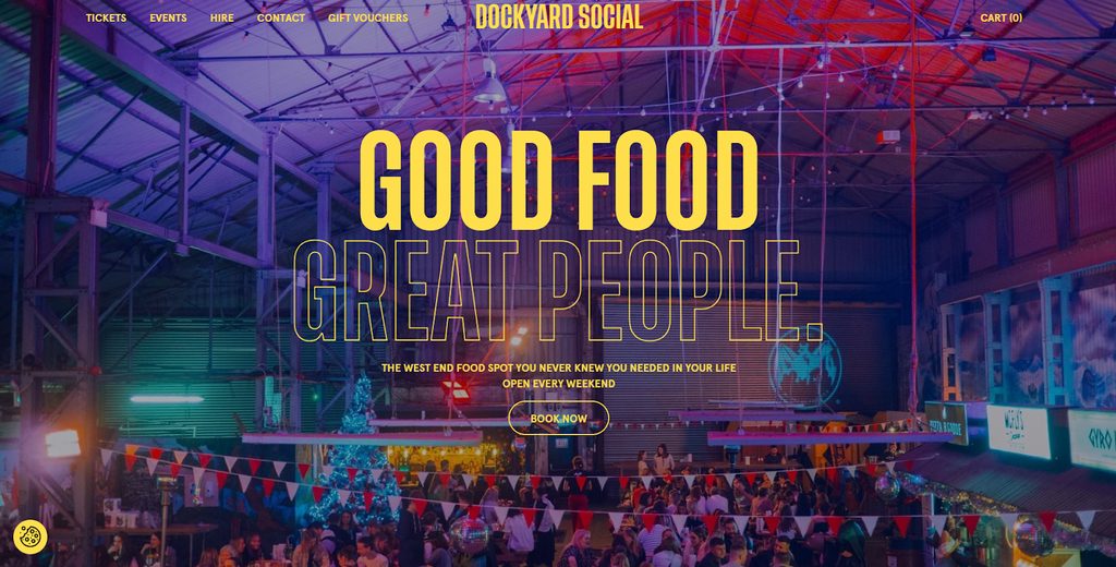
Consider using a common website layout that has been proven to be user-friendly and effective for presenting website content. The Dockyard Social’s landing page is a great example of a one-page website design, which is one of the most popular layouts for modern sites.
This is why looking at some of the most visited websites in your industry can be beneficial since they usually have figured out the best approach to attract their target audiences with excellent visuals.
9. Lack of Clear Call-to-Action
In an online store, it is crucial to have well-placed and easily identifiable call-to-action (CTA) buttons that guide users toward desired actions. The lack of clear call-to-action buttons in The Bad Website confuses users who visit the website with the intent to make a purchase.

Without clear instructions or intuitive visual cues, users may struggle to do essential actions like finding specific products, adding them to their cart, and proceeding to checkout. This confusion disrupts the user flow and may discourage users from completing their intended transactions.
Improvement Tips:
Ensure that CTA buttons have clear and descriptive labels that convey the intended action. For example, instead of generic labels like Interested?, use action-oriented labels such as Buy Now or Get Started.
Clear labels guide users and provide a better understanding of the desired action. Take a look at Netflix’s landing page as an example.

Strategically position CTA buttons in prominent and intuitive locations throughout the website. Place them where users naturally expect to find them, such as in the hero section, near product descriptions, or at the end of key sections.
Ensure they are visually distinct from other elements on the page and use contrasting colors, appropriate sizing, or prominent styling to draw attention.
Employ visual elements such as arrows, contrasting colors, or size variations to make the buttons visually distinct and emphasize their importance.
10. Complex Registration Processes
When users create an account on your website, you can use their information to communicate with them or personalize content suggestions. However, convoluted registration procedures can discourage potential customers from registering and completing their purchases.
The Bad Website encounters this issue with its non-intuitive forms and inputs. Complex registration forms with excessive fields or unclear instructions can overwhelm users and make the process confusing and time-consuming.
This gives the impression that the website has bad usability, potentially damaging its reputation and hindering customer acquisition.
Improvement Tips:
The first tip is simplifying the registration forms by minimizing the required fields. Only ask for essential information that is necessary for account creation and customization. Long and detailed forms can deter users from completing the registration process.
Consider utilizing progressive profiling techniques, where additional information can be collected gradually over time.
Communicate the purpose of each field and any specific formatting requirements clearly. Incorporate tooltips or help icons next to complex fields to provide additional context or examples.
Additionally, offer the option for users to sign up or log in using their social media accounts, such as Facebook or Google. This can streamline the registration process by pre-filling certain fields with information obtained from their social media profiles.

WordPress users can use plugins like WPForms to create customizable and secure website registration forms.
11. Neglecting SEO Practices
The Bad Website exhibits a critical flaw by neglecting essential search engine optimization (SEO) practices, hindering its visibility and discoverability on search engines. None of its images have alt text, and all its URLs have bad structure.
Additionally, the site’s content doesn’t incorporate keywords strategically to help search engines index the site optimally.
This issue can lead to poor rankings, limited organic traffic, and missed opportunities for reaching a wider audience, ultimately reducing its chances of receiving new customers.
Improvement Tips:
One of the most important approaches to improve the site’s SEO is to develop high-quality, valuable, and informative content that caters to the interests and needs of the target audience.
Optimize the content with relevant keywords, but ensure that it reads naturally and provides genuine value to users. Engaging content encourages longer website visits, lower bounce rates, and improved search engine rankings.
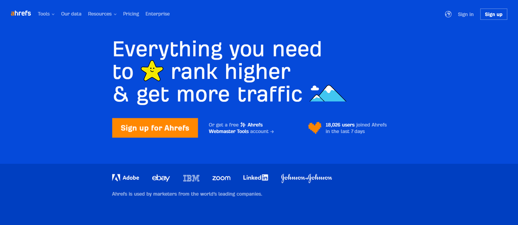
Perform comprehensive keyword research to identify relevant keywords and phrases that align with the website’s content and target audience’s search intent. Ahrefs and Semrush are examples of good keyword research tools you can use to improve your SEO.
Integrate these keywords strategically into page titles, meta descriptions, headers, and content to enhance the website’s chances of ranking higher in search engine results.
Pay attention to meta tags, including meta titles and meta descriptions, as they are crucial in search engine optimization. Consider using tools such as Yoast to manage these SEO aspects more easily.
12. Broken Links and 404 Errors
The Bad Website has many broken links that don’t take users to other website pages. Clicking those links will result in the “404 Page Not Found” error.
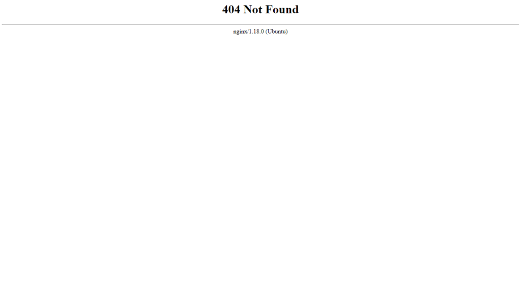
When users encounter this error, they will likely abandon the website and seek information elsewhere, leading to increased bounce rates and diminished user engagement.
A high number of 404 errors on this website may also create the perception of neglect or unprofessionalism, tarnishing the brand’s image and credibility. This lack of attention to detail can erode trust with visitors and discourage potential customers from exploring the site further.
Additionally, some links redirect to other websites without opening them in a new tab. This is a bad web design approach since it might disrupt users’ browsing experience.
Improvement Tips:
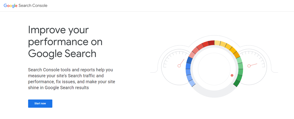
Conducting comprehensive website audits to identify broken links is the first step to fixing this issue. Utilize tools like Google Search Console or third-party website auditing tools to scan the website for broken links and detect 404 error occurrences. These audits will help you pinpoint the specific pages and links that need attention.
Once identified, promptly fix the links by updating or replacing the URLs with the correct ones. If a linked page no longer exists, consider redirecting the broken link to a relevant and active page to retain user engagement and prevent 404 errors.
When moving or renaming pages on the website, use 301 redirects to ensure that users and search engines are directed to the new page. Permanent redirects inform search engines that the content has moved permanently, preserving SEO value and preventing 404 errors.
Keep track of any changes made to the website, such as updating URLs, modifying site structure, or restructuring content. These changes can accidentally cause 404 errors, so it’s essential to be vigilant and test the website thoroughly after any updates.
Verify the functionality of external links leading to other websites. External websites may change their URLs or remove content, resulting in errors in your website. Regularly verify the accuracy of external links and update them accordingly.
13. Ignoring Accessibility
The Bad Website overlooks the crucial aspect of accessible design, resulting in inaccessible content for users with disabilities. A site design that fails to cater to diverse user needs risks alienating a significant demographic and perpetuating a sense of exclusion.
In The Bad Website’s case, the main issue revolves around the lack of alt text for images and keyboard navigation support.
Improvement Tips:
This website must include descriptive alt text for all images on the website to be more accessible. Alt text provides context and descriptions of images, making them accessible to users with visual impairments who rely on screen readers.
Ensure that the website’s content is organized using proper heading tags. A well-structured heading hierarchy makes navigating and understanding the content easier for screen reader users.
Include closed captions for videos and audio content to make them accessible to users with hearing impairments. Additionally, provide transcripts for multimedia content so that users can access the information through text.
Don’t forget to check the Web Content Accessibility Guidelines (WCAG) international standard that explains how to make web content more accessible to people with disabilities. See our article on web accessibility for examples and best practices.
14. Ineffective Use of Images and Graphics
The Bad Website uses images and graphics in an irrelevant manner instead of strategically incorporating high-quality visuals that enhance the content. This ineffective utilization decreases the impact of the visuals and stops them from communicating the intended message effectively.
Low-quality images also compromise the website’s aesthetics and reduce its credibility and professionalism.
These images often lack sharpness, clarity, and detail, resulting in a subpar visual experience for users. Blurry images can make products or services appear unappealing and discourage potential customers from exploring further or purchasing.

Additionally, overusing generic stock images can contribute to a sense of unoriginality and lack of authenticity. Stock images, if not carefully selected or customized to align with the website’s branding and content, can make the site feel generic and disconnected from the actual products or services offered.
Improvement Tips:
There are several approaches this website can take to address the issue of low image quality to improve its overall visual impact. The first one is to use high-quality images that are sharp, clear, and visually appealing.
Ensure that product images are of professional quality, showcasing the products in their best light. Utilize high-resolution photos that bring out the details and effectively capture the users’ attention.
Select images and graphics purposefully, ensuring they align with the website’s content and enhance the user experience. Avoid using visuals for the sake of decoration – instead, focus on using images that support the message and engage the audience in a meaningful way.
If you use background images, ensure they don’t interfere with the site’s readability or accessibility. Consider using subtle, muted, or blurred backgrounds that allow text and other content to stand out clearly. Then, perform thorough testing across devices and screen sizes to ensure optimal legibility.
15. Inconsistent Design
The visual appearance is one of the first aspects visitors notice when opening your site. Your brand may appear unprofessional and unreliable with a bad website design. The visual design must also be consistent throughout the site to maintain the brand’s identity.
Unfortunately, The Bad Website doesn’t implement these practices. The overall web design appears chaotic without following any specific design guidelines.
Some pages have confusing color schemes and poorly designed layouts that may confuse visitors. Essential elements like texts and CTA buttons also have incorrect color usage making them difficult to notice.
Improvement Tips:
The best way to approach website design is to create a comprehensive style guide that outlines the fonts, color palettes, and design elements to be used consistently throughout the web design process.
Plan these aspects while considering essential factors like the brand’s characteristics, mission, and target audience. Choose colors and shapes that represent these factors well. Use sites like Colorhunt to get a good color palette for your website design.

Consider checking a few websites in your industry for good website design examples. This process can also help you find a way to make your website design stand out from its competitors.
Additionally, you may want to explore using a website builder. For example, Hostinger offers AI color palette generation as one of its tools for website design. This feature creates custom palettes based on users’ prompts.
Suggested Reading
Prepare yourself with a website redesign project plan before you fix a website.
Conclusion
In this article, we’ve explored 15 poor website design examples found on our fictitious Bad Website. By analyzing these examples and understanding the common web design mistakes to avoid, you now have valuable insights into what to avoid when creating your own website.
The most common examples of bad web design include:
- Extended loading times
- Poor navigation
- Bad mobile responsiveness
- Inconsistent color scheme
- Cluttered page layout with a lack of white space
Crafting a visually appealing, user-friendly website takes time and effort, but the result will be worth it. Strive for good web design practices to create a website that stands out, engages users, and achieves your goals.
Suggested Readings
Avoid these bad web design practices by reading our other tutorials on website building:
How to Make a Website From Scratch
Basics of Building a Website
How to Design a Website
Website Launch Checklist
Web Design Mistakes to Avoid FAQ
In this section, we will answer some of the most frequently asked questions about bad website design examples.
Why Is Good Web Design Important?
Good web design is crucial as it enhances user experience, establishes credibility, improves search engine visibility, and increases conversions. It helps create a positive impression, builds trust, and keeps visitors engaged on your website.
Can a Bad Website Design Hurt My Business?
Yes, a bad website design can negatively impact your business. It can lead to high bounce rates, low conversion rates, and a poor reputation. Users are more likely to abandon a business with a bad website design, leading to lost opportunities and potential customers.
How Can I Avoid Making Design Mistakes on My Website?
To avoid website design mistakes, prioritize user experience, conduct usability testing, follow current design trends, optimize website speed, implement responsive design, use clear navigation, and ensure visual consistency. Regularly analyze user feedback and make improvements accordingly.
All of the tutorial content on this website is subject to Hostinger's rigorous editorial standards and values.

Pras has a background in IT education and experience as a website administrator, he hopes to share his knowledge with other tech enthusiasts. In his free time, Pras likes to play video games.