The 30 best website color schemes to make your website more compelling
Jan 07, 2025
/
Matleena S.
/
9 min Read
Your website’s color scheme significantly impacts user experience, brand perception, and the overall visual appeal of your site.
Looking for ideas for website color schemes? Check out this article for the newest 30 examples to use on your website to make it more appealing.
This article helps you understand what website color schemes are, why they matter, and how to choose and implement one effectively.
Our actionable tips and real-life examples should inspire you to create a visually appealing, modern, and consistent website design.
What is a website color scheme?
A website color scheme is a set of colors used consistently throughout a website to create a cohesive look and feel.
These colors work together to enhance readability, highlight important elements, and evoke the desired emotional response from visitors.
Considered a web design best practice, a well-chosen color scheme aligns with the website’s purpose and brand identity, making it more memorable and engaging for users.
Why are website color schemes important?
Cohesive website color schemes are essential because they impact the following:
- Brand identity. Colors are integral to brand recognition and influence how users perceive you or your business. A consistent color scheme also helps align your brand values and messaging.
- User experience. Proper color choices improve navigation and usability by highlighting key elements and guiding the user’s attention naturally through the site.
- Emotional response. Colors can evoke emotions and set the mood of your website, impacting how users feel and interact with your content.
- Readability. Effective contrast and color harmony ensure text and important elements are easy to read, improving overall user engagement and satisfaction.
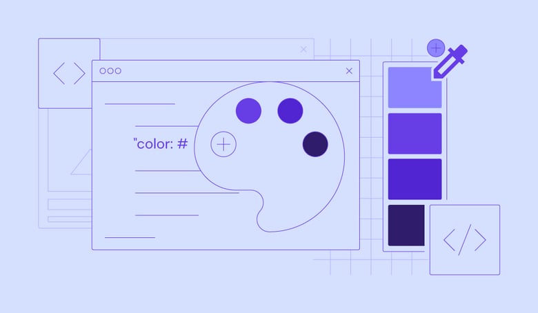
How to choose your own website color scheme
Selecting a website color scheme involves a few key steps:
- Understand your brand. Reflect on your brand’s identity and values to choose colors that represent the emotions you want to convey.
- Research your audience. Identify colors that resonate with your target demographic, considering factors like age and cultural preferences.
- Learn basic color theory. Understanding color relationships – complementary, analogous, and triadic colors –helps create a balanced color palette.
- Use tools and resources. Experiment with different color combinations using tools like Adobe Color, Coolors, and Paletton.
- Test and iterate. Implement your color scheme on your site and gather feedback. Be prepared to make adjustments based on visitors’ responses.
Top 30 website color schemes
Check out the following website color schemes to inspire you. The first nine examples are built with Hostinger Website Builder. With each example, we included the colors’ names and hex codes so you can mix and match different shades for your own website design.
1. Pink, teal, and cream
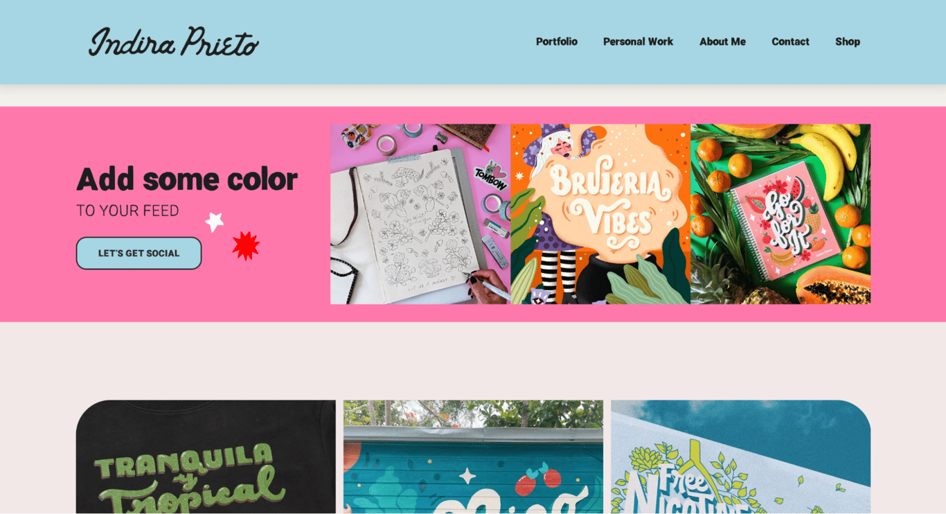
Colors: Pink (#FF78AC), teal (#A8D5E3), cream (#F2F0EA)
Indira Prieto’s portfolio website uses a vibrant color scheme that includes pink, teal, and cream, balancing warmth and professionalism.
The contrast between the vibrant pink and the calm teal, alongside the grounding cream, helps direct attention to key elements like calls to action and headlines and enhances user engagement.
With Hostinger Website Builder, it’s easy to update the colors of different page sections and elements from the Website styles menu.

2. Orange and yellow
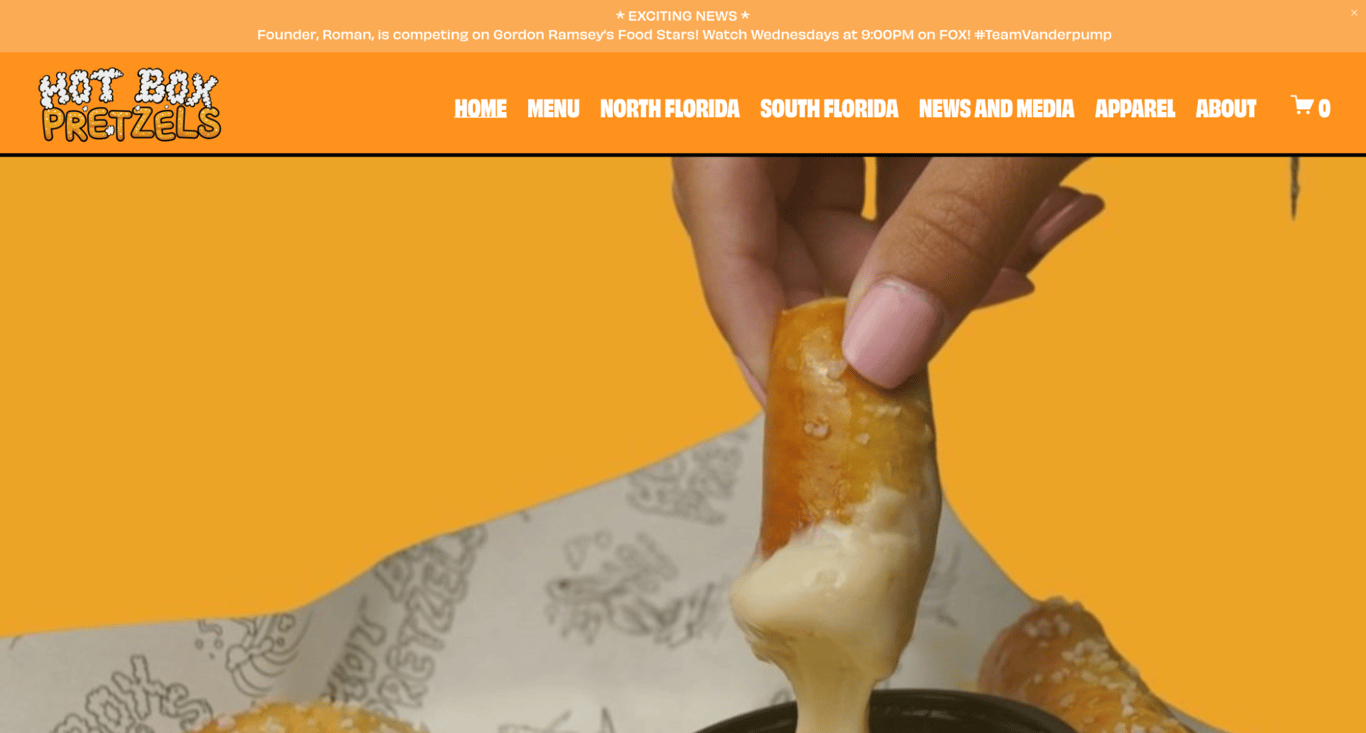
Colors: Orange (#FF921C), yellow (#ECA427)
The website for Hot Box Pretzels uses a color scheme of orange and yellow to create a warm, inviting, and appetizing look.
These colors are particularly effective for a food-related business as they are often associated with freshness, warmth, and energy, which can enhance the appeal of the food items offered.
3. Fuchsia and dark grey
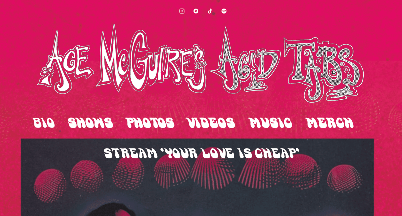
Colors: Fuchsia (#D8125B), dark grey (#2C2E39)
Ace McGuire’s Acid Tabs uses a bold color scheme of fuchsia and dark grey to create a vibrant yet edgy aesthetic.
This color palette is particularly effective in appealing to younger audiences and fans of energetic music genres, as the color combination evokes a sense of excitement and modernity.
4. Green, red, and white

Colors: Green (#205A28), red (#C72B32), and white (#FFFFFF)
Diplomatic Lawn Care utilizes a website color scheme of green, red, and white, which is both visually striking and thematically appropriate for a lawn care company.
It effectively communicates the service’s professionalism and is visually aligned with the industry’s color palette, enhancing the site’s aesthetic and functional appeal.
5. Cream and black
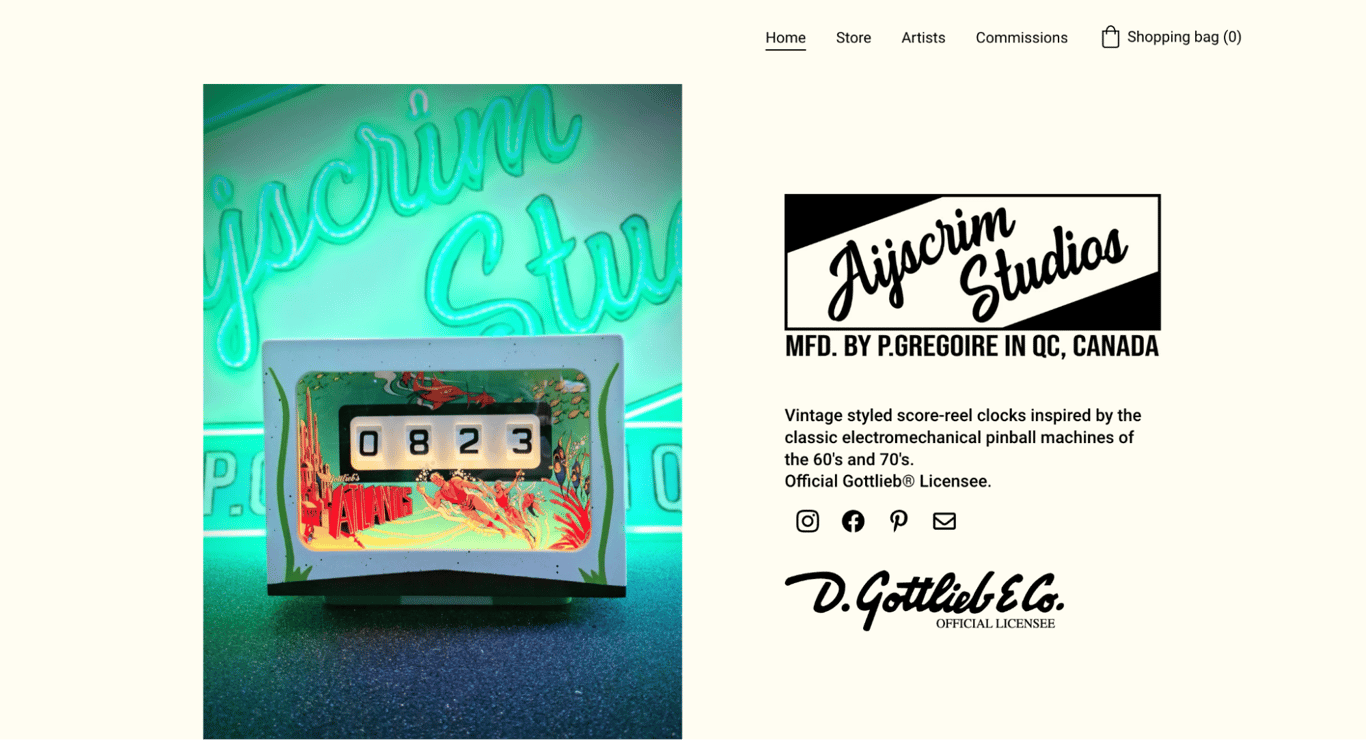
Colors: Cream (#FFFDF2), black (#000000)
The website for Ayscrim Studios uses a classic color scheme of cream and black, which gives the site a clean, sophisticated look – ideal for an online store showcasing vintage-inspired clocks.
This color palette lends an elegant and timeless feel to the website while enhancing the user’s shopping experience by highlighting the products and content.
6. Black and white
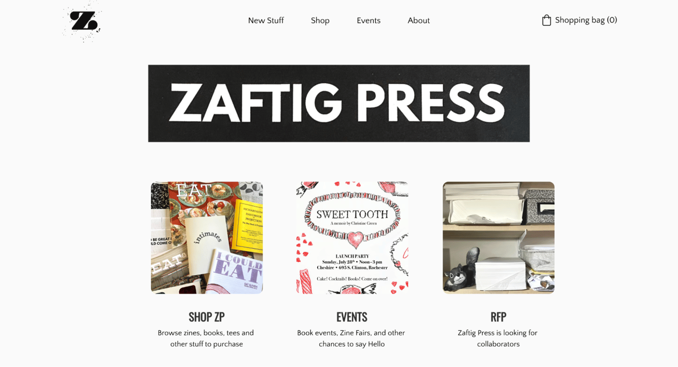
Colors: Black (#000000), white (#FFFFFF)
Zaftig Press utilizes a classic black and white color scheme that offers a sleek, minimalist aesthetic.
This monochromatic approach creates a visually clean and uncluttered look, which helps highlight on-page information without the distraction of other colors.
7. Dark pink and white
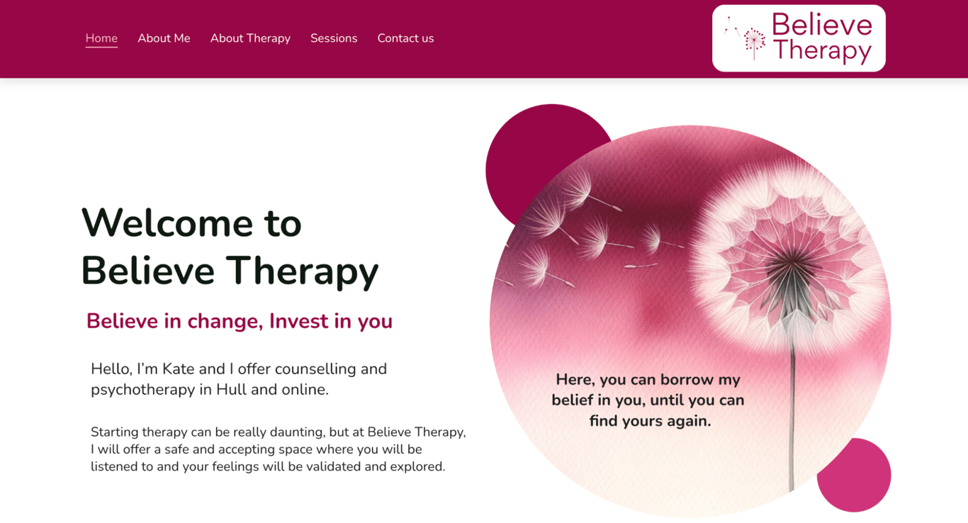
Colors: Dark pink (#970747), white (#FFFFFF)
Believe Therapy’s website uses a dark pink and white color scheme to evoke warmth and openness, which is essential for a therapeutic setting.
This combination effectively conveys a sense of safety and compassion, inviting users to explore and engage with the available therapy services. The use of dark pink adds a unique and memorable visual identity to the brand.
8. Blue and mint
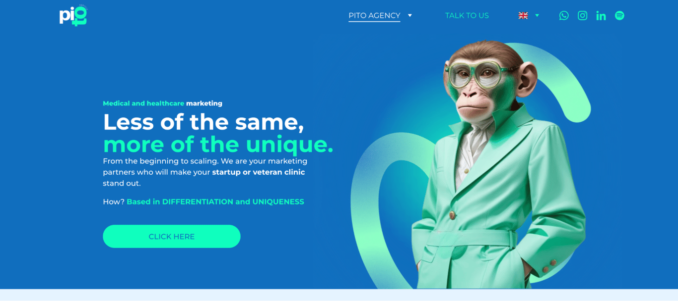
Colors: Blue (#106EBE), mint (#0FFCBE)
The website of Pito Agency uses a fresh and modern color scheme featuring blue and mint, creating vibrant and eye-catching visuals.
This color combination reflects the agency’s commitment to strong, unique marketing campaigns by blending blue’s associations with trust and professionalism with mint’s fresh, dynamic energy.
Together, these colors symbolize the agency’s ability to balance reliability with innovative and adaptable strategies, ensuring impactful and memorable campaigns.
9. Red and black
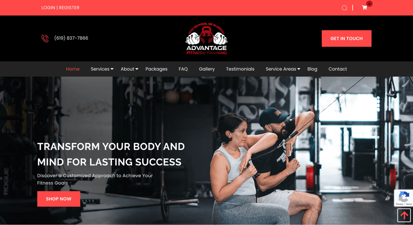
Colors: Red (#B4121B), black (#000000)
Advantage Fitness Training uses a bold red and black color scheme, which is highly effective for a fitness-oriented site.
This color combination enhances the site’s dynamic feel, fitting perfectly with the energetic and robust nature of physical training. The use of red also helps catch the user’s attention, making calls to action stand out and driving engagement and conversions.
10. Dark green, ivory, and yellow

Colors: Green (#009B4D), tangerine yellow (#FFCC00), ivory (#FAF5E9)
The website of Mandai Wildlife Reserve employs a color scheme of dark green, ivory, and yellow that resonates with its environmental theme.
This color palette creates a natural and inviting environment, encouraging visitors to explore and engage with the conservation efforts showcased on the site.
11. Bright green and hot pink
Colors: Malachite green (#31EC56), razzmatazz (#EF036C), heliotrope (#EE72F8)
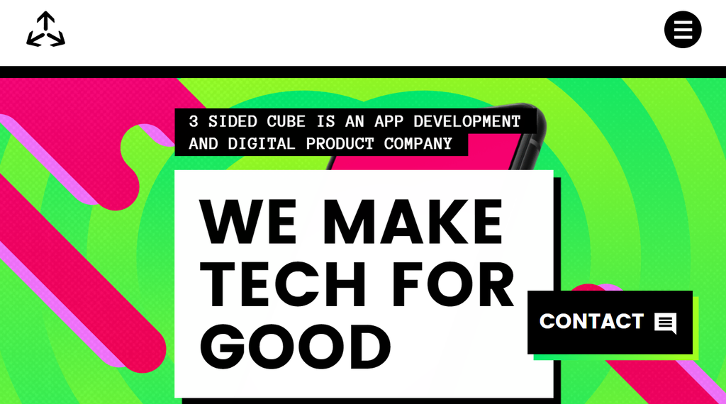
3 Sided Cube uses a unique color scheme of bright green and hot pink, which energizes the website’s interface and draws attention.
This combination is perfect for a creative tech company aiming to stand out in the digital space, highlighting the brand’s focus on innovation.
12. Dark grey and yellow-green

Colors: Yellow-green (#BAFF39), dim grey (#6E6E6E), white (#FFFFFF)
GolfSpace’s website features a dark grey and yellow-green color scheme that focuses on functionality and visibility.
The color combination is effective in a sports-related context, conveying energy and performance, in turn engaging visitors interested in golf.
13. Blue shades and white

Colors: Light blue (#E9F1FA), bright blue (#00ABE4), white (#FFFFFF)
Drone.io’s website effectively uses shades of blue and white to promote a sense of reliability and cutting-edge technology.
This color scheme is particularly suited for technology websites. In an industry where trust and clarity are paramount, these colors encourage user confidence and engagement.
14. White and lime green
Colors: Lime (#00DD00), white (#FFFFFF)
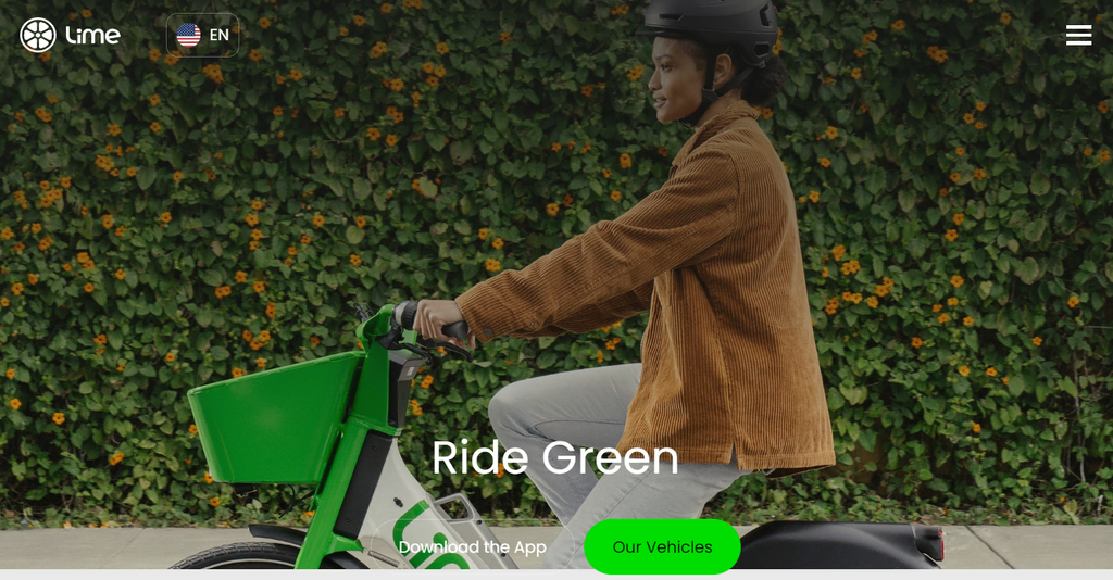
Lime’s website leverages a minimalist yet vibrant color scheme of white and lime green, designed to highlight the brand’s modern and sleek aesthetic.
This straightforward yet dynamic color palette effectively conveys the brand’s environmentally conscious values, keeping in line with the company’s core service – electric scooter hire.
15. Beige and dark grey
Colors: Beige (#DDD0C8), dark grey (#323232)
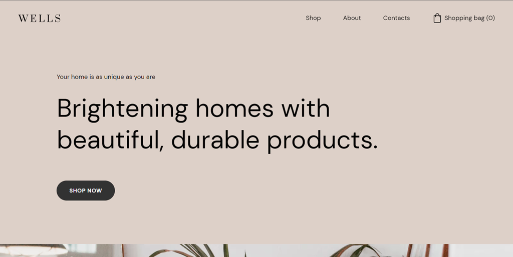
Wells’ eCommerce site uses a sophisticated palette of beige and dark grey, which is ideal for promoting the brand’s upscale products.
As website color schemes go, this combination signifies quality and luxury, appealing to an audience looking for premium products.
16. Pastel purple and neutral accents
Colors: Pastel purple (#C5ADC5), light steel blue (#B2B5E0)
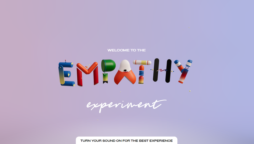
Empathy Experiment’s website uses a gentle combination of pastel purple and neutral accents to create a serene and inviting space.
This website color scheme contributes to a calming user experience, suitable for sites dedicated to mental health and well-being.
17. Navy blue and electric blue

Colors: Deep navy blue (#01257D), electric blue (#00FFFF)
Finlor’s logistics website employs a combination of navy blue and electric blue to create a sense of trust and professionalism.
Use this color palette for business and corporate websites, especially to emphasize dependability and create a clear visual hierarchy.
18. Color gradient, white, and dark blue
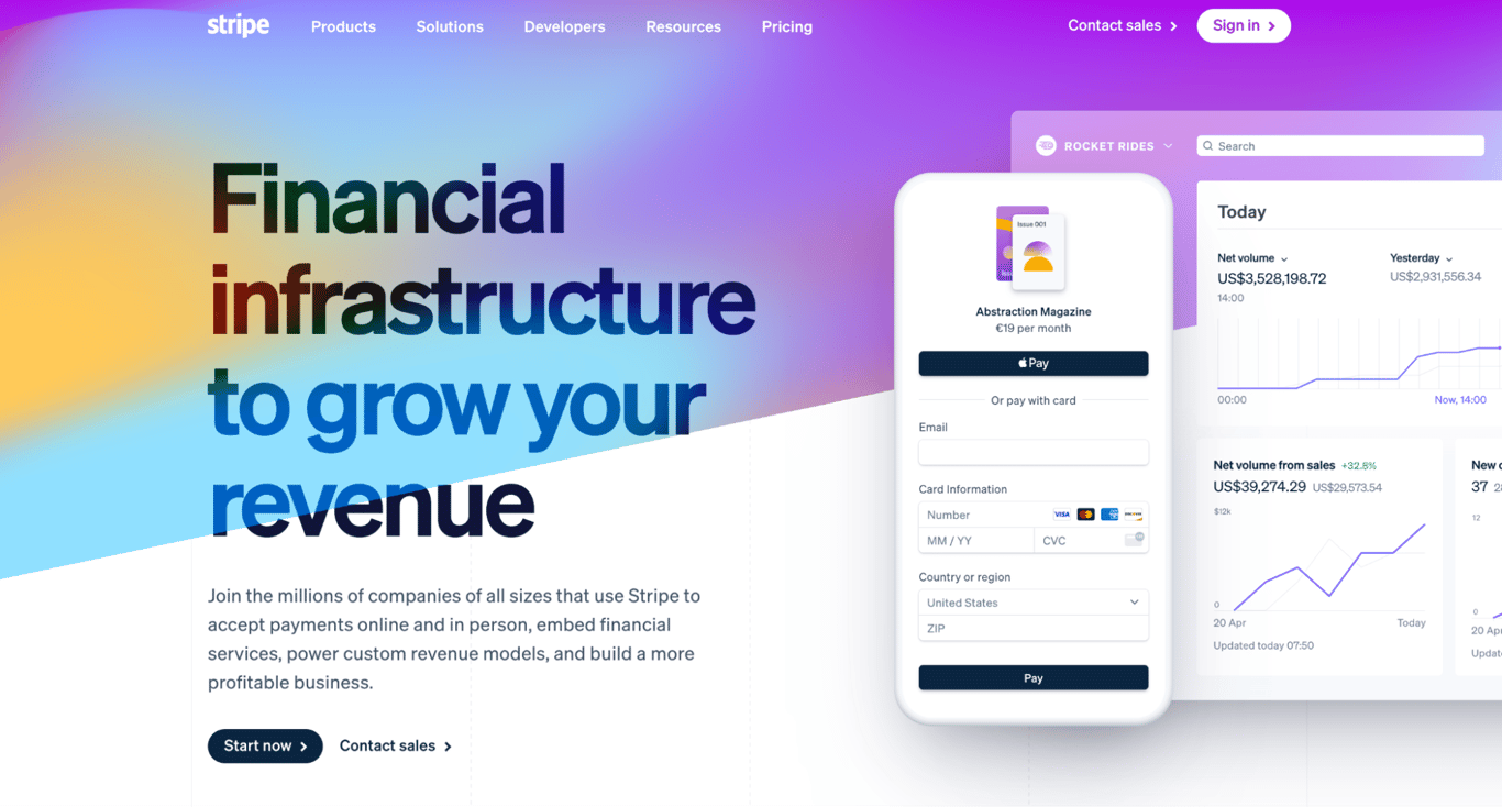
Colors: White lilac (#F8F8F9), dark blue (#111439), color gradient
Stripe’s homepage creatively uses a color gradient alongside white and dark blue to produce a dynamic yet professional look.
Gradient website color schemes are perfect for tech companies looking to emphasize innovation.
19. White and blue-grey
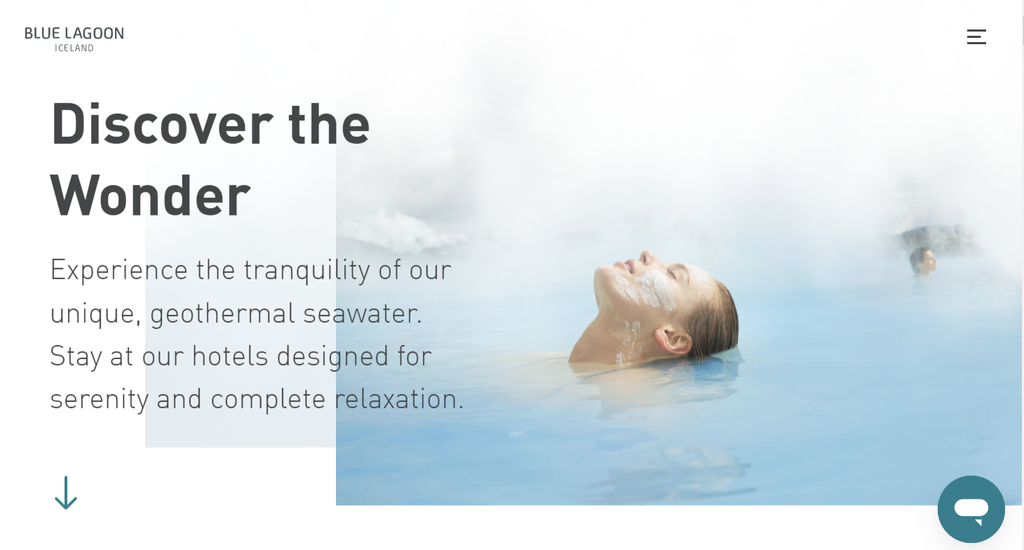
Colors: Blue-grey (#96C2DB, #E5EDF1), white (#FFFFF)
Blue Lagoon’s website uses a soothing combination of white and blue-grey to evoke a sense of tranquility and relaxation.
This color scheme is great for hospitality websites that want to promote a peaceful and rejuvenating experience.
20. Bright red and white

Colors: White smoke (#F0F0F0), bright red (#E7473C)
Best Horror Scenes uses a striking combination of bright red and white to create an impactful and bold website design.
This color scheme is ideal for websites looking to make a strong first impression, especially in the entertainment or creative industries.
21. Classic blue, turquoise, and gold
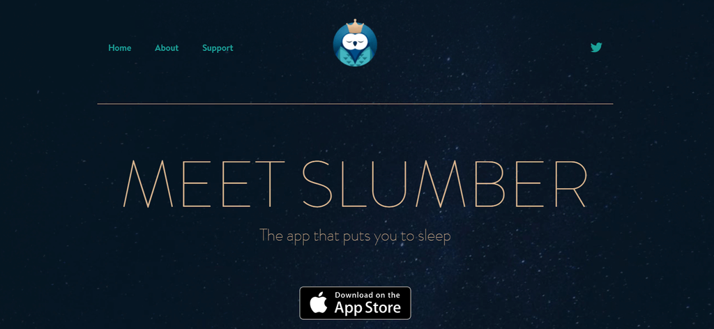
Colors: Dark classic blue (#0A1828), turquoise (#178582), gold (#BFA181)
Slumber’s audio library site features a sophisticated mix of classic blue, turquoise, and gold to convey calmness and luxury.
This website color scheme is perfect for services related to well-being and relaxation, highlighting the brand’s serene nature.
22. Yellow and blue
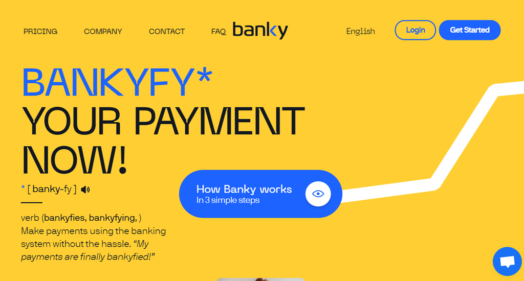
Colors: Yellow (#FFCE32), Prussian blue (#1D63FF)
Banky’s website uses a lively yellow and blue color scheme to convey optimism and trust.
This color palette is especially good for websites in the finance or educational sectors where it’s important to communicate energy and dependability.
23. Dark royal blue and gold
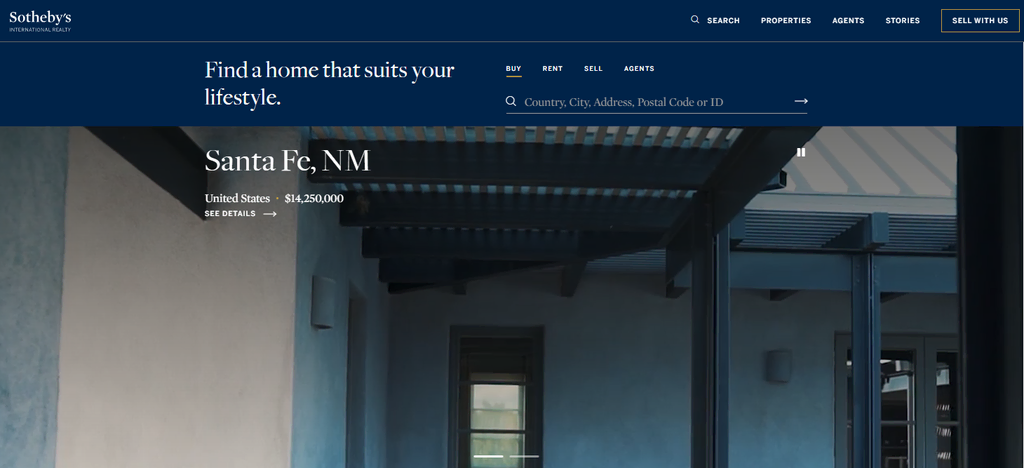
Colors: Blue (#002349), gold (#957C3D)
Sotheby’s real estate site uses a sophisticated website color scheme of dark royal blue and gold to convey elegance and prestige.
This color combination is ideal for luxury brands and high-end services, communicating exclusivity and quality to its audience.
24. White and purple
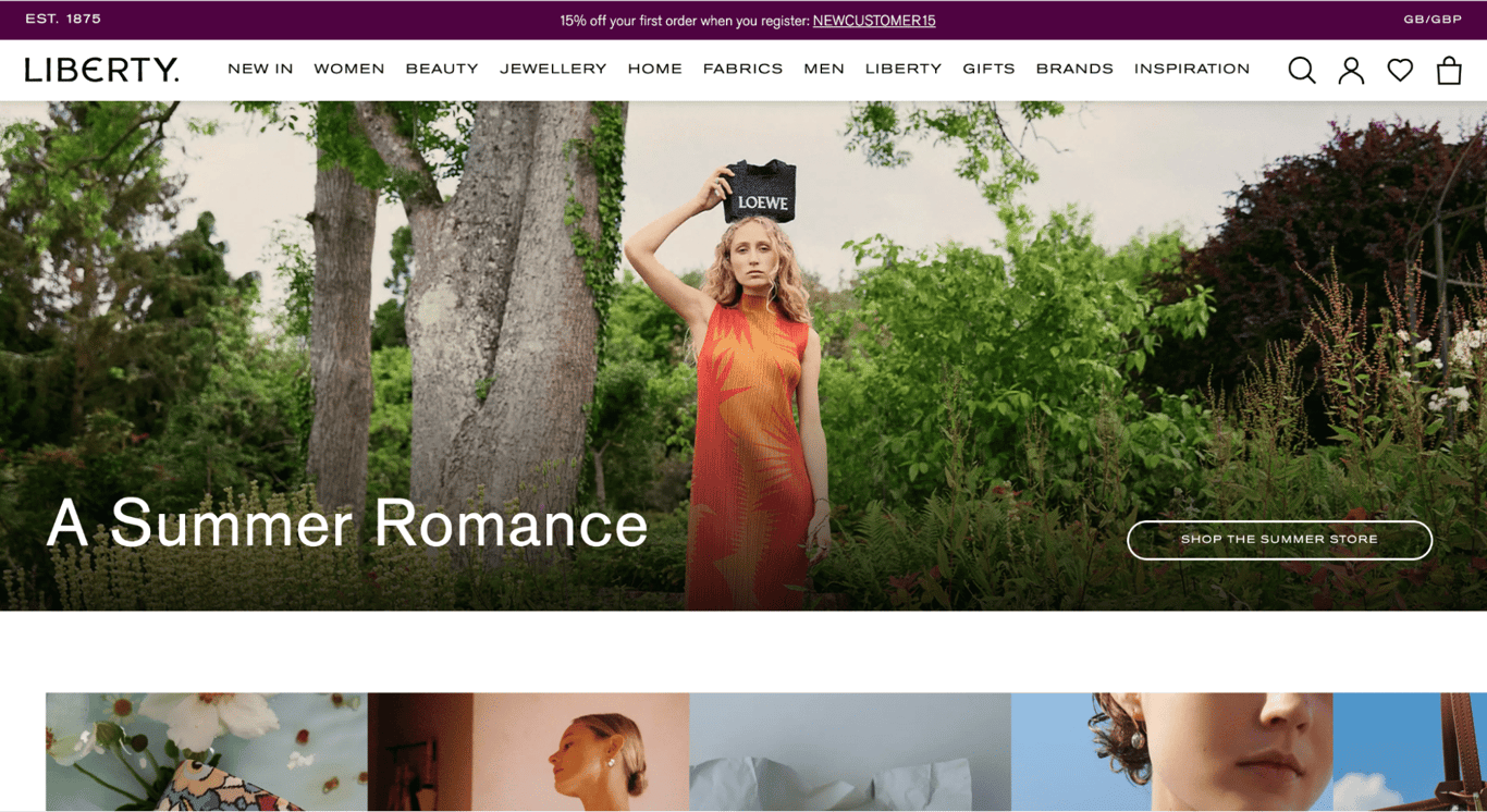
Colors: Tyrian purple (#4F0341), white (#FFFFFF)
Liberty London’s luxury eCommerce site uses a refined color scheme of white and purple to create a luxurious and elegant look.
This type of website color scheme is perfect for luxury brands looking to emphasize quality and elegance. They draw attention to premium products and create a memorable visual experience.
25. Blue shades, white, and red-violet

Colors: Pale blue (#EFFAFD), royal blue (#4A8BDF), eggplant (#A0006D)
Imprint Genius’ site employs a dynamic color scheme of blue shades, white, and red-violet to create a playful yet professional atmosphere.
A website color palette like this is excellent for marketing agencies aiming to convey creativity and innovation while maintaining a polished and organized on-page appearance.
26. Light and reddish orange
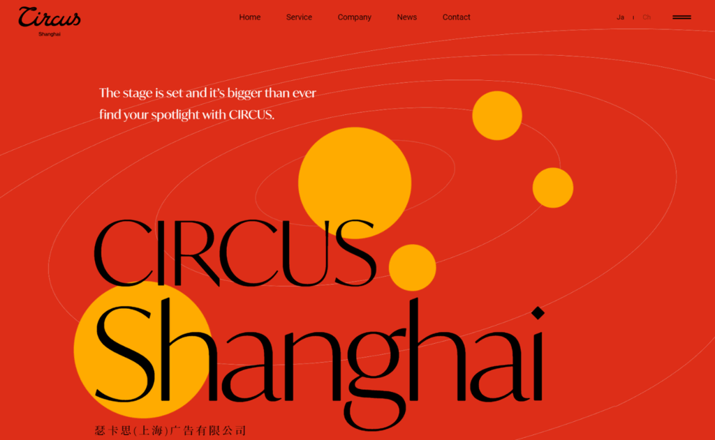
Colors: Orange (#FFAB00), Harley Davidson orange (#DD2E18)
CIRCUS inc. uses a vibrant website color scheme of light and reddish orange to create a lively and energetic web presence.
This color combination is perfect for creative industries looking to inspire excitement and capture the interest of visitors. Meanwhile, the black and white accents ensure readability and contrast against the vibrant backdrop.
27. White, purple, and orange

Colors: White (#FFFFFF), sunset orange (#FF5841), red-violet (#C53678)
Mila’s flat design site uses a striking combination of white, purple, and orange to create a vibrant and modern aesthetic.
This website color palette is ideal for creative services or startups that want to emphasize innovation and a youthful vibe.
28. Yellow and brown
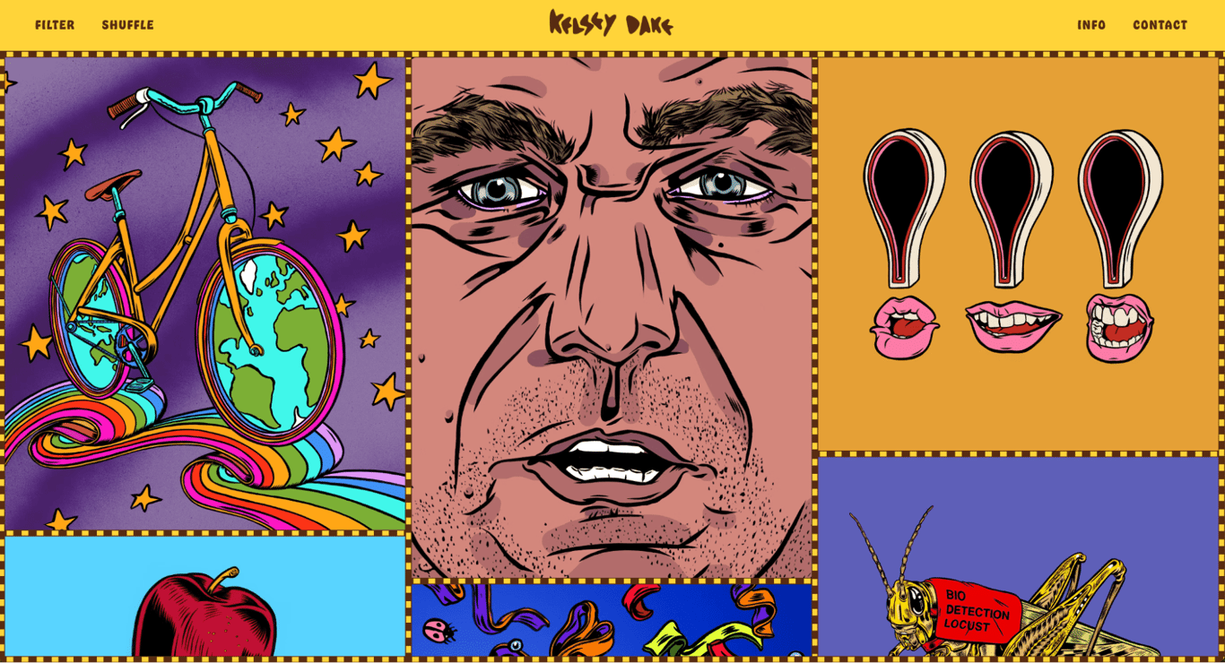
Colors: Sunglow yellow (#FFD43A), baker’s chocolate (#582C12)
Kelsey Dake’s portfolio combines yellow and brown to create a lively and unique aesthetic.
This website color scheme is perfect for artistic sites that aim to stand out and showcase creativity in a visually dynamic way.
29. Deep purple, orange, red, and pink
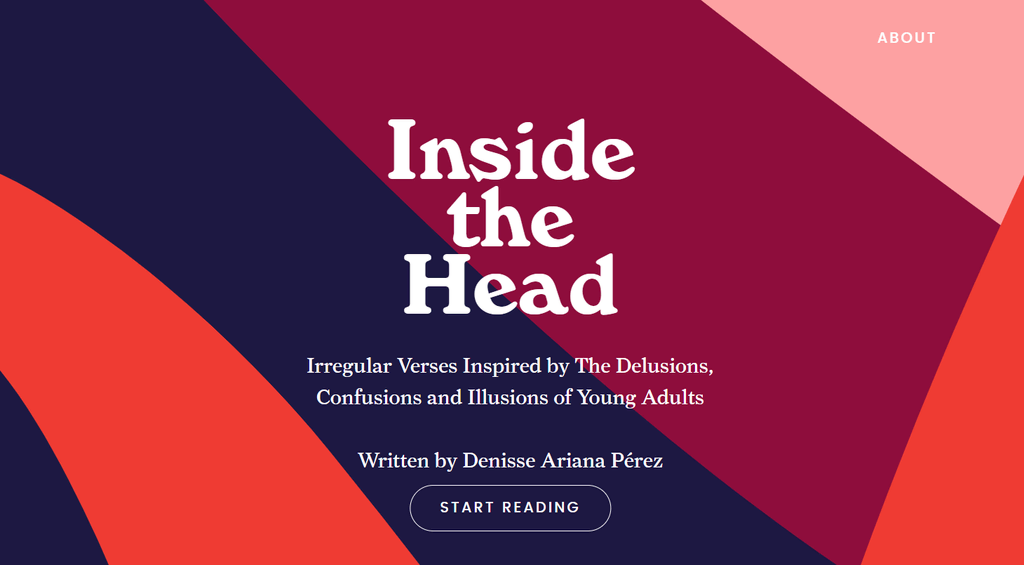
Colors: Deep red (#8E0D3C), blackcurrant (#1D1842), orange (#EF3B33), rose pink (#FDA1A2)
Inside the Head uses a bold color scheme of deep purple, orange, red, and pink to create a dynamic and captivating design.
This palette is perfect for creative and media-focused websites, where visual impact and user engagement are key.
30. Brown and beige

Colors: Narvik (#EAE7DD), Sorrell brown (#99775C)
Engineered Floors’ website uses a warm, earthy palette of brown and beige to create an inviting and natural aesthetic.
This color scheme is ideal for businesses looking to evoke comfort and trust, particularly in industries related to home decor and lifestyle products.
Deep grey is used for text and icons, enhancing navigation and readability without detracting from the overall color scheme.
How to change color palettes in Hostinger Website Builder
Updating your website’s color palette in Hostinger Website Builder is intuitive and fast. Therefore, you can easily adapt your site’s look for seasonal campaigns or a rebrand.
Simply follow these short steps:
- Open the Hostinger Website Builder editor.
- Expand the Website styles menu. Customize colors in the Colors tab.
- Use the preview function to see how your new website color scheme looks on different devices.
- Once you’re satisfied with your new colors, publish your changes.

Conclusion
Choosing the right color scheme for your website is crucial for creating a positive user experience and establishing a strong brand identity.
Colors significantly influence brand recognition, user experience, and emotional responses to your site. When designing a color scheme for your site, make use of color theory and audience research to create a balanced palette that aligns with your brand.
You can also utilize design tools like Paletton to experiment with color combinations. Then, adjust based on user feedback to ensure improved readability and engagement.
By applying these best practices, you can create a visually appealing and cohesive website that resonates with your audience.
To dive deeper into creating effective website designs, explore our comprehensive guide on how to design a website.
Website color schemes FAQ
This section will answer common questions about website color schemes. If you still have questions, don’t hesitate to leave a comment below.
How many color schemes should a website have?
Ideally, a website should have one cohesive color scheme with up to four colors. Using too many colors can make the site appear cluttered and confusing. Following the 60-30-10 design rule is recommended: use 60% of a dominant color, 30% of a secondary color, and 10% accent colors. This approach ensures a balanced and aesthetically pleasing website.
How to find exact color palettes on a website?
To extract colors from a screenshot, use Dopley. This tool provides detailed information about each color, including its value, combinations, and varying shades. For extracting colors from a website URL, Alwane.io is a useful tool, although it offers less detailed color information compared to Dopely.
What is the three-color rule for websites?
The three-color rule suggests using a primary color, a secondary color, and an accent color in your website design. This approach helps maintain visual harmony and ensures that the design is not overwhelming.
All of the tutorial content on this website is subject to Hostinger's rigorous editorial standards and values.

Matleena is a seasoned Content Writer with 5 years of content marketing experience. She has a particular interest in emerging digital marketing trends, website building, and AI. In her free time, Matleena enjoys cups of good coffee, tends to her balcony garden, and studies Japanese. Follow her on LinkedIn