Most Popular Tutorials
New to Hostinger Tutorials? Start with our most-viewed guides and resources.
19 best website design examples for inspiration in 2026
A well-designed website can captivate visitors, convey your brand’s message, and establish credibility. It also improves the user journey,...

What is VPS (virtual private server) hosting?
VPS (virtual private server) hosting is a service that provides users with virtual machines running on a physical server, each ...
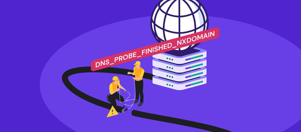
How to fix the DNS_PROBE_FINISHED_NXDOMAIN error
The DNS_PROBE_FINISHED_NXDOMAIN error appears when your browser can’t find a website’s IP address. In simple terms, the domain name...
WordPress
Whether you’re an expert or beginner, we have the latest updates, tutorials, and tips for your WordPress projects.

How to speed up a WordPress website: 12 performance optimization methods
Search engines like Google consider page speed a ranking factor as it affects the overall user experience. WordPress offers various ...
What is a WordPress plugin: A comprehensive guide for beginners
WordPress plugins are a crucial aspect of building WordPress websites as they allow users to add additional features without touching ...
How to improve WordPress security: 22 methods to protect your website
WordPress is the most popular content management system (CMS), with 43.2% of all websites running on its software. Unfortunately, its ...
Weekly Editor's Pick
Every week, our editors curate the best content for you to build success online.

Hytale server requirements: Minimum and recommended specs for 2026
Hytale server requirements are relatively modest for small player counts, but scale quickly as more players join and worlds grow. ...
8 best Hytale server hosting providers: Top features and pricing
The best Hytale server hosting providers deliver low latency and high-performance hardware to handle the game’s procedurally generated...
What is vibe coding? How does it work?
Vibe coding is a growing trend where developers use large language models (LLMs) to generate functional code by simply describing ...
Websites
Need a hand with a website? Our guides can walk you through all the processes, from choosing a hosting plan to optimizing site performance.

Website maintenance cost: Hiring a professional vs self-maintenance
Website maintenance costs typically range from $5 to $5,000 per month.This wide range depends heavily on your site’s complexity, size, ...
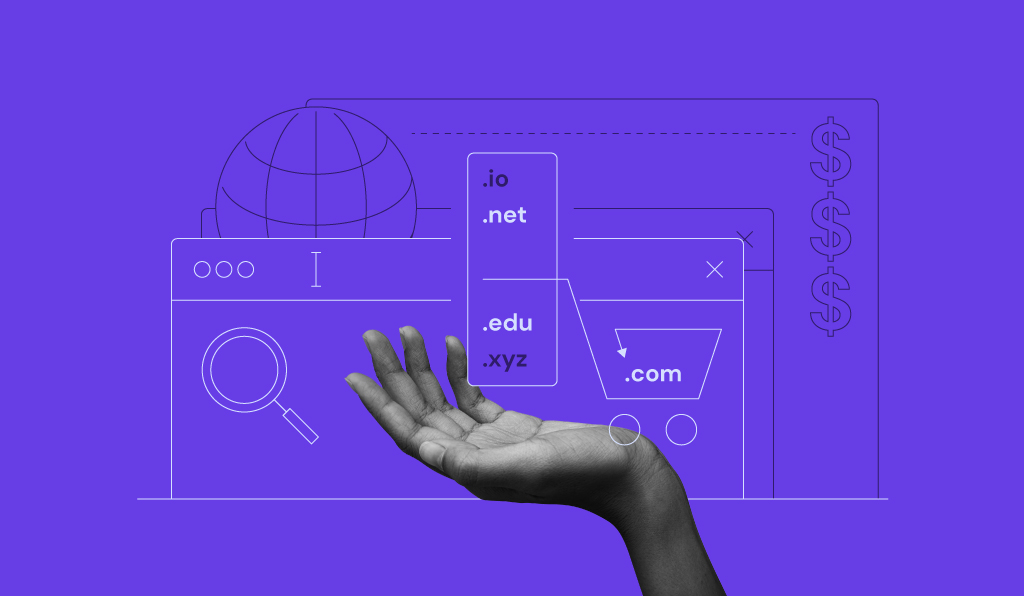
How to buy a domain name in 5 steps
Buying a domain means registering the rights to use a web address, such as yourname.com, for a set period. The ...
All Hostinger Tutorials
Learn more about web hosting, VPS, domain names, SSL, and more with our newest releases.

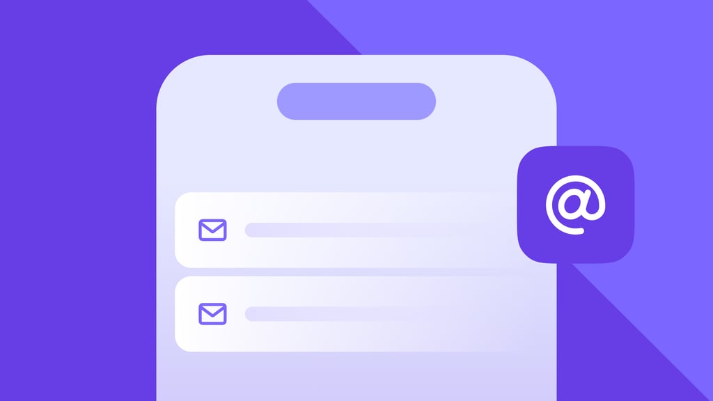
What is an onboarding email sequence and How to create one
An onboarding email sequence is a series of automated emails sent after a user signs up, subscribes, or makes a ...
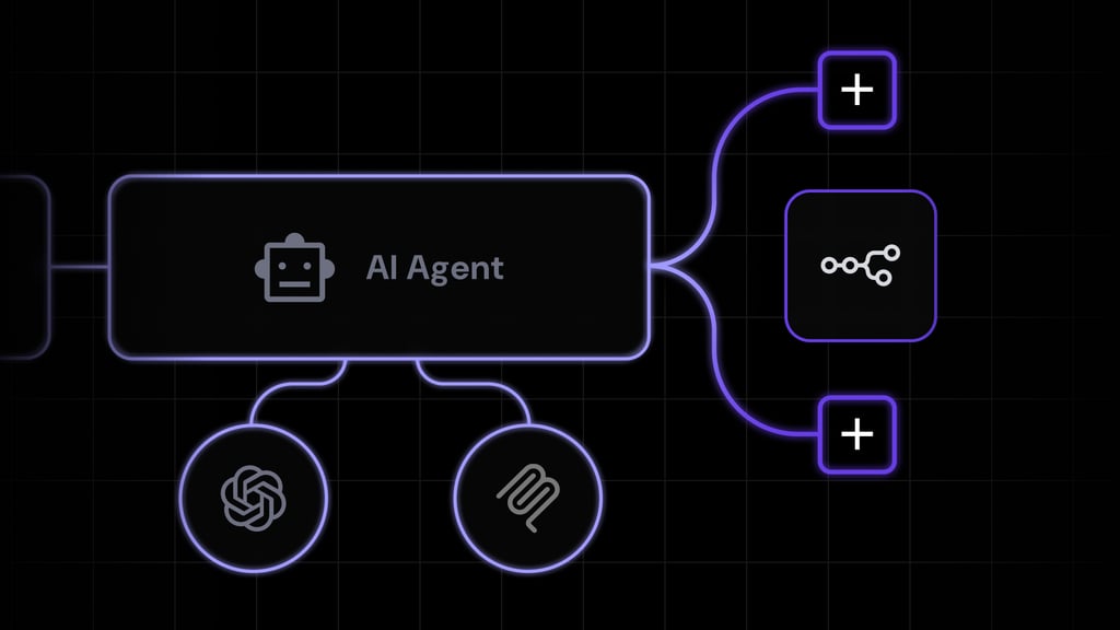
11 best no-code AI agent builders to automate your workflows
A no-code AI agent builder lets you create AI agents through a visual interface without writing code. Teams use them ...
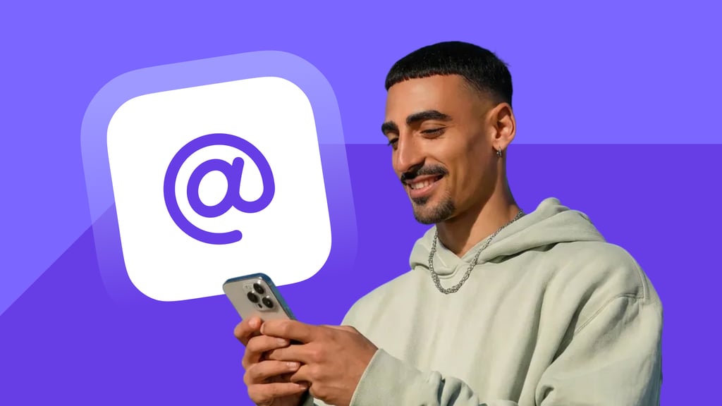
ChatGPT email integration: methods, setup, and use cases
ChatGPT email integration links ChatGPT’s language model to an email inbox so it can draft replies, summarize threads, prepare follow-ups, ...
What is agentic AI in marketing, and how does it work?
Agentic AI in marketing describes autonomous agents that read real-time data, decide on the next best action, and execute multi-step ...
AI Assistant vs. AI Agent: What’s the Difference?
An AI assistant responds to prompts, while an AI agent pursues goals. Assistants generate answers, drafts, and summaries one request ...
AI agents vs. LLM: What’s the difference?
An LLM is a language model that interprets a prompt and generates text, code, or other structured outputs. An AI ...

Claude email integration: What it is and how to set it up
Claude email integration connects Claude’s reading, searching, and drafting abilities directly to your inbox, turning email into another source...
How to schedule an email
To schedule an email, write your message as usual, then set a future date and time for delivery instead of ...
What is AI for content marketing?
AI for content marketing applies artificial intelligence to support every stage of the content lifecycle, from researching and planning topics ...
What is AI copywriting? How it works and when to use it
AI copywriting is using AI writing tools to draft short, persuasive marketing copy for ads, emails, landing pages, product descriptions, ...
What are OpenClaw skills?
OpenClaw skills are installable packages that add reusable capabilities to OpenClaw. Each skill contains instructions for a specific tool, workflow, ...
Headless CMS vs. traditional CMS: How to pick the right one
The difference between a headless CMS vs. traditional CMS is how they connect content to what visitors see.A traditional CMS ...
Types of AI agents
AI agents can be grouped by how they perceive information, make decisions, and carry out tasks.Each type uses a different ...

What is an email API and how it works
An email API is a software interface that integrates email functionality into applications. The API exchanges requests and responses with ...
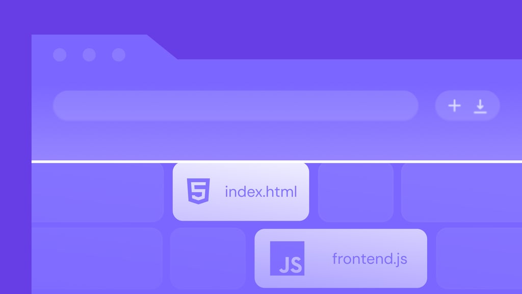
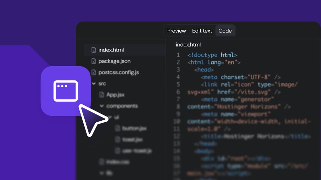
How to deploy a website from VS Code
To deploy a website from Visual Studio Code (VS Code), you push your project from your computer to a hosting ...
14 best AI sales tools for every stage of the sales process
The best AI sales tools automate the repetitive parts of the sales process, from finding leads and writing cold emails ...
Top AI marketing tools: Features and use cases
AI marketing tools help businesses create content, improve search visibility, manage campaigns, automate customer communication, and analyze...
Single-agent vs. multi-agent systems: What’s the difference?
The main difference between a single-agent and a multi-agent system is how AI completes a task.A single-agent system relies on ...
How to send an email in Claude
To send an email through Claude, connect it to your email provider using a built-in connector. Cowork and Claude Code ...

AI content optimization: What it is and how to use it
AI content optimization means using AI to improve your existing content’s ranking on Google and to be picked up by ...
How to deploy a website from Cursor
To deploy a website from Cursor, push your code to a GitHub repository and connect that repository to a hosting ...
How to deploy a React app in 6 steps
To deploy a React app, create a production build, connect the project to a host, configure the build settings, and ...