Product page design: Layout, best practices, and examples
Jul 28, 2026
/
By Simon L.
/
9 min Read
A well-designed product page answers shoppers’ questions, builds confidence in the purchase, and guides visitors toward completing their order.
Every element, from the first product image to the final call to action, plays a role in reducing hesitation and making the buying process feel effortless.
Strong product page design balances visual appeal with usability. Clear pricing, detailed descriptions, high-quality images, customer reviews, and trust signals help shoppers understand exactly what they’re buying and why it’s worth the price.
At the same time, a clean layout ensures visitors can find important information without feeling overwhelmed.
Every product page has the same goal: helping customers feel confident enough to click Buy now.
Reaching that goal depends on presenting the right information at the right moment, whether you’re selling physical goods, digital products, or customizable items.
How to structure a product page
A product page should present information in the order shoppers expect to find it.
Most visitors don’t read every word from top to bottom. They scan the page to find answers to a few key questions: What is this product? How much does it cost? Is it right for me? Can I trust this store?
A clear layout helps them find those answers quickly without jumping between sections or searching for essential details.
Organizing the page around the customer’s decision-making process reduces friction at every stage of the purchase journey.
Put the most important information above the fold
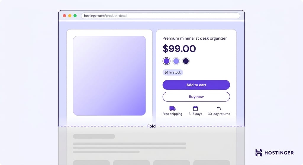
The area above the fold should communicate what the product is, how much it costs, and how to buy it without requiring visitors to scroll.
First impressions happen quickly. Research shows visitors form an opinion about a website in 50 milliseconds, making it essential to surface key product information immediately.
If customers have to hunt for basic details, they’re more likely to leave than continue browsing.
Display a clear product name, a high-quality hero image, the current price, and any available variants, such as size, color, or material, near the top of the page.
Stock availability should also be visible, especially for products with limited inventory or long delivery times.
Place a prominent Add to cart or Buy now button close to these elements so shoppers can take action as soon as they’re ready.
A short summary of shipping costs, estimated delivery times, and return policies can further reduce hesitation before purchase.
Many shoppers look for this information before committing to an order, so displaying it early helps answer common questions without interrupting the buying journey.
Show the product from every angle
Use product visuals to answer questions that a written description cannot. Include multiple images showing the front, back, sides, close-up details, and any parts customers need to inspect before buying.
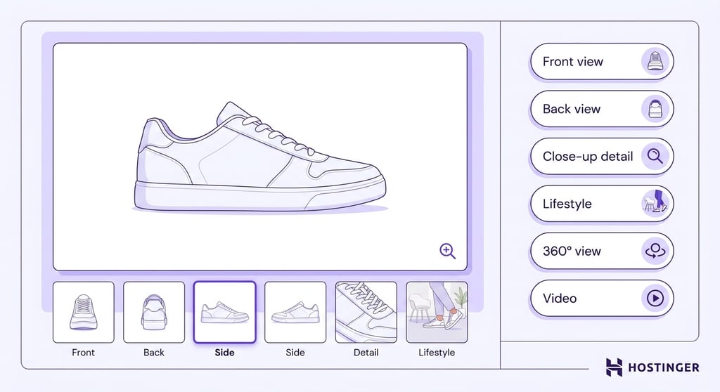
Different types of visuals serve different purposes. Add zoom functionality for products where texture, stitching, finish, or small components affect the buying decision.
Lifestyle photos help shoppers understand scale, fit, and everyday use, while videos demonstrate movement, setup, functionality, or the differences between product variants.
For products with important details on every side, such as furniture, footwear, or electronics, a 360-degree view lets customers inspect the item from every angle.
Product images play a major role in purchase decisions, as research shows that 67% of consumers say product images strongly influence whether they buy, making high-quality visuals just as important as written descriptions.
Important! High-resolution images significantly increase page load time if not properly compressed. Use image optimization tools or formats such as WebP to reduce file size without sacrificing visual quality. Slow-loading product pages can increase bounce rates and negatively affect your search engine rankings.
Write descriptions that answer buying questions
Product descriptions should start with the main benefit or problem the product solves, then explain the features that make those benefits possible.
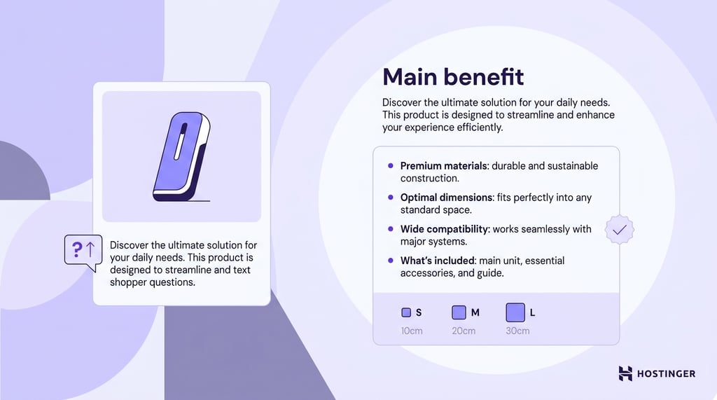
Shoppers care less about a list of specifications than they do about understanding how the product fits into their daily lives. In fact, 36.4% of shoppers prioritize accurate product descriptions and photos when shopping online.
When writing product copy that converts, make sure to include practical details that customers commonly look for before making a purchase.
Depending on the product, this may include materials, dimensions, weight, compatibility, ingredients, technical specifications, or what’s included in the package.
For clothing, furniture, and similar products, add sizing information or measurements to help shoppers choose the right option and reduce the likelihood of returns.
Present key information in bullet points so visitors can quickly scan the page for answers. If the product requires assembly, maintenance, or special care, explain those requirements clearly.
Addressing common questions upfront helps customers buy with confidence.
Make pricing easy to understand
Display pricing clearly and avoid surprising customers with unexpected costs during checkout.
Setting the right product price is only part of the equation. Customers also need to understand exactly what they’ll pay before they reach the checkout.
A transparent pricing section helps shoppers compare options, calculate the total cost, and decide whether the product fits their budget.
Include the following information whenever it applies:
- Current price. Display the selling price prominently, along with the original price if the item is discounted.
- Taxes and fees. Explain whether taxes are included or calculated at checkout to avoid confusion.
- Shipping costs. Show shipping fees or clearly state when free shipping is available.
- Variant pricing. Update the price automatically if different sizes, materials, or configurations have different costs.
- Subscription or bundle savings. Highlight recurring discounts, volume pricing, or bundle offers so shoppers can easily see how much they can save.
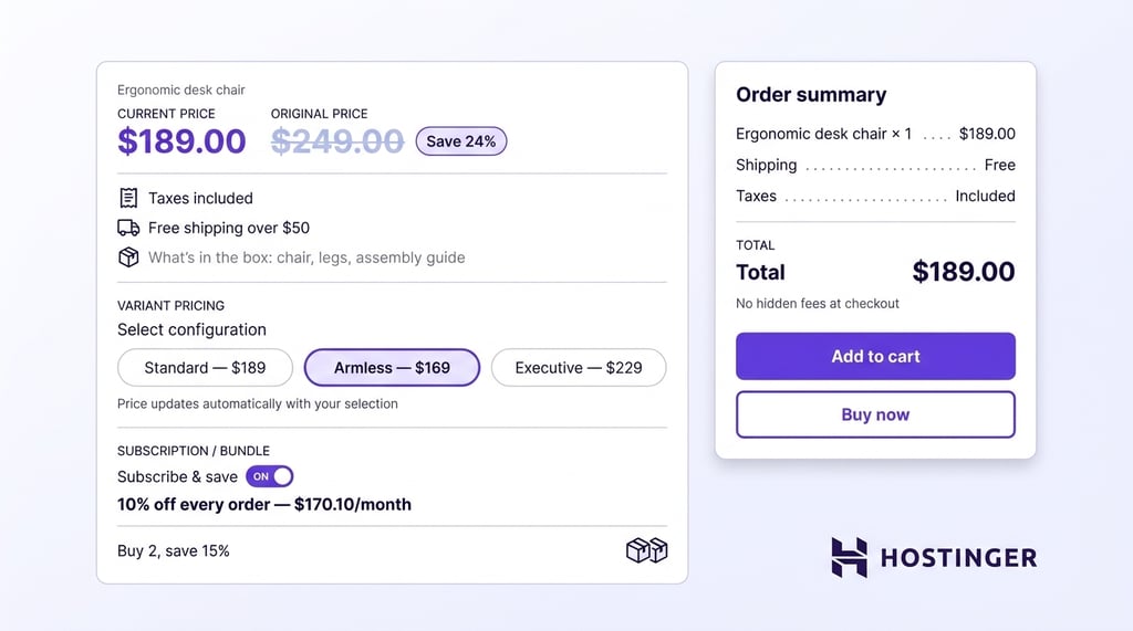
Before publishing your store, include pricing as part of your pre-launch store checks. Verify that every product page displays accurate prices, shipping costs, and discounts to prevent confusion and reduce the risk of abandoned carts.
Make the next step impossible to miss
Give shoppers a clear path to purchase. The primary call to action should stand out from the rest of the page and remain easy to find, whether visitors are browsing on a desktop or a mobile device.
When designing for mobile shoppers, place an Add to cart or Buy now button near the product title, price, and variant selector so customers can act without searching for it.
Personalized CTAs convert 42% more users than generic ones. Use a clear, action-oriented label and avoid competing buttons that distract from the primary goal.
On mobile devices, consider using a sticky call-to-action button that remains visible as shoppers scroll through images, descriptions, and reviews.
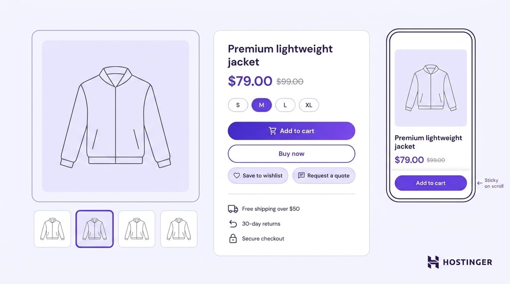
For products that involve more consideration, such as luxury items or custom-made products, include a secondary action like Contact us, Request a quote, or Book a consultation to answer questions before purchase.
A wishlist option can also encourage visitors who aren’t ready to buy immediately to save products and return later.
Build trust before asking customers to buy
Customer feedback, transparent policies, and secure payment options reassure visitors that they can buy with confidence.
A survey conducted by CXD Studio on behalf of Hostinger found that 48% of shoppers prioritize secure payment methods, reinforcing the importance of trust signals throughout the buying journey.
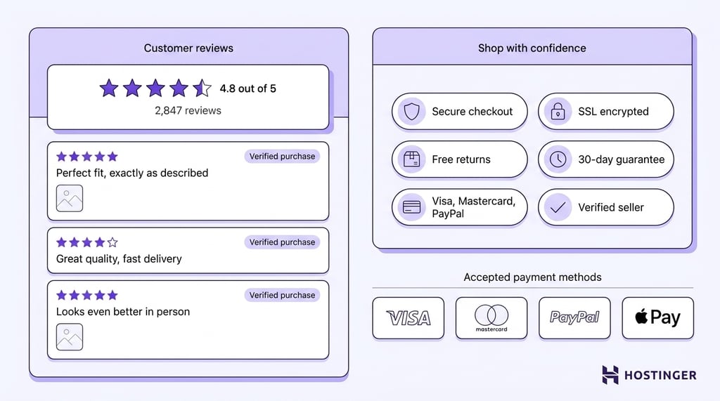
Include a mix of ratings, written reviews, and user-generated photos to give shoppers an authentic view of the product.
Reviews often answer practical questions that product descriptions don’t cover, helping customers understand quality, fit, durability, and real-world performance before making a purchase.
Trust extends beyond the product itself. Make your return policy, warranty, and accepted payment methods easy to find, and reassure customers that transactions are protected with secure checkout.
Pro tip
Display trust badges – such as SSL certificates, accepted payment icons, and money-back guarantee seals – near the Add to cart button. Placing them at the point of decision, rather than only in the footer, reinforces security at the moment shoppers are most likely to hesitate.
When shoppers know what to expect after they place an order, they’re less likely to hesitate at the final step.
Add supporting information below the fold
Reserve the space below the fold for details that help customers make a final decision without distracting from the primary purchase path.
Most shoppers want to see the product, price, and call to action first. Technical information and policies become more relevant once they’ve decided the product is worth considering.
Below the fold, include content such as:
- FAQs that answer common questions about the product, ordering process, or returns.
- Technical specifications for products where compatibility, dimensions, or performance matter.
- User manuals or installation guides that help customers understand setup and ongoing use.
- Size guides for clothing, footwear, furniture, and other products where choosing the right fit is essential.
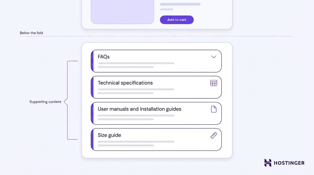
Improving the online shopping experience requires balancing simplicity with accessibility. Keeping the top of the page focused on driving purchases while placing supporting information below the fold gives shoppers the details they need without adding unnecessary clutter.
Recommend products customers are likely to buy together
Help shoppers discover products that complement their purchase, rather than leaving them to search for them separately.
Relevant recommendations make the shopping experience more convenient and ensure customers have everything they need before completing their order.
Choose recommendations that naturally fit the product, such as compatible accessories, replacement parts, matching items, or complete bundles.
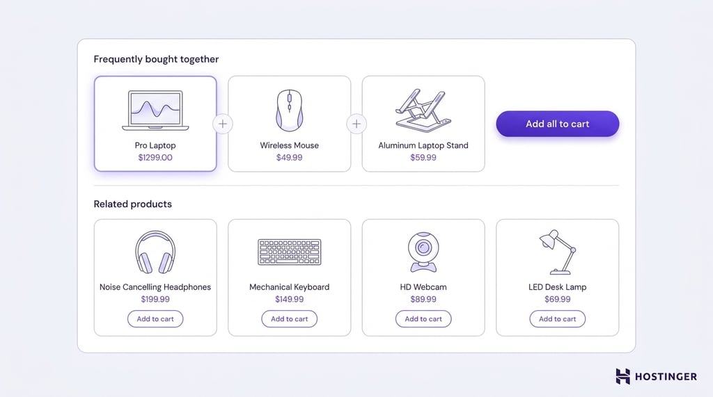
Sections like Related products and Frequently bought together work best when they solve a customer’s need rather than promote random or unrelated items.
Product page design for different product types
As various product types require different information in order to sell well, you need to adjust the product page design accordingly.
Physical products
The physical product page design should put the product front and center.
Place the image gallery at the top of the page or on the left side of the layout, with the product name, price, ratings, purchase controls, and key details grouped beside it.
Customers should be able to inspect the product visually and add it to their cart without scrolling through long descriptions.
Keep product variants close to the purchase controls so shoppers can switch colors, sizes, or configurations without losing their place on the page.
Present technical information such as dimensions, materials, compatibility, and package contents in clearly labeled sections or expandable panels below the main purchase area, where buyers can find additional details without cluttering the initial view.
Move supporting information such as shipping, stock availability, delivery estimates, and return policies near the call-to-action or in a dedicated section immediately below it.
Showing fulfillment details before checkout helps customers complete their purchase without leaving the page to search for practical information.
Digital products
Design digital product pages around product previews and purchase confidence. Place screenshots, videos, interactive demos, or sample files near the top of the page so customers can evaluate the product before buying.
Group information about what’s included, supported platforms, file formats, system requirements, and licensing close to the purchase section, as those details directly influence the buying decision.
Present technical specifications in a scannable format, such as a table or checklist, so customers can quickly confirm compatibility with their devices or software.
Reserve a dedicated section below the main purchase area for information about downloads, subscriptions, updates, customer support, and license renewals.
Separating post-purchase details from the core product overview keeps the page focused while answering the practical questions customers have before completing their order.
Custom products
Custom product pages should make the personalization process easy to follow. Place configuration options next to the product preview and organize them in the order customers naturally make decisions, such as size, material, color, and personalization.
Customers should never have to jump between different parts of the page to configure a product.
Keep the product preview visible as customers customize the product. Update the preview, price, and availability whenever possible to reflect each selection, helping shoppers understand how their choices affect the final product before adding it to their cart.
If certain options can’t be combined, disable or hide incompatible selections instead of showing an error at checkout.
Place production times, pricing changes, customization limits, and return policies close to the purchase controls so customers understand how personalization affects their order before completing the purchase.
Keeping those details next to the call-to-action reduces surprises and helps prevent abandoned carts or order disputes.
Top 3 ecommerce product page design examples
Successful online store designs follow the same product page principles: clear layouts, transparent pricing, high-quality visuals, and prominent calls to action.
The examples below show three product pages created with Hostinger’s ecommerce website builder, putting these principles into practice.
1. Manic Cherry
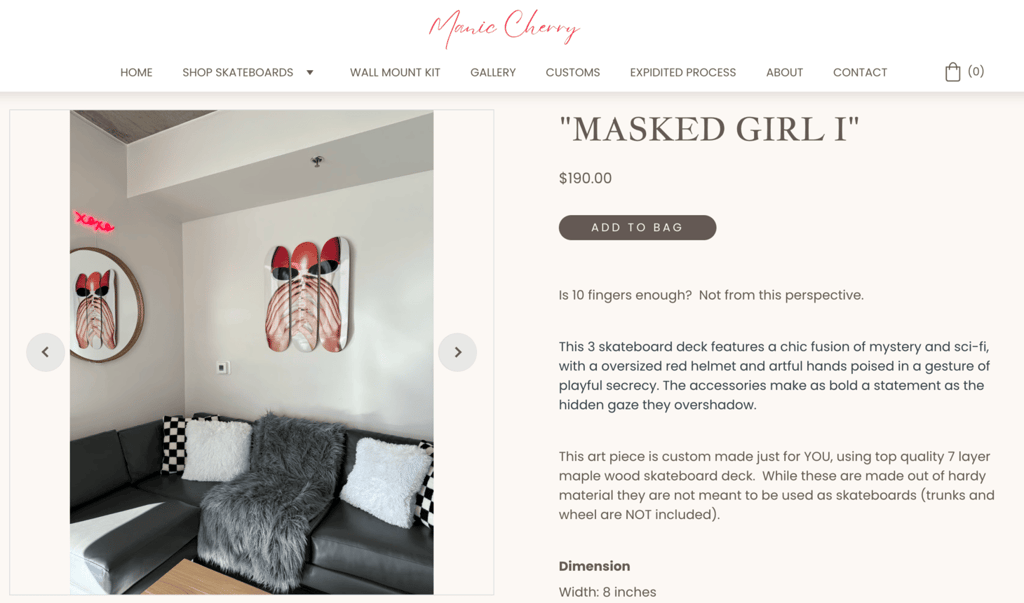
Manic Cherry is an Arizona-based company that creates unique skateboard wall art. The company works with artists like Caroline Ellis to create designs that appeal to skateboard enthusiasts and art lovers. Customers can also personalize their skateboards, which helps make the shopping experience more engaging.
Their product pages excel due to:
- High-quality photos. They use high-resolution product photos that look professional. Each image is clear and well-lit and showcases the items from multiple angles and in different settings.
- Consistent branding. The photos all have a vibrant and playful style, which matches the company’s overall look and feel.
- User-friendly layout: The page is clear and organized, with separate sections for product details, images, and pricing. An intuitive website layout makes it easy for customers to find the information they need.
2. LoopyCustoms
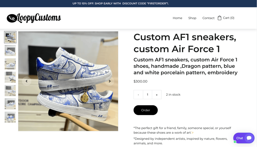
Loopy Customs is a business that specializes in creating custom-designed sneakers. The company believes that everyone should be able to express their unique style. They aim to provide high-quality craftsmanship and excellent customer service so that each pair of shoes is an extension of the customer’s personality.
The product pages on the LoopyCustoms website are effective for a few key reasons:
- Clear photos. The pages feature multiple high-quality images of the shoes from different angles so customers can see the creative designs and quality of the sneakers.
- Detailed information. The descriptions tell visitors everything about the shoes, including what inspired the designs, the materials used, and how to care for them. This helps customers understand what they’re buying.
- Showing discounts. LoopyCustoms shows a discount code at the top of each page, which can encourage customers to purchase since they feel like they’re getting a better deal.
3. Wild Slope Bikes
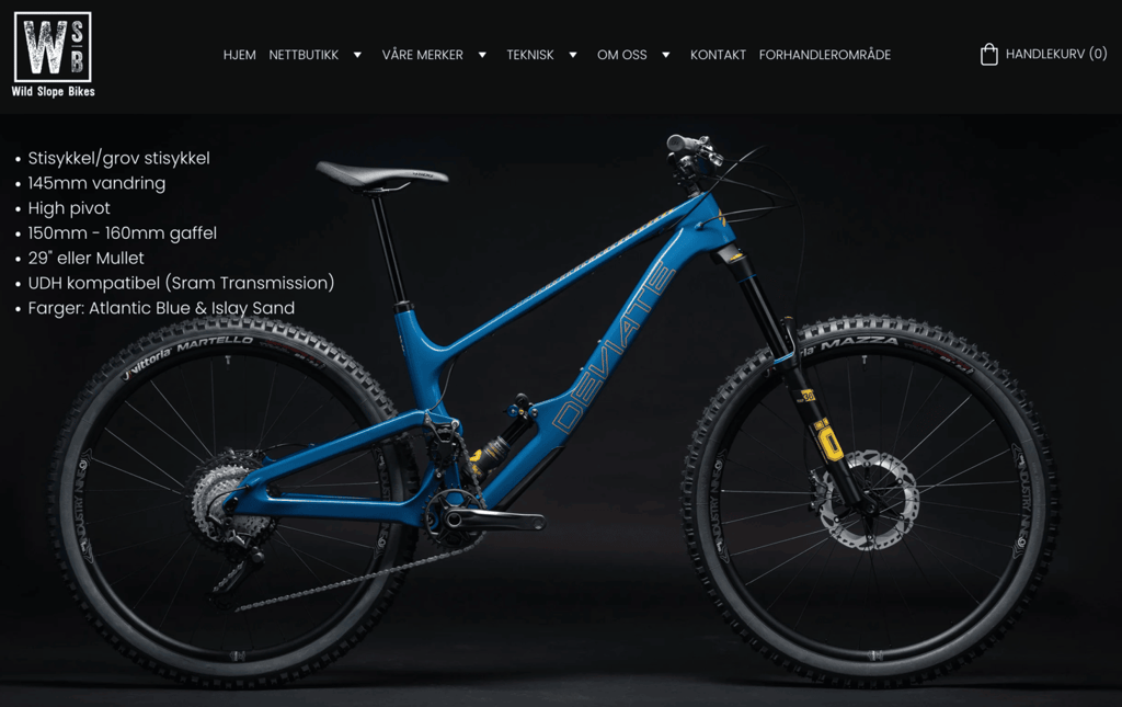
Wild Slope Bikes is a store in Norway that sells mountain bikes, road bikes, and electric bikes. They also fix bikes from their repair shop, ensuring customers are ready for trails and roads.
Their product pages work well for a few key reasons:
- High quality photos. They use clear, high-resolution photos that match the brand’s style and help customers understand the products better.
- Quick popup windows. When you click on a product, a window pops up with further details about it, such as pricing and call-to-action buttons. This feature makes it easy for customers to shop and to add products to their cart.
- Different payment options. By offering several ways to pay, the company makes it convenient for buyers to shop. This can help to reduce cart abandonment rates as customers can easily choose their preferred payment method.
Build effective product pages with Hostinger Ecommerce
Hostinger Ecommerce gives you the tools to create product pages that are clear, informative, and easy to manage.
From a single dashboard, you can create and update product listings, upload images, organize variants, adjust pricing, and keep inventory and orders in sync as your business grows.
The platform supports physical and digital products, services, subscriptions, and print-on-demand items, making it a practical solution for building a complete online store that brings all offerings together in one place.
Beyond product pages, Hostinger Ecommerce helps you manage the entire sales process.
You can accept more than 100 secure payment methods, automate digital product delivery, and manage orders without switching between different tools.
Built-in AI features also help speed up catalog management by generating product descriptions and suggesting prices from product images.
Measuring ecommerce performance is the next step after publishing your product pages.
Tracking which products attract attention, generate orders, or underperform can help you decide where to improve descriptions, pricing, visuals, and recommendations.
All of the tutorial content on this website is subject to Hostinger's rigorous editorial standards and values.

Simon is a dynamic Content Writer who loves helping people transform their creative ideas into thriving businesses. With extensive marketing experience, he constantly strives to connect the right message with the right audience. In his spare time, Simon enjoys long runs, nurturing his chilli plants, and hiking through forests. Follow him on LinkedIn.