Customize how your Hostinger AI Builder manual mode website displays on mobile by manually sorting, resizing, and repositioning elements independently from the desktop version. By default, the mobile website’s version displays elements in the order they’ve been added to the desktop version. Reordering elements on desktop later doesn’t change the mobile order, so you can lay out each view differently.
NOTE
-
If you delete an element or a section on the desktop view, it’s also automatically removed from the mobile view and vice versa
Access the mobile editor
Switch between the views by clicking on the mobile or desktop icon in the upper toolbar:

Auto-fix layout
After making any changes to the desktop version, the option Auto-fix layout appears in the corresponding section on the mobile version:
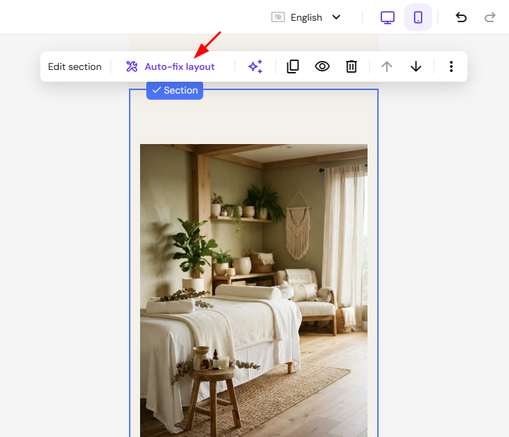
Once you click on the button, the mobile layout is forced to follow specific positioning rules based on the desktop layout.
The mobile auto-positioning is automatically turned off once you make any manual edits on the mobile version.
Sort elements
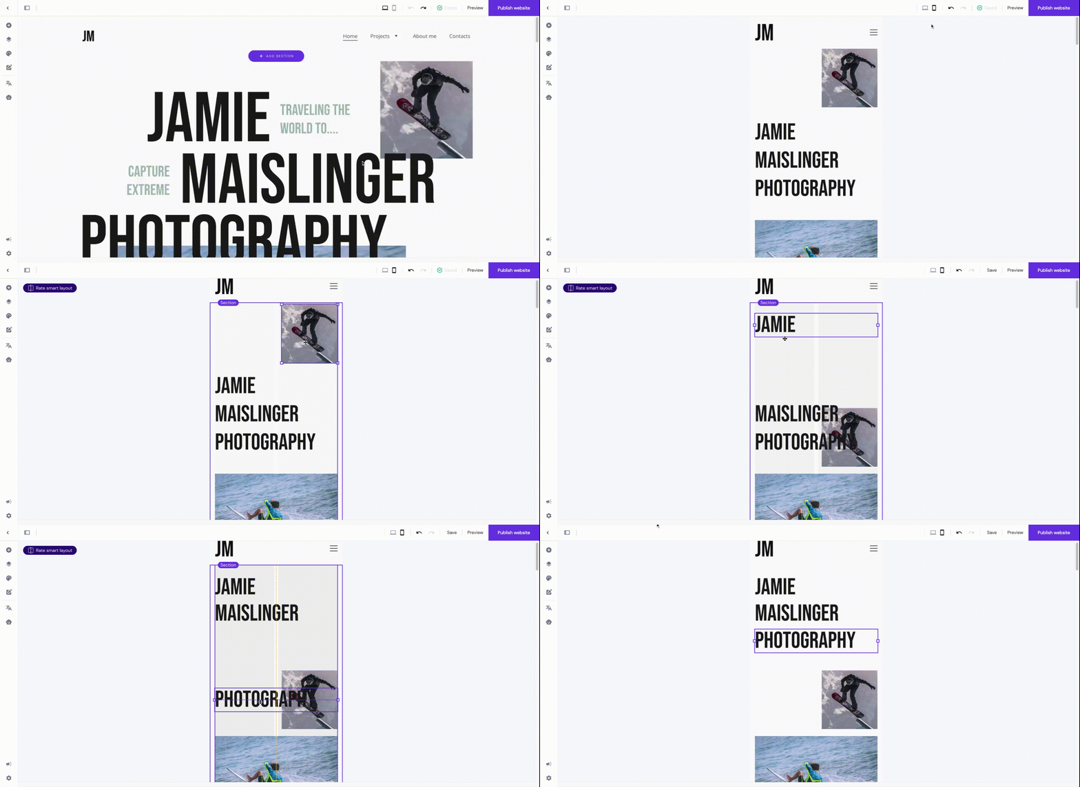
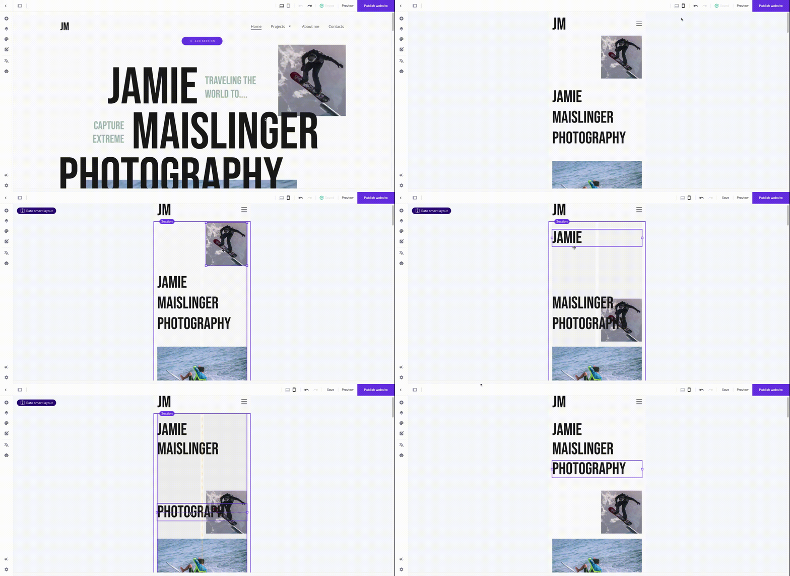
To reposition elements, enter the mobile view and drag and drop elements.
To move multiple elements, click and hold your cursor, then drag over the elements you want to select:
NOTE
- To get the best results, reposition elements within a section. Moving an element to a different section affects both the mobile and desktop views and may distort your layout.

Resize elements
To resize elements, enter the mobile view and use the resizing handles on the element borders:
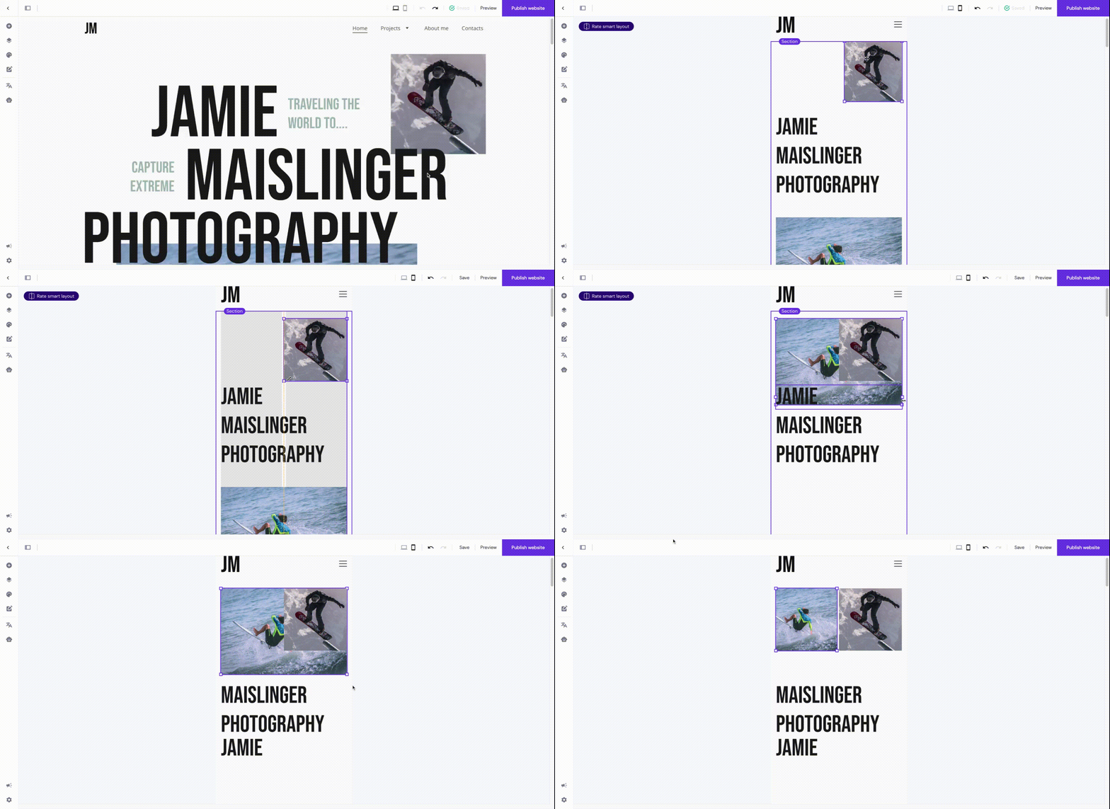
For more detail on sizing, see Hhow to Resize Elements and Sections.
Resize text
You can resize text in two ways:
-
Globally – affects all texts of a particular style (e.g., all texts written in Heading 1) all across your website on the mobile view
-
Locally – affects a particular text element on the mobile view
To resize text globally on mobile, enter the mobile view and change the font size of a particular text style in the global text style settings:
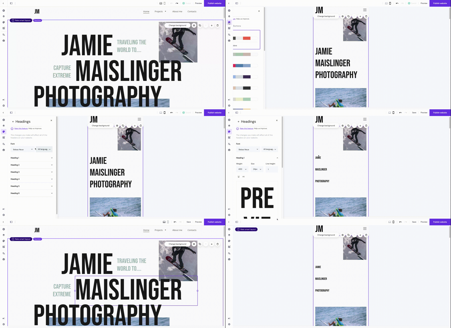
To resize text locally on mobile, enter the mobile view, click on a particular text element, and change its font size:

You can set the following settings to be different on desktop and mobile:
-
Font size, e.g., 20 PX (desktop) and 18 PX (mobile)
-
Text alignment, e.g., left (desktop) and center (mobile)
-
Line height, e.g., 2 (desktop) and 1.5 (mobile)
It means that once you change any other parameter – font family, bold, italic, underline, etc. – the change will reflect on both desktop and mobile. The same happens if you change the whole text style, e.g., if you set Heading 2 for mobile while it’s Heading 1 on desktop, the text element in the desktop view will change to Heading 2, too.
You may duplicate an element or section and make one version visible on desktop and another one visible on mobile devices. This way, you get more freedom when styling the content on desktop and mobile individually, as, normally, some settings (e.g., text style) apply to both desktop and mobile. To control what appears on each view, see How to Hide Elements and Sections.
Change the menu position
To change the position of the burger menu:
- Switch to the mobile view.
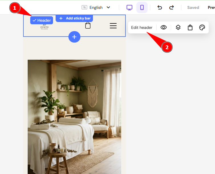
- Click the header section, then click Edit header.

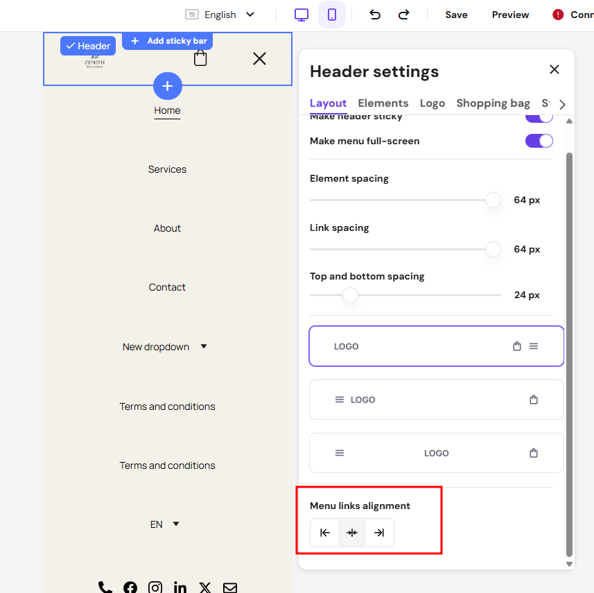
- In the Layout tab, change the menu position.

If you can’t see the header section, it’s likely that all your website pages are hidden from the navigation menu. For more on how your website automatically adapts across screen sizes, see responsive web design and image size.
Now you can adjust the mobile view of your website independently from desktop, so it looks right on every screen size.