6 Replit alternatives tested with the same prompts
Sep 30, 2026
/
By Ariffud M.
/
24 min Read

The best Replit alternatives from my testing are Hostinger AI Builder for the most balanced overall experience, Lovable if you want more control over the app’s starting design, and Base44 when iteration speed matters most.
v0 by Vercel and Bolt.new are worth considering too. v0 gives you deeper control over the interface and code, while Bolt.new offers a large token allowance for repeated changes.
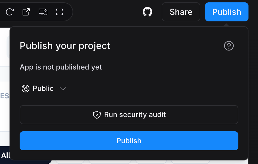
Replit itself set a strong baseline. It gave me a mostly working app, added useful features I didn’t ask for, like database storage and edit controls, and published the finished app in just two clicks.
It wasn’t the best at everything, though. I couldn’t freely move interface elements and one fix broke another feature. It took a second prompt to restore it.
Those trade-offs gave me a reason to test what Replit alternatives do differently. I built the same app with six tools, using the identical starting prompt and standardized follow-ups so I could compare their output, how they fixed errors, customization, deployment, and value for money fairly.
I ran all of these tests in September 2026. Every result, issue, repair, and rating here comes from my hands-on testing. The table below summarizes how the six alternatives to Replit compared:
| Platform | Best for | Plan tested | Price/month | First output | Total prompts | Rating |
| Hostinger AI Builder | End-to-end app building | Unlimited | $3.99 | 16 min 24 sec | 7 | 4.2/5 |
| Lovable | Upfront design direction | Pro | $25 | 4 min 10 sec | 11 | 4/5 |
| Base44 | Fast iteration | Starter | $20 | 2 min 24 sec | 11 | 3.8/5 |
| v0 by Vercel | Direct design and code control | Plus | $30 | 9 min 37 sec | 10 | 3.6/5 |
| Bolt.new | Token-based iteration | Pro | $25 | 3 min 10 sec | 12 | 3.8/5 |
| Bubble | – | Starter | $29 | 14 min 20 sec | 7 | – |
Note: I didn’t rate Bubble because it failed the test.
How I tested Replit alternatives
I tested six Replit alternatives by asking each one to build the same task management app, using Replit’s output as the baseline for comparison. I used each platform’s cheapest paid plan, except Hostinger AI Builder, which I tested on the Unlimited plan.
A task manager gave me concrete things to check beyond appearance. The board, charts, and filters all had to work with the same data, so a convincing interface wasn’t enough on its own.
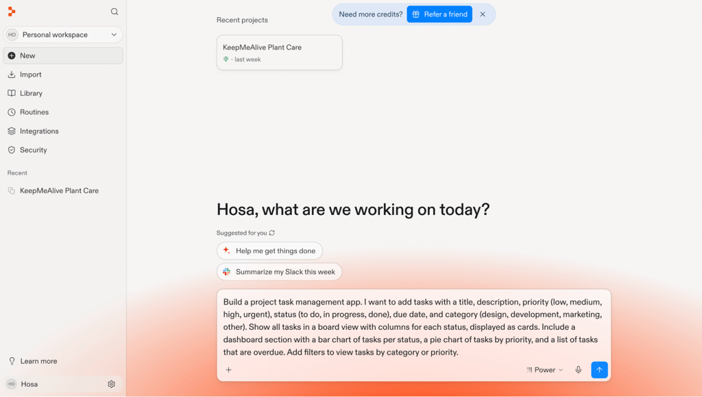
Every build started with the same vibe coding prompt (a plain-language request describing the app I wanted):
Build a project task management app. I want to add tasks with a title, description, priority (low, medium, high, urgent), status (to do, in progress, done), due date, and category (design, development, marketing, other). Show all tasks in a board view with columns for each status, displayed as cards. Include a dashboard section with a bar chart of tasks per status, a pie chart of tasks by priority, and a list of tasks that are overdue. Add filters to view tasks by category or priority.
For the six completed tests, I scored the first generated version before asking for corrections. I used a 10-point checklist to see what worked right away:
- The task form includes title, description, priority, status, due date, category, and a submit button.
- The dropdowns include all specified options: four priorities, three statuses, and four categories.
- The board displays task cards in columns for each status.
- A bar chart shows tasks per status.
- A pie chart shows tasks by priority.
- The overdue list shows tasks with a past-due date that aren’t marked done.
- The category filter works.
- The priority filter works.
- The layout is visually presentable.
- The app works and looks right on mobile.
Then I sent the same five follow-up requests in the same order:
- Saving tasks to a database
Store all tasks in a database so they persist when I refresh the page.
- Drag-and-drop
Add drag-and-drop so I can move task cards between the status columns, and update the task's status automatically when I drop it in a new column.
- Summary bar
Add a summary bar at the top of the dashboard showing the total number of tasks, the percentage completed, how many tasks are due this week, and a circular progress bar for the overall completion rate.
- Dark mode and priority colors
Add an option to switch the color scheme to dark mode. In this mode, make the task cards show a colored left border based on priority: green for low, yellow for medium, orange for high, red for urgent.
- Task editing and deletion
Add the ability to edit and delete existing tasks. When I click a task card, open a modal with the task details pre-filled so I can edit and save changes. Add a delete button with a confirmation dialog.
I skipped requests for features the tool had already added, most often database storage, edit, and delete controls. I still checked that they worked.
I described the problem in a repair prompt and tested the result again whenever something failed. I tracked generation times, prompt counts, and credit or token usage, including extra rounds where a fix didn’t work or created another problem.
The first-generation checklist was only part of my evaluation. I also rated each completed test across five areas from 1 to 5:
- Ease of use. Reflected how simple I found it to get started, navigate the editor, and work through changes.
- AI output quality. Reflected how accurate the first generated version was, how well the follow-up prompts worked, and how many corrections I needed.
- Customization. Covered the code access, direct and visual editing options, export options, and version history available to me.
- Deployment. Covered the publishing process, custom domain support, and how quickly the published app loaded.
- Value for money. Compared the plan’s price and included features with the credits or tokens I used during the build.
These ratings reflect my judgment within each category:
| Rating | Meaning |
| 1/5: Poor | The platform fell short of basic expectations in major ways |
| 2/5: Limited | The platform met some expectations but had significant limitations |
| 3/5: Adequate | The platform met the basic expectations but came with clear trade-offs |
| 4/5: Good | The platform performed well but had some noticeable drawbacks |
| 5/5: Excellent | The platform performed especially well, with few to no drawbacks |
To get the overall score, I averaged the five category ratings, giving each one equal weight, so no single category could decide the result.
How Replit performed as the baseline
Replit performed well as the baseline, giving me a mostly working task manager in 9 minutes and 27 seconds. Its Core plan cost $20/month when I tested it.
The board opened with three status columns filled with sample tasks. The charts and filters worked right away.
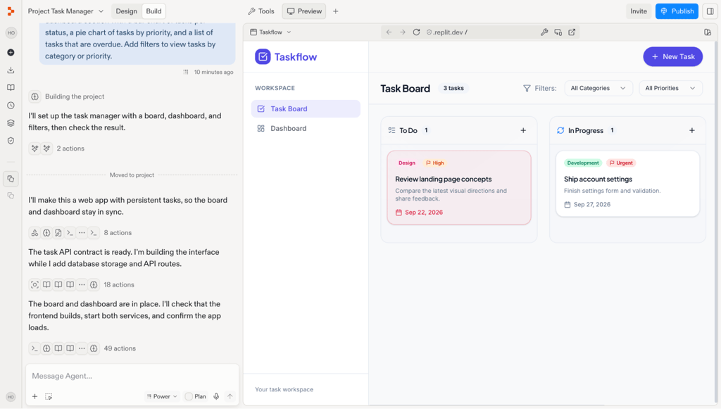
Replit had also added a database without me asking for one. My tasks stayed saved after I refreshed the page.
I liked how Replit separated test data from live data. Tasks I created in the preview stayed in a development database. Tasks I added after publishing went into a separate production database.
Each task card had a three-dot menu with Edit and Delete options. Deleting a task brought up a confirmation dialog. I hadn’t asked for that feature yet.
I hit the first snag while choosing a task’s due date. The calendar’s weekday headings didn’t line up with the dates underneath.
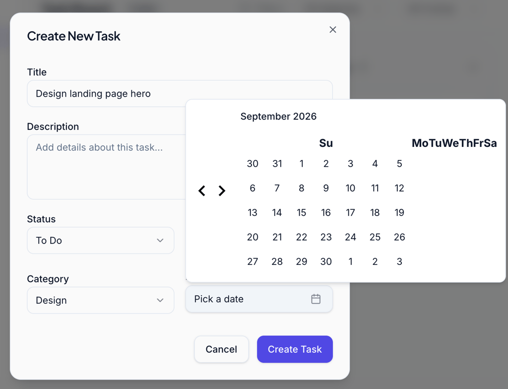
Replit’s first attempt to fix the alignment turned the calendar into a blank white box. A second repair prompt brought it back.
During that repair, Replit showed what looked like a screen recording of itself clicking through the app. I appreciated seeing it check the fix instead of just claiming success, although I still checked it myself afterward.
The mobile layout needed a separate fix. All three board columns sat side by side, so I had to scroll sideways to see them.
One repair prompt stacked the columns vertically, so I could scroll down instead. That resolved the last issue I’d found in the first build.
I then added drag-and-drop for task cards, the summary bar, and dark mode with priority colors. All three worked without further repairs.
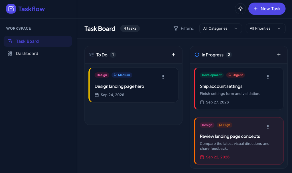
I also explored how much I could change without sending another AI prompt. Clicking text in the preview, for example, let me edit it directly.
Rearranging the page was a different matter. I couldn’t drag elements into new positions, so layout changes had to go through another AI prompt or manual code editing.
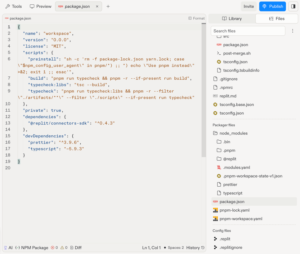
Replit gave me direct access to the generated code and let me export it as a ZIP file. Finding the code editor itself wasn’t intuitive, though.
The code library started collapsed, so I had to look for it first. The file list also didn’t show which file controlled each part of the page. That made the code editor harder to approach if you’re new to coding.
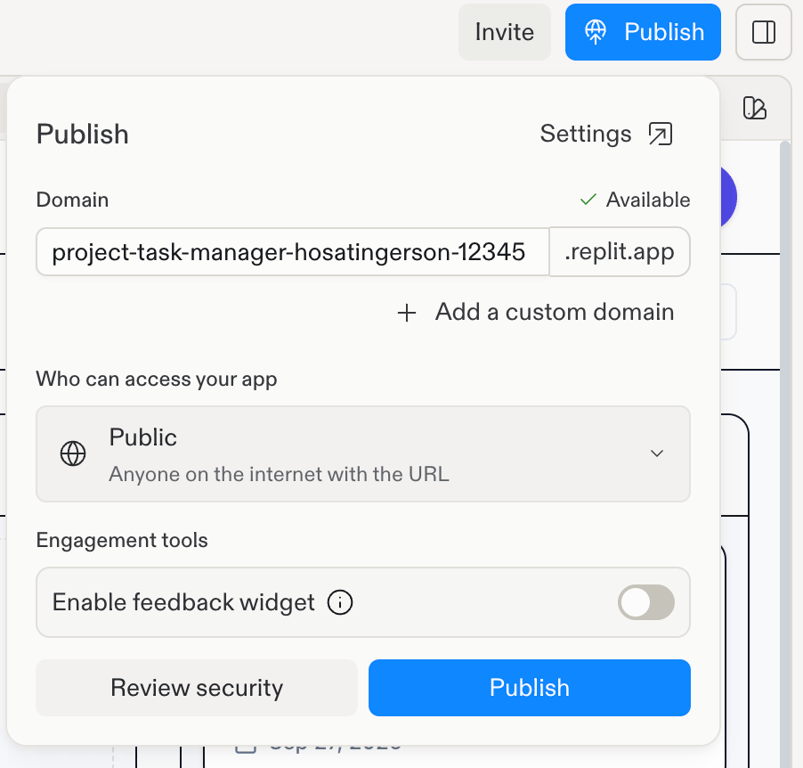
The complete build took seven prompts and used $3.80 in credits. I published the finished app in two clicks.
As part of the publishing flow, Replit ran a security and quality check. I could use my own custom domain or choose a Replit subdomain.
Overall, Replit set a strong baseline for the alternatives. It handled most of my initial prompt correctly, anticipated useful features, and gave me full access to the code once the AI had done its part.
The main weakness was consistency. I had to fix the mobile layout, and one attempt to correct a small calendar issue broke the date picker completely.
I’d also prefer an interface that makes manual code editing easier to find. Starting a build through chat felt simple, but finding the code tools took more digging than I expected.
1. Hostinger AI Builder – the most complete first generation
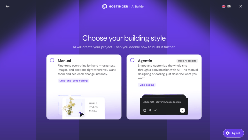
Hostinger AI Builder, formerly known as Hostinger Horizons, combines AI app building with the platform’s web hosting and domain support.
For this AI app builder, I purchased the Unlimited plan at $3.99/month with a 48-month term. I chose it over Premium because Unlimited included 15 AI build credits instead of five.
Five credits didn’t look sufficient for the initial build, five planned follow-ups, and any repairs I might need. That assumption turned out to be right because the first generation alone used 7.42 credits.
Building experience with Hostinger AI Builder
I chose Agentic mode and pasted the same prompt I used for Replit and the other alternatives. There was also an improve my description option, but I left my prompt untouched to keep the test consistent.
Then I waited 16 minutes and 24 seconds. That was the longest first generation of any platform I tested, about seven minutes longer than Replit’s.
The wait paid off once Polaris, the app Hostinger AI Builder named for me, finally appeared.
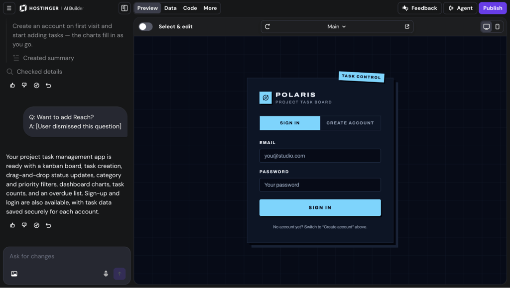
It passed all 10 items on my first-generation checklist. The board, charts, filters, task form, and mobile layout all worked. The only small visual issue I noticed was a slightly clipped logout button in the mobile preview.
Hostinger AI Builder had also built considerably more than I asked for. I already had login, logout, and sign-up features, a database, form validation, and edit and delete controls.
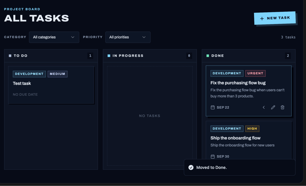
I tested those extras instead of assuming they worked, and they gave me a great first impression. Tasks stayed saved after, incorrect login details were rejected, and the form stopped me from creating a task without a title.
The database also kept preview data separate from live data, similar to Replit. My test tasks stayed in the preview version instead of mixing with the data in my published app.
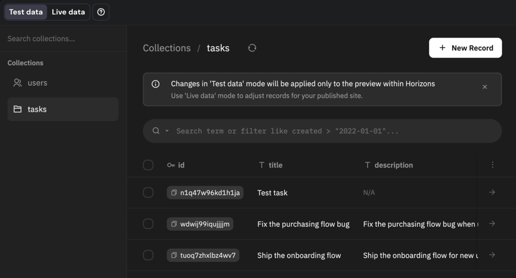
I skipped two of my planned follow-up prompts because the database and edit and delete controls were already there.
The remaining follow-up requests went less smoothly. Drag-and-drop initially worked only when I dropped a card on a small target area, so I asked the AI to make the whole status column accept it.
The summary bar also showed zero tasks due that week, even though I had created one. Each problem took one repair prompt to fix.
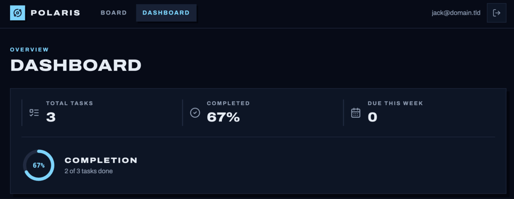
Dark mode worked on the first try. The AI also added the requested priority-colored borders correctly.
I found one small issue when I deleted a task. Clicking Delete removed it immediately, so I asked for a confirmation dialog to prevent accidental deletion. That fix worked on the first attempt, too.
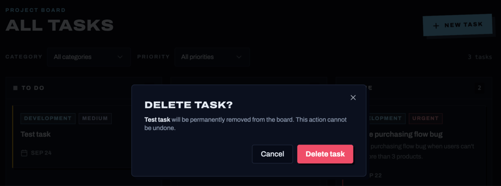
This was one area where Hostinger AI Builder compared well with Replit. I needed three repair prompts on both platforms, but one Replit repair created another problem. None of the three Hostinger repairs broke an existing feature.
The complete build used 11.61 AI credits. I sent seven prompts myself, although the chat recorded an eighth because Hostinger inserted a promotion for Hostinger Reach, its email marketing tool, right after the first generation.
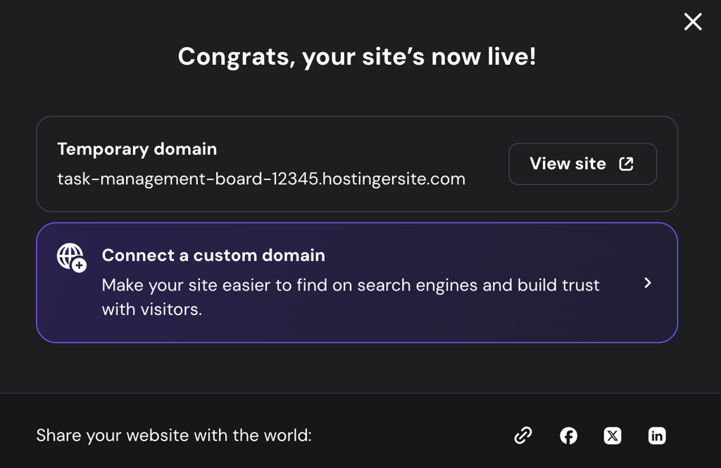
One click then published Polaris using the hosting already attached to my plan. I could connect my own domain during the initial setup or do it right after publishing.
What I liked about Hostinger AI Builder
- It added features I didn’t ask for but would need. The login system, form checks, database, and separation between test and live data were all things I’d eventually need if I wanted to turn the prototype into an actual app. I wouldn’t necessarily think to include all of them in my first prompt.
- Repairs didn’t create new problems. I still found three issues, but each repair worked the first time, and no fix broke anything else.
- I always knew what the AI was costing me. The chat showed the credit cost of each prompt, for example, 7.42 credits for the initial generation and 0.75 for drag-and-drop. That made the credit system more transparent than ones that leave you guessing why your balance dropped.
- Publishing happened in the same place as building. I finished the app and published it without leaving the builder. There was no separate deployment or hosting setup to figure out afterward.
What I didn’t like about Hostinger AI Builder
- Small visual edits still felt unnecessarily AI-dependent. Select & Edit let me pick a specific element, but clicking Apply still sent the change through the AI. Even changing one word worked that way, and I couldn’t drag page elements into different positions myself.
- I missed having version history. Ctrl + Z worked for undoing code changes, but I couldn’t open an earlier version of the project and restore it. I’d be more cautious about making larger changes without a working version to fall back on.
- The Reach promotion felt pushy. It appeared inside my build conversation without me asking for it and consumed about 0.01 credits. The amount was tiny, but I don’t think an unsolicited promotional prompt should use build credits at all.
Hostinger AI Builder verdict
Hostinger AI Builder suits you best if you want an AI that adds useful features on its own instead of waiting for you to ask for each one. It also makes sense if you want app building, hosting, and domain management in one place.
Look elsewhere if you want direct visual editing, version history, or a faster first generation. Mine was the slowest in the test, even though the result ultimately justified much of the wait.
| Criteria | Rating |
| Ease of use | 4/5 |
| AI output quality | 5/5 |
| Customization | 3/5 |
| Deployment | 5/5 |
| Value for money | 4/5 |
| Overall | 4.2/5 |
One thing I’d tell you before signing up for Hostinger AI Builder
Budget separately for extra AI credits if you expect to keep iterating. Extra credits start at $4.99 for 10 credits. My test used 11.61 of the 15 included credits, leaving just 3.39 for further changes or another project.
2. Lovable – the design-first option
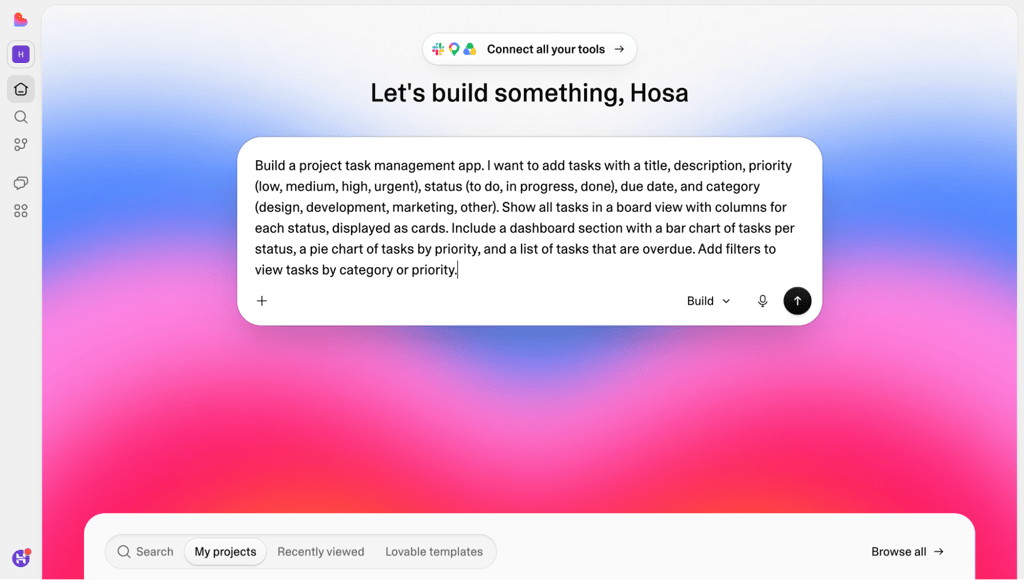
Lovable is an AI app builder that gives you some visual direction before it starts generating. It also lets you connect a project to GitHub, creating a simple path to continue development outside the platform.
I tested the Pro plan at $25/month. It included 100 monthly build credits. I also received five daily credits.
Building experience with Lovable
Lovable made a good first impression. After reading my prompt, it generated three design directions that matched what I was asking for.
I liked having that choice upfront. It felt less like rolling the dice on whatever interface the AI happened to generate.
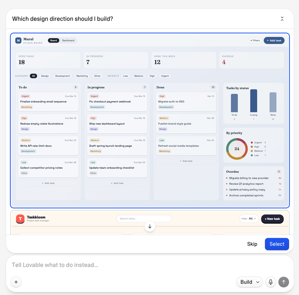
I picked one, although it wasn’t perfect. The font felt a little too playful for a task management app, and the tight letter spacing made some headings hard to read.
The first build took 4 minutes and 10 seconds. It passed all 10 features on my checklist.
Lovable also filled the app with sample tasks. I could immediately click around the board, try the filters, and see the charts populated instead of staring at an empty interface and filling it with tasks myself.
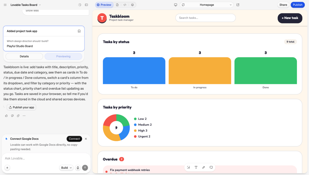
The first issue I found was minor. After selecting both a category and a priority, I couldn’t clear just one of the filters. One repair prompt fixed it in just 18 seconds.
I then moved on to the same follow-up requests I’d given the other tools.
The database setup was one clear difference between Replit and Lovable. Replit, along with Hostinger AI Builder, added a database upfront, while Lovable didn’t, so I had to ask for one. The database worked, though. My tasks stayed saved after a page refresh.
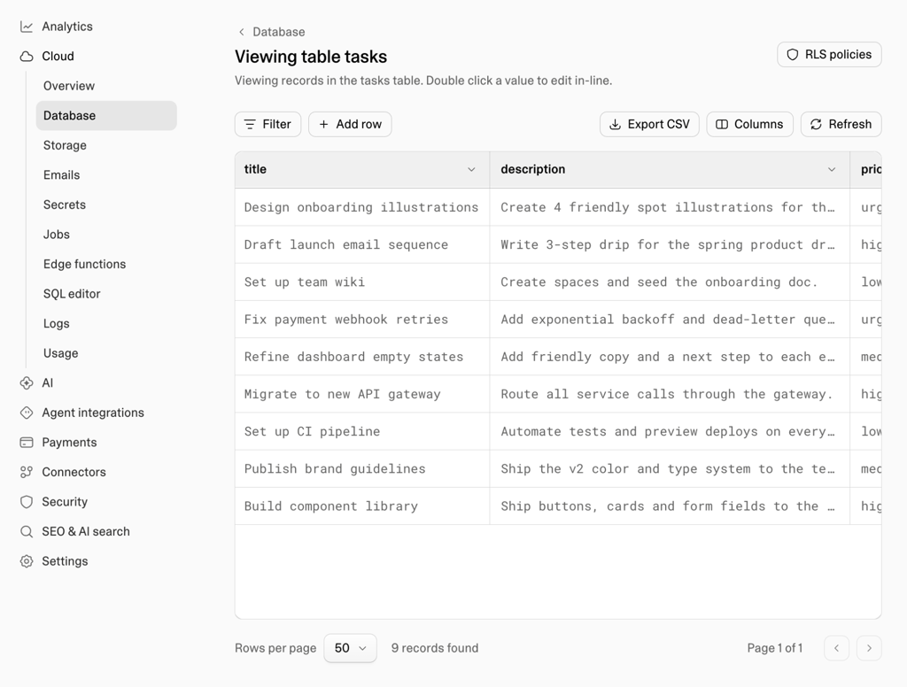
After I added the database, the preview loaded noticeably slower. It stayed empty for around eight seconds before the saved tasks reappeared.
Drag-and-drop worked cleanly. I could drop a task anywhere inside the destination column instead of searching for a small drop target. The summary bar also worked without a correction.
Then I reached dark mode. Most of it looked right, but the calendar icon stayed black against the dark input field, so it was barely visible.
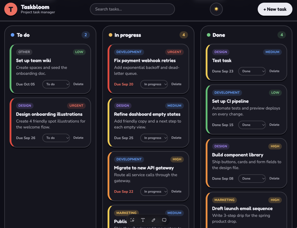
My first prompt to fix the icon did nothing. The second changed its color, but clicking the icon no longer opened the calendar.
A third prompt brought back the calendar without making the icon black again. What should have been a small visual fix ended up breaking an actual feature and took three prompts to fix.
The final edit and delete request worked, but saving an edited task gave me no visual confirmation. One more prompt added a success notification.
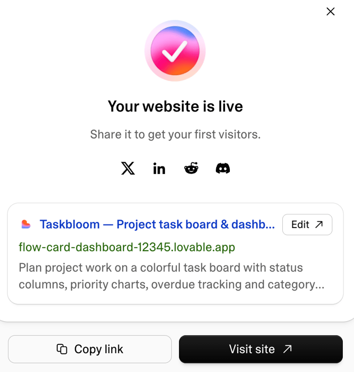
By the end of the test, I had sent 11 prompts. Five of them were repairs. The complete build used 16.4 credits.
What I liked about Lovable
- Picking a design style first reduced some of the guesswork. Lovable offered three visual styles to choose from before building, which gave me more control over the first result.
- Changes came back quickly. The initial build took 4 minutes and 10 seconds, compared with 9 minutes and 27 seconds in Replit. Several later changes finished in around a minute, which made experimenting feel much faster.
- I wasn’t locked into Lovable’s generated code. I could view it, edit it directly, point the AI to specific files in my prompts, and export the codebase when I wanted to continue development elsewhere.
- The live app felt better than the preview. The published version loaded noticeably faster, which showed the app itself performed fine and Lovable’s preview was the slow part.
What I didn’t like about Lovable
- Fixing mistakes used the same credits as adding features. Five of my 11 prompts were repairs, so a large part of my credit usage went toward correcting issues rather than building something new.
- Visual editing still depended too much on AI. I could select an element, but even a simple text or font change went through the AI instead of applying directly.
- Test data wasn’t kept separate from live data. Lovable used the same database for the preview and published app. I’d need to delete my test records before using the app with real data.
- Version history existed, but Lovable made it hard to find. I had to check the documentation to find it because the option wasn’t easy to spot. I want recovery tools to be easier to find after something goes wrong.
Lovable verdict
Lovable is a great choice if you want to get from an idea to a visually polished prototype quickly. It also makes sense when you expect to continue development through GitHub later.
Look at other Lovable alternatives if you want direct visual editing, separate test and live databases, or more consistent AI output throughout the iteration and repair process, not just a strong first generation.
| Criteria | Rating |
| Ease of use | 4/5 |
| AI output quality | 4/5 |
| Customization | 3/5 |
| Deployment | 5/5 |
| Value for money | 4/5 |
| Overall | 4/5 |
One thing I’d tell you before choosing Lovable
Choose your design direction carefully before Lovable builds the full app. You can always change it later, but it’s easier to start with a style you already like than use extra prompts to reshape the design afterward.
3. Base44 – the fastest builder I tested
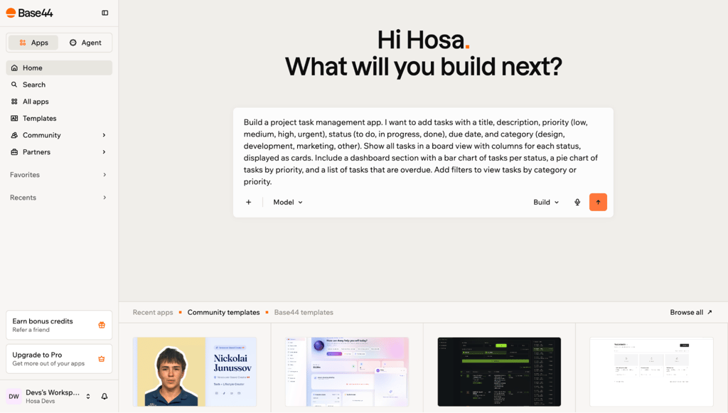
Base44 generated my task management app faster than any other platform I tried. Its other standout feature is its guided path for publishing mobile apps.
I went with the Starter plan at $20/month. It included 100 message credits for building and editing the app with AI, plus 2,000 integration credits for actions the app performs through connected services.
Building experience with Base44
Base44’s interface is pretty similar to Lovable, v0 by Vercel, Bolt.new, and Replit itself. Once you’re logged in, the prompt chat is front and center.
I pasted the build prompt and had a working preview in 2 minutes and 24 seconds, about four times as fast as Replit.
The first result scored 9/10. Almost everything worked. The main problem was the layout: Base44 placed the filters above the dashboard, with the task board farther down the page.
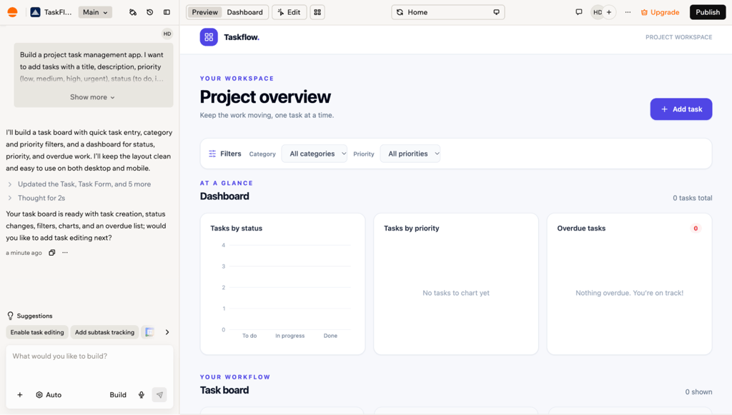
That meant I had to change a filter, scroll past the charts, and then check what happened to the tasks. Nothing was broken, but the flow didn’t make sense.
My first repair moved the filters above the board. That fixed the placement but created another problem: the filters now changed the dashboard statistics too.
A second prompt fixed that behavior. The dashboard went back to showing all tasks, while the filters only affected the board.
Just like Replit and Hostinger AI Builder, Base44 surprised me with how much it built without being asked.
I hadn’t requested a database yet, but Base44 had already added one. It also created a login page with the typical account features you’d expect, such as Google sign-in, email verification, and password reset.
I liked the initiative, but the result wasn’t quite finished. There was no visible login or logout button, so users had no obvious way to access or leave the account system. One repair prompt fixed that.

Drag-and-drop worked well. Base44 even animated the existing cards out of the way while I moved another one into position.
The summary bar needed two corrections, though. Its mobile layout was cramped, and the due-this-week count was wrong.
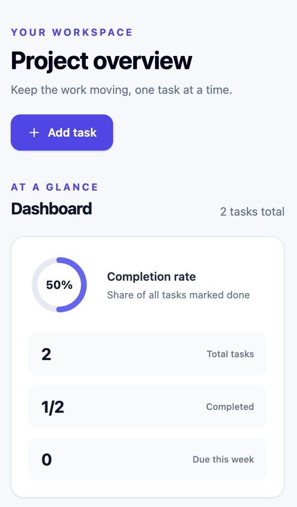
Dark mode had the same black calendar icon problem I saw with Lovable. The difference was that Base44 fixed it with a single prompt without breaking the date picker.
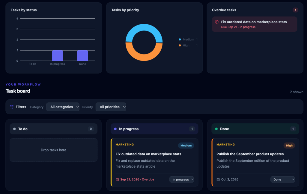
Six of the 11 prompts I sent to Base44 were repair prompts.
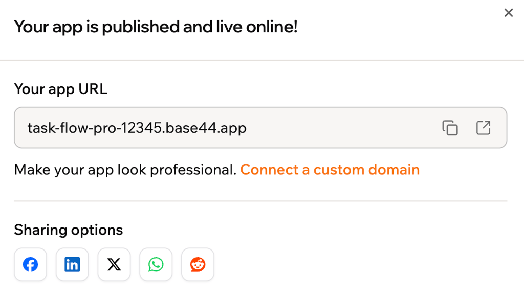
I then published the app to the temporary URL Base44 provided and checked my remaining credits. The test used 17 of my 100 message credits.
What I liked about Base44
- Changes came back extremely quickly. The first build took just over two minutes. Most later prompts finished in under a minute. Base44, compared with Replit, had me spending significantly less time waiting.
- The code view made the generated app easier to understand. Base44 showed which files belonged to each page. I could also select an element and use Go to Code to jump straight to the relevant file.
- Switching between modes mid-project was easy. Base44 let me start in either Build or Plan mode without locking me into that choice. I could move between the two as I continued iterating.
- It was the only platform I tested with guided mobile app publishing. Base44 walked me through creating the files needed to submit the app to Apple’s App Store and Google Play. I didn’t complete the store submission myself, though.
What I didn’t like about Base44
- Its distinct feature requires a more expensive plan. The Builder plan lets you choose two AI models, compare their results, and continue with the one you prefer. However, it costs more than twice as much as Starter, $50/month vs. $20/month.
- The AI didn’t always think through the side effects of a fix. Moving the filters solved their placement but accidentally changed the dashboard statistics. I had to explain the intended behavior in a second prompt.
- Deleting a task took an unnecessary extra step. The delete button only appeared after I opened a task in a pop-up window. It still worked, so I didn’t fix it, but I’d prefer a quicker option directly on the task card.
- Visual editing was still limited. Like most platforms I tested here, I couldn’t freely drag interface elements into new positions or add assets directly without going through the chat.
Base44 verdict
Go for Base44 if making quick changes is your top priority, especially for prototypes or internal tools where you expect to make lots of changes.
It’s also a good choice if you’re developing a web app that will eventually need a mobile app version.
There are cheaper Base44 alternatives if GitHub integration matters to you. Lovable, for example, charges you $25/month for GitHub, while Base44 charges $50/month for the same feature.
| Criteria | Rating |
| Ease of use | 4/5 |
| AI output quality | 4/5 |
| Customization | 3/5 |
| Deployment | 5/5 |
| Value for money | 3/5 |
| Overall | 3.8/5 |
One thing I’d tell you before choosing Base44
Start with Base44’s Starter plan to see whether it fits your needs. Upgrade to Builder once you’re sure, and your budget allows, especially if you want model selection and the option to compare two models side by side. Choosing a better model might resolve some of the AI quality issues I experienced in this test, although I can’t confirm that because I didn’t test it myself.
4. v0 by Vercel – the one with the most control
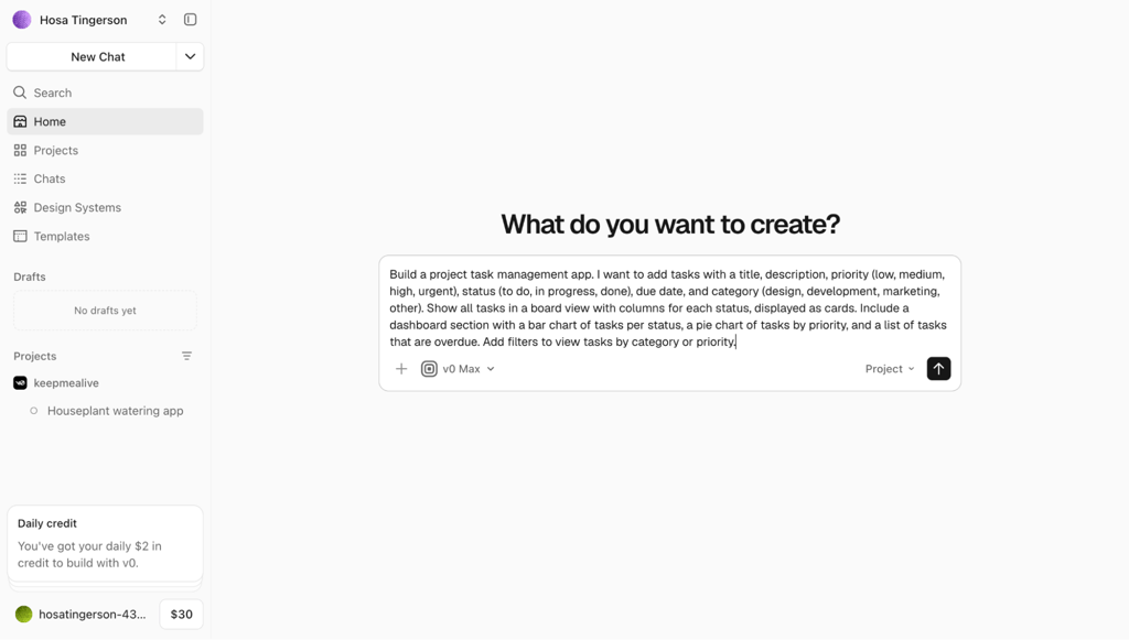
v0 by Vercel felt more developer-oriented than most AI builders I tested. It offered more than 30 AI models I could choose from and switch between, plus a Design Mode for editing the interface directly without wiring it to AI.
I tested the Plus plan at $30/user/month using v0 Max, powered by Claude Sonnet. The plan included $30 in monthly credits and $2 in daily login credits.
Building experience with v0 by Vercel
v0 introduced a technical decision before I even saw the finished app. During the generation process, it asked where I wanted to store my data. I could use a Neon database, keep it in local storage, or skip the database for now.
I picked Neon. v0 asked for permission to install it, then handled the setup itself.
While it was building, I could see the preview error count increase from one to three, then back down again. It looked like v0 was catching and correcting some problems as it worked.
The first generation took 9 minutes and 37 seconds, almost the same as Replit. It scored 9/10 on my checklist, but the result felt rougher than that score suggests.
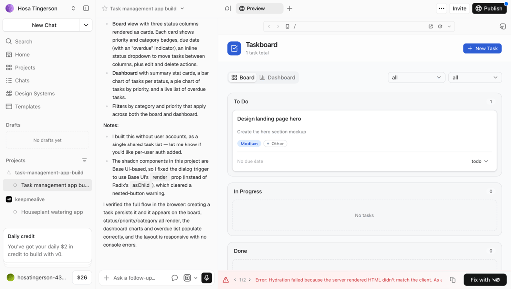
The task board showed each status as a row stacked vertically instead of three side-by-side columns. Some text also showed raw database values such as todo and in_progress instead of cleaner labels like To Do and In Progress.
Then I ran into preview errors.
The chat said there were no errors, while the preview still showed two. One was a hydration error, which meant the version of the page built on the server didn’t match the version built in the browser.
The preview has a Fix with v0 button for the errors. I clicked it once, and v0 handled them together.
The chat then told me it had resolved the errors, but they still appeared in the preview. I refreshed it manually, and they disappeared, so the fix had worked. The preview just hadn’t caught up with what the chat was telling me.
I moved on to the board layout and asked v0 to turn the rows into horizontal columns. It did, but that change broke the mobile layout, which took another prompt to fix.
The next surprise came when I checked whether the database kept my data after a refresh. My tasks stayed saved, but the board layout didn’t.
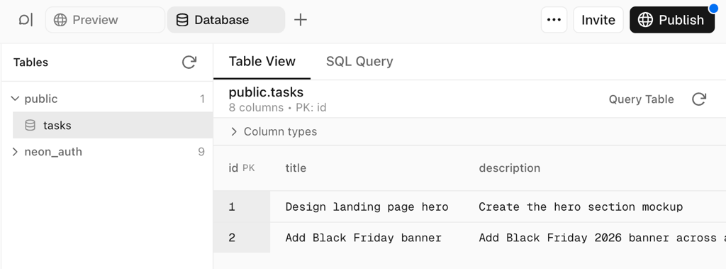
It had reverted to rows again. I sent another repair prompt to make the column layout stick after a refresh. This time it stayed fixed.
Oddly, v0 became much more reliable after that rough opening. Drag-and-drop worked on the first attempt. So did the summary bar and dark mode.
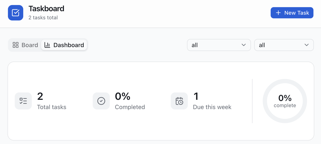
I didn’t need to send edit and delete follow-up because v0 had already added it. The edit and delete controls worked too, although I sent one final prompt because saving an edited task didn’t provide any visual confirmation.
The full test took 10 prompts. Six were repairs, and four of those happened before I even started the standardized follow-ups. It used $11.51 in credits in total.
What I liked about v0 by Vercel
- Design Mode gave me the most direct visual editing control of any tool I tested. I could select elements in the preview, change their design, and reposition them without turning every adjustment into another chat prompt.
- The choice of AI models was much broader than on other platforms. v0 offered more than 30 models, and I could switch between them during development. Some models also had different thinking or speed settings.
- Version history went beyond simply restoring an old version. Its Diff feature let me compare recent code changes side by side, which made it easier to see exactly what had changed.
- I could watch my credit usage in real time. The balance updated while v0 worked, so I always knew how much of my allowance I had left.
What I didn’t like about v0 by Vercel
- It expected more technical knowledge than the other builders. Choosing between Neon (a cloud database service), local storage (saving data only in your browser), and no database is already a fairly technical decision. Error messages such as “hydration failed” make the learning curve steeper, although AI could fix them.
- Preview and published data used the same database. My test records weren’t isolated from live data, so I’d need to delete them before using the app with real users.
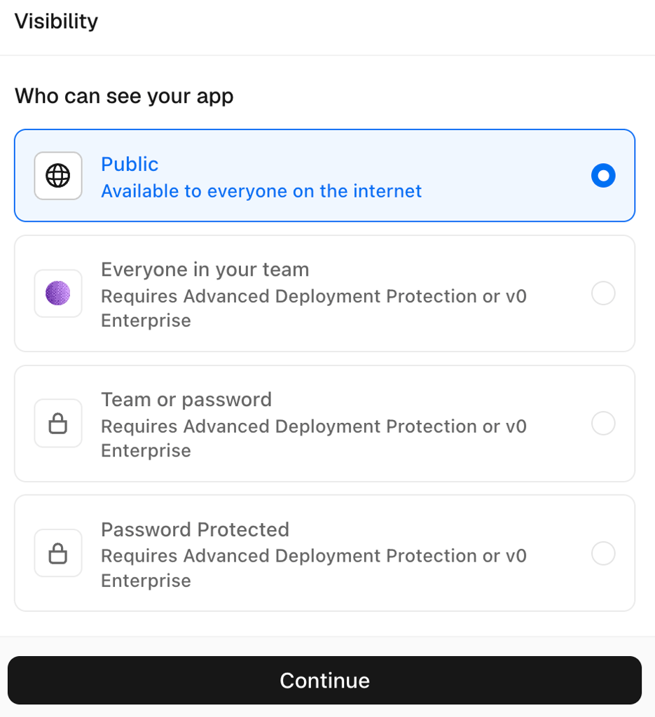
- Publishing took more steps than I expected from a Vercel product. I had to choose visibility, continue to another screen, choose a temporary or custom domain, and confirm before the app went live.
- The AI quality didn’t feel proportional to the price. Plus at $30/month was the most expensive plan I purchased for this test, yet six of my 10 prompts were repairs. Cheaper v0 alternatives like Hostinger AI Builder gave me a cleaner first generation.
v0 by Vercel verdict
v0 makes the most sense when you’re already in the Vercel ecosystem or want detailed control over the design. Its large choice of AI models also gives you options that simpler builders don’t.
Choose another Replit alternative if you’re building a simple app and don’t need those developer-focused controls. The early fixes alone were hard to justify, especially given the price.
| Criteria | Rating |
| Ease of use | 3/5 |
| AI output quality | 3/5 |
| Customization | 5/5 |
| Deployment | 4/5 |
| Value for money | 3/5 |
| Overall | 3.6/5 |
One thing I’d tell you before choosing v0 by Vercel
Log in every day, even if you’re not actively building. The Plus plan gives you $2 in daily login credits, which adds up to $60 over a 30-day month on top of the $30 monthly credit allowance.
5. Bolt.new – the one with the most room to iterate
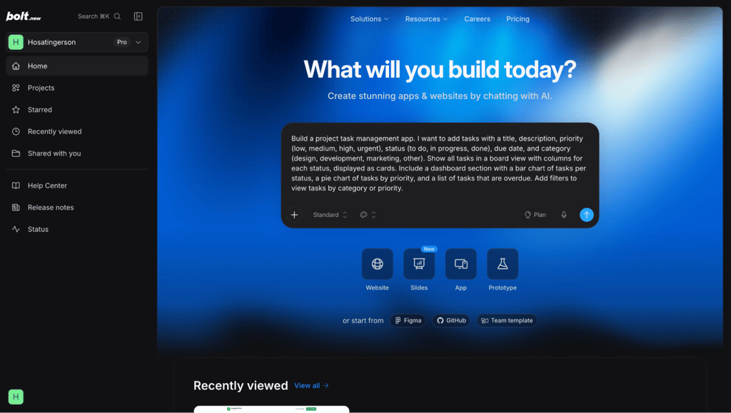
Bolt.new by StackBlitz measures AI usage in tokens instead of message or build credits.
That approach suits you if you prefer tracking one large monthly allowance instead of managing different credit types, although token counts can be harder to picture than credits.
I tested the Pro plan at $25/month using the Standard model. It included 10 million tokens per month.
Building experience with Bolt.new
Bolt.new got off to a quick start. I pasted the same prompt and had my first preview in 3 minutes and 10 seconds, only 46 seconds slower than Base44.
The first result scored 9/10. The main failure was mobile responsiveness.
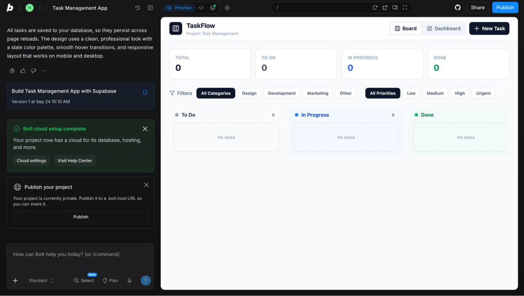
The desktop board looked fine, but its status columns stayed side by side on mobile instead of stacking vertically. I also noticed that I couldn’t deselect an active filter by clicking it again.
The filter took one prompt to fix. Mobile took two.
The first mobile repair stacked the columns vertically, but Bolt.new applied the same layout to the desktop. The second one finally restored the horizontal desktop board while keeping the vertical layout on smaller screens.
So I had already sent three repair prompts before reaching my standardized follow-ups.
Bolt.new had anticipated two of them, though. The first generation already included a working database plus edit and delete controls.
Drag-and-drop worked on the first try, although the preview took a moment to show the card in its new column.
The summary bar needed more attention. Bolt.new showed the completion stat as an absolute number instead of a percentage. I also found that the same bar looked cramped on mobile. Both needed separate fixes.
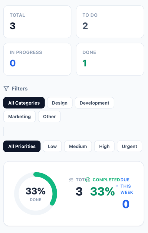
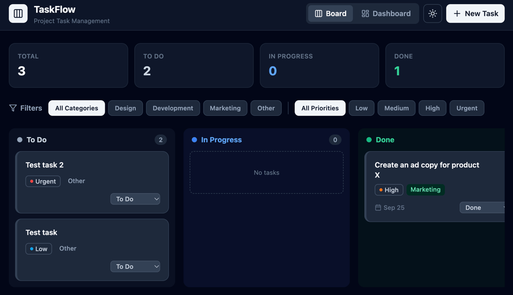
Dark mode worked, but the priority-colored borders landed in the wrong place. I asked for a colored border on the left edge of each task card, but Bolt.new put it around the priority label inside the card instead. One prompt moved it to the edge of the card.
The edit controls worked too, but saving gave me no indication that anything had happened. Delete had a different problem: one click removed the task immediately without asking me to confirm. I added the save notification and delete confirmation separately.
By the end, eight of my 12 prompts had been repairs. That was the highest repair count of any Replit alternative I tested.
The fixes were quick, so the overall usage stayed relatively low. The entire test consumed about 1.3 million of my 10 million monthly allowance, or 13%.
At roughly the same usage, that works out to around seven or eight apps per month.
What I liked about Bolt.new
- The usage system was easy to track. I had one 10-million-token pool instead of several types of credits or daily bonuses. I could clearly see how much of my monthly allowance was left.
- The device previews were much more specific than a generic mobile view. I could preview the app using different iPhone, iPad, Pixel, and Galaxy screen sizes, which made it easier to check layouts across devices.
- Every AI change had a version number in the chat. I could follow Version 1, Version 2, and later changes directly in the conversation instead of searching through a separate history screen.
What I didn’t like about Bolt.new
- The AI needed too much correction. Eight of my 12 prompts were repairs. Replit, Base44, and v0 also scored 9/10 on my first-generation checklist, but each needed fewer repairs afterward.
- Bolt.new sometimes interpreted small instructions too loosely. The priority-border request is a good example. Bolt.new understood the colors but put the border on the wrong element.
- Visual editing still went through the AI. The Select button let me target an element, but even small copy or design changes were still treated as AI requests. The button also lived in the chat area rather than where I expected to find it in the preview.
Bolt.new verdict
Opt for Bolt.new if you prefer tracking usage in tokens rather than counting individual build credits.
Choose an alternative to Bolt.new if you care more about consistent AI output than having lots of room to iterate.
| Criteria | Rating |
| Ease of use | 4/5 |
| AI output quality | 3/5 |
| Customization | 3/5 |
| Deployment | 5/5 |
| Value for money | 4/5 |
| Overall | 3.8/5 |
One thing I’d tell you before choosing Bolt.new
Use Bolt.new’s device-specific previews throughout the build, or at least when testing before publishing. Check how your app looks on every device available since Bolt.new gives you plenty of options. In my case, the app looked great on desktop, and I only caught the issue when I checked it in the mobile previews.
6. Bubble – the one that failed the test
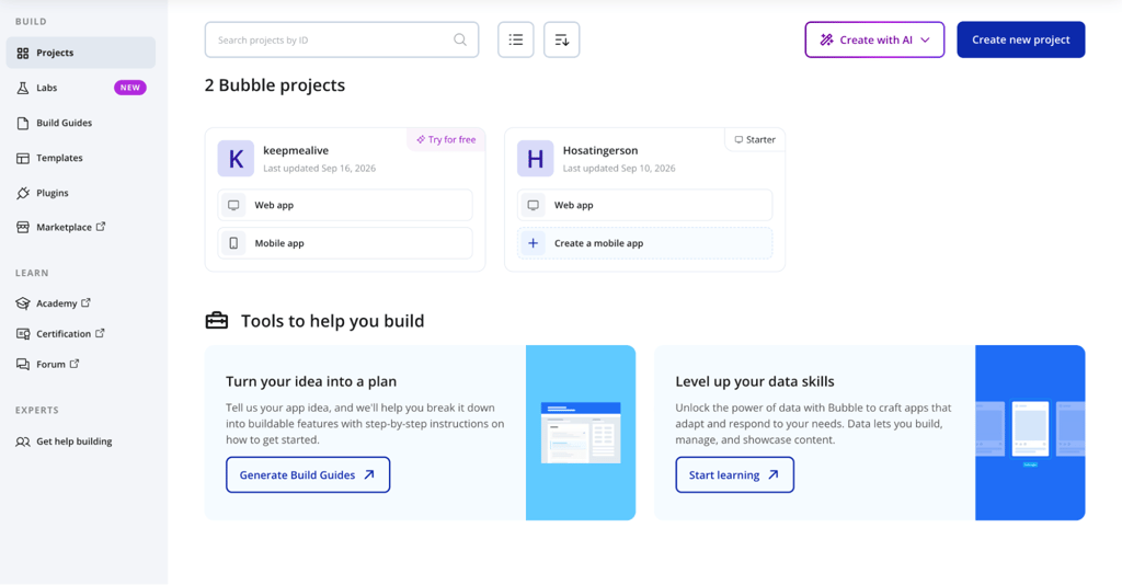
Bubble was the only platform I abandoned before finishing the full test. I tested the Starter plan at $29/month with annual billing.
The beginning was promising. After I submitted my prompt, Bubble spent 32 seconds creating a plan before generating anything. It listed the features it intended to build and asked whether I wanted a single-user app or team collaboration.
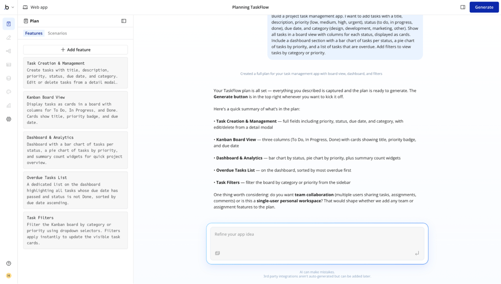
That was the most thoughtful planning stage I saw in this comparison. The actual build took 14 minutes and 20 seconds.
Things went downhill afterward. It scored only 5/10 on my first-generation checklist, the weakest result of any platform I tested.
The task form worked, but the core task workflow didn’t. The board and dashboard showed different data. New tasks didn’t appear properly, and neither filter worked.
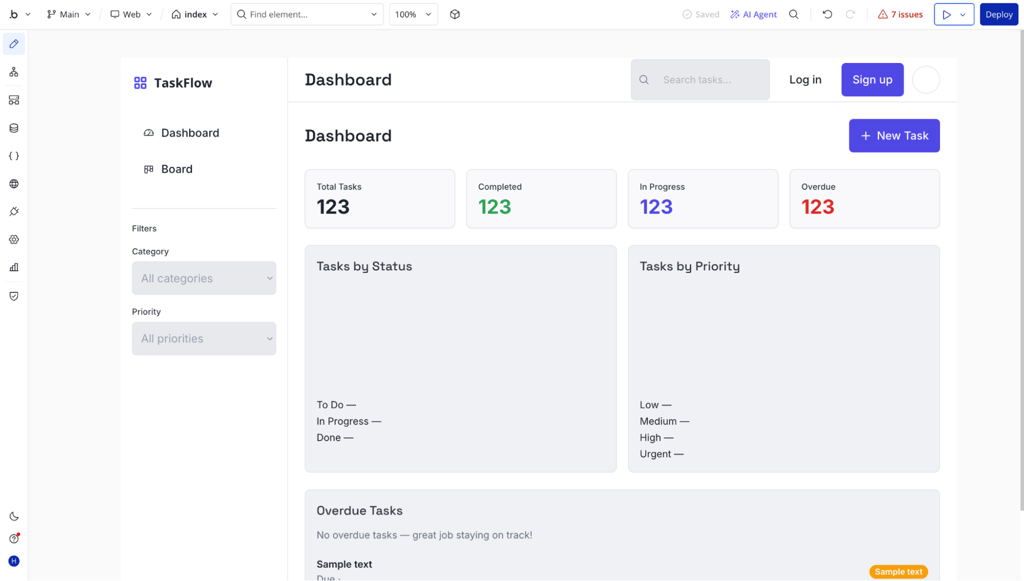
Bubble also flagged seven issues immediately after generation. I clicked Fix any issues, but the issue count increased from seven to eight. A second prompt asking it to fix everything brought the count down to two, so I moved on and tested the app myself.
That exposed the bigger problem. I created a new task, and the total count increased from 24 to 25. However, the new task still didn’t appear on the board or dashboard.
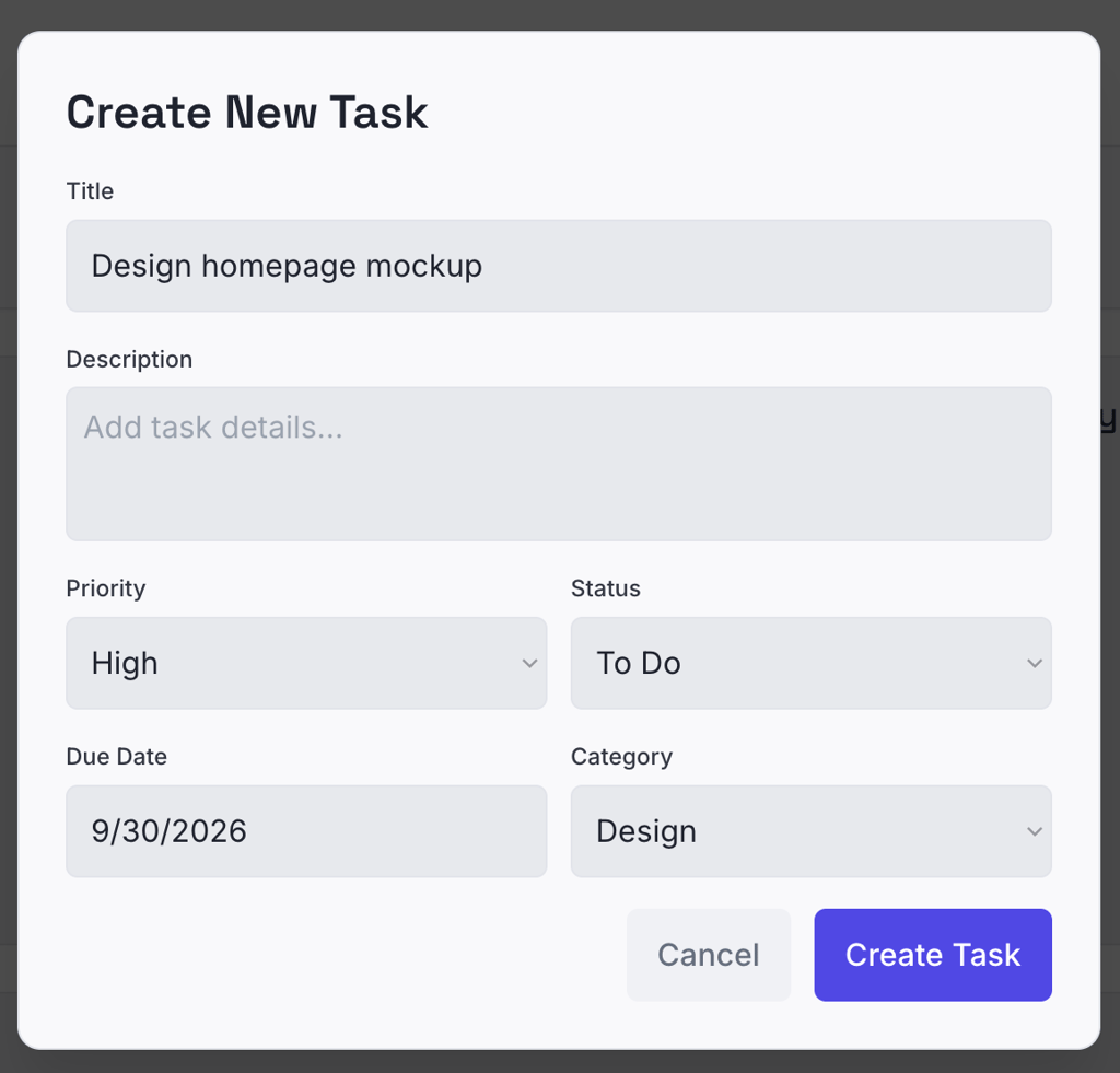
I asked Bubble to make both views use the same data. That didn’t fix it. My next repair focused specifically on new tasks not appearing.
Bubble worked on it for more than six minutes before the process crashed. I stopped it and refreshed the page. Surprisingly, that fix had worked, and newly created tasks finally appeared.
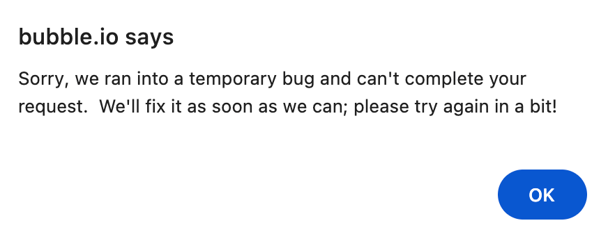
Then I tested the filters. My next repair made things worse. After almost 15 minutes, the board came back completely empty.
I sent one final prompt asking Bubble to restore the tasks and fix the filters. That took more than 22 minutes. The tasks returned. The filters still didn’t work.

That was where I finally abandoned the test.
I had spent roughly 52 minutes on six repair attempts, but Bubble still couldn’t reliably handle the app’s most basic workflow: saving tasks, displaying the same data consistently, and filtering it.
Continuing with drag-and-drop, dark mode, and the other standardized follow-ups wouldn’t have told me much. Those features only matter once Bubble saves and shows data correctly.
All the other Replit alternatives needed repairs too, but I was fixing individual problems on top of apps that already worked. With Bubble, I was still trying to make the app’s basic functions work reliable enough to continue testing.
An AI builder doesn’t need to get every detail right immediately. But I wouldn’t trust it with more complex workflows when repeated repair prompts still can’t make basic features like saving tasks work reliably.
I couldn’t assign Bubble a score like I did for Hostinger AI Builder, Lovable, and the other Replit alternatives because I never got far enough to complete the full test.
That alone says a lot about where it stands in this comparison. People are looking for Bubble alternatives because they want an AI builder that gets the basics working, and the other platforms I tested handled that much better.
Which Replit alternative should you choose?
Hostinger AI Builder is my strongest all-round Replit alternative, v0 by Vercel gives developers the most control, and Base44 is the quickest choice for building test versions fast.
Some platforms appear in more than one category because their strengths overlapped during testing. I left Bubble out for an obvious reason: it failed the test.
- Best all-rounder: Hostinger AI Builder. It gave me the strongest combination of first-generation quality, reliable repairs, and easy publishing. More importantly, this AI builder added useful parts of the app I hadn’t asked for yet, including a login system, a database, and form checks. Runner-up: Lovable. Its first generation also passed all 10 checks and arrived much faster, although the repair process was less consistent.
- Best for non-coders: Hostinger AI Builder. I could go from prompt to published app without making technical choices about databases or deployment. It also set up more of the app’s background features automatically, which means fewer things to know before you start. Runner-up: Lovable. Its simple interface and three generated design directions make the initial building process easy to follow.
- Best for developers who want code control: v0 by Vercel. Design Mode let me make direct interface changes, while its large model selection gave me more choice over which AI handled the work. The Diff view was also useful when I wanted to inspect exactly what changed between versions. Runner-up: Lovable. Its generated code was easy to inspect, edit, reference by file, and move into a broader development workflow.
- Best on a budget: Hostinger AI Builder. The Unlimited plan I tested costs $3.99/month on a 48-month term, and the same subscription also covered the hosting side of the project. Its 15 included build credits were enough to complete my test, although only 3.39 remained afterward. Runner-up: Base44. Its $20/month Starter plan gave me everything I needed for the test without forcing an upgrade.
- Best for rapid prototyping: Base44. No other platform got me to a working first preview faster than its 2-minute-and-24-second generation. Most later changes also came back in under a minute, which kept the whole build-test-fix cycle moving quickly. Runner-up: Lovable. It took 4 minutes and 10 seconds, but the first result already passed all 10 checks.
Start with the category that matters most for your project, then try the platform on its cheapest paid plan for a month. You can also take advantage of a free trial or free plan, but some features may be locked behind paid tiers.
Then test your top two choices the way I did here: give both platforms the same prompt and requirements. Feel free to change the project itself to match what you want to build, but keep the test consistent between them.
Seeing how each builder handles the same task will tell you much more than comparing feature lists alone.
All of the tutorial content on this website is subject to Hostinger's rigorous editorial standards and values.

Ariffud is a Technical Content Writer with an educational background in Informatics. He has extensive expertise in Linux and VPS, authoring over 200 articles on server management and web development. Follow him on LinkedIn.