Ecommerce conversion rate: What it is and how to calculate it
Mar 20, 2026
/
Ksenija
/
12 min Read
Ecommerce conversion rate is the percentage of store visits that turn into purchases, calculated using the ecommerce conversion rate formula: (orders ÷ sessions) × 100. It shows how effectively your online store turns traffic into revenue.
Most stores see an average ecommerce conversion rate between 1.5% and 3%, while anything above 3% is generally considered strong.
This number directly affects how much you earn from your existing traffic, how much you spend to acquire customers, and how efficiently your marketing performs. A small increase in conversion rate can significantly improve revenue without increasing traffic.
Understanding your online store conversion rate also helps you spot where performance breaks down. It reflects how well your user experience, traffic quality, and checkout flow work together. When one of these is off, conversions drop, even if everything else looks fine.
Benchmarks give useful context, but they vary by device and industry, and they only tell part of the story. Real improvement comes from knowing how to calculate your rate correctly, interpret what it means for your store, and apply changes that remove friction from the buying process.
To calculate your ecommerce conversion rate:
- Count total sessions
- Count completed orders
- Divide orders by sessions and multiply by 100
What is ecommerce conversion rate?
Ecommerce conversion rate is the percentage of store visits that end in a purchase.
The formula is simple:
Ecommerce conversion rate = (orders ÷ sessions) × 100
For example, if your store gets 2,000 sessions and 50 orders, your ecommerce conversion rate is 2.5%.
To understand the formula, you need to know what each part means:
- Sessions are visits to your store. One person can create multiple sessions by visiting more than once.
- Users are unique visitors.
- Transactions are completed orders.
Ecommerce conversion rate is based on sessions, not users. If one person visits your store three times and buys once, that counts as 1 order from 3 sessions.
This number tells you more than just how many people bought.
It reflects how well these three things are working together:
- User experience (UX) → Is your site easy to navigate and understand?
- Traffic quality → Are you attracting people who actually want to buy?
- Checkout efficiency → Can users complete a purchase without friction?
For example, you might get 5,000 sessions from an ad campaign, but if the product page is weak or checkout has too many steps, your conversion rate may still stay below 1%.
Most online stores convert between 1.5% and 3%, and anything above 3% is a strong rate. In comparison, a typical ecommerce conversion rate falls between 1.5% and 3%, while 3%+ is considered high-performing.
In ecommerce, a conversion usually means a completed purchase. That is the main action you want. But there are also micro conversions, such as adding a product to the cart, starting checkout, or signing up for a discount code.
These smaller actions show buying intent and help you spot where the path to purchase may need improvement.
Ecommerce conversion rate vs general conversion rate
A general conversion rate measures any action you want a visitor to take, such as signing up, downloading something, or filling out a form. This is often used in lead generation, where the goal is to collect potential customers rather than sell immediately.
For example, a conversion could be:
- Signing up for a newsletter
- Downloading a guide
- Filling out a contact form
An ecommerce conversion rate only measures how many visitors complete a purchase.
They measure different outcomes, as shown in the table below:
Type | What it measures | Example action | Intent |
General conversion rate | Any desired action | Email signup, form submission, etc. | Interest |
Ecommerce conversion rate | Completed purchases | Buying a product | Transaction |
For example:
- 100 visitors → 10 signups = 10% conversion rate (lead generation)
- 100 visitors → 2 purchases = 2% ecommerce conversion rate
The reason for the gap is simple. Signing up takes very little effort. Buying requires trust, money, and a decision.
In simple terms:
- General conversion → “this person is interested”
- Ecommerce conversion → “this person paid”
While general conversion rates are often higher, the ecommerce conversion rate is more closely tied to revenue.
How to calculate ecommerce conversion rate
Following the formula, ecommerce conversion rate = (orders ÷ sessions) × 100, you can calculate the rate in three steps:
- Count total sessions – Look at how many visits your store received.
- Count completed orders – Out of those visits, how many turned into purchases.
- Divide and multiply by 100 – Divide orders by sessions, then multiply by 100 to get a percentage.
Here’s a simple example:
- 2,000 sessions
- 50 orders
Conversion rate = (50 ÷ 2,000) × 100 = 2.5%
Important! Use the same time period for both numbers. For example, compare this month’s orders with this month’s sessions. Otherwise, the calculation won’t reflect reality.
What is a good ecommerce conversion rate?
As a starting point, most online stores convert between 1.5% and 3%. A rate above 3% is generally strong. If you compare across ecommerce website examples, those in the top 10% to 20% by performance often convert at 3.2% to 4.7%.
Here’s a simple way to read those numbers:
Performance Level | Conversion Rate |
Below average | <1.5% |
Average | 1.5–3% |
Strong | 3–4.5% |
Top 10% | 4%+ |
These ranges are useful, but they are not universal.
A store selling low-cost, everyday items like snacks or beauty products will usually convert differently from a store selling furniture, luxury goods, or custom products.
The reason is that lower-priced items require less thought. People can decide quickly and buy on the spot. Higher-priced items take more time. Shoppers compare options, read reviews, and often come back multiple times before buying.
For example, someone might buy a $10 skincare product in one visit. But the same person might visit a furniture store three or four times before buying a $1,000 sofa.
That difference in decision time directly affects conversion rate.
Traffic intent matters just as much.
If someone clicks through from an email about a product they already viewed, they already know what they want. They are much closer to buying.
But if someone lands on your store from a broad social media ad, they may just be browsing. They might not even know your brand yet.
So treat benchmarks as context, not a verdict. A 2% rate might be weak for a store with high-intent returning traffic, but solid for a store attracting mostly cold visitors.
The real question is not just “Is this good?” but “Is this good for my store, my products, and my traffic?”
Ecommerce conversion rate benchmarks
Benchmarks help you understand whether your conversion rate is low, average, or strong compared to other stores.
As a general reference:
- Average ecommerce conversion rate: ~1.5%–3%
- Strong performance: 3%+
- Top-performing stores: ~3.5%–5%+
These numbers give you a baseline.
From there, conversion rates vary based on device and industry.
Ecommerce conversion rate by device
Conversion rates are usually higher on desktop than on mobile.
- Desktop: ~1.8%–2.5%
- Mobile: ~1%–1.5%
The main reason is ease of use. On desktop, it’s easier to browse products, compare options, and complete checkout.
On mobile, small screens and slower input make things harder. Filling out forms, entering payment details, or navigating between pages takes more effort.
That said, mobile commerce is improving fast. Features like Apple Pay, Google Pay, and one-tap checkout reduce friction and help close the gap.
Ecommerce conversion rate by industry
Conversion rates also vary a lot depending on what you sell.
Here are some typical ranges:
Industry | Average conversion rate |
Food & Beverage | ~4%–5% |
Fashion (various) | ~1.5%–3% |
Home & Furniture | ~1%–2% |
The difference comes down to price and buying behavior.
Lower-cost, everyday products (like food or beauty items) convert higher because people buy them often and don’t need much time to decide.
Higher-cost products (like furniture) convert at a lower rate because people take more time. They compare options, read reviews, and often come back multiple times before buying.
That’s why a 2% conversion rate might be strong in one industry and weak in another.
How the ecommerce conversion rate affects revenue and profitability
Your conversion rate directly affects how much money your store makes and how efficiently you spend it.
At the core, everything comes down to this formula:
Revenue = Traffic × Conversion rate × Average order value (AOV)
Here’s what that looks like in practice:
- 10,000 visitors
- 2% conversion rate
- $50 average order value
Revenue = 10,000 × 2% × $50 = $10,000
Now increase your conversion rate from 2% to 3%:
Revenue = 10,000 × 3% × $50 = $15,000
Just improving the conversion rate adds $5,000 more revenue. Same traffic. Same products.
Conversion rate also affects how much you pay to acquire each customer.
The formula for customer acquisition cost is:
CAC = Ad spend ÷ Number of customers
If your conversion rate improves, you get more customers from the same traffic and the same budget.
For example:
- $1,000 ad spend ÷ 20 customers = $50 CAC (at 2% conversion)
- $1,000 ad spend ÷ 30 customers = ~$33 CAC (at 3% conversion)
You are getting more customers without spending more money, which makes your marketing more efficient.
The same logic applies to return on ad spend.
ROAS = Revenue ÷ Ad spend
When your conversion rate increases, your revenue goes up, even if your ad spend stays the same.
For example:
- $10,000 revenue ÷ $1,000 ad spend = 10x ROAS
- $15,000 revenue ÷ $1,000 ad spend = 15x ROAS
You are generating more revenue from every dollar you spend.
At the same time, conversion rate is only one part of the equation.
If your average order value is low, your revenue will still be limited, even if many people buy.
For example:
- 10,000 visitors
- 5% conversion rate
- $10 average order value
Revenue = 10,000 × 5% × $10 = $5,000
Now compare that to a lower conversion rate but higher order value:
- 10,000 visitors
- 2% conversion rate
- $50 average order value
Revenue = 10,000 × 2% × $50 = $10,000
Even though fewer people buy, the store makes twice as much revenue because each order is worth more.
The key takeaway is simple.
You grow revenue by improving all three parts of the formula: traffic, conversion rate, and average order value.
Conversion rate is one of the fastest levers to improve, because you are making better use of the traffic you already have.
Types of ecommerce conversion rates
Ecommerce conversion rates include product page conversion rate, add-to-cart rate, and checkout completion rate, each measuring a different step in the path to purchase.
Instead of looking only at final purchases, you can track smaller steps along the way. These are called micro-conversions, and they help you understand where people drop off or lose interest.
Product page conversion rate
This measures how many people who land on a product page actually buy.
Product page conversion rate = purchases ÷ product page visitors
This is where most buying decisions happen.
If people land on your product page but don’t buy, the issue is often here:
- Writing product descriptions that are unclear or weak
- Low-quality images
- Missing reviews or trust signals
For example, if 1,000 people view a product but only 10 buy, the problem is likely in the product page design and how the product is presented, not your traffic.
Add-to-cart rate
This shows how many visitors add a product to their cart.
Add-to-cart rate = add-to-cart actions ÷ sessions (or product page visits)
This is a strong signal of purchase intent. It means the visitor is interested, even if they don’t complete the purchase.
For example:
- 1,000 visitors
- 100 add to cart → 10% add-to-cart rate
If this number is low, your offer may not be compelling enough, or the product page may not build enough trust.
Checkout completion rate
This measures how many people who start checkout actually finish it.
Checkout completion rate = completed purchases ÷ checkout starts
This is directly tied to cart abandonment.
For example:
- 100 people start checkout
- 60 complete purchase → 60% checkout completion rate
If this number is low, the issue is usually in your checkout flow, where you might have:
- Too many steps
- Unexpected costs (like shipping)
- Limited payment options
- Forced account creation
Factors that affect ecommerce conversion rate
Your conversion rate is affected by three things: how your store works, how it feels to use, and how ready your visitors are to buy.
User experience and page speed
User experience and page speed shape the first impression of your store. If something feels slow or confusing, people leave before they even consider buying.
Speed is the first barrier. When a page takes more than a couple of seconds to load, visitors start to drop off. This is especially critical on product and checkout pages, where users expect an instant response.
But speed alone is not enough. How your site is structured matters just as much for ecommerce customer experience.
Visitors should be able to quickly understand:
- What the product is
- How much it costs
- How to buy it
If any of this is unclear, they hesitate or leave.
For example, if someone lands on a product page and has to scroll, search, or guess where to click next, they lose momentum. That moment of friction is often enough to stop the purchase.
Checkout complexity
Checkout is where many people drop off, not because they don’t want the product, but because the process feels like too much work.
Every extra step makes it easier to quit. Long forms, forced account creation, or unclear steps slow people down right when they are ready to pay.
For example, imagine you’re buying a single item, but the checkout asks for full account registration, multiple address fields, and extra details that don’t feel necessary. At that point, many people leave, even if they were ready to buy.
A good checkout removes that friction. It focuses only on what’s needed to complete the purchase. Fewer fields, clear steps, and the option to check out as a guest make a big difference.
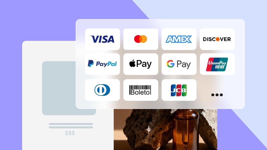
Payment options matter too. If someone can’t use their preferred method, like a card they trust or a digital wallet, they are more likely to abandon the purchase.
If you want to improve this part of your store, see our guide to simplifying the checkout process.
Trust signals and payment security
Trust signals and payment security affect whether a user feels safe enough to complete a purchase.
When someone reaches checkout, they are about to share personal and payment details. At that point, even small doubts can stop the purchase.
Users look for clear signals that your store is legitimate:
- Real customer reviews
- Visible ecommerce security measures (like HTTPS/SSL)
- Familiar payment options
If these are missing or unclear, hesitation kicks in.
For example, if your checkout page looks different from the rest of your site, lacks reviews, or does not show secure payment icons, users may question whether the transaction is safe and leave before completing the purchase.
Payment methods also play a role in trust and speed. Options like Apple Pay or Shop Pay reduce the effort required to enter details and make users feel more secure because they already trust those platforms.
Traffic source quality
Traffic source quality determines how ready your visitors are to buy before they even land on your site.
Not all traffic has the same intent. Some users arrive with a clear goal, while others are just exploring.
For example:
- Email traffic usually converts higher because users already know your brand and often return with a specific product in mind
- Paid social traffic often converts lower because users are discovering your store for the first time
This is the difference between high-intent and low-intent traffic.
A user who clicks a product link in an email or search result is already closer to making a purchase. A user who clicks an ad out of curiosity still needs to be convinced.
Even with a well-designed store, low-intent traffic will convert less because the buying decision has not fully formed yet.
How to improve ecommerce conversion rate
You improve ecommerce conversion rates by removing friction, making buying easier, and optimizing your store with practical website optimization techniques.
The best way to do that is step by step. Start with the parts of your store that have the biggest effect on sales, then keep improving based on real data.
1. Simplify the checkout process
Checkout should feel quick and predictable. If it asks for too much information or adds too many steps, people leave even when they are ready to buy.
Start by removing anything that is not required to complete the order. Long forms, forced account creation, and unclear progress bars all create checkout friction.
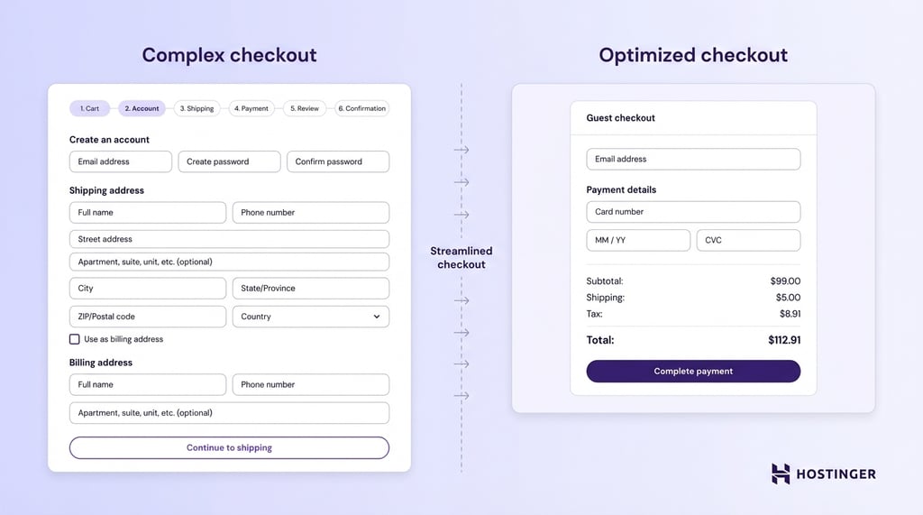
For example, if someone wants to buy one t-shirt but has to create an account, confirm their email, and fill in extra fields before paying, that extra effort can kill the sale.
A better ecommerce checkout flow keeps things simple:
- Ask only for essential details
- Offer guest checkout
- Keep the number of steps to a minimum
- Show shipping costs and payment options early
2. Optimize for mobile users
You improve mobile conversion by making your store easy to browse and buy from on a small screen.
This matters because many stores get more traffic from mobile than desktop, but mobile users are easier to lose. They are often distracted, moving quickly, and less willing to deal with friction.
Make the next step obvious by:
- Using large, easy-to-tap buttons
- Keeping text readable without zooming
- Making sure product images load fast
- Avoiding layouts that require horizontal scrolling
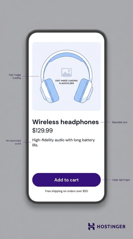
For example, if your Add to cart button sits too low on the page, or the checkout form is hard to fill out on a phone, mobile users will leave even if they like the product.
Digital wallets help here. Apple Pay, Google Pay, and similar options reduce typing and speed up mobile checkout.
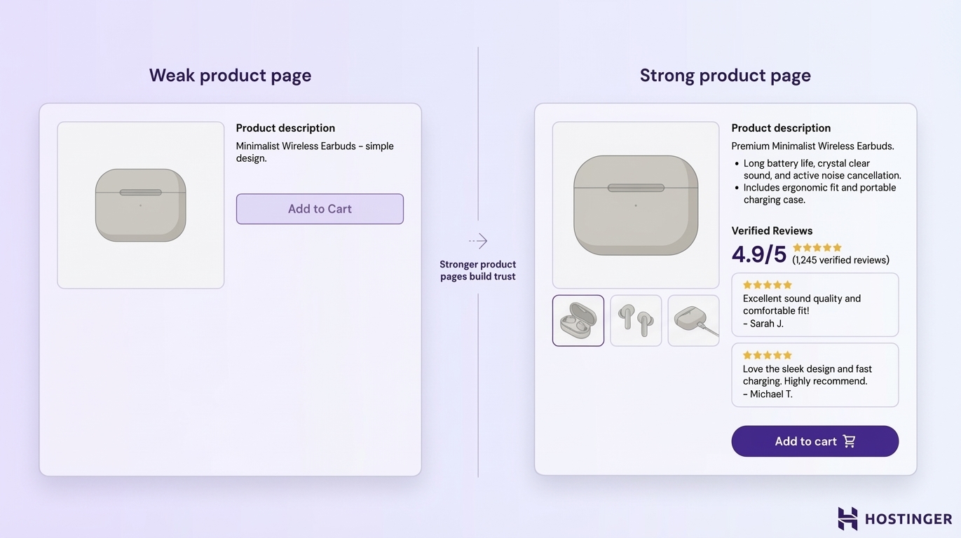
3. Improve product pages
You improve product page conversion by answering the questions that stop people from buying.
When someone lands on a product page, they are deciding whether the item is right for them and whether your store feels trustworthy enough to buy from. That decision depends on how clearly the page explains the product.
Strong product pages include:
- High-quality images that show the product from multiple angles
- Clear, detailed descriptions
- Verified reviews from real customers
For example, a blurry image and a one-line description force the shopper to guess. A clear image, sizing details, material information, shipping details, and real reviews reduce doubt and make the decision easier.
Your product page should help the user picture the product, understand what they are getting, and feel confident clicking “Buy now”.
4. Add trust and urgency elements
You improve conversion by reducing doubt and giving people a reason to act now.
Trust comes first. If your store looks unfamiliar or risky, visitors hesitate. Reviews, secure payment badges, return information, and clear contact details reassure people that the purchase is safe.
Urgency can help too, but only when it reflects something real. A limited-time discount, low-stock notice, or shipping deadline can encourage action by giving the buyer a clear reason not to wait.
For example, “Order today for delivery before Friday” is useful. On the flip side, a fake countdown timer that resets every time the page reloads damages trust.
5. Run A/B tests continuously
You improve conversion rate over time by testing one change at a time and measuring what actually works.
This matters because small changes can have a big effect, but not always in the way you expect. A stronger headline, a clearer CTA, a shorter checkout form, or a better product image can lift conversion, but you only know by testing.
Start with high-impact areas:
- Headlines
- CTA buttons
- Product page layouts
- Checkout steps
For example, you might test:
- “Buy now” vs “Add to cart”
- One-page checkout vs multi-step checkout
- Product reviews near the top vs lower on the page
Keep the test focused. Change one element at a time, wait until you have enough data, and compare results. If you change too many things at once, you won’t know what caused the improvement or the drop in performance.
How to create a high-converting ecommerce website?
A high-converting ecommerce website is built on a strong technical foundation that makes buying fast, easy, and reliable.
Before you optimize headlines or run tests, your store needs to work smoothly at a basic level. That means fast-loading pages, a mobile-friendly layout, and a checkout process that doesn’t slow users down. If the foundation is weak, even the best marketing will struggle to convert.
Focus on the essentials first. Your site should load quickly, work well on mobile devices, and support secure, simple payments.
For example, if your store takes too long to load or your checkout feels clunky on a phone, many users will leave before they even consider buying.
Built-in analytics also matter, because they help you see what users are doing and where they drop off, so you can improve the right areas.
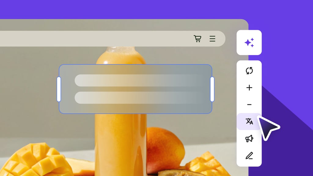
This is where using the right tools makes a difference. Website builders designed for ecommerce, like Hostinger Website Builder, come with conversion-focused templates, mobile-ready design, and built-in SEO tools.
This makes it easier to set up a store that not only looks good, but also supports performance and growth from the start.
If you’re starting from scratch or rebuilding your store, follow our guide to learn how to build an online store and set the right foundation from the start.
All of the tutorial content on this website is subject to Hostinger's rigorous editorial standards and values.

Ksenija is a digital marketing enthusiast with extensive expertise in content creation and website optimization. Specializing in WordPress, she enjoys writing about the platform’s nuances, from design to functionality, and sharing her insights with others. When she’s not perfecting her trade, you’ll find her on the local basketball court or at home enjoying a crime story. Follow her on LinkedIn.