Top 10 email design best practices for engagement and conversions
Apr 17, 2026
/
Alma F.
/
7 min Read

Email design encompasses the layout, visual hierarchy, and structural decisions that shape how subscribers experience your message once they open it. It determines how quickly they grasp your content, where their attention goes, and how easily they can take action.
Across marketing campaigns and transactional emails alike, design directly influences open rates, click-through rates (CTRs), and conversions by guiding attention and minimizing friction.
Emails render differently depending on the device and client. A message that looks polished in Gmail may break in Outlook, or display poorly on mobile. That’s why good email design goes beyond appearance – it accounts for layout stability, cross-client consistency, and accessibility from the start. The tools you use to build and test campaigns matter just as much as the visual decisions.
Email design best practices focus on these structural decisions – from layout and hierarchy to calls to action (CTAs), accessibility, testing, and execution – so your messages remain clear, consistent, and conversion-focused.
1. Use a single-column layout
The single-column layout is the most reliable email layout you can use. It renders consistently across devices and email clients, unlike multi-column designs that often break on smaller screens.
While multi-column layouts look sharp on desktop, they don’t stack predictably on smaller screens – columns overlap, images misalign, and the email your subscriber opens looks nothing like the one you designed.
A single-column email layout also creates a clear vertical reading path: subscribers move naturally from headline → image → body copy → call-to-action button. That flow breaks the moment a second column competes for attention to the side.
Keeping it simple is one of the fundamentals behind successful email marketing. One column first. Add complexity only when you have a clear performance reason.
This structural simplicity sets the foundation for mobile-first design, where layout decisions directly affect usability on smaller screens.
2. Design with mobile-first principles
According to Hostinger’s email marketing statistics, over 60% of all emails are opened on a mobile device, according to Hostinger’s email marketing statistics. Your design needs to hold up on a small screen before you think about desktop. Designing for desktop first and scaling down introduces usability issues on smaller screens.
Phones punish lazy spacing – padding that works on desktop often collapses on mobile. Text below 16px strains the eye, buttons shorter than 44px are hard to tap accurately, and elements packed too tightly force readers to zoom in just to follow the message.
Individually, these may seem minor, but together they make the difference between an email that converts and one that gets closed.
Getting these key factors for successful emails right from the start saves you from chasing open rate drops later.
3. Keep email width at 600–640px
Most email clients display messages within a preview pane that is approximately 600px wide. Designing email templates between 600 and 640px ensures compatibility across major clients like Gmail, Outlook, Apple Mail, and Yahoo, preventing horizontal scrolling or clipped layouts.
A 600px container fits most desktop preview panes, stacks cleanly on mobile, and prevents layout overflow across every major client.
It’s not the most exciting constraint, but reliability beats visual experimentation when it comes to rendering. Set your template to 600px, and unexpected cutoffs stop being a worry.
4. Use a clear visual hierarchy
Clear visual hierarchy ensures your subscribers immediately understand where to look and what to read next.
One strong headline, a short supporting paragraph, a contrasting CTA, and supporting visuals below – that sequence moves the eye naturally from top to bottom, and every element does its job without competing with the others.
When everything carries equal visual weight, nothing stands out. Accessibility and UX guidance generally recommends a minimum of 16px for body copy, with larger sizes for headings to establish hierarchy – for example, 22–28px for primary headlines and 18–20px for subheadings.
Subheadings should clearly separate sections, and body copy should sit comfortably below that without competing. White space should let each element breathe. High contrast between text and background makes your copy readable at a glance.
Subscribers rarely invest extra effort in marketing emails, so hierarchy must guide attention effortlessly.
5. Limit fonts and colors
Limit your email design to one or two fonts and two to three primary brand colors.
Using more fonts increases rendering inconsistencies across email clients and raises the likelihood of fallback substitutions that disrupt brand consistency. More colors pull your reader’s focus in too many directions, diluting your brand.
Keeping your email palette aligned with your website color scheme matters too – subscribers who click through should feel like they’ve arrived somewhere familiar.
Pro Tip
Include web-safe fallback fonts such as Arial, Georgia, or Verdana to preserve layout integrity when custom fonts are not supported, particularly in Outlook for Windows.
6. Optimize images for fast loading
Large or unoptimized images slow email load times, especially on mobile networks, reducing engagement before subscribers interact with the content. Keep individual images under 200KB when possible and choose the best image format from the start.
Format | Best for |
JPEG | Photos and images with many colors |
PNG | Graphics, logos, and anything with transparency |
WebP | Either of the above, with smaller file sizes where client support allows |
Excessive image-to-text ratios and oversized files can also trigger spam filters, negatively affecting deliverability. What looks like a design decision has a real impact on whether your email reaches the inbox at all.
Write descriptive alt text for every image, too. Many clients block images by default, making your alt text the first thing subscribers actually see.
7. Make call-to-action buttons obvious
Every element in your email design – including headline, copy, and visuals – should support a single primary action. So don’t let that button get lost in the background. A button that blends in, sits below the fold on mobile, or uses vague, generic copy like Submit is costing you clicks that were already within reach.
Use buttons that are at least 120px wide, maintain strong color contrast, and use action-oriented copy that clearly communicates the benefit. For example, Claim discount instead of Submit.
A CTA button placed directly below a product image converts better than a hyperlinked sentence buried in a paragraph.
Put your primary CTA above the fold so mobile readers find it without scrolling. Text links work well for secondary actions, but your main ask always gets the button.
8. Ensure accessibility compliance
Accessible email design improves usability for all subscribers, not just those with disabilities. Around 1 in 12 men and 1 in 200 women have some form of color vision deficiency, which means relying on color alone to signal meaning quietly excludes a meaningful chunk of your list.
The areas that you should pay attention to are color contrast ratios of at least 4.5:1 for body text, font sizes large enough to read without zooming, a logical reading order so screen readers can follow the layout, and descriptive alt text for every image.
Implementing accessibility standards such as the Web Content Accessibility Guidelines (WCAG) contrast ratios and logical heading structure improves readability, usability, and long-term engagement.
9. Keep copy concise and scannable
Concise email copy increases CTR because it reduces cognitive load, makes the main CTA easier to find, and keeps more readers engaged long enough to click.
Most subscribers scan email content before committing to read it in full. They take in your headline, skim the first line of each section, glance at the button, and decide in about three seconds whether the rest is worth their time. Long blocks of text get skipped.
Short paragraphs of two to three sentences, bullet points for lists, and plenty of white space between sections all make your email easier to move through quickly. Lead with your most important point – the offer doesn’t belong in the third paragraph. Edit aggressively by removing filler language and prioritizing clarity over length.
Strong email copy is what closes the gap between a good design and an email that actually converts.
10. Test emails across clients and devices
An email that looks perfect in your browser can break in Outlook, misalign in Gmail on Android, clip your preheader in Apple Mail, or invert your color scheme in dark mode. Each email client renders HTML differently. For example, older versions of Outlook use the Microsoft Word rendering engine, which ignores many modern web CSS properties.
Doing pre-send testing catches the following problems before they reach your subscribers:
- Broken layouts
- Misaligned images
- Font fallback substitutions
- Button display issues
- Dark mode color conflicts
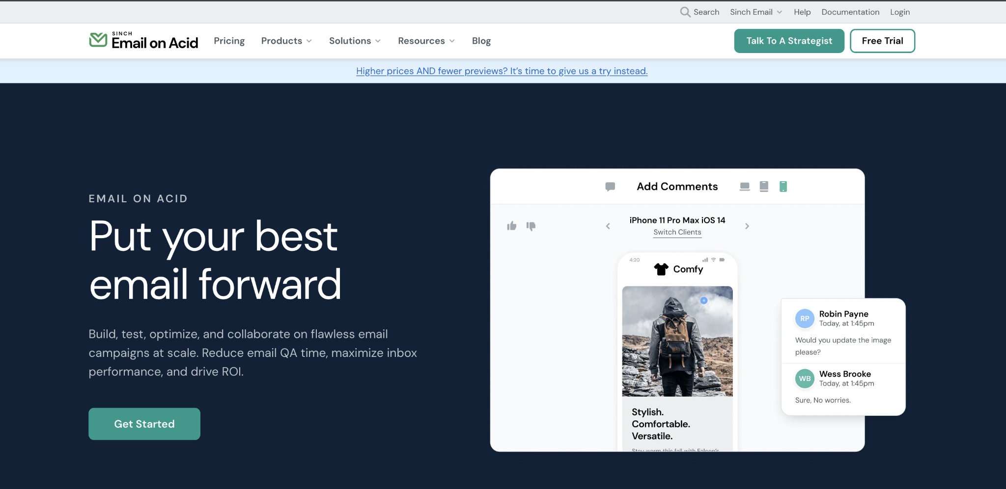
Tools like Litmus and Email on Acid preview your email across 90+ clients in minutes. At minimum, test in Gmail (web and mobile), Outlook (2019+), and Apple Mail before any significant send.
Catching rendering issues during testing takes minutes; discovering them after sending to thousands of subscribers can significantly impact engagement and brand trust.
What are the best tools for creating email designs?
There is no single best email design tool – the right choice depends on your team’s technical skills, branding requirements, and campaign complexity.
To evaluate the options effectively, it helps to understand the main types of tools available. Email design tools generally fall into three categories: template-based platforms with drag-and-drop builders, visual design tools, and code-based editors.
- Template-based platforms such as Reach, Mailchimp, Brevo, and Klaviyo provide pre-designed email structures and use drag-and-drop interfaces that allow marketers to customize layouts without writing code, making them ideal for fast execution and easy team collaboration.
- Visual design tools like Figma offer greater control over layout and branding, supporting teams that prototype designs before exporting them to HTML, which helps maintain strong brand consistency.
- Code-based editors such as MJML or raw HTML provide maximum flexibility and scalability, but require technical expertise and closer coordination between marketing and development teams.
Many modern platforms also integrate AI features that suggest layouts, generate copy variations, and personalize content blocks, reducing production time for high-volume campaigns. These capabilities – along with automation, deliverability controls, and reporting – are typically built into broader email marketing platforms rather than standalone design tools.
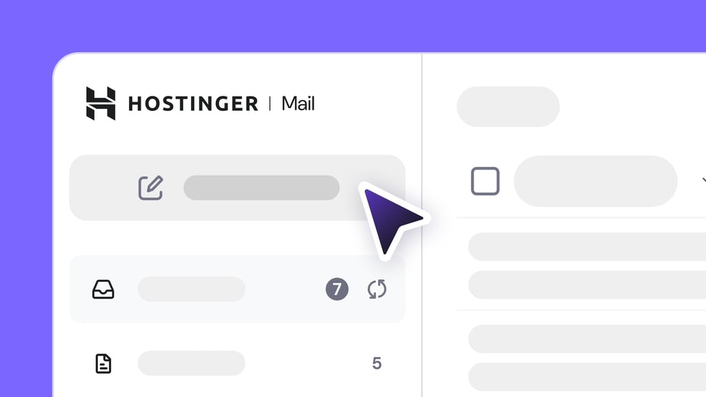
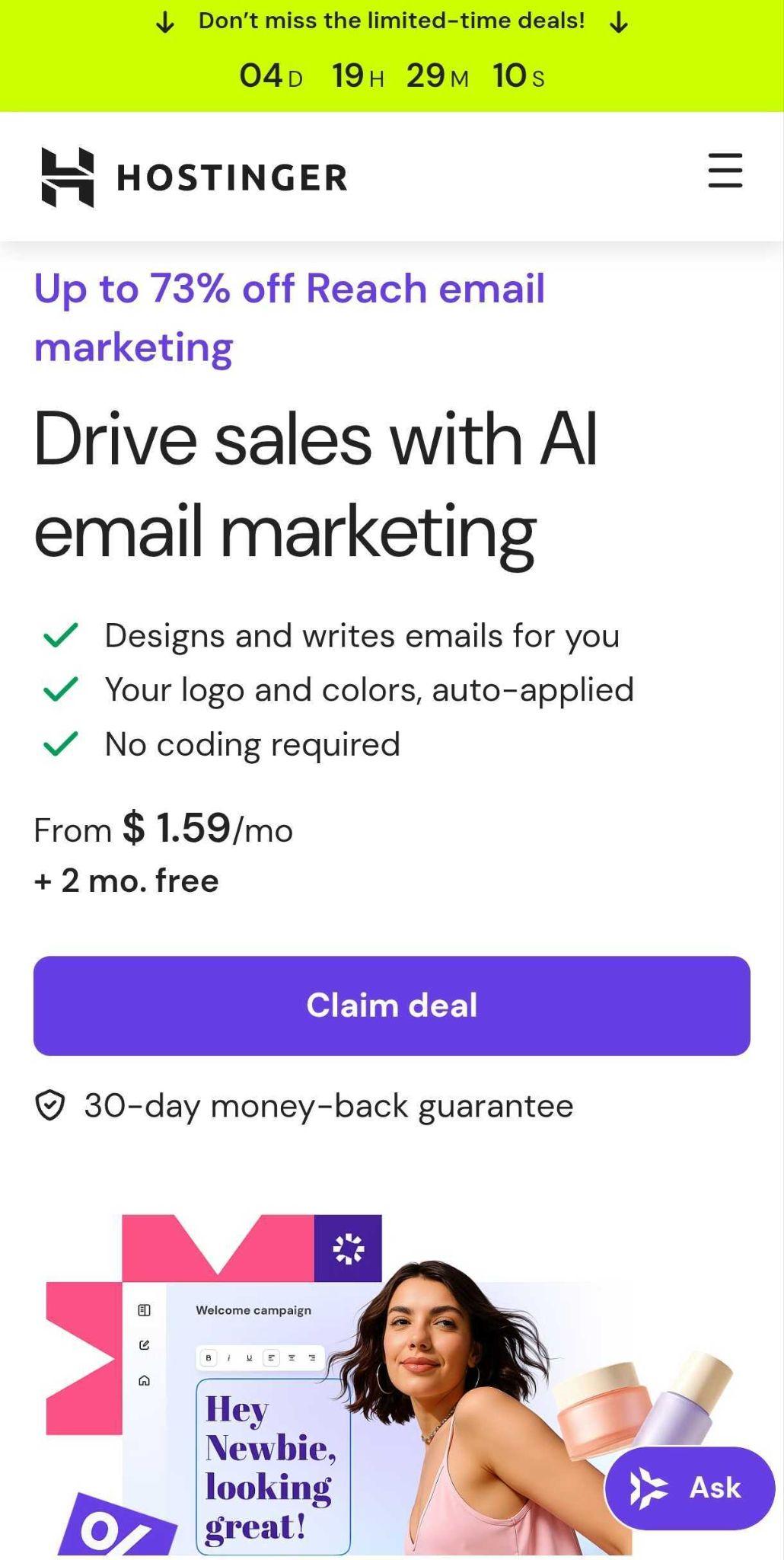
One example of an integrated email marketing platform that combines design, automation, and campaign management in a single system is Hostinger Reach.
Is Hostinger Reach good for email design?
Hostinger Reach is a strong option for email design if you want an integrated platform that combines template creation, campaign management, and performance tracking in one place. As an email marketing tool, it allows users to design, send, and analyze campaigns without relying on separate design software or external automation systems.
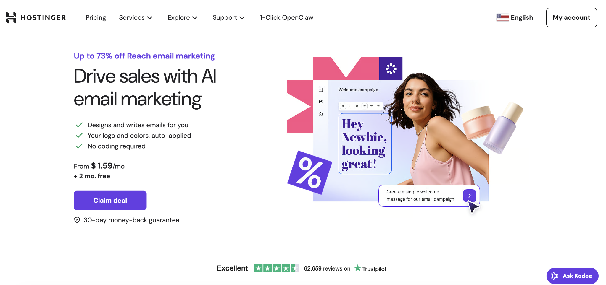
Reach includes an AI-powered design system that analyzes your existing website and generates email templates aligned with your brand’s colors, typography, and visual style. Because templates are created directly from your website, brand consistency is maintained without manual layout adjustments or additional tools.
Compared to advanced visual prototyping tools or code-based editors, Reach offers less granular control over custom HTML and complex conditional logic. But for small businesses and early-stage teams that value speed and simplicity, this tradeoff makes email creation easier while still covering the essentials.
What are other factors that influence successful email marketing beyond design?
Strong design improves your email readability and click-through rates, but performance depends on whether your emails reach the inbox in the first place.
Deliverability plays that foundational role. Without proper SPF, DKIM, and DMARC authentication, even the most well-designed campaigns can land in spam or fail to arrive at all. Sender reputation reinforces that foundation – a clean subscriber list and low complaint rates protect your visibility over time.
Once inbox placement is secured, list quality and targeting determine whether engagement turns into revenue. Sending the same message to every subscriber regardless of behavior or intent reduces relevance and increases unsubscribe rates.
Segmentation by engagement level, purchase history, or interests makes campaigns more timely and personal, which directly improves conversions.
From there, timing and consistency shape your long-term performance. Sending too frequently erodes trust, while sending too rarely weakens brand recall. A/B testing subject lines, send times, and calls to action replaces guesswork with data, and consistent analytics review reveals patterns that compound over time.
When you align design, deliverability, segmentation, and testing, email stops being a series of isolated sends and becomes a structured email marketing strategy that improves with every campaign.
Email design increases engagement. Email strategy sustains growth.
All of the tutorial content on this website is subject to Hostinger's rigorous editorial standards and values.

Alma is an AI Content Editor with 9+ years of experience helping ideas take shape across SEO, marketing, and content. She loves working with words, structure, and strategy to make content both useful and enjoyable to read. Off the clock, she can be found gaming, drawing, or diving into her latest D&D adventure.