Aug 14, 2025
Emman Z.
8min Read

A landing page is a standalone web page that someone lands on after clicking a link from an email, ad, or other online source.
Landing pages often feature compelling headlines, concise messaging, persuasive calls to action, and a layout with no navigation or distractions. Whether you’re running an ad campaign or promoting a product launch, a landing page helps you drive better results by keeping your audience focused.
The main purpose of a landing page is to guide visitors toward a specific marketing objective (such as lead generation, product sales, or sign-ups) by focusing their attention on a single action.
Unlike general web pages that serve multiple functions, landing pages are built with a clear goal in mind. They highlight a specific offer and present a direct call-to-action from your campaign. This makes landing pages ideal for supporting targeted initiatives like paid ads, email promotions, or seasonal product launches.
Some of the most common objectives of a landing page include:
Each landing page is designed with one of these unique goals in mind – keeping content, layout, and CTA tightly aligned for maximum impact. So knowing how to create a landing page that’s tailored to a specific goal is important to achieve strong results.
Landing pages and regular web pages serve different purposes. While regular website pages are often part of a larger navigation structure meant to inform or guide users through various sections of the site, landing pages are singularly focused on achieving a specific goal.
To better understand the broader structure and function of a website as a whole, it helps to first know what is a website and how its different pages work together.
A landing page typically:
In contrast, regular web pages:
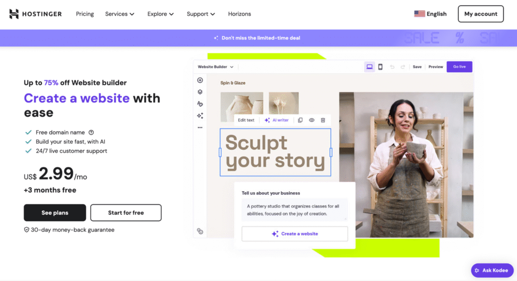
The Hostinger Website Builder landing page is a great example of clarity and conversion-focused design. It starts with a benefit-driven headline and a minimalist layout that immediately highlights its value proposition. The visuals are modern and professional, giving a clear sense of what users can expect from the product. The CTAs are impossible to miss, and the pricing transparency right before them builds trust with visitors.

The page also includes website builder reviews, comparison between different plans, product features, and a testimonial laid out in a user-friendly format – all of which work together to guide users toward taking action.
While landing pages are designed with a single focus or goal, a website homepage serves as the main entry point of a website, offering a broader overview of what the site offers and linking to various sections like About, Services, Blog, or Contact. It’s built for exploration, not just conversion.
To help clarify, here’s a side-by-side comparison of their key attributes:
| Aspect | Landing Page | Homepage |
| Purpose | Drives a single, focused action (sign up, download, purchase) | Provides a general overview and directs visitors to different parts of the site |
| Target Audience | Specific campaign or audience segment | Broad audience including new, returning, and curious visitors |
| Content | Minimal and tightly aligned with one goal | Covers multiple topics like services, products, company info, and blog |
| Design | Simple, streamlined layout with little to no navigation | Multi-section layout with rich visuals and full navigation |
| Navigation | Often removed or limited to reduce distractions | Full navigation menu for site-wide access |
| Call-to-Action | Singular and prominent (like “Get Started”) | Multiple CTAs based on different user intents |
| Traffic Source | Linked from specific campaigns (ads, emails, social media) | Often visited through direct URLs, search engines, or brand discovery |
For more details on how landing pages and homepages differ and when to use each, check out our full guide on landing page vs. homepage.
A successful landing page includes specific elements that work together to drive conversions. Here’s a breakdown of the key elements that make a landing page successful:
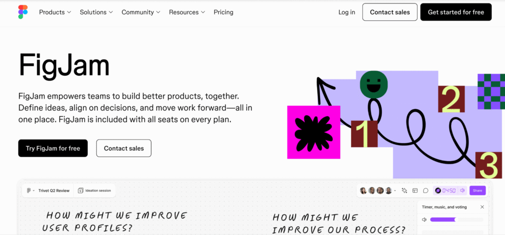
An example of a good landing page with all essential elements is Figma’s FigJam landing page.
It has a clear headline (“FigJam empowers teams to build better products, together”) and a supportive subheading explaining the key benefits. The prominent CTA (“Try FigJam for free”) directs users clearly.

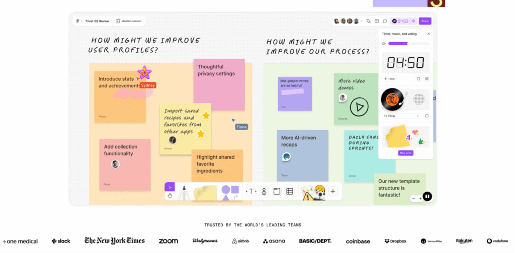
A hero image showcases the product in action, while concise content highlights its collaborative features. Social proof appears through logos of well-known clients like Microsoft and Airbnb.

All of this is designed in a distraction-free layout optimized for both desktop and mobile users – a textbook example of how to bring all these elements together effectively.
Besides that, your landing page should also be fully mobile-friendly. With more and more users browsing on mobile devices, the layout and functionality need to adapt seamlessly to smaller screens. A poor mobile experience can quickly lead to drop-offs, no matter how compelling your offer is.
If you’re starting from scratch or need inspiration, exploring ready-made landing page templates. can help speed up the process and ensure your layout includes all the essential elements.
Headlines and subheadings work together to grab attention and guide users through your landing page, but they serve slightly different purposes.
A headline is the first thing visitors see when they land on the page. Its main job is to grab attention immediately and communicate the core value of your offer in just a few words. A strong headline should be clear, benefit-driven, and compelling enough to make someone want to keep reading. If it’s vague, confusing, or too generic, you risk losing interest within seconds.
A subheading, on the other hand, supports the headline by adding context or expanding on the main message. It helps clarify what the offer is about, who it’s for, or what problem it solves without overwhelming the reader. So while the headline pulls users in, the subheading reassures them that they’re in the right place.
Together, these two elements set the tone for the rest of the landing page. They help users quickly understand what you’re offering and why it matters to them, keeping them engaged and encouraging them to scroll, explore, or take action.
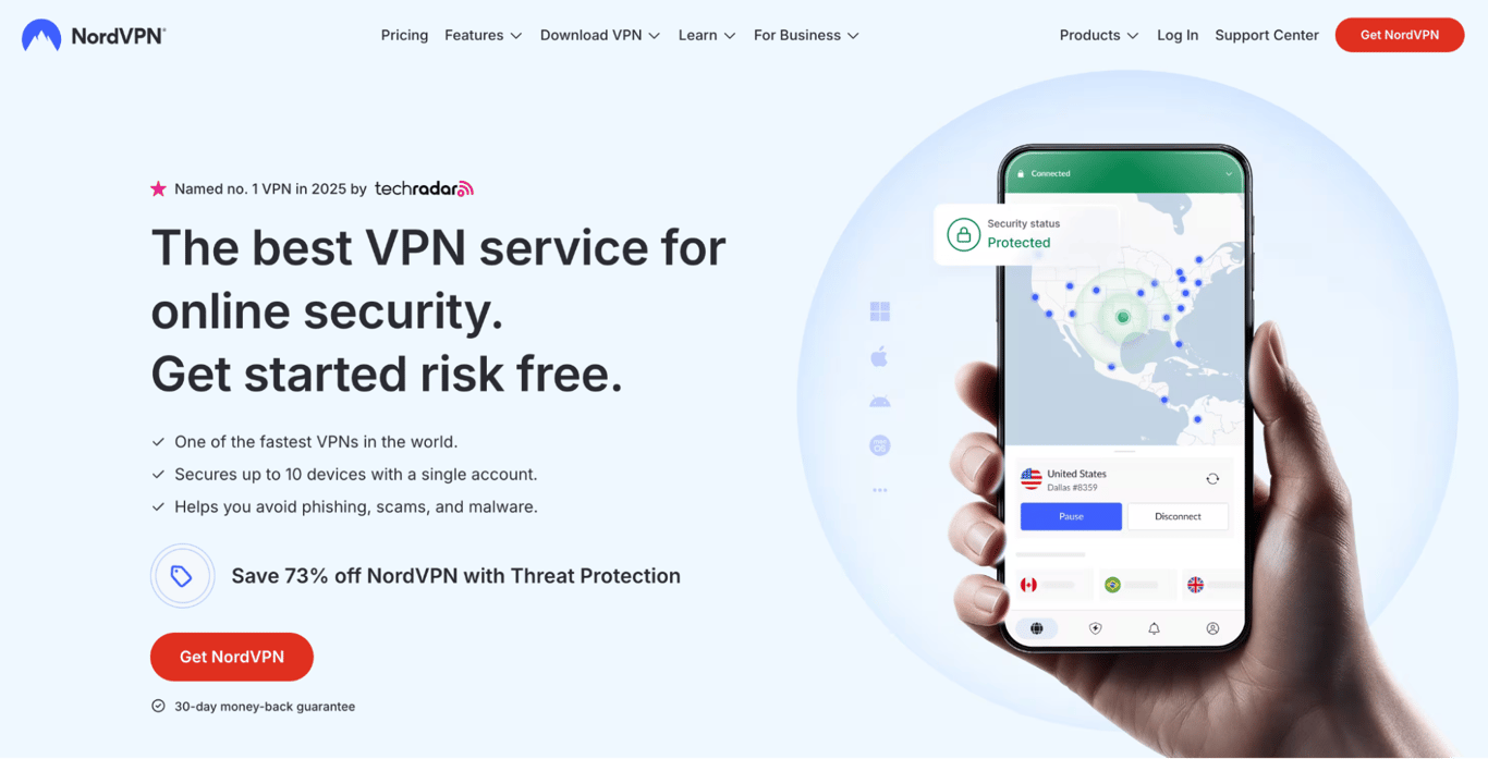
NordVPN uses clear and persuasive headings on its landing page to immediately capture attention and communicate its core value.

The main headline is bold and benefit-driven:
“The best VPN service for online security. Get started risk free.”
It delivers two key messages in one line: trust and low risk. This makes it highly effective in reassuring users while encouraging them to take action.
Just below the headline, a short subheading reinforces the main message with three quick bullet points highlighting speed, multi-device coverage, and protection from online threats. These act as concise proof points and make it easier for readers to scan and understand the benefits.
Landing pages come in different formats depending on the campaign goal, audience, and type of offer. Choosing the right design is essential to getting the results you want. Here are some of the most common types:
Important! While exploring these types, it’s worth noting that splash pages are not the same as landing pages. Splash pages are typically introductory screens that appear before the main content of a site, often used to display announcements, language selection, or age verification. They’re not built for conversions and shouldn’t be confused with goal-oriented landing pages.
Landing page optimization is key for turning visitors into leads or customers. Even if you’re driving the right traffic, a landing page that isn’t fine-tuned can quickly lose potential conversions. Optimization ensures that the page is doing its job: capturing attention, building trust, and guiding users toward the desired action in the marketing funnel.
It’s not just about making a page look good – it’s about making sure every element works together to support your goal. In fact, if you look at real-world landing page conversion rate statistics, you’ll see how much of a difference smart optimization can make.
Because user behavior, technology, and market trends constantly change, optimizing landing pages is essential and should be an ongoing process. Without it, even the most well-crafted campaigns could fall flat due to unclear messaging or poor user experience.
By regularly testing and refining your landing pages, you can uncover what resonates most with your audience and improve performance over time. This continuous improvement helps you get more value from your marketing efforts and ensures that your campaigns are not just reaching people but converting them.
In short, landing page optimization is what turns good traffic into real results.
Landing pages provide a focused experience that’s built around a specific purpose. This helps you connect with your audience more directly and guide them toward a single, clear action – whether that’s signing up, making a purchase, or learning more. Unlike general website pages, landing pages remove distractions and keep the message aligned with your campaign goals.
Here are some of the key benefits of using landing pages in your strategy:
To make your landing pages truly effective, start by defining what your landing page is meant to achieve – whether it’s collecting leads, driving sales, or promoting a specific offer.
Everything on the page should support that goal. Your headline should match the visitor’s intent, your copy should clearly explain the value, and your CTA should guide users to take action without friction.
Use SEO best practices to optimize your content. That includes using relevant keywords in your headline and body text, writing clear meta descriptions, and ensuring the page loads fast on all devices.
Once your page is live, track its performance using tools like Google Analytics, Hotjar, or your ad platform’s built-in metrics. Look at bounce rates, time on page, and conversion rates. If something’s underperforming (like a weak CTA or a form that’s too long), make small adjustments and test again.
As you continue your journey, scaling your landing page efforts should be a priority. This could involve running A/B tests to refine your messaging, expanding your campaign reach, or using multiple landing pages for different segments of your audience.
Now that you know what is a landing page, go ahead and create a landing page today and see how these fundamentals come to life.
All of the tutorial content on this website is subject to Hostinger's rigorous editorial standards and values.