What is a splash page? Your guide to getting started
May 20, 2026
/
Jordana A.
/
7 min Read
A splash page is an overlay page that usually appears on top of a website’s homepage and serves as an introductory screen before visitors reach the main content of a website. As the name suggests, it’s designed to make a splash ‒ whether it’s shaping first impressions, sharing key information, or tailoring the experience for each person.
Keep reading as we’ll cover what makes a splash page different from other types of web pages, why it can be useful, and how to create one that works for you.
Difference between splash pages and landing pages
Splash pages are often confused with landing pages because both are standalone pages that appear before or instead of a regular website page. To understand this distinction, you should first know what a landing page is. Here’s how they differ:
| Element | Splash page | Landing page |
| Purpose | To grab attention quickly and share key information before entering the main website | To motivate an action, like signing up or buying |
| Timing | Shown before the homepage or main content | Accessed via a link from an ad or email |
| Content length | Short, usually a headline and a short text | More detailed, includes headlines, information on the action being promoted, and a call-to-action |
| Navigation | Minimal, usually a single action like “Enter Site” or choosing a language | Usually none, to avoid distractions from the main goal |
Difference between splash pages and homepages
Splash pages and homepages are both among the first things visitors might see on a website. Despite having different purposes, they’re easy to mix up. Here’s how to tell the difference:
| Element | Splash page | Homepage |
| Role | An intro screen before the main content | The website’s main content and navigation hub |
| Timing | Briefly disrupts user experience to display something specific | Consistently supports user experience by guiding visitors through the site |
| Content | Minimal, with strong visual and short text | Rich, with a full navigation menu linking to key pages and sections in a structured layout |
| Audience targeting | Can be shown based on location, device, or campaign | Visible to all visitors by default |
| Longevity | Temporary or seasonal, often used for announcements or promos | Permanent part of the website structure |
| Engagement | One quick action ‒ click, select, or acknowledge | Ongoing, allows visitors to explore different parts of the website |
Want to dive deeper? Check out our landing page vs homepage guide for the full breakdown.
Difference between splash pages and popups
Another common point of confusion is the difference between splash pages and popups, since both interrupt the browsing experience. Take a look at the difference between the two:
| Element | Splash page | Popup |
| Purpose | Announcements, age verification, language selection | Promotions, newsletter signups, alerts |
| Timing | Before entering the website | After the page has loaded |
| Size | Full-screen | Small window or overlay |
| User interaction | Blocks access temporarily, must be dismissed to continue exploring the site | Interrupts browsing momentarily, but can be closed or ignored |
How to create a splash page
The exact steps to set up a splash page depend on your chosen website-building method. Generally, you will need to:
- Define your goal. For example, an online store selling age-restricted products might need an age verification splash page to meet legal requirements.
- Write a clear and concise message. Focus on what visitors need to know or do before entering the website.
- Design the layout. Keep the layout simple but use a strong visual element or background to grab visitors’ attention. Remember to include a clear headline and a call-to-action that resonate with your goal.
- Add branding elements. Your splash page will be the first thing visitors see, so it should reflect your brand and fit your website’s look.
- Set an exit path. Add an exit link or button to redirect site visitors who opt out to the homepage. It must be visible and easily accessible.
- Choose how the splash page appears. Depending on your platform, set it to show before the homepage or trigger it based on the visitor’s location or device.
- Test and publish. Make sure all the clickable elements work properly and the visual elements are clear across all screen sizes before going live.
Did you know?
While Hostinger’s site maker doesn’t have a native popup element yet, you can still create a splash page by modifying one of our pre-built landing page templates with our drag-and-drop editor. Hostinger Website Builder also supports third-party integrations and custom code.
Benefits of splash pages and why they still convert
Here’s why you might want to use a splash page for your website:
Grabs attention instantly
Since a splash page shows before entering the main homepage, visitors will instantly see the message that you want to convey. Combining visually captivating design elements and clear messaging, splash pages are perfect for highlighting promotions, new product launches, or important announcements.
A splash page is also a great spot to showcase social proof. Showing your sales numbers is a great way to build trust and improve conversions.
Highlights key information
Whether it’s an upcoming event, a limited-time deal, or a disclaimer, a splash page makes sure visitors see it right away. Plus, you save time by not having to update multiple pages to achieve the same effect.
Black Sheep takes the disclaimer route with its splash page. Visitors from the US are greeted with a message confirming that the Australian cycling apparel company ships to them, along with details about the additional fees.

Personalizes user experiences
Splash pages help personalize marketing by letting visitors sort themselves by location, language, or age. You can then redirect them to the designated version of your site, where they get a more relevant experience and are more likely to convert.
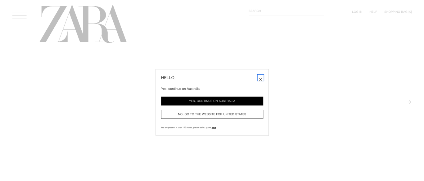
Zara, the renowned online clothing retailer, does just that. When users try to access a version of the site that doesn’t match their location, it cross-checks their region and offers a choice: continue with the version they entered or switch to the one for their local area.
Helps with legal and compliance needs
If your site needs to verify age, ask for consent, or confirm location, splash pages offer a simple and reliable way to do it.
Heineken, the brewing company, uses a splash page to verify visitors’ age. After confirming their legal drinking age, users are redirected to the main site to browse and purchase beer.

A splash page might not be built to drive conversions like a landing page, but it still plays a helpful role. It supports your bigger goals by increasing brand awareness and guiding visitors to the right place. It’s also a great way to improve the ecommerce customer experience, where personalization has a big impact on turning visitors into customers.
How to optimize a splash page
A poorly designed splash page can increase bounce rates, which is bad for your SEO efforts. Here are some tips to optimize your splash page for better visibility and engagement:
- Use proper headings. Structure your content with H1 and H2 tags properly, even if the page is short, to improve readability and indexing.
- Add internal links. Include at least one link to your website to keep the splash page in the structure and prevent it from becoming orphaned.
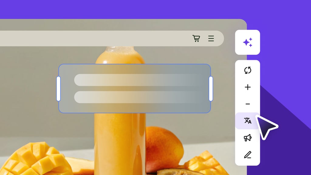
- Use alt text for images. Make your visual elements easy to understand for search engines and screen reader users. This practice also shows your commitment to accessibility and inclusivity.
- Check for mobile responsiveness. Make sure your splash page works properly on all devices.
How Google indexes splash pages and how to avoid crawling issues
Search engine crawlers scan your website to understand its content and structure. The better they can read your site, the easier it is for your pages to rank in search results.
Since most splash pages contain little or no text, search engines might struggle to understand what the page is about. Adding internal links helps crawlers reach other parts of your site, giving them more context and helping key pages continue to rank.
Google also puts a lot of weight on mobile experience. For your splash page to perform well, it needs to meet mobile-first indexing standards. That means making it easy to dismiss and visually clean by using high-quality images.
Speed is also key to Google splash page SEO. Nearly half of visitors expect a web page to load in two seconds or less, according to our landing page statistics. If your splash page loads too slowly, it can frustrate visitors and drive them away. The higher the bounce rates, the lower your search engine rankings will be.
What makes a good splash page?
Clarity, usability, and consistency are what separate a forgettable splash page from one that actually works. A well-designed splash page guides visitors without overwhelming them, reflects your brand, and includes a clear call-to-action that supports your goals. If you’re not sure where to start, running a quick UX audit can help spot areas for improvement.
While there’s no one-size-fits-all recipe for a high-performing splash page, the most effective ones usually include the following key components.
Visual hierarchy
Visual hierarchy guides your visitor’s attention, showing them what to look at first, next, and last. You can do this by adjusting the size, color, contrast, or placement of elements on the page.
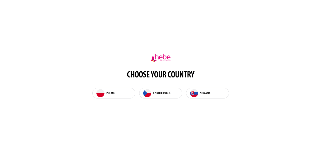
For example, Hebe’s online drugstore uses a simple, pyramid-shaped layout to make its splash page easy to understand. It starts with the logo at the top, followed by a clear call-to-action heading, and ends with country selection options. The minimal design helps maintain focus by removing any distractions.
Since people in general have short attention spans, a simple and concise design makes the splash page easier to scan. In fact, shorter landing pages outperform longer ones by 13.5%, proving that “less is more” really does apply here.
Consistent design
When your splash page and homepage look and feel connected, it makes the whole experience smoother for your visitors. Using the same colors, fonts, and overall style helps people know they’re in the right place and builds trust. It also sets the tone for the rest of the site, highlighting brand personality.
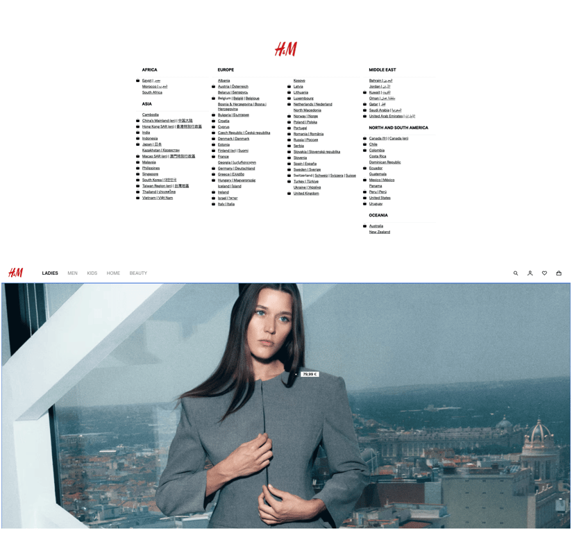
H&M, another popular clothing company, does a great job with this approach by using a combination of black and white with a minimal aesthetic on its splash page as the rest of its website. When you close the splash page, it doesn’t feel like you’re jumping to a new site.
Below is a comparison of H&M’s splash page (top) and homepage (bottom). Notice how everything stays connected visually.
Subscription forms and social media links
If your goal is to build a following, consider adding these elements to your splash page.
Subscription forms let you collect email addresses from interested visitors for email marketing, while social media links make it easy for them to connect with you on multiple platforms. Both are effective for increasing your reach and engagement rates.
When it comes to forms, simple works best. Our research found that the ideal number of fields is just three, which converts about 10% of users. The top-converting combinations are email plus name (7%) and email plus birthdate (5.7%). Don’t be afraid to create your own combination to match your goal.
Did you know?
With Hostinger Reach email marketing solution, you can have AI design a subscription form, kickstart a campaign, and track its performance ‒ all in one place.
What to do after launching your splash page
Once your splash page is live, the next step is to monitor its performance and optimize based on the data. Use tools like Google Analytics to track user behavior (how long visitors stay, CTA clicks, and exits) to determine if the splash page is meeting its goals. Test different CTAs, headings, and layouts to figure out what resonates best with your audience.
If you still aren’t getting the results you want, it might be time to look at other areas of your site. Our web design statistics show that a seamless UX design can drive conversion rates up to four times higher, with custom CTAs getting 42% more clicks. On the other hand, poor website usability, like frustrating navigation or a cluttered layout, drives 79% of visitors away.
With Hostinger’s website maker, you can easily enhance your site without any coding knowledge. Our customizable templates are mobile-optimized and designed with usability in mind. The drag-and-drop editor and a range of AI tools make the process simple, whether you’re a beginner or a pro.
Use the seven-day free trial to test our website builder risk-free. If it meets your needs, you can upgrade starting at $2.99/month. All purchases include a 30-day money-back guarantee.
All of the tutorial content on this website is subject to Hostinger's rigorous editorial standards and values.

Jordana is a Senior Content Writer with a background in Information Systems. She has over five years of experience in WordPress and is casually dabbling with PHP and MySQL. Her passion for writing and technology drives her to create tutorials for anyone wanting to build their online presence. Follow her on LinkedIn.