18 ecommerce conversion rate optimization strategies to increase sales
Aug 01, 2026
/
By Alma
/
10 min Read
Ecommerce conversion rate optimization (CRO) focuses on helping more store visitors complete a purchase without depending only on more traffic. It covers the full shopping process, from finding a product to adding it to the cart and completing payment.
Shoppers can leave at any point. Pages might load slowly, navigation might make products hard to find, product pages might leave important questions unanswered, or checkout might add costs and steps they didn’t expect.
The ecommerce conversion rate optimization strategies below show how to find these drop-off points, understand what is stopping shoppers, and improve each step. Start with the point where the most shoppers leave, make one change, and check whether more of them continue.
1. Track where shoppers leave
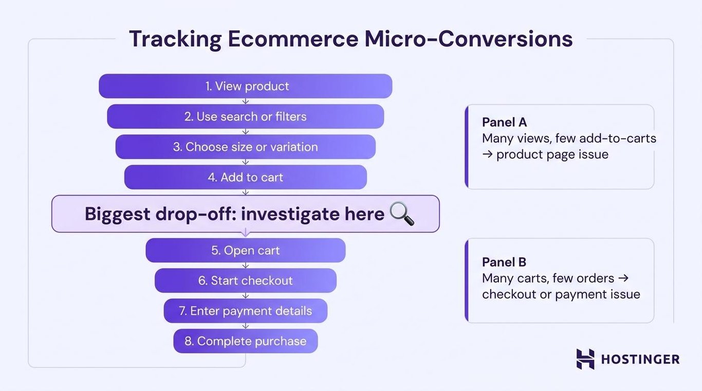
Start by checking your ecommerce conversion rate and the steps shoppers take before buying.
These smaller steps are called micro-conversions. They show where shoppers start leaving.
Track actions such as:
- Viewing a product
- Using search or filters
- Choosing a size or variation
- Adding an item to the cart
- Opening the cart
- Starting checkout
- Entering payment details
- Completing a purchase
Look for the biggest gap between two steps.
For example, many product views but few add-to-cart actions show that something on the product page is stopping shoppers. Plenty of added carts but few completed orders point to issues with shipping, checkout, or payment.
Record these numbers before making changes. You’ll need them later to check whether your work helped.
2. Improve page speed
Make every important store page load quickly on both phones and computers.
Test the homepage, category pages, popular product pages, cart, and checkout separately. One large image, chat box, or tracking tool can slow a single page even when the rest of the store works well.
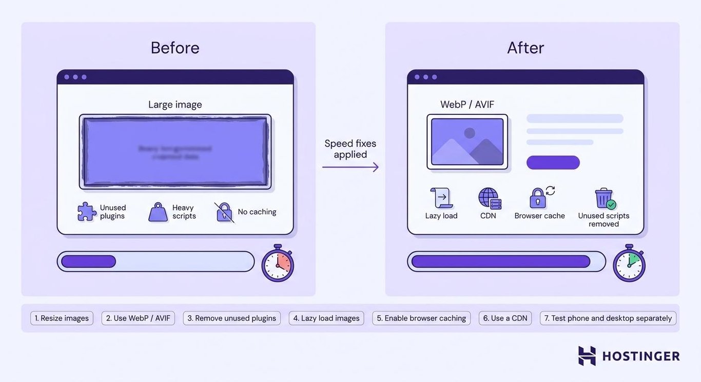
You can optimize website speed by working through these fixes:
- Resize images before uploading them.
- Use WebP or AVIF instead of larger image formats.
- Remove plugins and scripts you no longer use.
- Load images further down the page only when the shopper scrolls toward them.
- Let browsers save parts of the site so they don’t download everything again.
- Use a content delivery network to load files from a server closer to the shopper.
- Test phone and computer speeds separately.
Check the full shopping process after every change. A page isn’t better if it loads faster but breaks the image gallery, reviews, or add-to-cart button.
3. Make the mobile store easier to use
Test the whole store on a real phone, not only in a browser preview.
Complete one purchase from the homepage to the order confirmation screen. Note every point where you need to zoom, tap twice, scroll back, or correct a form field.
Look for:
- Buttons that are too small or close together
- Product text that requires zooming
- Filters that cover most of the screen
- Pop-ups that are hard to close
- Long checkout forms
- Product options hidden far down the page
- Payment methods that require manual card entry
Keep the price, product options, delivery details, and main button near the top. On long pages, use an add-to-cart button that stays visible while the shopper scrolls.
Mobile usability is one part of improving ecommerce customer experience across browsing, support, payment, and delivery.
4. Use navigation labels that shoppers understand
Name categories with the words shoppers use when looking for products.
“Women’s running shoes” tells people exactly what they’ll find. “Active Collection” makes them guess.
Review the menu and ask:
- Does every category name describe what’s inside?
- Can shoppers reach important products in a few clicks?
- Are related categories grouped together?
- Does the menu work the same way on phones and computers?
- Can shoppers move back to a wider category?
- Are popular categories easy to find on the homepage?
Add breadcrumbs to product and category pages. They show shoppers where they are and let them move back without having to start over.
Before you make an ecommerce website, plan your categories and subcategories. It’s easier to change this plan before hundreds of products have been added.
5. Improve product search and filters
Help shoppers find products when the menu doesn’t lead them to the right place.
Suppose someone searches for “navy waterproof jacket,” but your store calls the item a “blue raincoat.” The search tool should recognize that those words are related rather than return no results.
Useful search features include:
- Suggestions while the shopper types
- Support for common spelling mistakes
- Similar words for the same product
- Product images and prices in the results
- Ratings and stock information
- Related products when there’s no exact match
Filters should match the choices customers make.
A clothing store needs filters such as size, color, fit, price, and availability. A furniture store needs material, width, height, room, and delivery time.
A small store doesn’t need a complex search system. Clear categories and a few useful filters are enough when the catalog only has a few dozen products.
6. Show products from several useful angles
Use product images to answer the questions shoppers would ask if they could inspect the item in person.
Someone buying clothes wants to see the fit, fabric, and size. Someone buying furniture wants to see the material, dimensions, storage capacity, and how the item will look in a room.
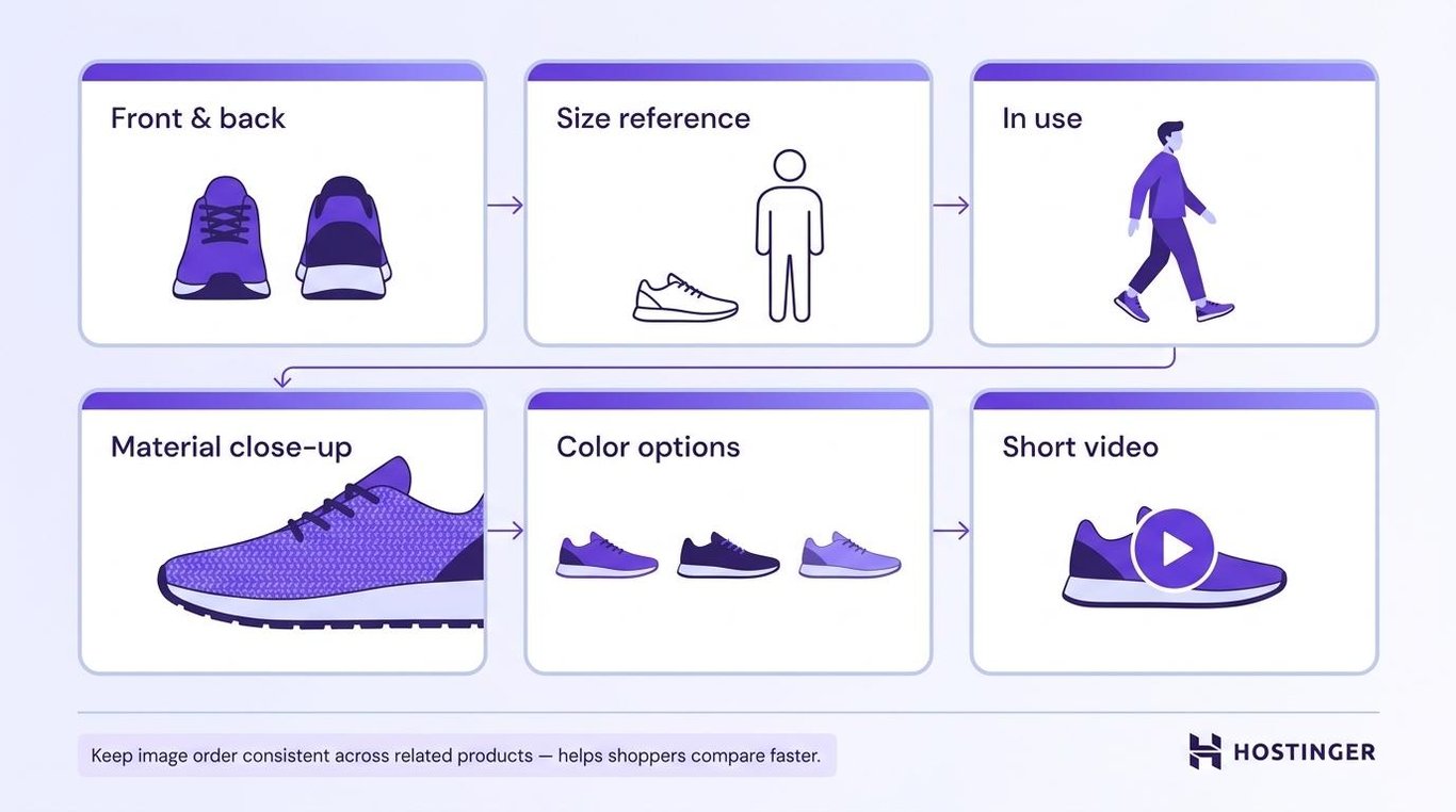
Build each image gallery around those needs:
- Show the front, back, sides, and important details.
- Include a photo that makes the size clear.
- Show the product being used.
- Add close-ups of materials or finishes.
- Display each color or design option.
- Use a short video for movement, setup, or operation.
- Let shoppers zoom on phones and computers.
Keep the image order similar across related products. This helps shoppers compare them faster.
Compress every file before uploading it. Extra images won’t help if they slow down the page.
7. Write descriptions that answer buying questions
Tell shoppers what the product does, who it’s for, and whether it will meet their needs.
Start with the main benefit. Then add the details people need to check the size, fit, quality, or compatibility.
“500 ml stainless steel bottle” only tells shoppers the size and material.
A better description would explain that the bottle holds enough water for a short workout, fits in standard cup holders, and can go in the dishwasher.
Include details such as:
- What the product is used for
- Materials and dimensions
- Size or fit guidance
- Compatible products or devices
- What comes in the package
- Cleaning and care instructions
- Setup steps
- Warranty or return conditions
Use short paragraphs for benefits and bullets for product facts.
Customer questions, reviews, and return reasons show what the page is missing. Add the answer whenever shoppers keep asking the same question.
8. Make the next action obvious
Make it clear what shoppers need to do after reading the product details.
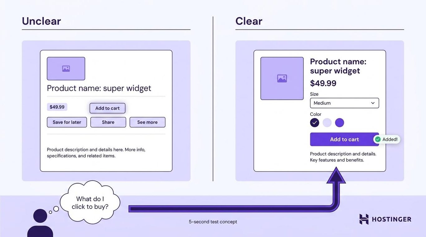
The main call to action (CTA) might say Add to cart, Buy now, Choose a size, or Select an option. The wording should match what happens after the shopper clicks.
Check whether the button:
- Sits close to the price and product options
- Stands out from the background
- Remains visible on long phone pages
- Shows that the click worked
- Explains what shoppers must select first
- Competes with other large buttons
Try a five-second test. Show the page to someone who hasn’t seen the store before, then ask what they would click to buy the product.
Don’t start by testing slightly different button colors. Fix unclear wording, poor placement, hidden options, and competing buttons first.
9. Show reviews and proof that the store is reliable
Place proof close to the question or concern it answers.
Show the product rating and number of reviews near the title. Put a short returns message near the add-to-cart button. Show accepted payment methods near the cart or checkout.
Useful proof includes:
- Verified purchase labels
- Recent customer photos
- Ratings on category pages
- Clear shipping and return information
- Customer service contact details
- A business address, when relevant
- Recognized payment logos
- A secure HTTPS checkout
Ask for reviews after customers have had enough time to use the product. A meal can be reviewed quickly, while furniture or electronics need more time.
Don’t remove every negative review. A calm reply that explains how you fixed the situation can build more trust than a page with only perfect scores.
Avoid filling the page with security badges. Too many can make the store look less reliable.
10. Display shipping costs before checkout
Show shipping costs before shoppers reach the final payment step.
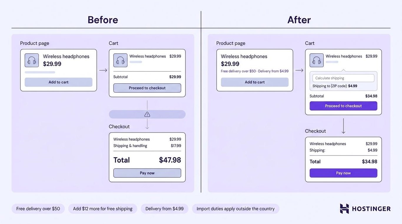
A much higher total at checkout forces them to rethink a purchase they had already decided to make.
Put shipping information on the product page or in the cart. When the exact cost depends on the address, explain how it’s worked out or add a shipping calculator.
Clear messages include:
- Free delivery over $50
- Add $12 more for free shipping
- Delivery from $4.99
- Taxes based on your location
- Import duties apply outside the country
Show the full order total before payment whenever possible. Include the required fees rather than adding them at the last moment.
Compare the final delivered price with competitors, not only the product price. A low-priced item still feels expensive when high shipping costs and extra fees appear later.
11. Remove unnecessary checkout steps
Ask for only the information needed to take payment and deliver the order.
Every extra field gives shoppers another chance to make a mistake or decide that checkout is taking too long.
Review each field and ask what would happen if you removed it. When the answer is “nothing,” remove it.
A simpler checkout might:
- Fill in addresses as shoppers type
- Use the shipping address as the billing address by default
- Keep information after an error
- Show errors beside the field that needs fixing
- Keep the full order total visible
- Show how many steps remain
- Remove menus and promotions that distract from payment
- Select the most common delivery method without hiding the others
A one-page checkout isn’t always easier. A short checkout with several steps works well when each screen asks for one type of information.
Test different phones, computers, addresses, discount codes, delivery choices, and payment methods. Some checkout errors only appear in specific situations.
12. Let shoppers buy without creating an account
Let shoppers pay without forcing them to create an account first.
Offer guest checkout as a clear option. After payment, invite the customer to create a password so they can track the order or save their details.
You can still:
- Collect an email address for order updates
- Ask for marketing permission separately
- Offer loyalty points after purchase
- Save the order to a new account
- Give returning customers a quick sign-in option
This keeps account creation out of the way while the shopper is trying to pay.
Don’t hide the guest checkout behind a small link. Make it as easy to find as the sign-in option.
13. Offer payment methods your customers use
Give shoppers payment options they already know and trust.
Customers in different countries use different payment methods. The right choices also depend on the device they use and the price of the order.
Options might include:
- Credit and debit cards
- PayPal
- Apple Pay
- Google Pay
- Local bank payments
- Buy now, pay later services
Use real payment data to decide what to add:
- Check which payments failed or weren’t completed.
- Review where your customers live.
- Ask the support staff which payment questions come up most often.
- Add the most requested option.
- Check whether more shoppers complete payment.
Digital wallets are useful on phones because they reduce the amount of typing.
Don’t add every provider available. Each one adds fees, refund rules, support work, and another account to manage.
14. Remind shoppers about abandoned carts
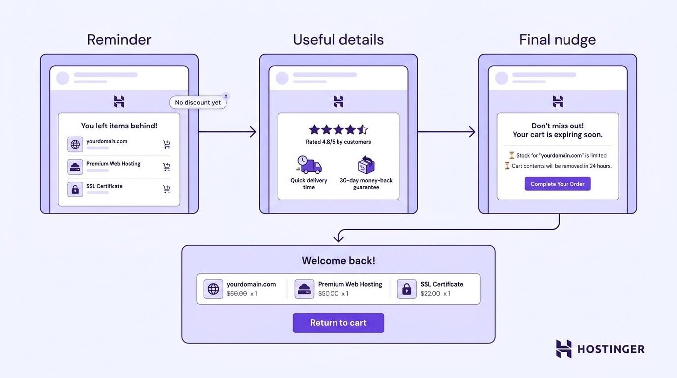
Send a few reminder messages when shoppers add products to their carts but leave without buying.
A simple sequence could work like this:
- Send a reminder soon after they leave.
- Follow up with useful details such as reviews, delivery times, or the returns policy.
- Send one final message before the cart or reserved stock expires.
When shoppers click the message, reopen the cart with the same products and options. Don’t make them start again.
Avoid offering a discount in the first message. Some repeat customers will learn to leave the cart and wait for a coupon.
Send text messages only when the shopper has agreed to receive them. Keep each message focused on the unfinished order.
15. Use urgency only when the limit is real
Give shoppers a reason to act now only when a real deadline or shortage exists.
Honest examples include:
- A sale that ends at a stated time
- A delivery cutoff for a specific date
- Low stock based on current inventory
- A preorder deadline
- A limited production run
Place the message near the offer it affects. A delivery countdown belongs beside the shipping details, not at the top of every page.
Don’t use timers that restart, permanent “today only” offers, or false stock warnings. Shoppers who notice the trick won’t trust later promotions.
Use exit popups sparingly. Show one only when the visitor is leaving, and make it easy to close.
16. Keep product recommendations simple and useful
Recommend products that help with the current purchase or make a useful next purchase.
You don’t need a complex AI system to begin.
Start with options such as:
- Frequently bought together
- Customers also viewed
- Recently viewed items
- Matching accessories
- Refills or replacement parts
- Products related to an earlier order
A laptop sleeve beside a laptop is useful. An unrelated product with a high profit margin isn’t.
Record how many people click recommendations, how many buy, and how much they spend before adding them. Check the same numbers afterward to see what changed.
Use customer information in ways people would expect. Explain in the privacy policy how browsing and order details affect recommendations.
17. A/B test changes that affect buying
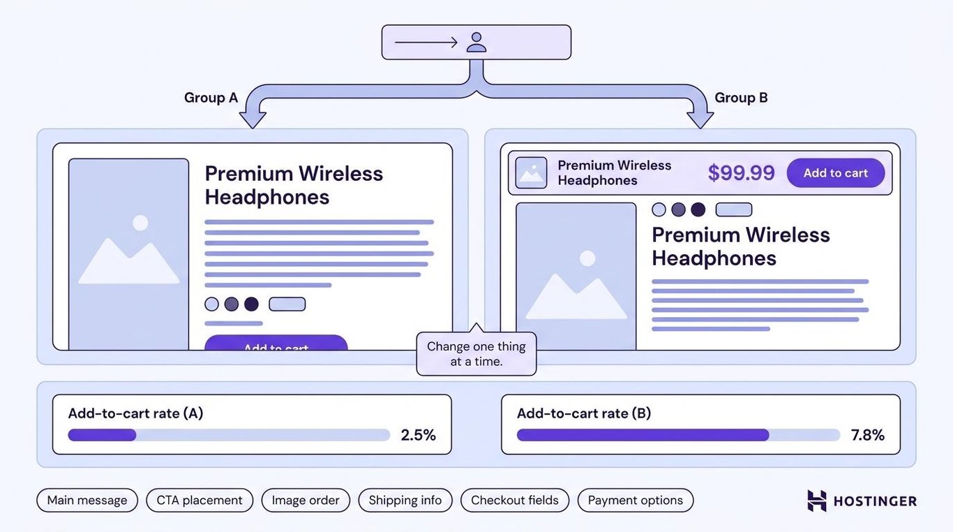
Use A/B testing to compare two versions of a page or feature.
One group of visitors sees the current version. Another group sees the changed version. You then compare which group is more likely to add a product, start checkout, or complete a purchase.
Begin with one clear reason for the test.
For example:
Mobile shoppers scroll past the add-to-cart button. Keeping it visible should help more of them add the product.
Keep everything else the same. Changing the images, wording, layout, and button at once makes it impossible to know what caused the result.
Good areas to test include:
- The main product message
- CTA placement
- Product image order
- Shipping information
- Checkout fields
- Guest checkout placement
- Payment options
Small stores might not have enough visitors to get a clear A/B test result. Compare the numbers before and after the change, read customer feedback, and check the related micro-conversions instead.
18. Attract visitors who are ready to buy
Bring in visitors whose searches closely match the products you sell.
Someone searching for “waterproof hiking boots size 9” is closer to buying than someone searching for “what shoes should I wear hiking.” Both searches can bring visitors, but they show different levels of interest.
Create product and category pages around searches that show someone is ready to buy. Include details such as product type, size, material, price, and availability.
Ecommerce SEO helps product and category pages appear in search results for queries that match what your store sells.
Check which search terms lead to purchases, not only which ones bring the most visitors. Large numbers of visitors don’t help when none of them want what the store sells.
How to prioritize ecommerce CRO work
Start with the part of the buying process where the most shoppers leave.
Before testing small changes, make sure the store has the essential ecommerce website features needed to help people find products, shop on phones, pay securely, choose shipping, and manage their orders.
Then use your store data to decide what to fix:
What you notice | What to check first |
Visitors leave before viewing products | Page speed and phone loading |
Far fewer phone visitors buy | Phone layout, menus, forms, and payment methods |
Many people view products but don’t add them | Images, descriptions, buttons, reviews, and prices |
Shoppers add products but leave the cart | Shipping costs, taxes, delivery times, and cart design |
Shoppers start checkout but don’t pay | Form length, guest checkout, errors, and payment options |
Visitors struggle to find products | Navigation, search, filters, and categories |
The store gets visitors, but few sales | Search terms, landing pages, and where visitors come from |
You don’t know where shoppers leave | Tracked steps, heatmaps, and recordings of store visits |
Fix slow pages, broken phone layouts, unclear prices, and checkout errors before testing small wording or design changes.
Work on product pages when shoppers look but don’t add anything. When many shoppers add products but don’t pay, check shipping, guest checkout, payment options, and form errors.
Leave product recommendations and A/B tests until shoppers can find a product and complete checkout without trouble. These changes are easier to judge once the basic store already works.
How to build a conversion-ready ecommerce store
A good ecommerce platform should help shoppers find products and pay without forcing you to connect a separate tool for every store feature.
Hostinger Ecommerce lets you manage products, orders, inventory, payments, and sales channels from one dashboard. It supports over 100 payment methods and tracks sales, orders, and average order value.
The Reach integration can also send abandoned cart emails to subscribed shoppers who start checkout but don’t finish.
Features like these make it easier to bring shoppers back and improve checkout. However, the platform won’t fix unclear product details, poor images, or hidden shipping costs on its own. You still need to check how shoppers browse, compare products, and pay.
Choose one reason shoppers leave, change one part of the store, and compare the new numbers with where you started. Once more shoppers complete the buying process, use the same approach to increase online sales by attracting the right visitors and bringing customers back.

Alma is an AI Content Editor with 9+ years of experience helping ideas take shape across SEO, marketing, and content. She loves working with words, structure, and strategy to make content both useful and enjoyable to read. Off the clock, she can be found gaming, drawing, or diving into her latest D&D adventure.