15 best Black Friday landing page examples
Sep 10, 2026
/
By Alma & Jordana A.
/
12 min Read
The best Black Friday landing page examples share three things: a clear offer, a direct path to checkout, and enough urgency to keep shoppers from looking elsewhere.
Black Friday brings more traffic in a few days than at any other point in the year, and most of those visitors have never seen your store before. They’re checking multiple sites for the best deal, and they’ll leave if they can’t find your deal in seconds.
A dedicated landing page puts the offer first instead of hiding it behind your usual menus and category pages, where seasonal shoppers won’t go looking.
Here’s how 15 brands pull this off, from minimalist gift-card pages to year-round content hubs, along with what you can take from each:
Here’s how 15 brands pull off their Black Friday landing pages:
- Display discounts and pricing clearly, simple but effective — Apple, DJI, WP Rocket, Steam
- Use countdowns, early access, and limited drops to create urgency, so shoppers buy now instead of later — BIKE24, Sephora, Ghost
- Organize deals so shoppers don’t have to dig, putting the customer first — Target, Gymshark, Costco, Brooks Brothers
- Keep their Black Friday page live all year so it’s ready when the next sale hits — Samsung, Delsey
- Let tone and branding do the selling, no heavy visuals needed — Lena Layne, The North Face
1. Apple
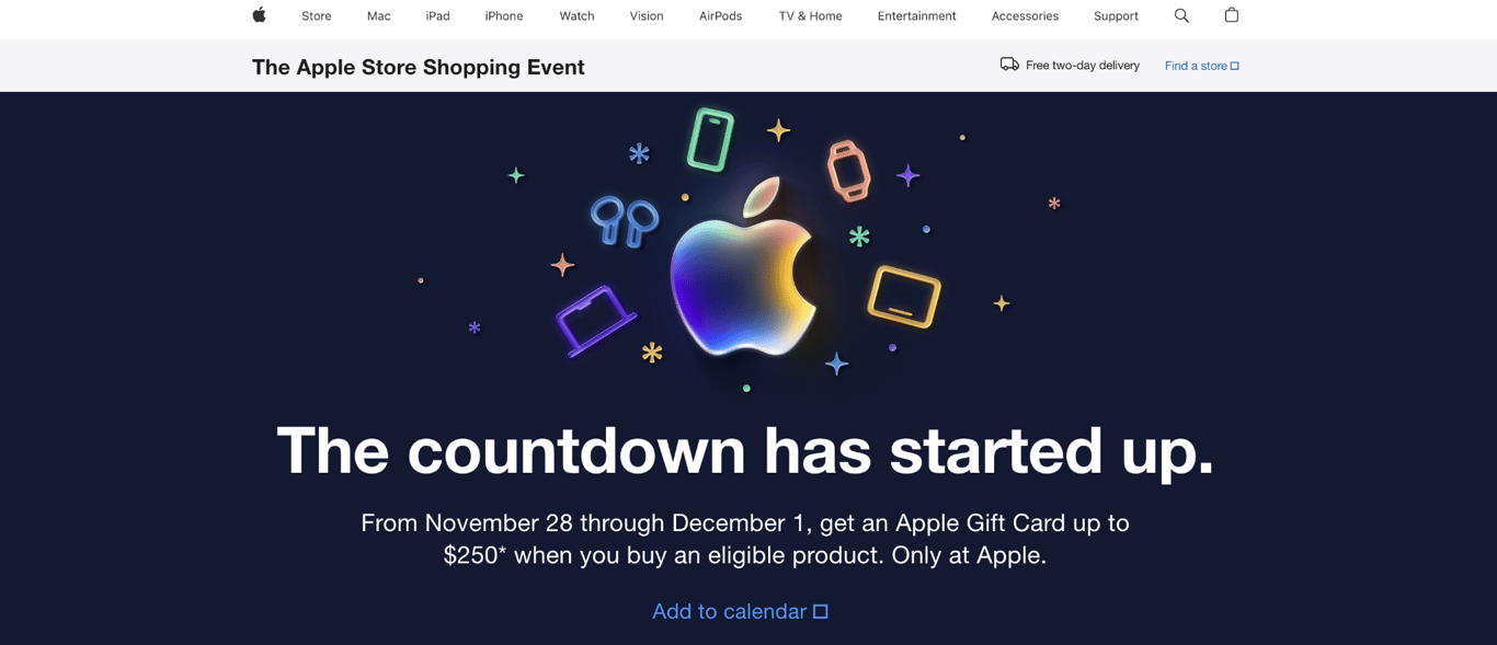
Apple takes a different approach to Black Friday than most retailers: instead of cutting prices, the company offers gift cards worth up to $250 with eligible product purchases.
The page runs for a short window (typically four days, from Black Friday through Cyber Monday) and links directly to product pages for each category. It’s a strong example of landing page design that lets the offer speak for itself.
The takeaway: You can run a successful Black Friday campaign without cutting prices. Gift card incentives protect your margins while still giving shoppers a reason to buy now instead of waiting.
Apple also keeps the landing page live after the event ends, redirecting it to promote current offers. This preserves the page’s search ranking and link equity year-round.
2. Gymshark
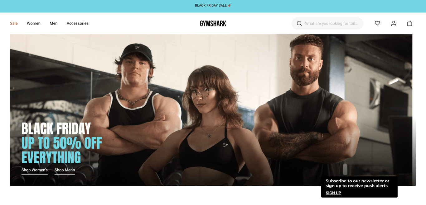
Gymshark’s Black Friday landing page is live all year and works as a planning guide, not just a sale announcement. Months before the sale goes live, the page features FAQs about return policies, sale start dates, and product guides, all designed to help shoppers plan ahead.
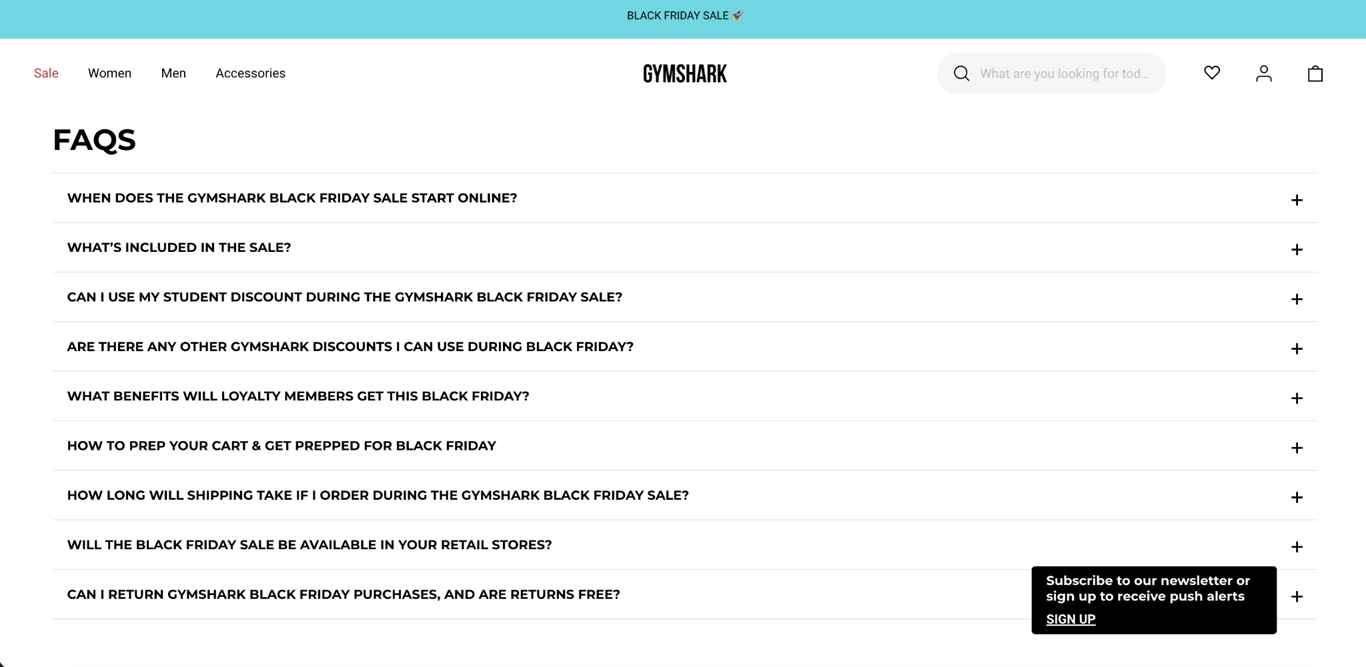
The page prompts visitors to download the Gymshark app for early access to deals and encourages them to create wishlists. A loyalty program signup is featured prominently, offering members even bigger discounts.
When the sale finally launches (up to 50% off sitewide), shoppers already know what they want and how to get it.
This kind of evergreen page is also a good foundation for customer retention strategies after Black Friday, since visitors who download the app or join the loyalty program stay connected long after the sale.
The takeaway: Building your Black Friday landing page months in advance and treating it as a planning resource lets you capture search traffic long before competitors launch their campaigns.
3. Target
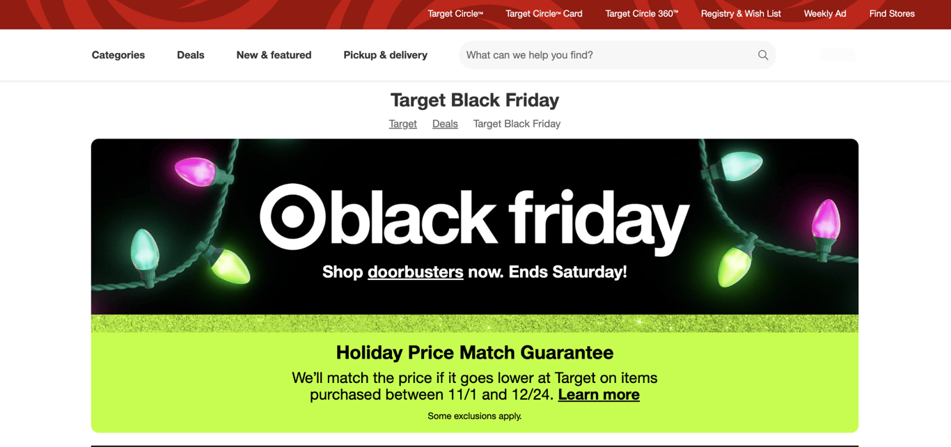
Target’s Black Friday landing page groups a huge catalog so shoppers can reach what they want in one click. Deals are split into clear categories (electronics, home, toys, clothing) and a “Deal of the Day” section rotates one-day-only offers that give shoppers a reason to keep coming back.
Navigation is simple. Category tiles let visitors jump straight to the products they care about without scrolling through unrelated items. Low-stock indicators and “limited time” badges on individual products create urgency at the item level rather than across the whole page.
This structured approach helps improve your ecommerce customer experience during the busiest shopping weekend of the year.
The takeaway: When you sell across many categories, organized navigation and rotating daily deals keep shoppers engaged longer than a single static discount banner.
4. Lena Layne
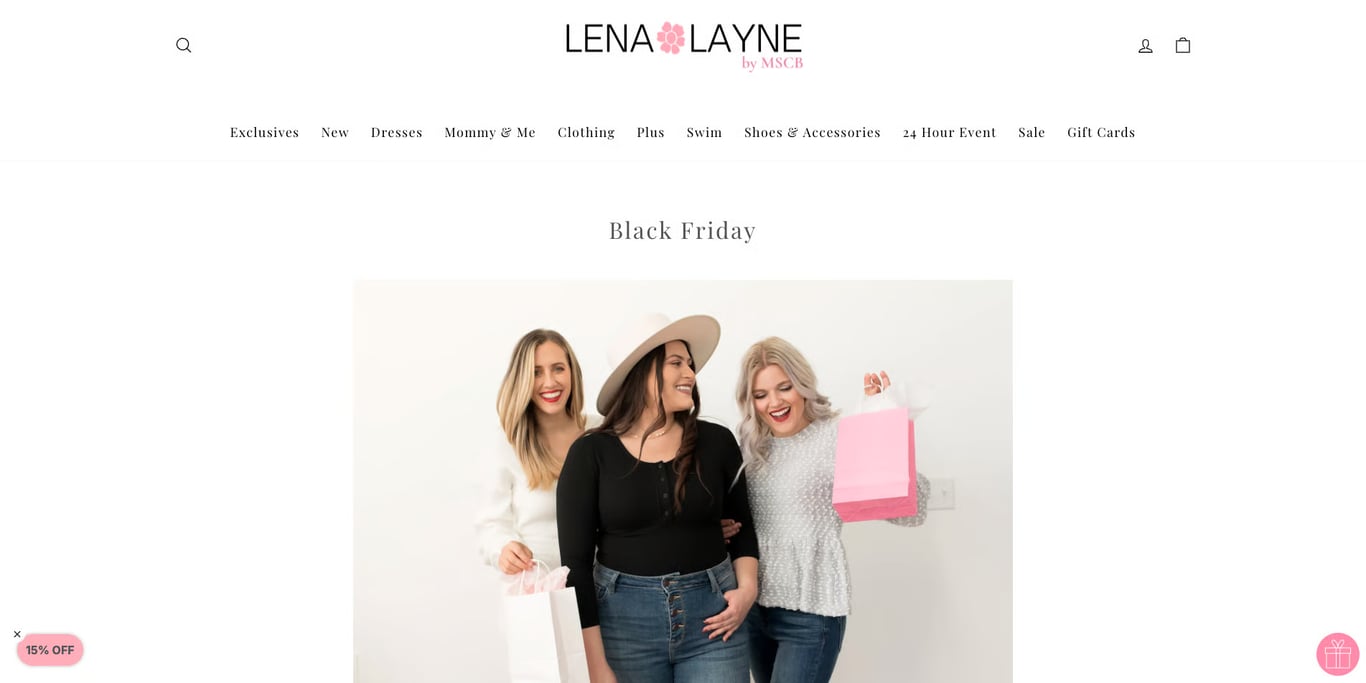
Lena Layne’s Black Friday landing page is written like a personal letter, with all the key details in plain text: when the deals start, the discount percentage, and which items are included. The warm, inviting tone reflects the brand’s friendly, personal image.
Phrases like “Take the perfect Christmas photos” and “Shopping for a loved one?” appeal to customers’ emotions, giving shoppers a reason to buy now without countdown timers or stock warnings.
The takeaway: A text-focused landing page with a warm, personal voice can be just as effective as a visually heavy design, especially for brands built on personal connection.
5. BIKE24
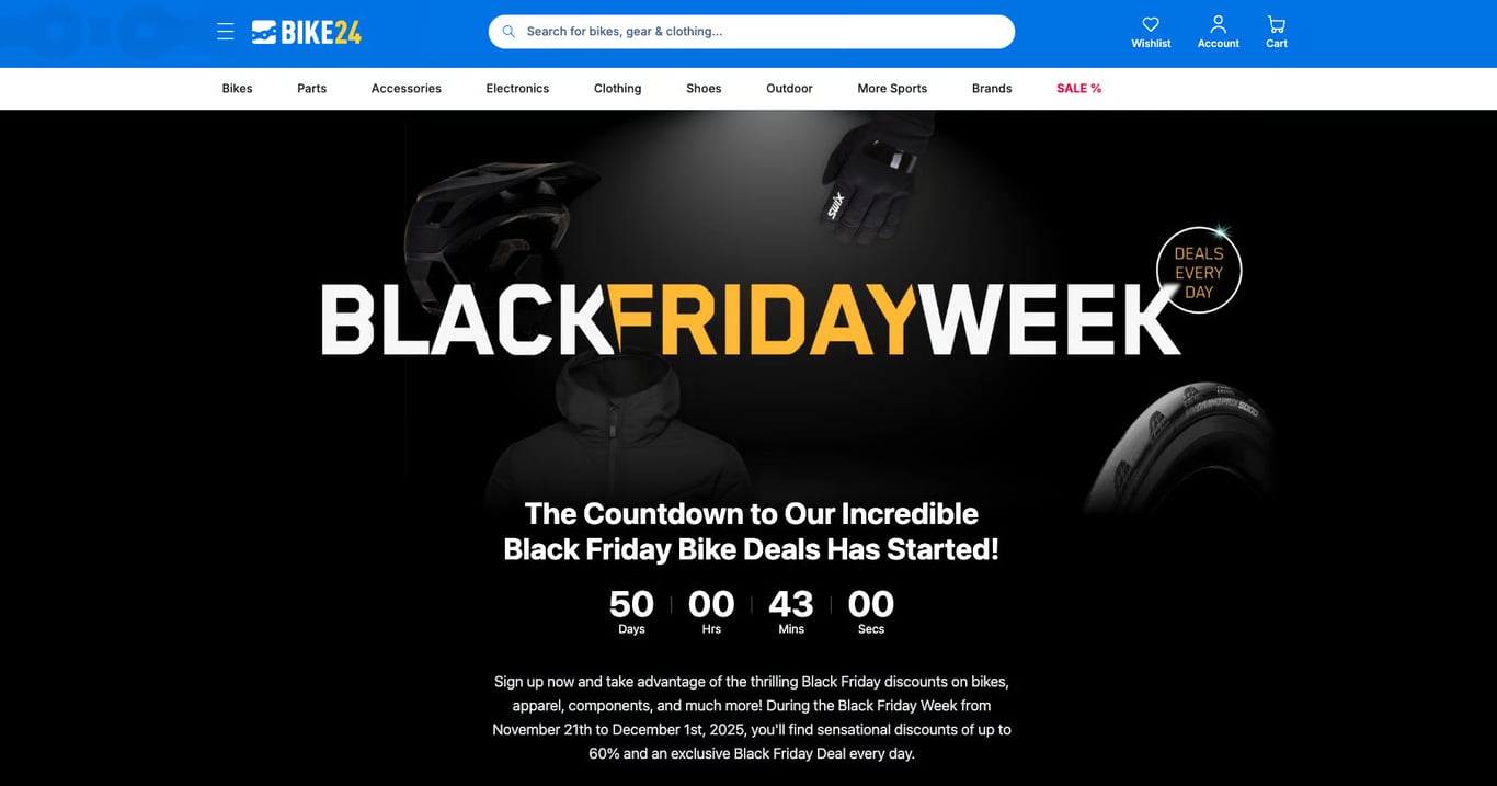
BIKE24, an online retailer specializing in bikes and cycling gear, keeps its Black Friday page simple: a bold “Black Friday Week” heading and a badge for daily deals, so it’s immediately clear that there are new discounts each day.
A prominent countdown timer adds urgency, a classic Black Friday marketing tactic that works especially well for time-limited daily offers.
The page also invites visitors to sign up for the newsletter, so shoppers keep hearing about deals after Black Friday ends. A Black Friday email marketing strategy built around this kind of signup means you can email those shoppers directly before your next sale.
The takeaway: Pairing a countdown timer with rotating daily deals creates a reason to visit the page multiple times, increasing the chances of a purchase.
6. Sephora
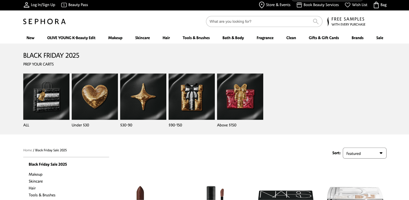
Sephora uses its Black Friday landing page to drive app downloads by showing shoppers the actual deals before the sale opens. The beauty retailer gives app users exclusive early access to Black Friday deal previews, letting them scroll through curated sets and bestsellers before the sale goes live.
The landing page promotes the app front and center, with a clear call to action to download it. Once inside the app, shoppers can browse upcoming deals, add favorites to their wishlists, and receive push notifications when offers become available. By launch day, shoppers already know what they want and what it costs.
Sephora’s approach mirrors the tactics behind effective Black Friday newsletter examples – show the deals early, then send a reminder the moment they go live.
The takeaway: Showing your discounts before the sale starts lets shoppers decide in advance, so the first minutes of your sale go to checkouts instead of browsing.
7. Steam
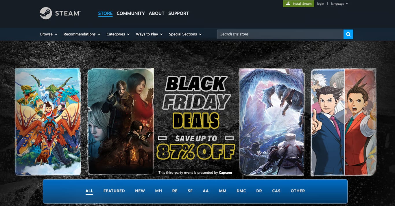
Steam is a popular digital marketplace for games, and its Black Friday landing page for Capcom games shows how to sell with images instead of copy.
The landing page displays vibrant images of Capcom’s most popular titles, like the Resident Evil series and the Ace Attorney Investigations collection. A shopper can see what’s on sale without reading a word.
The middle section highlights Black Friday deals, offering discounts of up to 87% on various Capcom titles. “Save up to” pulls people in with the biggest number available, and the exact figure underneath – 87% rather than a rounded 85% – makes that number read as a real calculation rather than a marketing estimate.
This pairing of a headline number with exact per-item pricing is a common Black Friday pricing strategy.
The takeaway: Lead with your biggest discount to get attention, then show exact percentages on individual products so the headline number feels credible rather than exaggerated.
8. Costco
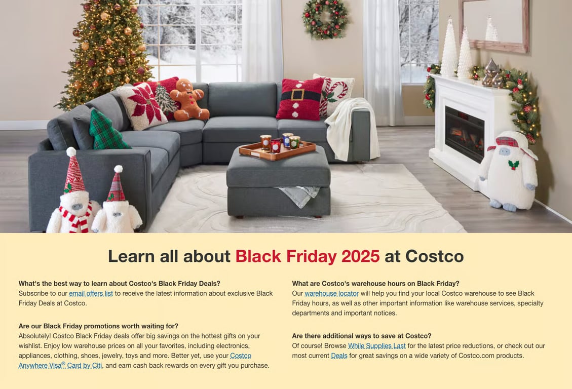
Costco’s Black Friday landing page carries almost no discounts at all – it answers logistics questions instead. Because most people come to Costco for groceries and household essentials, the page is built around getting them into the warehouse rather than announcing percentages.
The page opens with a picture of a cozy, holiday-themed living room, setting a seasonal mood before any selling starts.. It’s followed by an FAQ section about the company’s Black Friday offers: the best way to stay updated, items on sale, warehouse hours, and tips for securing the best deals.
Scrolling down, you’ll find sections promoting holiday items, from house decorations to gift ideas and treats for yourself. There’s no mention of specific discounts.
By prioritizing helpful content over hard sells, Costco stays useful to shoppers who aren’t ready to buy yet, which is what keeps them returning and helps increase sales online well beyond the Black Friday weekend.
The takeaway: When your Black Friday depends on store hours, stock levels, or membership rules, those details matter more to shoppers than the discount headline. Answer the practical questions, and you remove the reasons people leave before buying.
9. The North Face
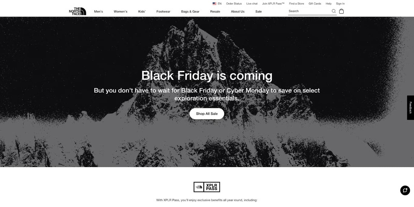
The North Face’s Black Friday landing page opens with a simple heading: “Black Friday is coming.” The brand, known for high-quality outdoor clothing and gear, keeps the page stripped back to a single message.
Under the heading, visitors are told they don’t have to wait for the deals,, letting bargain hunters know they can take advantage of discounts before the Black Friday rush.
The landing page then promotes The North Face’s loyalty program, detailing benefits like early access to sales, members-only events, and free shipping. A clear call to action (CTA) makes it easy for potential customers to sign up and start using those benefits right away.
The takeaway: Making early access to your Black Friday sale a members-only benefit turns the discount into a reason to join, not just a one-time cost.
10. Samsung
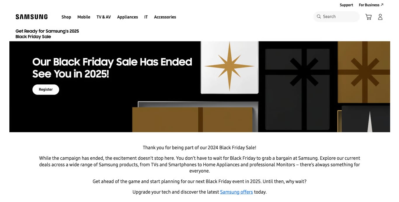
Samsung keeps its Black Friday landing page live year-round, even after the sale has ended.
When the sale is over, the page displays a message like “Our Black Friday Sale Has Ended,” along with a signup form to get notified about future deals. The page stays in search results, so the people still searching for Samsung Black Friday deals in January land on something useful instead of an error page.
This type of page can be reused throughout the year for other sales events. When Black Friday rolls around again, Samsung can refresh the content while retaining the link equity and search authority the page has built over time.
The takeaway: Keeping your Black Friday landing page live year-round preserves its search rankings and lets you collect email subscribers continuously, giving you a head start on next year’s campaign.
11. DJI
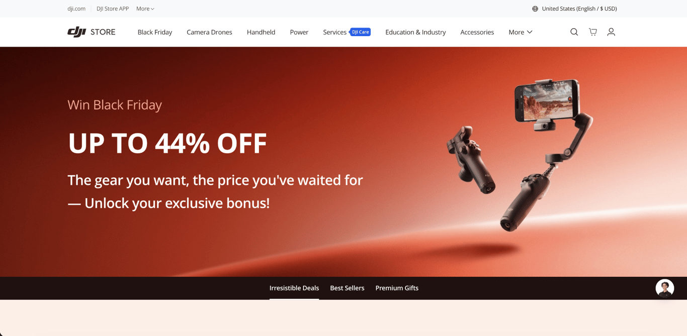
DJI, the drone and camera manufacturer, gathers all its Black Friday deals onto a single dedicated landing page. A hero banner leads with the headline discount (up to 44% off), followed by tabbed sections like Irresistible Deals, Best Sellers, and Premium Gifts that let shoppers jump between categories.
The page opens with one large product image, followed by a secondary navigation menu, allowing shoppers to quickly jump between product categories such as drones, cameras, and accessories.
Each product section displays original and discounted prices side by side, so shoppers see the amount they’re saving without doing any math.
Product photography is high-quality and consistent across all sections, giving the page a polished, cohesive look. The layout stays focused on products rather than walls of promotional text.
The takeaway: Show the old price next to the new one on every product. Shoppers comparing several stores judge your offer at a glance, and a discount they can see beats a percentage they have to calculate.
12. Delsey
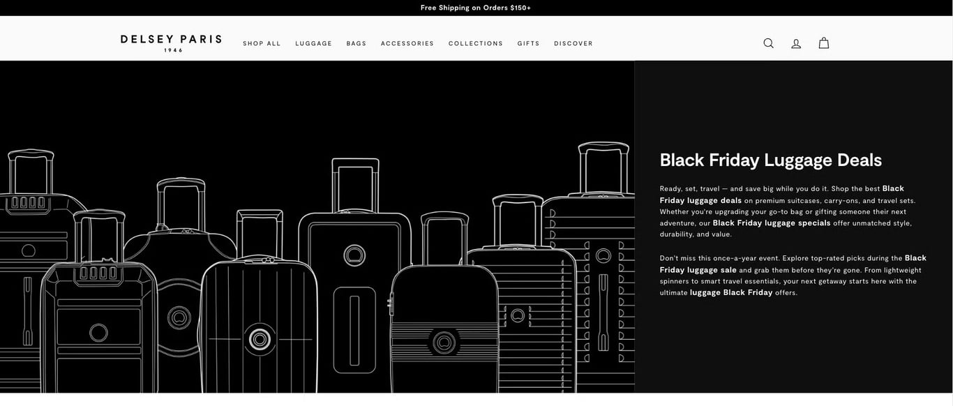
Another effective way to keep a Black Friday landing page useful beyond a single season is by leaving the specific year off the page, as Delsey does.
The luggage and travel accessories brand keeps things simple with an introductory text written around the terms shoppers search for, followed by a catalog of its best-selling products.
The catalog shows both starting and final prices, so customers see exactly how much they save by purchasing during the sale. This creates urgency without relying too heavily on calls to action, subtly encouraging visitors to act quickly.
The takeaway: Keeping the year out of your Black Friday landing page’s URL and headings means you can update and reuse the same page every season, instead of building a new one that starts from zero in search results.
13. WP Rocket
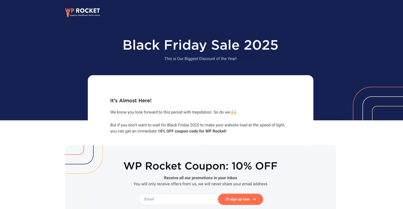
WP Rocket, a WordPress speed plugin, displays the heading and the discount code at the same font size on its Black Friday landing page, so the code is impossible to miss.
This design choice is intentional. By giving equal visual weight to the discount code and the sale message, WP Rocket removes any confusion, so visitors see the value right away. There’s no hunting for a promo code buried in the page or hidden in the details.
Below the discount code, the page features a signup form and links to social channels, making it easy for visitors to stay connected with the brand.
The takeaway: Displaying the discount code at the same size as the headline removes friction and lets visitors grab the deal without searching for it.
Pro tip
Browse other Black Friday deals to learn what discounts work best and how to phrase your offers to attract more buyers.
14. Ghost
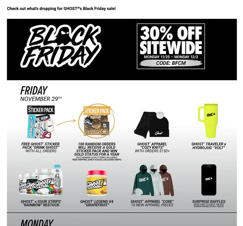
Ghost, a fitness supplement brand, runs a different kind of promotion each day of its Black Friday week. Shoppers can enter raffles through the app, receive free limited-edition products with qualifying orders (like a special-edition energy drink flavor sold nowhere else), and access new releases throughout the week.
The point isn’t a bigger discount each day. It’s a different reason to open the page each day, which keeps shoppers checking back across the whole week rather than only on Black Friday.
Combining these daily events with email marketing automation – like triggered reminders for each event day – would make this approach even more effective.
The takeaway: Changing the type of promotion each day (raffles, free products, limited releases), rather than just rotating which product is on sale, gives shoppers a new reason to open your page across the whole sale week.
15. Brooks Brothers
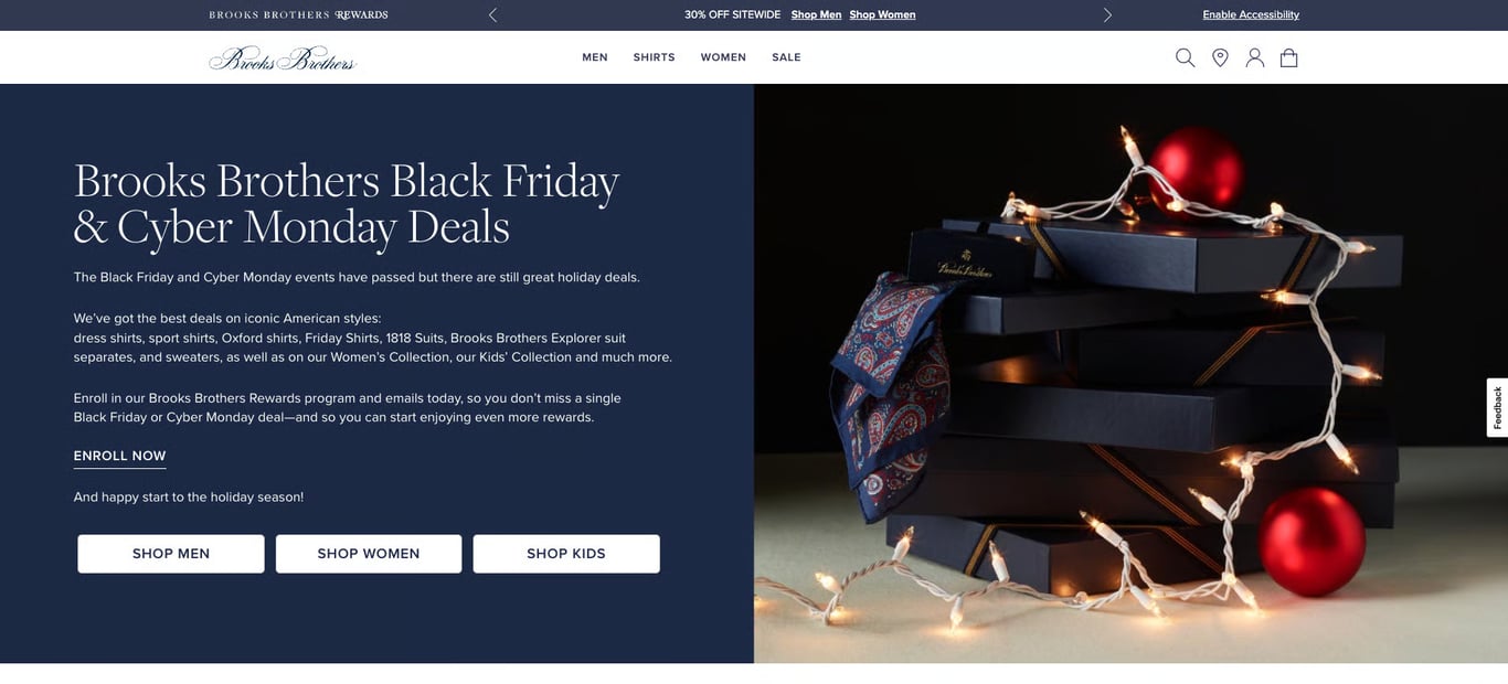
Brooks Brothers builds its Black Friday landing page around the questions first-time buyers have before ordering. Black Friday brings in a lot of people who have never bought from the brand, and the page is designed to make that first purchase feel easy and low-risk.
The first part includes the standard Black Friday elements: a large product image, items on sale, and a call to subscribe to a newsletter. What sets it apart is the FAQ section at the bottom.
The fashion company addresses popular questions about Black Friday deals, then moves on to rewards programs, credit card promotions, payment methods, and order processing times.
Below relevant questions, Brooks Brothers includes helpful links, like a direct link to its rewards program page.
Answering these questions directly on the page removes hesitation and helps improve conversion rate by reducing the back-and-forth that often kills a first-time purchase.
The takeaway: An FAQ section on your Black Friday landing page addresses buyer hesitations (shipping times, return policies, payment options) and reduces the friction that stops first-time shoppers from completing a purchase.
What are the key elements of successful Black Friday landing pages?
Successful Black Friday landing pages match the offer to the audience and remove every obstacle between “I’m interested” and “I bought it.”
The content depends on your brand voice and goals, but pages that convert well during the shopping season tend to share these elements:
- A clear, attention-grabbing headline. The headline should convey the sale’s key offer right away, such as “Black Friday Deals: Up to 70% Off.” Make sure the font size, color, and placement make the headline stand out above everything else on the page. For context, the median landing page converts at 6.6%, so anything that makes your offer clearer in the first second is worth the effort.
- Deadlines shoppers can see. Countdown timers, “limited stock” badges, or phrases like “ends Friday at midnight” give shoppers a clear reason to act now. Specific deadlines are more effective than vague urgency because they give shoppers a concrete timeframe for making a decision.
- Eye-catching visuals. High-quality product images or graphics highlighting featured deals make the page more appealing. During Black Friday, shoppers are scanning dozens of sites, so strong visuals help your offers stand out in the first few seconds.
- One clear call to action (CTA). A visible, compelling CTA like “Shop Now” or “Grab the Deal” tells shoppers what to do next.. Keep it to one primary CTA per section so shoppers aren’t choosing between competing buttons.
- Clearly worded deals. Be specific about what you’re offering: “Save Up to 50%” or “Buy One Get One Free.” Vague claims like “amazing savings” don’t give shoppers enough to act on.
- Simple navigation. An easy-to-navigate layout helps visitors find the deals they want without feeling overwhelmed. Category filters and jump links are especially useful if you sell across multiple product lines.
- Mobile-first design. Over 55% of Black Friday purchases happen on mobile, and the number keeps growing. A responsive design that loads fast and makes CTAs easy to tap on a small screen isn’t optional.
- Social proof and trust signals. Customer reviews, ratings, or secure checkout badges reassure visitors, especially first-time buyers who found your store through a Black Friday search.
- Post-sale engagement. Adding a section for email signups or social media follows helps you keep in touch with Black Friday shoppers for future promotions. A one-time buyer who joins your email list is worth far more than a single sale.
How to optimize a Black Friday landing page for AI search
To optimize your Black Friday landing page for AI search, make your product and deal information as specific and structured as possible. AI tools like Google AI Overviews, ChatGPT, and Perplexity pull concrete facts from pages to compare deals for shoppers, so vague marketing copy won’t get picked up.
These details also need to live in your page text, not inside images or banner graphics. Some AI tools can read text in images, but page text is far more reliably picked up, so a deal that appears only in a designed banner risks being missed entirely.
For instance, a page that says “incredible savings on our best products” gives AI nothing to work with. But a page that says “40% off the Pro Plan, normally $49/month, now $29.40/month through December 1″ gives AI a specific fact it can cite and compare.
With that in mind, make sure your Black Friday landing page includes the following:
- Accurate pricing and availability. List original prices, discounted prices, and exact sale dates. Update the page immediately when a deal sells out or changes. AI tools can surface outdated information if your page still advertises an expired offer.
- Structured product details. Include product names, key specs, and discount amounts. The more specific the detail, the more likely AI tools will pull it into a comparison.
- FAQ content. Questions like “When does the Black Friday sale start?” and “What’s the return policy during Black Friday?” are exactly the type of queries shoppers ask AI tools. Answering them directly on your landing page increases the chance that AI cites your page.
- Schema markup. Schema markup is a bit of code you add to your page that labels your content for search engines, like tagging a price as “price” and a product name as “product name” so machines don’t have to guess. Adding Product and Offer schema (with pricing, availability, and sale dates) helps both search engines and AI tools understand your deals at a technical level.
- Reviews and ratings. AI tools favor pages with social proof. If your products have customer reviews and star ratings displayed on the landing page, those details can appear in AI-generated recommendations.
- Shipping and checkout details. Include information like shipping timelines, free shipping thresholds, and accepted payment methods. Shoppers frequently ask AI tools about these details when comparing stores.
AI search isn’t replacing traditional SEO for Black Friday. But it’s becoming another channel where shoppers narrow down where to buy.
If you sell products directly, our guide to Black Friday in AI search walks through how to structure product feeds, pricing, and availability so AI tools can actually find and compare your offers.
How do I create a highly converting landing page?
To create a high-converting Black Friday landing page, start with one goal and build every element around getting visitors to take that single action.
- Choose one primary goal. Avoid trying to sell products, collect emails, and promote a loyalty program all on the same page. Decide which action matters most and build the page around it.
- Write a clear headline and CTA. Use a headline that communicates your main offer in one sentence. Follow it with copy that explains what customers get and why the offer matters, rather than focusing only on the discount percentage. Then, add a clear, action-oriented CTA that directs visitors toward your main goal.
- Add visuals, social proof, and conversion elements. Use high-quality product images to support your message and add customer reviews or ratings to build trust. For Black Friday campaigns, elements like countdown timers, product showcase sections, and prominent CTA buttons can also help create urgency and make your offers easier to browse.
- Choose or build your landing page. Pick a template that supports the structure and elements you need. If none of the available templates fit your campaign, you can also create a landing page from scratch.
- Publish, test, and optimize. Once your landing page is live, run A/B tests on elements such as your headline, CTA placement, and page layout to see what drives the most conversions.
For ecommerce stores, the landing page is one piece of a larger campaign. Check out our Black Friday ecommerce campaign checklist to learn what else to prepare.
If you want to launch faster, Hostinger AI Builder can generate a complete Black Friday landing page from a simple description. You can customize the sections with drag-and-drop editing, use mobile-friendly templates, and quickly update promotions as deals change or sell out.
For $3.99/month in the Unlimited plan, you’ll also get access to AI tools, a free domain name for the first year, email marketing features, and various marketing integrations. Plus, the 30-day money-back guarantee lets you try it risk-free.

Alma is an AI Content Editor with 9+ years of experience helping ideas take shape across SEO, marketing, and content. She loves working with words, structure, and strategy to make content both useful and enjoyable to read. Off the clock, she can be found gaming, drawing, or diving into her latest D&D adventure.

Jordana is a Senior Content Writer with a background in Information Systems. She has over five years of experience in WordPress and is casually dabbling with PHP and MySQL. Her passion for writing and technology drives her to create tutorials for anyone wanting to build their online presence. Follow her on LinkedIn.