19 best website design examples for inspiration in 2026
Jan 21, 2026
/
Linda D.
/
11 min Read
A well-designed website can captivate visitors, convey your brand’s message, and establish credibility. It also improves the user journey, making navigation and accessing information easier for visitors.
In this article, we’ve carefully curated 19 of the best website design examples to inspire your creativity and help you achieve exceptional results when designing your own website.
We consider the latest web design trends to ensure you get a big picture of the contemporary aesthetic. Whether you’re working on personal or professional projects, we hope you can get design inspiration from these website examples.
In addition, we’ll cover some of the best website design practices to help you embark on your own journey in building a website that captivates, converts, and leaves a lasting impression.
Top 15+ Website Design Inspirations of 2026
From minimalism to nostalgic design and the brutalist approach, here are the 19 website design inspirations to help you get started. Regardless of your website ideas, we’ve collected the best examples encompassing various industries. Each website has special attributes that set them apart.
1. Foundry
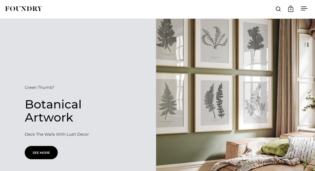
- Made by: eCommerce platform
- Category: art
Foundry, a wall decor eCommerce website, is one example of a successful minimalist web design implementation.
Its exceptional use of negative space and the black-white-gray color scheme provides a visually appealing and user-friendly experience. This allows elements to breathe, letting website visitors focus on content without distractions.
Foundry’s minimalist style, aligned with the principles of flat design, provides a modern and streamlined user experience. The absence of shading and excessive highlights enhance information clarity and readability.
In addition to its minimalistic approach, Foundry incorporates a grid layout, reinforcing the website’s clean and organized structure. This website layout ensures a systematic arrangement of content elements and facilitates easy navigation.
2. Supima
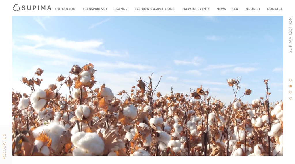
- Made by: WordPress content management system
- Category: fashion and apparel
Supima is another minimalist website example. Its clever use of negative space and the attention-grabbing hero image is inspiring.
Incorporating negative space with pastel colors, the cotton fabric provider breaks the stereotypical black-and-white minimalist design. The use of white space allows the colors and design elements to breathe while maintaining a clean and uncluttered aesthetic.
Supima’s hero image features a stunning visual that entices visitors and leaves a good first impression. Aside from setting the tone for the website, it encourages visitors to engage with the site and learn more about what Supima has to offer.
Supima’s web design not only looks great – it also emphasizes function. It has an intuitive, user-friendly layout that makes it easy to navigate. Its prominent call-to-action (CTA) also encourages user engagement and boosts conversion rates.
3. Okalpha
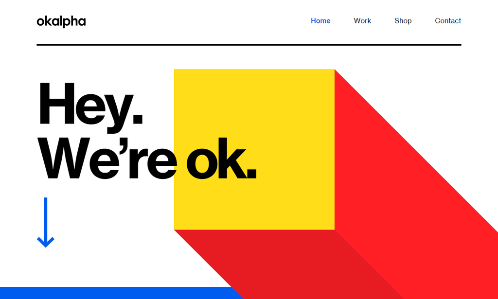
- Made by: drag-and-drop website builder
- Category: creative
Okalpha’s web design also embraces the minimalist approach, focusing on simplicity and clean aesthetics. A distinctive element of the design is the bold palette featuring primary colors.
By utilizing vibrant shades of red, blue, and yellow, Okalpha creates a striking and memorable visual identity. The bold color choices evoke a sense of energy and creativity, aligning with the brand’s mission.
The thoughtful use of the animations draws attention to important content, guiding the user’s focus. The typography is legible and visually appealing, whereas design elements and visual hierarchy smoothly assist visitors through the site.
By prioritizing simplicity, the website offers a user-friendly experience, allowing visitors to focus on the content. The unique visual identity shaped by the bold color choices also reinforces Okalpha’s attention to detail.
If you liked the design, you can create a similar project using Hostinger’s AI website designer.
4. Rick Waalders
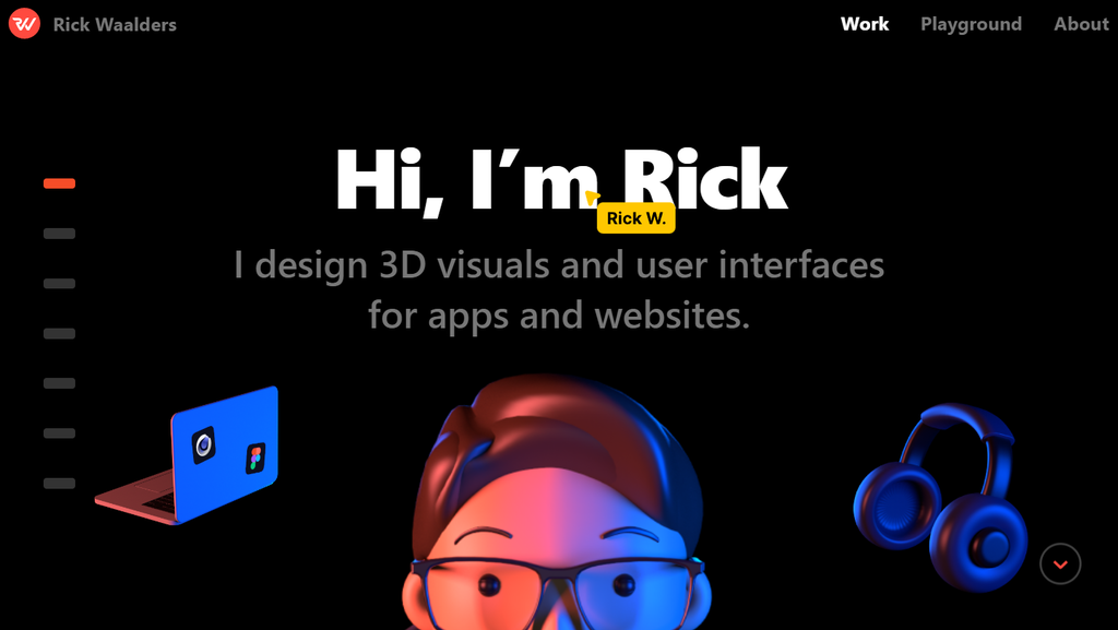
- Made by: Next.js static site Generator, CMS, web Framework, and web server
- Category: design portfolio
Rick Waalders is a web designer and developer who has gained accolades in the industry for his exceptional work. With a keen eye for detail and a passion for creativity, Waalders has established a portfolio of award-winning websites that showcase his talent and expertise.
Rick Waalders’ web design is characterized by bold typography and 3D elements. His meticulous selection of fonts and typographic arrangements adds a unique touch to the portfolio website.
Regarding 3D graphic design, Waalders uses cutting-edge technology and visual solutions, which result in a sophisticated look. He crafts the design using Cinema 4D and builds applications with JavaScript/React.
With its appealing visuals and user-friendly interface, Waalders effortlessly merges design and technology.
Suggested Reading
Advance your web design skills with our tutorial on AI-powered design tips. Discover innovative tools and strategies to create dynamic, user-friendly websites.
5. Mbau
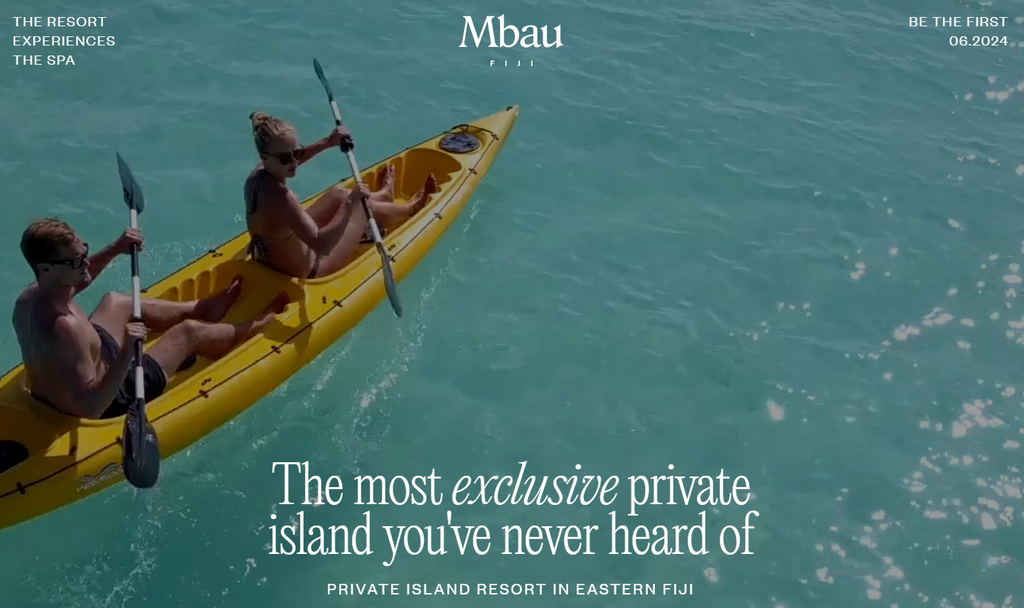
- Made by: drag-and-drop website builder
- Category: travel and tourism
Mbau, an exclusive luxury island resort in Eastern Fiji, offers a visually immersive website experience while maintaining first-rate performance.
Mbau’s website, awarded as one of CSS Design Awards’ Website of the Month, employs a stunning hero video that immediately captivates visitors. The video gives a glimpse of the tropical paradise, showcasing the island’s beauty.
Despite displaying multiple videos, Mbau’s website maintains its high performance. The web design is also mobile-first, ensuring minimal layout shifts across different devices and screen sizes.
By taking performance and layout into account, Mbau provides visitors with a seamless and enjoyable browsing experience.
6. Cure Nails
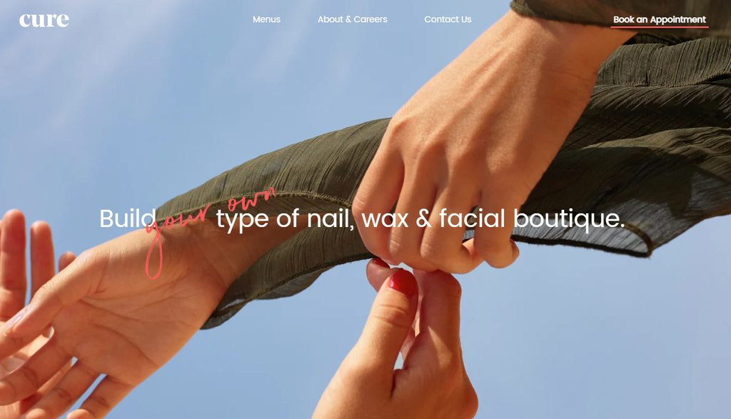
- Made by: Contentful and Nuxt.js static site generator, CMS, web framework, and web server
- Category: beauty and lifestyle
Cure Nails has a sleek and modern website design. The website showcases their nail care and beauty services with a captivating hero image on the homepage. The unique tagline in the hero section captures visitors’ attention and entices them to explore further.
In addition to subtle parallax scrolling, animations are strategically integrated throughout the website. They introduce dynamism and interactivity as visitors transition between different sections.
Combining aesthetics with accessibility, Cure Nails ensures that these features don’t distract visitors from important information. Therefore, visitors can easily navigate the site and explore their nail care products and services.
7. Outreach Space
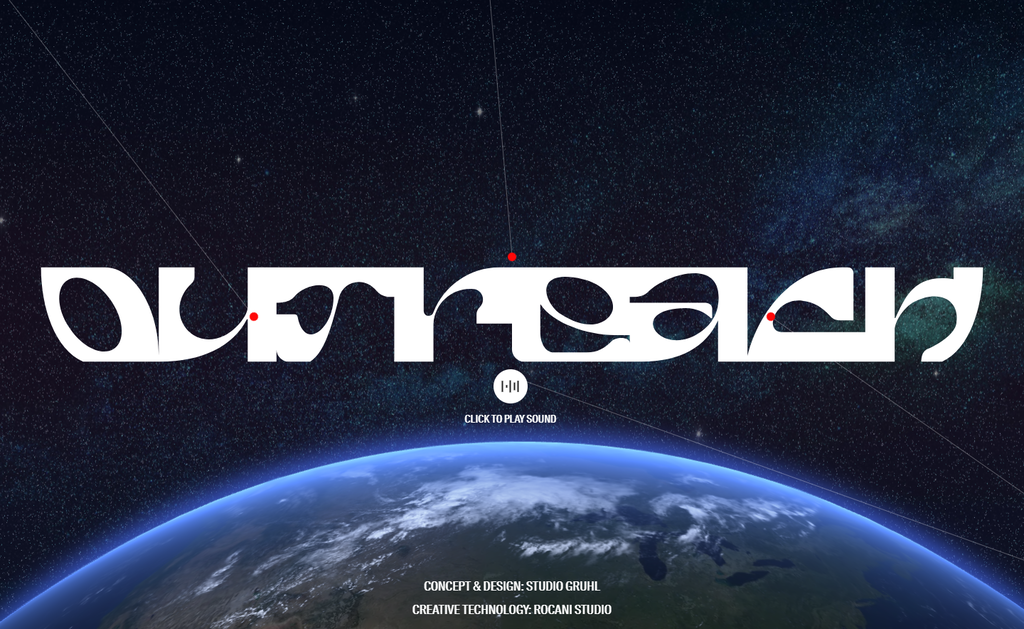
- Made by: Next.js static site generator, CMS, web framework, and web server
- Category: education
Outreach Space emphasizes modern web design elements with a futuristic appeal. Its homepage features a high-quality hero animation and artistic typography, creating a strong brand voice.
This educational website incorporates parallax scrolling. The effect creates a captivating illusion of layered content that responds to the visitors’ scrolling. With engaging visual storytelling and sci-fi-inspired design, Outreach Space has a futuristic feel.
Outreach Space’s web design carefully selects and blends hues that result in beautiful background images. The color gradients provide dimension, add a modern touch, and maintain elegance.
Once awarded CSS Design Awards’ Site of the Day, this website also implements responsive design principles to look and function seamlessly across devices. The mobile-friendly layout offers a smooth user experience, extending the website’s reach.
With its focus on modern design trends and optimization, Outreach Space is a testament to the ever-evolving nature of web design.
8. Elva
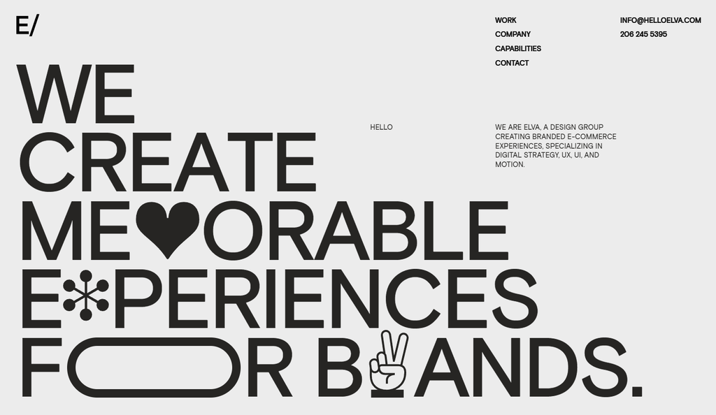
- Made by: custom-built
- Category: creative
Elva’s superior web design combines kinetic typography, minimal design, geometric elements, and tasteful animations. It is an excellent example of modern web design. The design agency also custom-built the website from scratch, demonstrating its authority in the industry.
Elva’s homepage design uses kinetic typography for its hero. This design element combines animation with typography, adding an artistic flair and bringing the text to life.
Another unique feature is the geometric design. The use of clean lines creates a visually appealing aesthetic that enhances the user experience. The minimal design allows the content to take center stage so visitors can easily navigate and engage with the website.
9. Motion
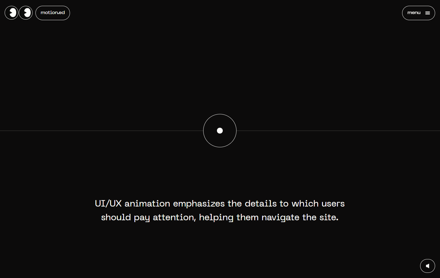
- Made by: drag-and-drop website builder
- Category: creative
Motion, another CSS Winner’s Site of the Day, reimagines web design with game-like functionality and playful sound engineering. As you scroll, a white dot will guide your site navigation.
Motion is an ideal example for website owners wanting their site to stand out. Its simple yet creative design showcases an unconventional use of CSS. This approach by the creative agency turns the browsing experience into an adventure where visitors explore dynamic content.
In addition to its video game-like functions, Motion’s commitment to user experience is excellent. It carefully balances the artistic vision with usability and accessibility. The website is not only visually impressive but also easy to navigate and understand.
10. Swab the World
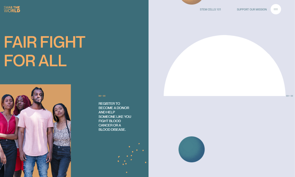
- Made by: Craft CMS and Yii web framework
- Category: health and wellness
Swab the World incorporates motion graphics and geometry design to create an aesthetically pleasing and dynamic website. If you’re looking for a twist to the hero image approach, take website design inspiration from the charity organization and experiment with a split screen.
Split-screen layout divides the screen into sections, displaying multiple content elements simultaneously. It delivers information efficiently, encourages exploration, and facilitates easy navigation between website sections.
The carefully crafted animations grab visitors’ attention and enhance the overall aesthetics of the design. The geometry design employed in Swab the World also adds a sense of modernity and sophistication to the overall look and feel.
Pro Tip
Look at some of the best charity website templates to get your charity site up and running fast.
11. AARK Collective
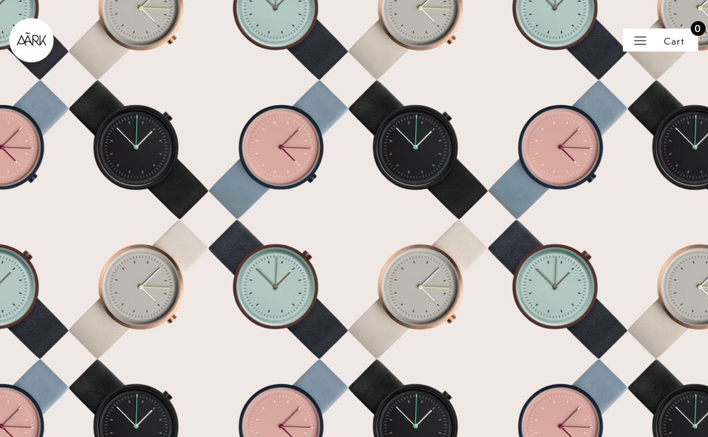
- Made by: WordPress content management system and WooCommerce
- Category: accessories
AARK Collective employs a unique combination of geometric shapes, a pastel color palette, and full scrolling hero image. The eCommerce website also carries out a good job of presenting its product images.
AARK Collective’s web design excels with geometric shapes. The precise angles create order, structure, and aesthetic appeal. The design also stands out with its soothing pastel color palette. The carefully selected hues create a positive user experience with a pleasing atmosphere.
The full-scrolling hero image on the AARK Collective website instantly captivates visitors. It extends across the screen, creating a visually striking first impression.
12. Beauvoir
- Made by: WordPress content management system
- Category: creative
Beauvoir pushes boundaries in web design with unique usability elements and captivating digital design. It grabs visitors’ attention with a hero video format upon arrival.
Beauvoir is one of the best websites with experimental navigation. While most websites use vertical scrolling, Beauvoir introduces a side navigation menu with horizontal scrolling, breaking conventions.
Horizontal scrolling allows visitors to scroll left and right to reveal content. This unique navigation style adds a refreshing dimension to web content, offering an exciting new way to explore the website.
By leveraging scroll-triggered animations, Beauvoir keeps visitors engaged in the content. The creative agency also features horizontal and vertical typography, creating a unique composition that integrates seamlessly into the web design.
13. Roee Ben Yehuda

- Made by: drag-and-drop website builder
- Category: art and home decor
Roee Ben Yehuda has a keen eye for creativity and innovation. His website incorporates unique features that boost user experience.
Yehuda’s web design is another great example of experimental navigation. Instead of traditional menus, Yehuda places them in the four corners of the webpage.
The online store also features simple cinemagraphs – a combination of static images and subtle animations – to highlight products and add dynamics to the website. The combination of horizontal and vertical typography creates an interesting and bold composition.
In some sections, Roee Ben Yehuda effectively uses the split-screen layout. This technique lets Roee showcase different design projects or categories side by side, providing visitors with an overview of his products.
14. Darc Room
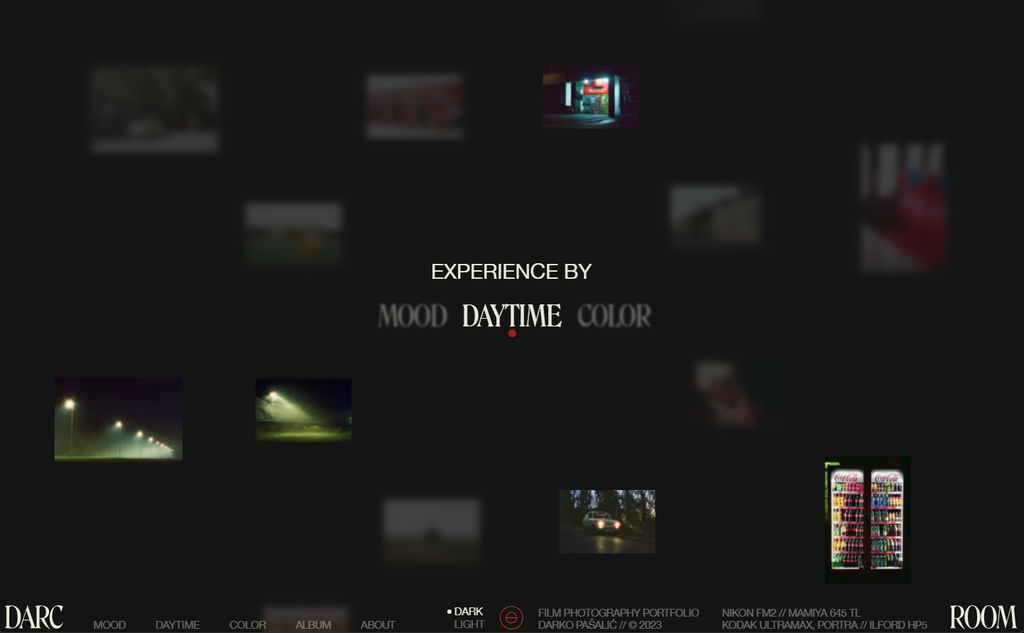
- Made by: Next.js static site generator, CMS, web framework, web server
- Category: photography portfolio
Darc Room, Darko Pašalić’s online publication site, combines animation and experimental navigation. The unusual homepage design showcases the photographer’s talent and ability to creatively think outside the box.
On the homepage, visitors will see Darko Pašalić’s selected works spinning around the site menu. Hovering over one category will blur the other two and highlight the relevant photographs.
Visitors can easily switch from dark mode to light mode at their convenience. Additionally, Darc Room carefully uses its fonts to reflect its artistic style and professionalism.
All the design elements combined help elevate the browsing experience to new heights, whether you’re exploring Darc Room’s portfolio or seeking web design inspiration.
15. Appart Agency
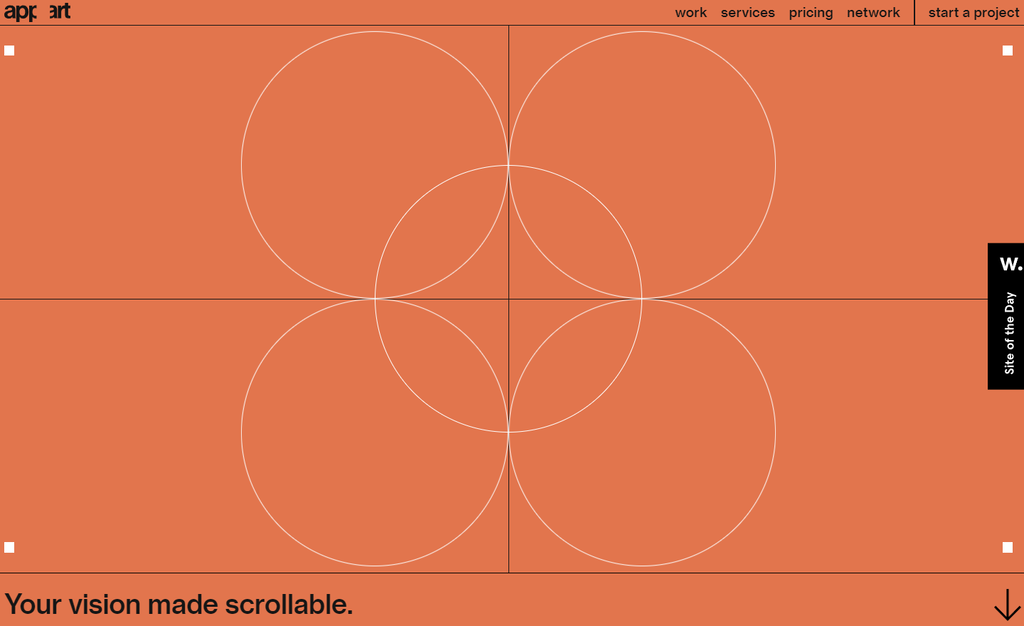
- Made by: drag-and-drop website builder
- Category: creative
Appart, an award-winning web design agency, incorporates fine line art throughout its web pages. With a refined and polished style, the design brings elegance and sophistication to the visual components, elevating the website’s overall aesthetics.
The homepage design lets site visitors interact with the line art. Aside from improving the user experience design, these interactive elements showcase the agency’s ability to create engaging digital solutions.
The website uses a well-thought-out color scheme, creating a harmonious and visually appealing experience for visitors. The consistent palette also strengthens its brand identity and establishes a cohesive visual language.
Appart Agency incorporates a grid system with simple animation throughout its website pages. A grid system adds structure and organization, creating a seamless browsing experience. It also maintains clarity and ease of navigation.
The horizontal scrolling effect adds fluidity and elegance to the design, making the website visually appealing and distinct.
16. Critical Danger
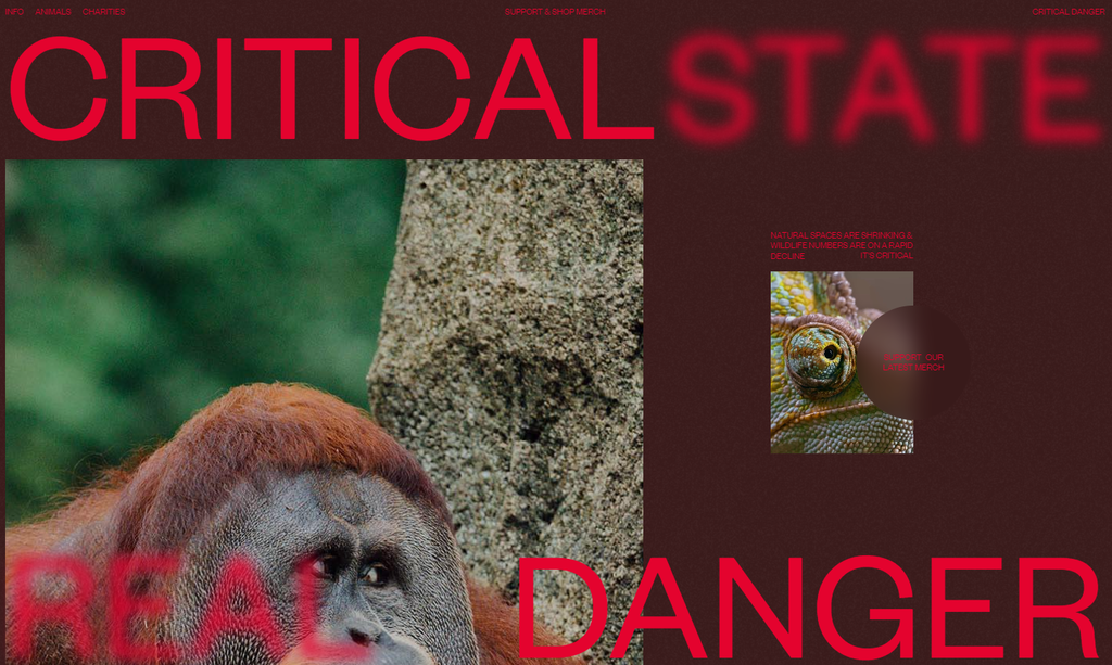
- Made by: drag-and-drop website builder
- Category: animal welfare
Critical Danger has a cutting-edge web design that sets itself apart from others in the industry. Its meticulous attention to detail offers an engaging user experience while perfectly balancing creativity and usability.
The website uses strong typography to ensure easy-to-read content and enhance the visual appeal. Motion graphics adds a layer of interactivity and dynamism. Meanwhile, scrolling effects engage visitors in their website journey.
With its unique features, Critical Danger sets new standards in web design. Whether it’s the fluid animations, impeccable choice of fonts, or seamless effects integration, the nonprofit organization offers an engaging user experience without overwhelming visitors.
17. Breakfast
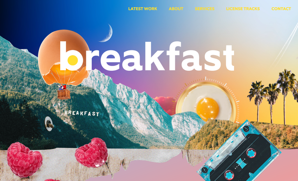
- Made by: WordPress content management system
- Category: creative
The creative agency’s nostalgic design evokes a sense of familiarity and charm, capturing the essence of a bygone era while infusing it with modern aesthetics. In contrast, the art deco style brings an elegant and sophisticated touch to the overall design.
Breakfast skilfully uses gradients and an interactive background. On its homepage, for example, visitors can click and drag the sunny-side-up to transform the sky from day to night and vice versa.
The carefully crafted layering, vibrant color combinations, and animated elements add a dynamic aspect to the user experience. Moreover, with its horizontal scrolling effect, Breakfast offers a unique navigation experience to its portfolio.
18. Magic John’s
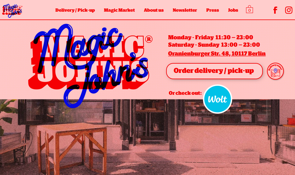
- Made by: drag-and-drop website builder
- Category: food and dining
Magic John’s web design also aims for a nostalgic atmosphere. The web design stands out thanks to its muted red scheme, playful fonts, and subtle grain effect in the background.
The overall color choice creates a compelling story reminiscent of classic pizzerias. The monochromatic palette creates a striking contrast, making the pizzas appear visually enticing. Meanwhile, the playful fonts add a touch of whimsy.
By employing user-friendly features such as the sticky header, Magic John’s website design is easy to navigate. On top of all, the web design successfully blends nostalgia and playfulness to create an appealing and user-friendly site.
The combination creates a warm, inviting atmosphere that enhances the overall user experience and encourages visitors to explore the website further.
19. Studio Job
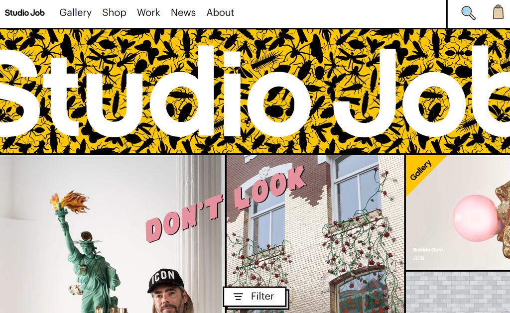
- Made by: Express web framework and web server
- Category: creative
Studio Job’s web design follows a brutalist style. It is an experimental visual design approach combining styles like bold typography and a high-contrast color scheme. The website embraces a rough and unrefined aesthetic, incorporating broken grids to create a quirky layout.
The brutalist aesthetic gives Studio Jon’s website a distinctive charm. The bold typography and colors grab site visitors’ attention, creating a visually stimulating experience.
Studio Job’s most prominent website feature is endless scrolling. It eliminates the need for pagination and encourages seamless exploration of website content.
Overall, the website’s design choices evoke a sense of creativity and artistic expression, reflecting Studio Job’s unique style and approach as a brand.
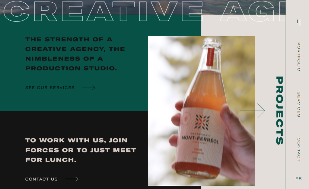
What Makes a Great Website Design
When designing a website, you should combine effective website design elements to increase its impact and functionality, focusing on:
- Purpose-Driven Design: Ensure every aspect, from fonts to buttons, aligns with the site’s goals.
- Brand Identity: Use design elements like color schemes and typography to reflect the brand consistently.
- Simplicity: Aim for a user-friendly design with fast load times, clear navigation, and minimal clutter.
- Engaging Content: Keep content relevant and engaging, utilizing white space for readability.
- Mobile-Friendliness: Ensure the design is responsive across various devices.
Stay updated on web design trends and consider professional help for a unique design, though it can be costly. Alternatively, seek inspiration from award-winning sites and use website builders like Hostinger’s AI-powered platform, offering easy-to-use tools and customizable themes for a professional website without coding.
Conclusion
Coming up with the perfect design is a crucial aspect of creating websites. A good web design helps your website stand out and keeps visitors engaged. Let’s recap some of the best web design examples for your inspiration:
- Supima. Its key characteristic is a minimal design with a pastel color palette. The cotton fabric provider also utilizes a high-quality image for its hero header. It helps communicate the brand’s mission and grab visitors’ attention.
- Mbau. Using video as the hero header helps entice visitors to explore the website further. It successfully highlights the island’s beauty, giving visitors a glance at life in Mbau, Fiji.
- Beauvoir. Layering, simple animations, and strategic typography placements are some of Beauvoir’s distinctive elements. The creative agency also employs horizontal scrolling, reinforcing its quality as an atypical site.
- Darc Room. This photography portfolio incorporates dark mode and unique categorization. The carefully chosen fonts help elevate the overall website’s aesthetic.
- Critical Danger. This award-winning website features an assortment of unique design elements without overwhelming users.
Creating a website with a drag-and-drop editor can be a good alternative to hiring web designers. Some of its best benefits are ease of use and web development speed. All you have to do is select a pre-designed theme and edit the preset elements for each website page.
We hope these website examples help spark design inspiration for your project. If you have any questions, feel free to share in the comments.
Best Website Design FAQ
When it comes to website design, there are common questions that arise regarding the cost and essential components. Let’s explore two frequently asked questions related to website design.
How Much Does a High-Quality Website Design Cost?
The cost of a high-quality website design varies depending on several factors. For a professional designer, the cost can go over $10,000. Fortunately, using a website builder with a drag-and-drop editor can significantly reduce costs, with upfront expenses as low as $12–60.
What Should I Include in My Website Design?
Some elements to consider are an attractive homepage, headline and subheadlines, consistent color palette, carefully chosen typography, clear navigation, call-to-action buttons, supporting images or videos, contact information, and social proof.
For eCommerce sites, don’t forget the shopping cart feature, product pages, and checkout.
All of the tutorial content on this website is subject to Hostinger's rigorous editorial standards and values.

Linda is a seasoned Content Writer specialized in website creation. With her passion for the written world and obsession with helping others, her goal is to deliver resourceful content pieces for all skill levels. When she’s not writing, Linda likes to cross stitch and watch films. Follow her on LinkedIn.