Padding vs margin: What’s the difference in CSS and when to use them?
Feb 16, 2026
/
Aris S.
/
7 min Read
Padding is a CSS property that adds room between an HTML element’s border and its content to increase its total size. Meanwhile, margin puts empty space around an element to prevent it from overlapping with adjacent elements.
Think of every HTML element as a box with layers: this is the CSS box model that governs web layout. Padding creates breathing room between an element’s content and its border, expanding the element from the inside. Margin, on the other hand, pushes elements apart by adding invisible space around their outer edges.
You can add padding and margin using either longhand or shorthand properties. Both take pixels, percentages, em, rem, and inherit as their values, but margin lets you use auto and negatives.
Understanding how padding and margin work is important for your website’s design. It’s also crucial to consider best practices like using relative values so you can implement these CSS properties more effectively.
What is padding in CSS?
Padding is a CSS property that controls the space within an HTML element, between its content and border. It adds space around the content, making it more easily identifiable and visually appealing.
Padding is part of the element’s interior, which contributes to its total size and interactable areas. When you apply padding, the space is filled with the element’s background color or image, creating visual breathing room between the content and border.
You can define the padding size using different values:
- Pixels. Representing the number of pixels on the screen. Adding 20px padding spaces content from its border by 20px.
- Percentage. Calculating the padding size relative to the parent element’s width. If the parent is 50px wide, using 50% padding equals 20px.
- em. Setting the padding relative to the element’s font size. If the font size is 16px, then 1em equals 16 pixels.
- rem. Applying padding based on the font size of the root elements, typically specified at the top of the HTML document. If the page’s font size is 12px, 1rem is 12px.
- inherit. Adopting the same padding value as the parent element. If the parent element’s padding is 10px, the child’s padding will also be 10px.
- initial. Resetting an element’s padding value to the default, which is 0.
- unset. Behaving the same as initial, resetting the padding size to 0.
Padding is helpful for a variety of purposes:
- Adding room inside an element. Applying padding creates space around content, like text, within a box or container to improve visual appeal.
- Expanding interactive area. Using padding lets you increase the clickable area of a button or link, which is crucial for mobile-friendly design.
- Content spacing. Setting padding is crucial to ensure content doesn’t touch the edges of a container, ensuring better readability.
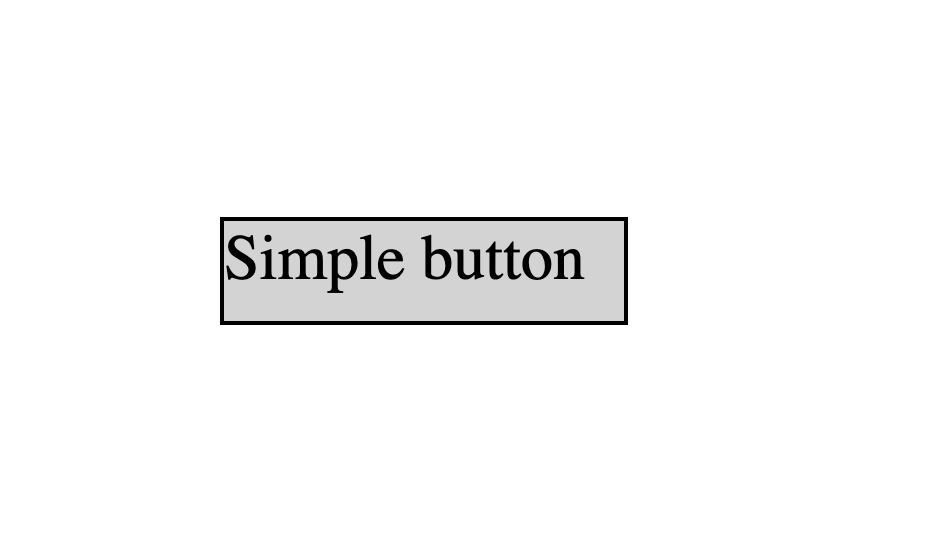
Here’s an example of a button without CSS padding:
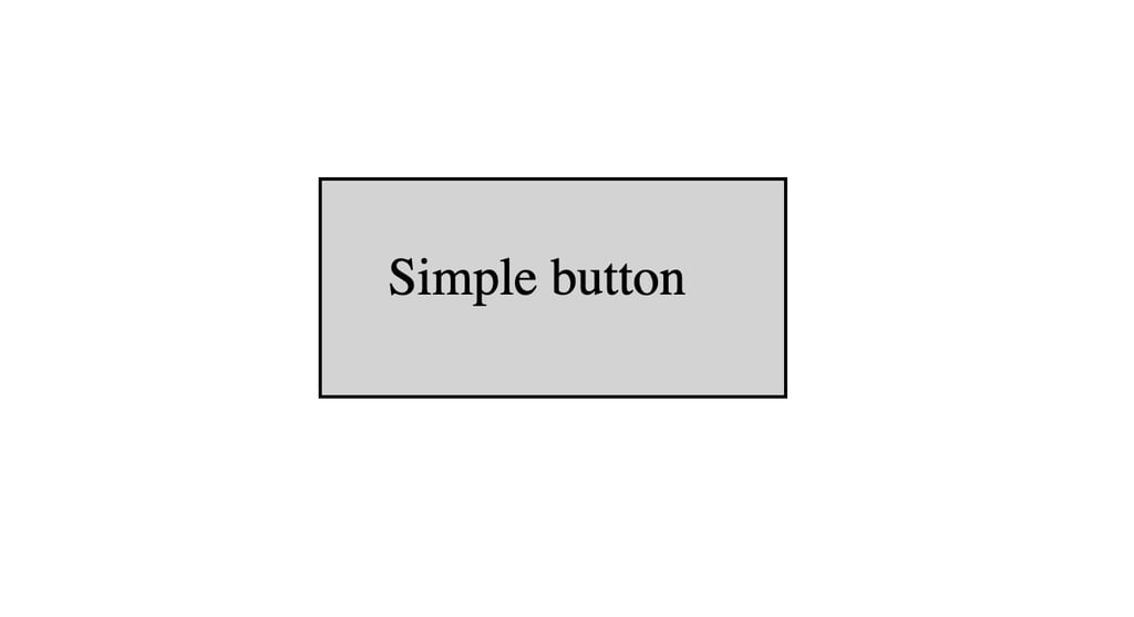
Selecting the text using a CSS class and adding 20px padding around it increases the element’s size:
What is margin in CSS?
Margin is the CSS property that controls the space outside an element’s border, creating separation between it and adjacent content. This space is always transparent and unaffected by the element’s background color or image.
You can use pixels, percentages, inherit, em, rem, initial, and unset as margin values. Unlike padding, however, it also supports negative and auto values.
Margin is essential for positioning elements and controlling the overall page layout. It’s commonly used for:
- Separating elements. Putting space between two different blocks of content, like paragraphs or images.
- Centering a block-level element: Setting the margin to auto will horizontally center a block-level element within its container.
- Creating negative space. Using negative margin values lets you pull elements closer together or even make them overlap.
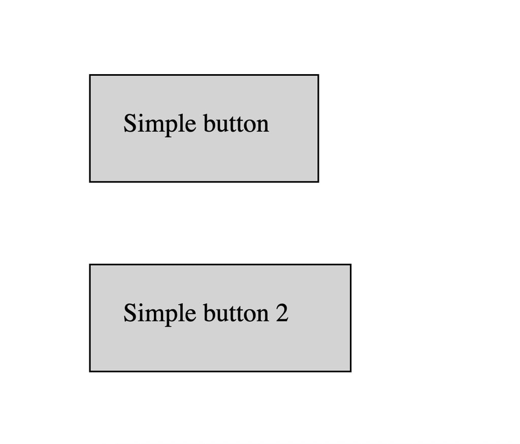
For example, we have these HTML elements without any margin:
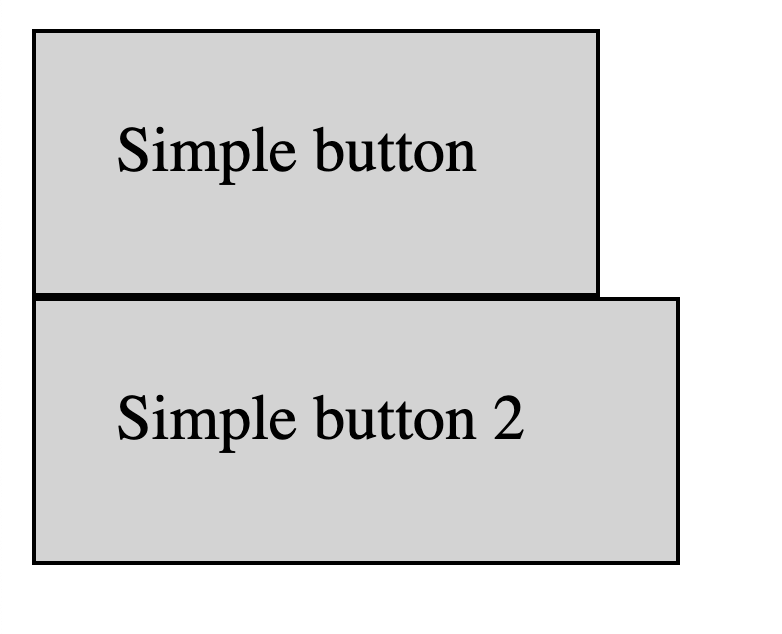
Applying 50px margins will separate those elements based on the specified distance:
Margin has a unique feature called collapse, which allows you to combine two adjacent vertical margins into one to avoid excessive spacing between elements.
Instead of adding two margins, the collapse feature will use the bigger margin. For example, if you have elements with a margin of 20px and 30px, the distance between them will be 30px.
Padding vs margin: Key differences
Padding adds room within an element to increase its interactive size, while margin creates invisible space around it. While similar, there are some significant differences between them. Here’s how they compare.
| Padding | Margin | |
| Location | Inside the element, between its content and the border | Outside the element’s border |
| Function | Creates breathing room within an element | Creates space between elements or an element and its container |
| Effect on background | Filled with the element’s background color or image | Always transparent and unaffected by the element’s background |
| Supported values | Pixels, percentages, ems, rems, inherit from the parent element, initial, and unset. | Everything that padding does, plus auto and negative values |
| Vertical collapse | Not supported | Vertical margins on adjacent block-level elements can collapse into a single margin |
While different, padding and margin have a similar purpose in defining how HTML elements are rendered inside the CSS box. This concept is crucial when designing and publishing a website because it defines how the page looks.
What is the CSS box model?
The CSS box model describes how browsers render every HTML element as a rectangular box. Understanding it is crucial when using padding and margins to predict the element’s final spacing more easily.
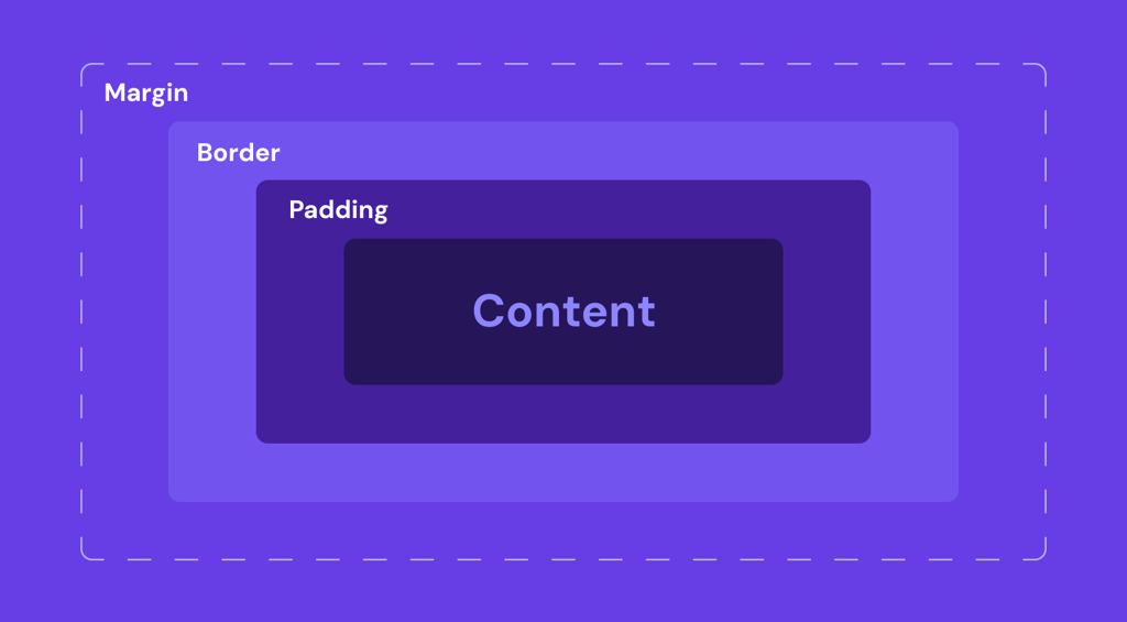
The CSS box model comprises several distinct layers, each adding space and dimension to the element:
- Content box. The innermost area where your actual content is displayed. Its size is defined as explicit width/height dimensions or determined automatically based on the web browser that renders it.
- Padding box. This layer surrounds the content and creates an inner space between the content and the border.
- Border box. The border wraps around the padding, creating a visual frame for the element.
- Margin box: The outermost layer that creates a transparent space outside the border, separating one element from another.
You can modify your CSS box’s padding and border behavior by using the box-sizing property with values like content-box and border-box.
Use box-sizing: content-box; if you want padding and borders to increase the element size. Since CSS uses this property by default, you don’t need to specify it explicitly unless necessary for clarity.
Meanwhile, use box-sizing: border-box; if you want the element’s total dimension to stay fixed even with padding and border. You can add this property globally at the top of your CSS file like so:
, *::before, *::after {
  box-sizing: border-box;
}
Alternatively, apply border-box to a specific element by adding the property inside the CSS class selector:
.element {
  box-sizing: border-box;
  Padding: 20px;
}
How to add padding in CSS
The most basic way to add padding in CSS is to use the padding-top, padding-bottom, padding-left, and padding-right properties, followed by the desired values. These properties define where the padding will be relative to the content.
For example, the following CSS code will add 20px padding around an HTML button element:
.button-element {
  padding-top: 20px;
  padding-bottom: 20px;
  padding-left: 20px;
  padding-right: 20px;
}
To keep your code concise, you can also use the shorthand property to define the padding values in a single line. It looks like this:
.button-element {
  padding: 20px;
}

.interactive-element {
  padding: 20px 40px;
}
The shorthand property behaves differently depending on the number of values assigned to it:
- Four values. Specifying the values of the top, right, bottom, and left paddings in clockwise order.
- Three values. Controlling the value of the top, horizontal, and bottom padding. This is used if the right and left padding have the same length.
- Two values. Determining the value of the vertical and horizontal padding.
- One value. Setting a single value for all four sides of the padding.
Important! When using padding, pay attention to whether you are using the content-box or border-box property, as it will affect the final size of your element.
How to add margins in CSS
Adding margins in CSS is the same as padding. You can use either the shorthand or longhand properties, which behave similarly to those of padding. Here’s an example:
.button.element {
  margin: 20px;
}

.interactive.element {
  margin: 20px 40px;
}
Unlike paddings, however, you can use negative values with margins. This will bring the element closer to a specific direction according to the given value.
For example, the following CSS styling will bring the button.value element upward by 20px:
.button.element {
  margin-top: -20px;
}
You can also add margin to center elements by using the auto value, like so:
.button.element {
  margin-left: auto;
  margin-right: auto;
}
Note that the auto margin only works for horizontal spacing by default. To automatically center elements vertically, they must be inside a flexbox or grid.
For example, here’s an inline CSS code snippet that uses automatic vertical and horizontal margins with flexbox:
<html>

<head>
  <style>
    .flex-container {
      display: flex;
    }

    .box {
      margin: auto;
    }
  </style>
</head>

<body>
  <div class="flex-container">
    <div class="box">I'm centered!</div>
  </div>
</body>

</html>
What are some tips for using padding and margin effectively?
Using padding and margin effectively can make your layouts cleaner and more accessible for a broader range of users, which is a crucial web design best practice. Here are a few key tips:
- Differentiate between layout and content elements. Distinguishing between web page components makes them more easily reusable and maintainable. Apply margins to layout elements to define structure and spacing between blocks, while using padding on content elements, such as buttons or cards, to give their content internal space.
- Use padding for interactive elements. Using padding for interactive elements increases their size for better usability and accessibility. It also helps you maintain a consistent dimension more easily than adjusting the size manually.
- Set the bottom margin first. Adding the bottom margin before the other directions helps you easily maintain consistent spacing between elements.
- Prioritize relative values. Using auto, inherit, or percentages allows you to set padding and margin values relative to other elements. This results in a more consistent sizing and placement of your elements.
- Adjust for responsiveness. Adapting padding and margin to various screen sizes ensures your web page is usable on different devices. Small displays generally need minimal whitespace to maximize content visibility, while large ones benefit from more to improve readability.
How can you adjust padding and margin for different screen sizes?
Padding and margin should be designed to adapt to different screen sizes, ensuring content looks good and remains usable across devices. You can do it by using CSS breakpoints.
This feature lets you apply different spacing rules at specific screen widths. On smaller viewports, reduce padding and margin to maximize usable space and ensure content remains easily readable and accessible.
Conversely, increasing padding and margins on larger desktop screens adds whitespace, improving visual balance and user experience by preventing the interface from feeling cluttered.
Combining breakpoints with padding and margins is one of many essential practices when implementing CSS into your website. If you are new to web design, check out our website design tutorials to familiarize yourself with the styling language.
All of the tutorial content on this website is subject to Hostinger's rigorous editorial standards and values.

Aris is a Content Writer specializing in Linux and WordPress development. He has a passion for networking, front-end web development, and server administration. By combining his IT and writing experience, Aris creates content that helps people easily understand complex technical topics to start their online journey. Follow him on LinkedIn.