How to create a landing page
Jun 23, 2026
/
Simon L. & Miglė C.
/
9 min Read

A landing page is a standalone web page built for one specific goal, such as collecting leads, promoting a product, or encouraging visitors to sign up for an offer. Unlike a homepage, it removes distractions and guides users toward a single action.
Learning how to create a landing page starts with defining your conversion goal. From there, you’ll need a clear headline, benefit-focused copy, trust signals like testimonials, a strong call to action, and regular A/B testing to improve performance.
1. Define your main conversion goal
Before creating your landing page, clearly identify the action you want visitors to take when they get there.
This could be signing up for a newsletter, requesting a demo, making a purchase, or downloading a resource.
For example, if you’re building an email list, your conversion goal will be to get visitors to submit their email addresses. This goal will then shape every element of your page design.
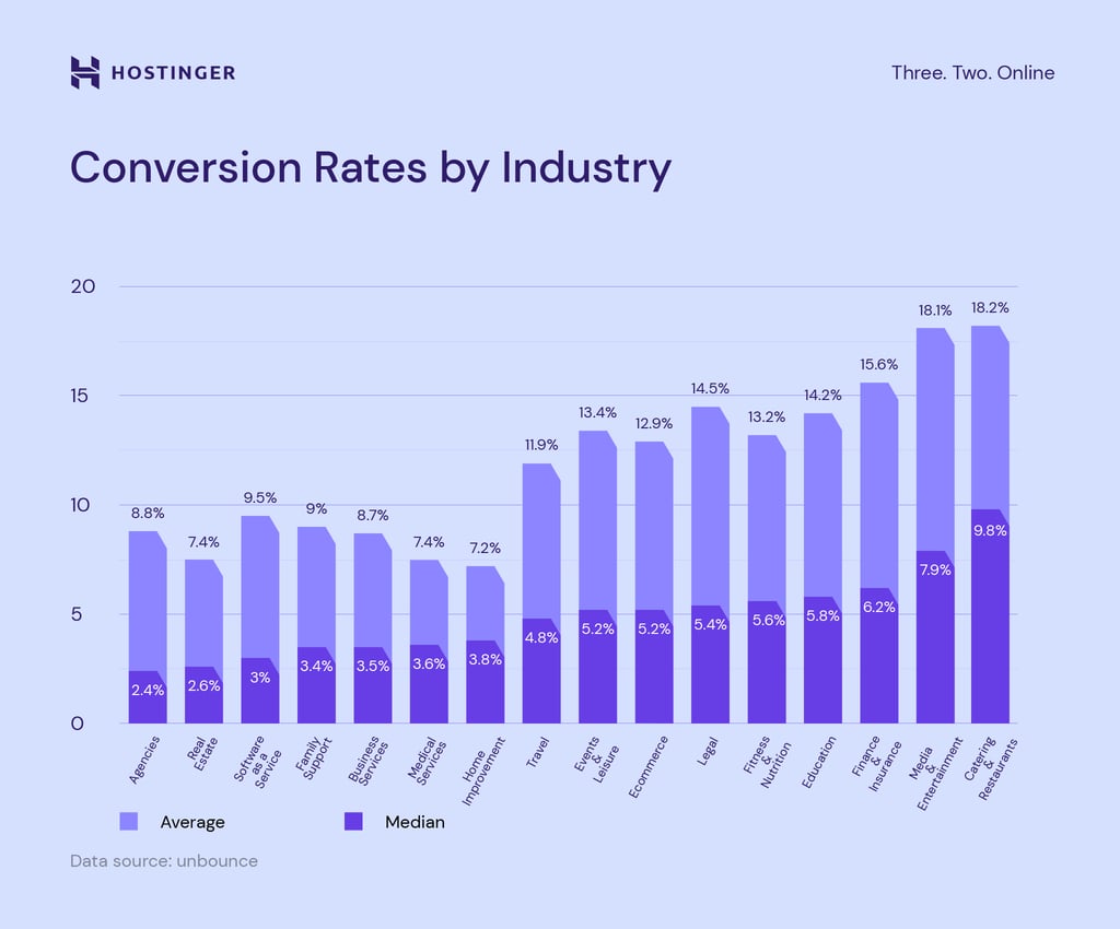
To calculate your conversion rate, divide the number of people who completed your desired action by the total number of visitors. For instance, if 1,000 people visit your page and 30 sign up for your newsletter, your conversion rate is 3%.
According to WordStream, conversion rates typically range from 2-3%, but this differs widely across industries. As shown in our recent landing page study, restaurants average around 9.8%, ecommerce sites around 1.8%, and SaaS products around 3%.
Here’s how you can set appropriate conversion goals for your landing page:
- Choose one primary goal. Focus on a single, clear objective rather than trying to accomplish multiple goals on one page.
- Set realistic targets. Research industry benchmarks for similar campaigns to establish attainable conversion rates.
- Use Google Analytics. Implement this free tool to track visitor demographics, and behavior like time on page and conversion actions.
- Create goal segments. Analyze conversions by traffic source, device type, or demographics to identify which audiences respond best to your page.
- Establish a baseline. Record initial performance metrics so you can measure improvements after making changes.
Once you’ve defined your conversion goal, you can strategically design your page with the following steps to guide visitors toward your desired action.
2. Create an attention-grabbing headline
Your headline is one of the first elements visitors see when landing on your page, so it needs to capture attention immediately.
An effective headline should be concise and compelling, and should instantly convey what your product or service offers.
Here are several factors to keep in mind when writing your headline:
- Focus on benefits. Tell visitors what problem you’ll solve for them, not just what you’re selling. “Save 5 hours every week” is more compelling than “Our time management tool.”
- Speak directly to your audience. Use “you” and “your” to make your headline personal and engaging. “Double your sales in 30 days” feels more engaging than “How our tool doubles sales.”
- Incorporate keywords. Use words and phrases people type into search engines when looking for your page. ConversionLab did this by including keywords in their headline, resulting in a 31.4% increase in conversions.
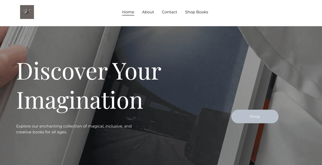
Caffeinated Muse Press’ landing page – created with our landing page builder – features a great example of an attention-grabbing headline. It uses a powerful action word with a clear benefit, immediately offering value with a simple, easy-to-remember message.
3. Write copy that highlights your benefits
Your unique selling proposition (USP) is what sets you apart from your competitors. It clearly communicates why your site’s visitors should choose your offer over others by highlighting its benefits.
To write copy that conveys your selling points quickly, focus on these key elements:
- Keep it brief. Short, simple sentences are easier to understand and remember. Aim for 2–3 sentences per paragraph and break up longer sections with subheadings or bullet points.
- Match your audience’s style. Adapt your tone to connect with your target audience. Use “we” and “us” instead of “I” or “me” to create a friendlier tone that builds trust.
- Maintain clear formatting. Maintain consistent fonts, spacing, and text sizing throughout your page. Use bold text for important points and ensure there’s enough contrast between text and background colors for easy reading.
- Use search engine optimization (SEO). Write SEO-friendly content to help people find your landing page through search engines. Ensure the keywords are relevant to your offer and fit naturally within your message.
The Advantage Fitness Training landing page excels at highlighting benefits. Rather than just listing services, it focuses on a specific outcome – “achieve your fitness goals” – and explains how the team’s approach helps people get results through personalized training.

4. Include testimonials and social proof
Testimonials and social proof statements build trust with your visitors by showing that others have had positive experiences with your product or service.
A dedicated section for genuine customer feedback helps potential customers feel more confident about taking action.
Here are some practical steps you can take to add social proof:
- Showcase specific results. Highlight testimonials that mention concrete outcomes rather than vague praise. “This tool helped me increase sales by 27% in just two months” is more compelling than “Great product, loved it!”
- Include customer details. Add names, job titles, locations, and real photos to testimonials to make them more believable. Remember to get permission before using customer details.
- Feature recognizable logos. If you’ve worked with well-known companies or brands, display their logos in a “Trusted by” or “As seen in” section.
- Show numbers. Highlight user counts, subscriber numbers, or download statistics when impressive. Something like “Used by over 50,000 professionals” creates confidence in your offer.
- Incorporate third-party validation. Include awards, certifications, or media mentions that verify your credibility from external sources.
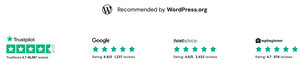
Here’s an excellent example of social proof from one of Hostinger’s landing pages – it combines trust signals from multiple sources, creating a powerful impression of credibility and reliability:
5. Present a compelling call to action
Your call to action (CTA) is the key element that guides users toward completing your desired conversion goal and should stand out visually on your page.
A well-designed CTA element can dramatically increase conversion rates by making the next step obvious and appealing to visitors.
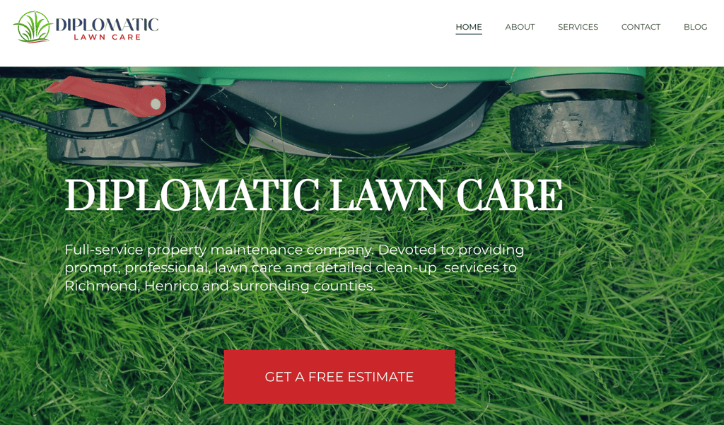
The Diplomatic Lawn Care landing page features a bright red CTA button that stands out clearly against a green background. The button uses action words that tell visitors exactly what they’ll get, while the bold color and large size make it easy to spot on the page.
6. Regularly A/B test everything
A/B testing, or split testing, involves showing different versions of your page to visitors and measuring which performs better.
Regular testing can help improve conversion rates over time through incremental changes. Rather than relying on assumptions, A/B testing provides concrete data about what actually works for your specific audience.
Here are some essential factors to consider:
- Test one element at a time. Change only one element, such as the headline, CTA button color, or image, to clearly identify what caused the performance difference.
- Prioritize high-impact elements. Focus on testing elements that typically influence conversions most, such as headlines, CTAs, hero images, and form length.
- Run tests long enough. Most tests require at least 1,000 visitors per variation for you to collect sufficient data and declare a winning version.
- Implement proper tracking. Use Google Analytics, Facebook Pixel, and Google Ads to measure clicks and conversions. This helps identify which traffic sources deliver the highest-quality visitors most likely to convert.
- Document everything. Keep detailed records of all tests, including screenshots, specific changes made, results, and insights gained. This creates an invaluable knowledge base for future optimization.
- Never stop testing. Even well-performing pages can be improved. Continue testing regularly as audience preferences and market conditions evolve.
How to create long-form and short-form landing pages
Landing pages generally fall into two categories: long-form and short-form. The best choice depends on what you’re offering and who your audience is.
Short-form landing pages are concise, with minimal content and a short path to conversion. Long-form pages include more detailed information, addressing potential questions and objections before asking for the conversion.
| Short form is best for: | Long form is best for: |
| Products with simple value propositions | Complex or innovative products or services |
| Lower-priced items | Higher-priced offers |
| Mobile-focused campaigns | Detailed explanations or demonstrations |
| Familiar brands with established trust | Building credibility for new brands |
| Impulse purchases | Products requiring education |
| Lead generation | Direct sales of premium items |
Here are some tips to help you choose the right format:
- Consider your offer’s complexity. Straightforward offers of products like clothing or accessories often work well with short-form pages, while complex services or high-priced items typically benefit from longer pages with more explanation.
- Match your audience’s awareness level. Visitors who are already familiar with your brand might need less information than those encountering it for the first time.
- Align with your traffic source. Cold traffic from ads usually needs more convincing, so it would be more suitable for long-form landing pages, while warm traffic from email lists might benefit from more concise landing pages.
- Test both approaches. Instead of guessing, create both versions and see which performs better with your specific audience and offer.
Short-form landing page pros and cons
Short-form landing pages deliver your message quickly, fitting all essential information above the fold. They work best when you need prompt action from visitors who already understand what you’re offering.
Pros:
- Fewer distractions. With fewer elements on the page, visitors can focus directly on your offer without getting sidetracked.
- Faster loading. Less content means shorter page loading times, which matters since conversion rates drop with every second of load time.
- Easier to create. You’ll spend less time creating content, designing the layout, and testing when launching a short-form page.
- Immediate impact. Visitors can make decisions fast without reading through a lot of information.
Cons:
- Limited space. You have less room to address concerns or build strong arguments for your offer.
- May attract lower-quality leads. Without enough qualifying information, you might attract people who aren’t ideal for your product.
- Lower SEO potential. Fewer words mean fewer chances to include keywords for search traffic.
- Not ideal for complex products. Innovative products or services often need more explanation than a short landing page allows.
Long-form landing page pros and cons
Long-form landing pages give visitors comprehensive information about your offer, answering questions and concerns throughout the content. These pages build trust with detailed explanations and proof.
Pros:
- Better for SEO. More content gives you more opportunities to include keywords that help your page show up in search results.
- Higher-quality leads. By explaining your offer fully, you attract more qualified leads who understand exactly what they’re signing up for.
- More persuasive. You have space to address all possible objections and build a complete case for your product or service.
- Builds trust. Detailed information, examples, and testimonials throughout the page create stronger credibility.
Cons:
- Can lose visitor attention. If not carefully structured, longer pages risk losing visitors before they reach your call to action.
- Slower to create. Developing more substantial content requires more time, resources, and planning.
- May generate fewer leads or sales overall. While conversions might be of higher quality, the total number of conversions may be lower as some visitors won’t read the entire page.
- Less mobile-friendly. Extensive scrolling on mobile devices can create friction in the user experience.
Landing page design tips with examples
Whether you choose a short-form or long-form approach, certain design principles apply to all high-converting landing pages. These tips will help you create a page that converts visitors regardless of length.
Make content easy to scan. Use clear headings, plenty of white space, and break up text with bullet points and short paragraphs to help visitors find and digest information easily.
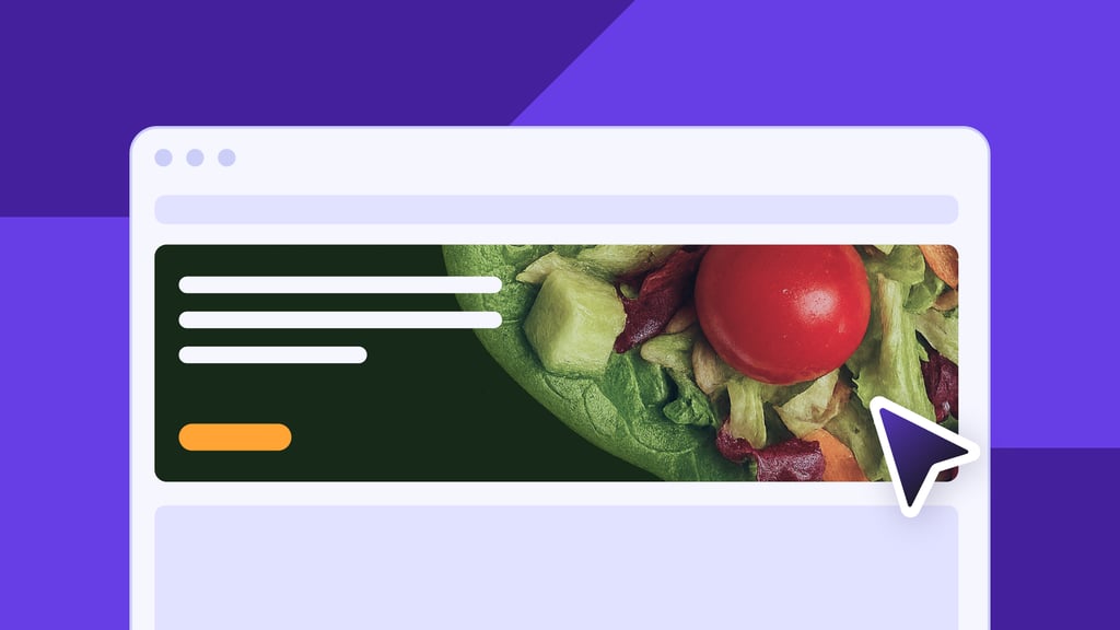
The CGEM landing page does this well, with its clear sections, simple headings, and pictures that help visitors understand the content at a glance without reading lengthy text.
Keep branding consistent. Use your brand colors, fonts, and style to create a cohesive experience that builds trust.
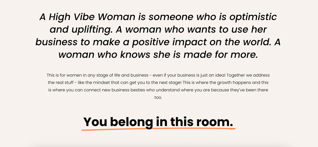
The High Vibe Women landing page shows great brand consistency. Every element of their page screams “high vibe women” with its pink background, modern fonts, vibrant copy, and authentic photos that work together to reflect a distinct sense of community.
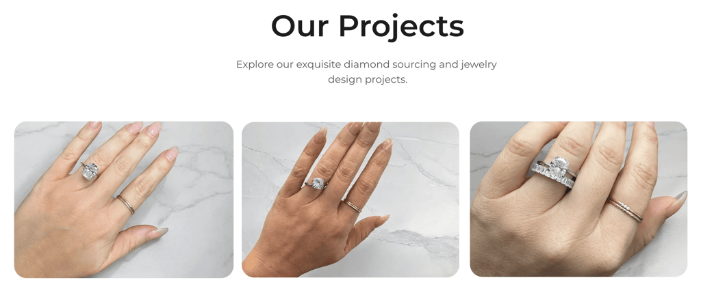
Choose compelling images. Select visuals that strengthen your message instead of generic stock photos that feel fake.
MPW Sourcing does this well. They use authentic photos of their customers wearing diamonds they sourced, showing potential customers exactly what they can expect.
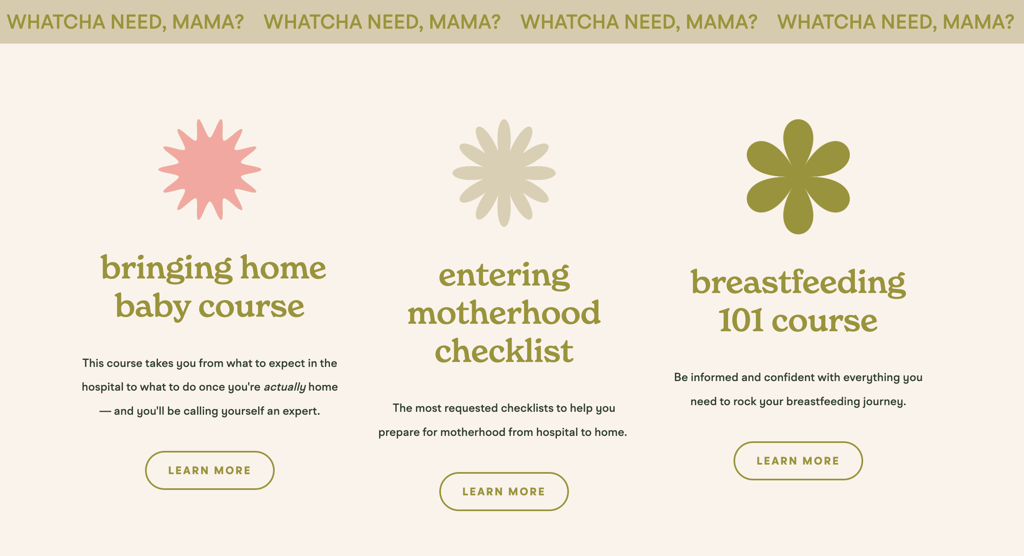
Speak your visitors’ language. Use words, phrases, and examples that resonate with your audience’s experiences and pain points.
Karing for Postpartum does this perfectly. It connects with its audience by detailing mothers’ real postpartum frustrations and offering practical solutions to their most significant pain points.
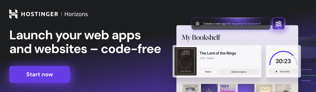
How to create a landing page with Hostinger Horizons
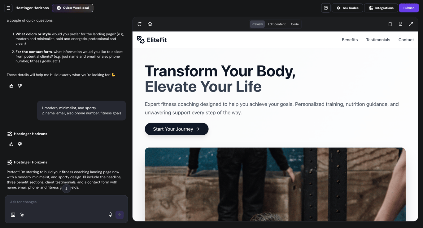
Hostinger Horizons is an AI creation platform that allows to build landing pages from plain-language instructions. Instead of assembling the page from scratch or relying on a drag-and-drop editor, you describe what you want, and the AI generates the layout.
To create a landing page, explain your goal and list the elements you need, such as a headline, benefit sections, testimonials, and a call-to-action button.
Horizons then generates a working page based on your description. You can refine it with follow-up prompts until it matches your vision.
Here’s how to get started:
- Go to hPanel → Horizons → Add website.
- Describe your landing page. For example: “Create a landing page for a fitness coaching service with a headline, three benefit sections, client testimonials, and a contact form.”
- Review the generated page in the preview window and refine it with additional prompts.
- Click Publish to launch your page on a custom domain.
This approach suits anyone who prefers conversational instructions over visual editing or wants to test landing page ideas quickly without rebuilding each version manually.
If you’d rather build the landing page directly inside ChatGPT, our guide walks through the same process using the Hostinger Horizons GPT.
Conclusion
Creating a successful landing page is easy when you follow the six key steps we’ve outlined.
- Set clear conversion goals.
- Craft attention-grabbing headlines.
- Write content that focuses on benefits.
- Include social proof and testimonials.
- Design compelling CTA elements.
- Repeatedly test and improve.
Remember, there’s no one-size-fits-all approach to landing pages. Whether you choose a short-form or long-form design depends on your specific offer, audience, and goals.
Ready to create landing pages that actually convert? Like all the examples you’ve seen in this guide, you can use Hostinger’s landing page creator of Website Builder to build professional, high-converting landing pages in minutes – no coding required!
All of the tutorial content on this website is subject to Hostinger's rigorous editorial standards and values.

Simon is a dynamic Content Writer who loves helping people transform their creative ideas into thriving businesses. With extensive marketing experience, he constantly strives to connect the right message with the right audience. In his spare time, Simon enjoys long runs, nurturing his chilli plants, and hiking through forests. Follow him on LinkedIn.

Miglė Cicėnaitė-Jocė is a Product Manager for Hostinger's Website Builder. She is on a mission to redefine website creation, focusing on the AI flow and its features, and is always eager for product feedback and market insights to improve the user experience. Follow her on LinkedIn.