Mobile ecommerce: What it is, types, and why it matters
Sep 08, 2026
/
By Alma
/
9 min Read

Mobile ecommerce is the buying and selling of products or services through smartphones and tablets. Understanding how it works helps you build an online store that’s easy to browse and buy from on a phone.
Shopping on a phone is different from shopping on a computer. Mobile ecommerce covers everything from browsing products and comparing options to making in-app purchases, buying tickets, and completing checkout – all on a hand-held device.
To make this work, stores need products that are easy to find, details that are easy to read, and a checkout process that doesn’t get in the way.
Customers can shop from almost anywhere, but slow page load times, long forms, crowded layouts, and limited payment options can prevent them from completing a purchase.
A good mobile store avoids these problems: it displays important details clearly, keeps checkout simple, protects customer information, and works well across different phone sizes and models.
What are the key differences between mobile ecommerce and general ecommerce?
Mobile ecommerce is a subset of general ecommerce that takes place on smartphones, tablets, and other portable devices.
General ecommerce includes online transactions made on any connected device. Mobile ecommerce focuses on what changes when shoppers use a smaller touchscreen with built-in tools such as cameras, GPS, and digital wallets.
Those differences shape the whole shopping journey. A customer might open a product from a TikTok video, scan a QR code on a shop shelf, swipe through product images, and pay with card details or a wallet saved on their phone.
Here’s how mobile ecommerce differs from general ecommerce:
Area | Mobile ecommerce | General ecommerce |
Main devices | Smartphones, tablets, and wearables | All connected devices, including phones, tablets, desktops, and laptops |
Navigation | Taps, swipes, gestures, and voice input | Touch, mouse, keyboard, trackpad, or voice, depending on the device |
Shopping context | Short sessions while commuting, multitasking, or shopping in-store | Quick purchases and longer sessions for research, comparison, and detailed browsing |
Screen space | Smaller screens that need focused layouts | Layouts range from compact mobile pages to wider desktop views |
Payments | Cards, digital wallets, QR codes, and express checkout, with less emphasis on typing | Cards, bank transfers, wallets, and other online payment methods |
Location features | GPS-based offers, nearby stock, and local collection options | Entered addresses, IP data, or device location when available |
Product discovery | Social apps, QR codes, notifications, visual search, and mobile search | Search engines, marketplaces, email, social media, and direct visits |
Design priorities | Fast loading, large tap targets, focused pages, and minimal typing | Flexible layouts, detailed product information, multi-level navigation, and comparison tools |
Responsive design lets one store serve both mobile and desktop shoppers. The layout adjusts to the available space, keeping text readable, images within the screen, and controls easy to use without zooming.
On mobile, the tighter space and shorter shopping sessions make fast product discovery, focused product pages, and low-friction checkout especially important.
Core features of mobile ecommerce
The main features of mobile ecommerce help shoppers find products quickly and complete purchases without struggling with a small touchscreen.
Digital wallets and express checkout
Digital wallets and express checkout reduce how much information a shopper needs to type.
Apple Pay, Google Pay, PayPal, and similar wallets store payment details on a device or online account. Instead of entering a full card number for every order, the customer confirms the payment using their phone.
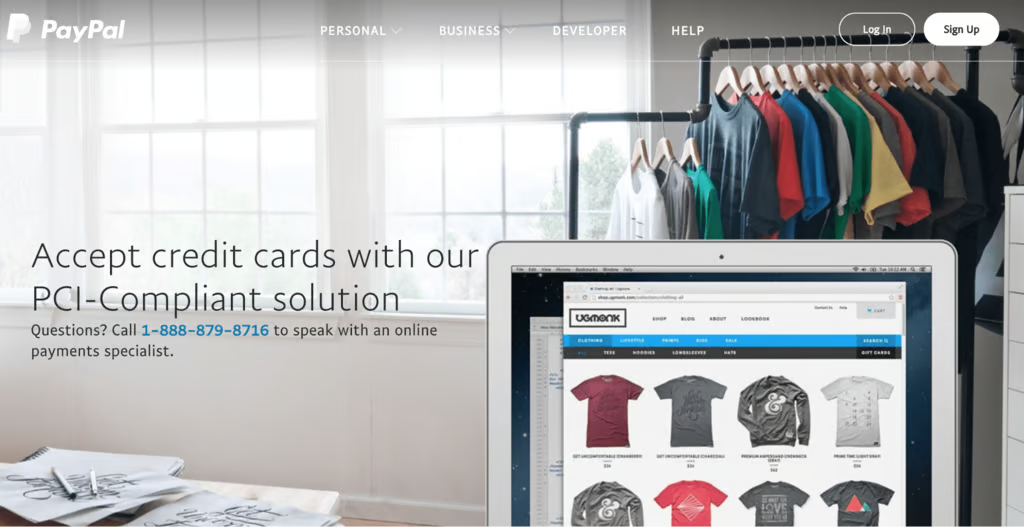
Digital wallets accounted for 56% of global ecommerce spending in 2025, making them the largest online payment category worldwide.
Express checkout also reuses saved delivery details. The shopper selects a wallet or stored card and confirms the order without having to fill out every field in a standard checkout form.
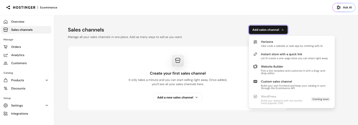
For example, the Quick link store in Hostinger Ecommerce supports Stripe-powered Express Checkout. Customers with a supported wallet or saved card can pay directly from the product page. Other shoppers continue through the regular checkout.
Smart product discovery
Smart product discovery means helping shoppers find the right item with fewer searches.
A visible search bar, useful filters, related products, and recently viewed items make a large catalog easier to use. For example, someone who looked at a jacket yesterday should be able to find it again without repeating the original search.
Social platforms also act as storefront entrances. A shopper might tap a product tag on Instagram, open a store from a TikTok video, or follow an ad directly to a product page.
Visual search lets customers photograph an item and look for the same product or a similar design. AI recommendations use browsing and purchase history to suggest items that match the shopper’s interests.
Social shopping, visual search, and AI recommendations are established ecommerce trends because they take shoppers directly from discovery to a relevant product page.
QR codes connect physical and online shopping. A code on packaging, a poster, or a shop shelf can open the exact product page instead of asking the customer to search manually.
Mobile-optimized product pages
A mobile-optimized product page puts the information shoppers need to purchase where they can find it quickly.
The product title, price, main image, options, delivery details, and purchase button should appear before less important content. Shoppers should be able to swipe through images, zoom in on details, and select a size or color without repeatedly tapping small controls.
Expandable sections work well for specifications, materials, and care instructions. Keep stock information, shipping costs, and return terms easy to find because they directly affect the buying decision.
A mobile-friendly ecommerce template gives you a responsive starting point. You still need to check that images stay clear, product options work correctly, and buttons do not overlap on smaller screens.
Keep the same essential information on both mobile and desktop pages. Google uses the mobile version of a page for indexing and ranking, so missing descriptions, images, or structured data can reduce search visibility. The Google mobile-first indexing documentation explains what must remain consistent.
Push notifications and location features
Push notifications let stores send timely updates directly to a customer’s phone.
Useful examples include delivery updates, restock alerts, price changes, and reminders about saved products. Each notification should open the relevant product or order rather than sending the customer to a general homepage.
Location access can show nearby stock, collection points, and delivery options. A retailer with physical branches can display click-and-collect availability when a shopper is close to one of its stores.
Notifications and location tracking require permission. Request access only when the customer clearly benefits, and explain how the information will be used.
Connected sales channels
Connected sales channels keep product, order, and inventory information consistent when a business sells through multiple storefronts.
A customer might discover a product on social media, compare it on the main website, and complete the purchase through another sales channel. Shared data prevents those storefronts from showing different prices, outdated stock, or conflicting product details.
Centralized management also lets the business update a single catalog rather than editing each storefront separately. Channel-level reporting then shows where customers discover products and where they complete purchases.
Types of mobile ecommerce
Mobile ecommerce is the shopping-focused part of the broader mobile commerce category. It includes buying physical products, booking tickets, purchasing digital features inside an app, and completing payment from a mobile device.
1. Mobile shopping
Mobile shopping means browsing, comparing, and buying products or services through a smartphone or tablet.
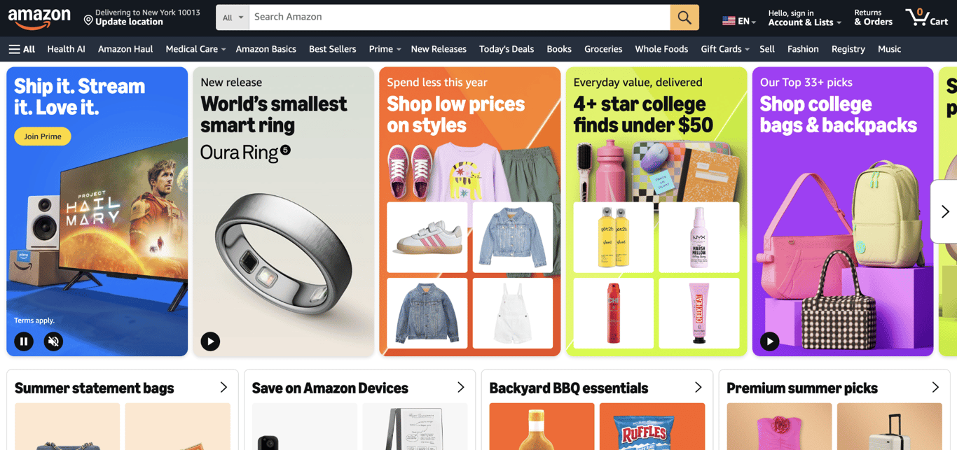
The purchase might happen on a responsive website, in a retailer’s app, through a marketplace such as Amazon, or from a product post on Instagram or TikTok.
A shopper can discover a jacket in a social post, check its reviews, choose a size, and place the order without switching to a computer.
This is the most familiar type of mobile ecommerce because it follows the standard online shopping journey: product discovery, comparison, cart, checkout, and order confirmation.
2. Mobile ticketing
Mobile ticketing lets customers buy access to an event, journey, or service through a mobile website or app.
A customer can choose concert seats in the Ticketmaster app, book a flight through an airline’s mobile site, or buy a train ticket while heading to the station. After payment, the provider sends a QR code or digital pass that the buyer can present at the venue or boarding point.
The ticket purchase is the ecommerce transaction. Simply storing a boarding pass or displaying a ticket bought elsewhere does not create a new sale.
3. In-app purchases
In-app purchases let users buy digital content, features, or services without leaving an app.
Common purchases include game currency, premium tools, extra cloud storage, ad-free access, and subscriptions. For example, someone might download a free photo-editing app and later pay to unlock advanced filters.
The product usually becomes available as soon as payment is approved. The app store or payment provider processes the transaction, then tells the app which feature, subscription, or content to unlock.
4. Mobile payments
Mobile payments let shoppers complete an ecommerce purchase from a smartphone, tablet, or wearable device.
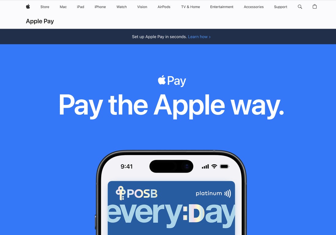
They can enter a credit or debit card through a standard checkout form or use Apple Pay, Google Pay, PayPal, a bank transfer, or a QR code.
Mobile banking belongs here only when it helps complete the purchase. A shopper might approve a bank transfer in their banking app or confirm a card payment through a bank notification. Checking a balance, depositing a check, or managing an account is mobile banking, but not mobile ecommerce.
Offer the payment methods your customers already trust. Digital wallets reduce typing, while a clear card form still matters for shoppers who do not use one.
Why is mobile ecommerce important?
Mobile ecommerce is important because smartphones now shape how customers discover products, compare options, and complete purchases.
Hostinger’s latest ecommerce statistics found that 69.6% of surveyed shoppers preferred smartphones for online purchases. Desktop and laptop computers were preferred by 22.8%, while the remaining respondents chose tablets and other connected devices.
Mobile purchases also represent a large share of online revenue. Adobe reported that mobile devices accounted for 56.4% of US online holiday spending in 2025, totaling about $145.2 billion. It was also the first full year in which mobile accounted for more than half of US online spending.
Search visibility also depends on a store’s mobile version. Google primarily uses mobile content for indexing and ranking. Missing text, blocked images, or different product data on the mobile version can make a page harder to find in search results.
Plan the mobile shopping journey when you start an online business, not after customers begin leaving. Product layouts, checkout fields, and payment options take more work to rebuild once the store is already receiving traffic.
A shopper who cannot read a description, choose the right product option, or complete payment on a phone is unlikely to switch to a computer just to finish. The sale will usually go to a store that is easier to use.
Advantages of mobile ecommerce
Mobile ecommerce gives online stores more ways to reach shoppers and makes it easier to move from product discovery to checkout on one device.
- Shoppers can buy from almost anywhere. A customer can browse during a commute, compare products inside a physical store, or place an order from the sofa without opening a computer.
- Marketing can lead straight to the product. An Instagram post, TikTok video, QR code, text message, or push notification can open the exact item being promoted rather than sending shoppers to the homepage.
- Checkout can take less time. Digital wallets, address autofill, and saved card details reduce typing. This is especially useful on phones, where long forms are harder to complete.
- Mobile features can connect online and offline shopping. A shopper can scan a QR code on packaging, check nearby stock, or choose collection from a local branch.
- Saved information makes repeat purchases easier. Customer accounts can remember addresses, preferred sizes, saved products, and previous orders, so returning shoppers do not need to start again.
- Notifications can bring interested shoppers back. Stores can send useful alerts about restocked products, price changes, abandoned carts, and delivery updates.
- Mobile data shows where shoppers struggle. Product views, cart additions, checkout starts, and completed orders reveal where phone users leave the buying process.
Disadvantages of mobile ecommerce
Mobile ecommerce gives shoppers less screen space, less patience for slow pages, and more chances to leave before completing an order.
- Small screens can hide important information. A crowded layout might push product options, delivery costs, return terms, or the purchase button below less useful content.
- Typing makes checkout harder. Long forms, unclear errors, and unnecessary fields are more frustrating on a phone. Baymard found that 63% of mobile checkouts had mediocre or worse usability.
- Page speed depends on the customer’s connection. Large images, autoplay videos, scripts, and tracking tools might work well on Wi-Fi but make the store difficult to use over a weak cellular connection.
- The store must work across many devices. Screen sizes, browsers, operating systems, keyboards, and wallet support differ. A checkout that works on one phone might look or behave differently on another.
- Mobile shoppers are easier to interrupt. Calls, messages, app notifications, and location changes can disrupt the shopping session. Saved carts and persistent form entries help customers continue later.
- Personalization creates privacy responsibilities. Location, browsing, account, and notification data should be collected for a clear purpose and protected from unauthorized access.
- Payments require strong security. Stores that process card payments must follow the relevant Payment Card Industry Data Security Standard requirements. Using a trusted payment provider reduces the amount of sensitive card data the store handles directly.
- A dedicated app adds development work. Native apps need ongoing security updates, testing across operating systems, and approval through app marketplaces. A responsive mobile website is a more practical starting point for many smaller stores.
Yes. The section has three clear design areas that work better as bullets, while the post-launch diagnosis fits a table.
How to design and implement an excellent mobile ecommerce experience
Create a strong mobile ecommerce experience by making your online store mobile-friendly and removing friction along the path from product discovery to payment.
Focus on three parts of the buying journey:
- Layout and speed. Use a responsive layout, readable text, large tap targets, and navigation that keeps search and categories easily accessible. Compress images without blurring product details, then test loading over both Wi-Fi and cellular connections.
- Product pages. Place the title, price, main image, available options, delivery details, and purchase button before secondary content. Let shoppers swipe through images and zoom in where materials, textures, or other details affect the buying decision.
- Checkout. Offer guest checkout, show the full cost before payment, support familiar card and digital-wallet options, and preserve previously entered information when a shopper needs to correct a field.
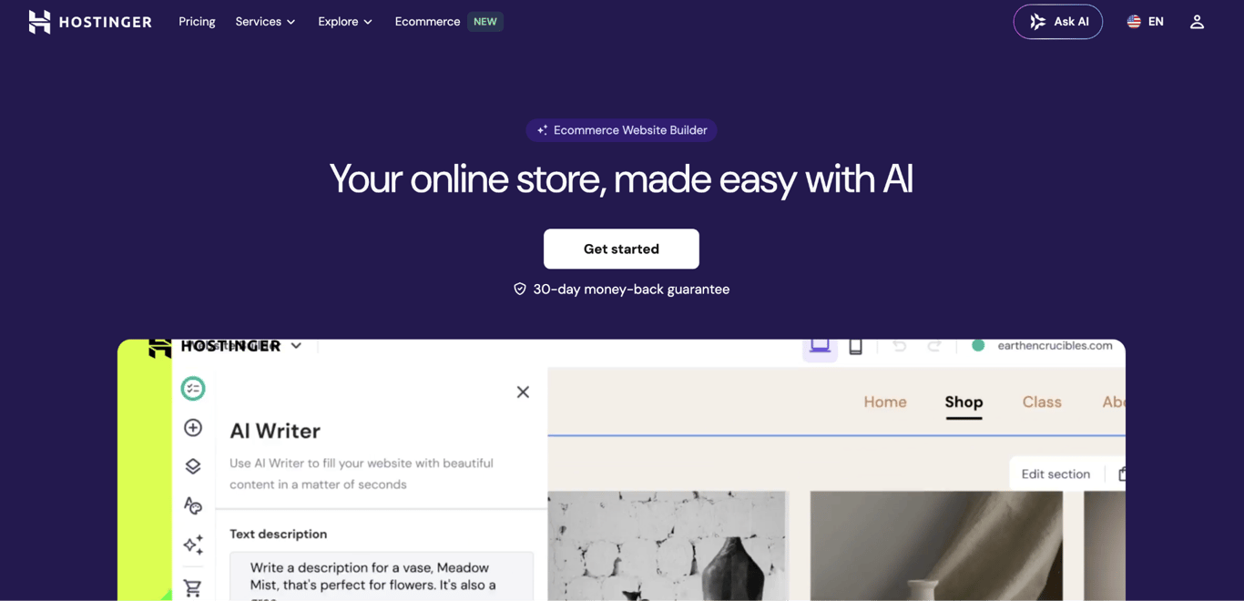
Hostinger Ecommerce Website Builder provides responsive store templates and mobile editing controls for creating product pages without coding. Use its mobile preview while building, then test the published store on a real phone because previews cannot reproduce every browser, keyboard, or payment-wallet difference.
Place a test order before sending traffic to the store. Find a product, choose its options, add it to the cart, complete payment, and confirm that the order appears in the store dashboard. The process should not require zooming, repeated data entry, or searching for hidden buttons and fees.
After launch, use store data to decide what to fix first:
Where shoppers leave | What to improve |
Product pages | Images, descriptions, prices, delivery details, and option selectors |
Cart | Unexpected costs, unclear quantities, or a hard-to-find checkout button |
Checkout | Unnecessary fields, confusing errors, missing payment options, or unclear fees |
Payment step | Wallet compatibility, declined-payment guidance, and trust signals |
When you sell through more than one storefront, Hostinger Ecommerce keeps products, orders, categories, and analytics in one place. Central management prevents separate storefronts from showing outdated product details or stock as the business grows.
All of the tutorial content on this website is subject to Hostinger's rigorous editorial standards and values.

Alma is an AI Content Editor with 9+ years of experience helping ideas take shape across SEO, marketing, and content. She loves working with words, structure, and strategy to make content both useful and enjoyable to read. Off the clock, she can be found gaming, drawing, or diving into her latest D&D adventure.