How long should a marketing email be?
Jun 25, 2026
/
Alma F.
/
11 min Read
A marketing email should be 50 to 600 words in the body, depending on the email type, goal, audience, and call to action (CTA).
The question “how long should a marketing email be?” is best answered by looking at the email type and the action you want the reader to take.
A short promotional email needs enough copy to explain the offer and drive one click. A newsletter needs more room because it covers several topics. A nurture email can run longer because the reader expects more context before taking action.
Email length is not only the body copy. The full size of an email includes the subject line, preheader, body word count, layout, CTA placement, and mobile view. When one of these parts is too long, the email becomes harder to scan and easier to ignore.
Use this process before you write:
- Define the campaign format and objective.
- Set clear limits for the subject line and preview text.
- Decide how long the main message should be.
- Lead with the most important information first.
- Match CTA placement to the email’s length.
- Test only one length-related element at a time.
- Record the best-performing word count range.
1. Identify your email type and goal
Your email type and goal determine how long the marketing email should be.
Start by identifying the type of email you are sending. Then, write the one action you want the reader to take. This gives you a clear brief before you write the marketing email, so the copy does not carry more information than it needs.
Common email types include:
Email type | Main goal | Recommended body length |
Promotional | Drive one click to a product, offer, or landing page | 50–150 words |
Newsletter | Share several updates or resources | 200–500 words |
Transactional | Confirm an action, order, payment, or account change | 50–125 words |
Welcome | Introduce the brand and set expectations | 150–250 words |
Re-engagement | Bring inactive subscribers back | 75–150 words |
Nurture or educational | Explain, build trust, and move readers toward a later action | 300–600 words |
Abandoned cart | Recover an unfinished purchase | 75–150 words |
Post-purchase | Thank the customer, explain next steps, or ask for a review | 100–200 words |
The ranges differ because each email type needs a different amount of context.
A transactional email only has to confirm what happened. A promotional email has to explain the offer and drive one click. A nurture email needs more room because it has to explain the topic before asking the reader to act.
Ask this before drafting: What should the reader do after reading this email?
If the answer takes more than one sentence, the email is trying to do too much. Split the message into separate emails or choose the strongest goal.
2. Set your subject line and preheader length
Your subject line should fit the inbox before the reader opens the email. Use these inbox copy limits:
- Mobile subject line – 30–40 characters, so the main message appears before the cutoff.
- Desktop subject line – 50–60 characters, giving you more room for context.
- Preheader – 35–90 characters, adding a benefit, deadline, or missing detail.
Once you set the character limits, decide what the reader must see first. Put the offer, product name, deadline, benefit, or required action near the front, because those words are most likely to appear before the subject line gets cut off.
Compare these two subject lines:
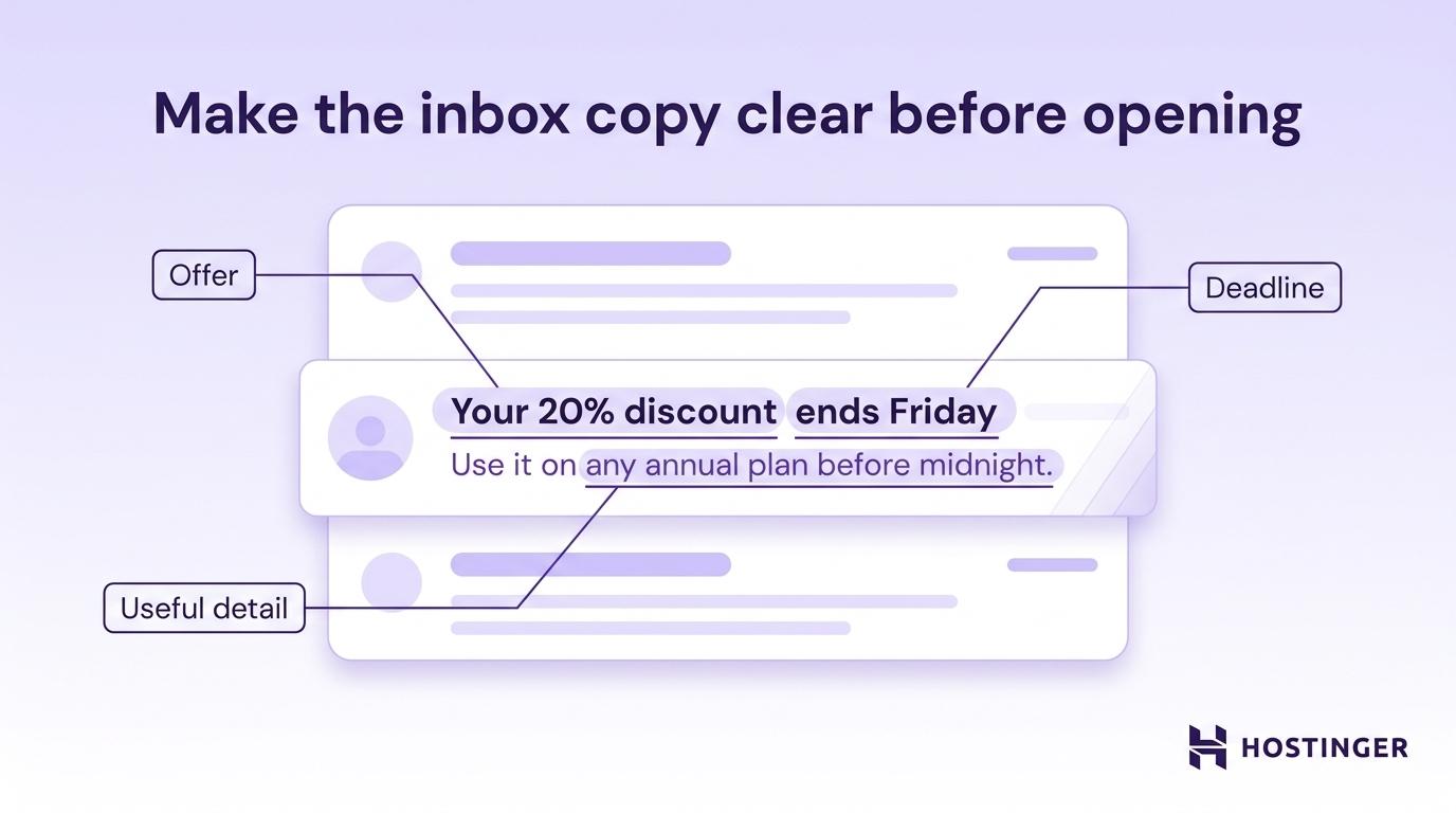
Subject line A – “Important news from our team”
Subject line B – “Your 20% discount ends Friday”
The second subject line is stronger because it presents the offer and deadline right away. The reader doesn’t need to open the email to understand what is at stake.
The preheader should then add the next useful detail.
Example:
Subject line: “Your 20% discount ends Friday”
Preheader: “Use it on any annual plan before midnight.”
The subject line explains the offer. The preheader adds where the discount applies and when it expires. Together, they give the reader enough context to decide whether to open.
Subject lines, sender names, and preheaders shape the decision to open before the reader sees the body copy. Clear inbox copy helps you improve open rates without changing the offer itself.
3. Choose a target word count
Your target word count should match the email type you are sending.
Set the range before drafting. This gives the copy a clear limit and makes editing easier.
The exact number depends on how much the reader already knows. A familiar audience needs less setup, while a new reader, an inactive reader, or someone still comparing options needs more context before clicking.
For example, a promotional ecommerce discount email can stay short because the reader already understands the product and only needs the offer, deadline, and CTA.
In contrast, a B2B nurture email needs more space because the reader is comparing options, weighing risk, or learning about a process. Cutting too much context in this case can weaken trust and reduce clicks.
Use these rules to choose where you land within your email-type range:
- One simple offer – stay at the lower end, such as 50–100 words for a promotional email with one discount, product, or deadline.
- Cold or inactive audience – move toward the higher end, adding 50–100 extra words to explain why the message matters and rebuild interest.
- Mobile-heavy audience – keep the body to 50–125 words, use short paragraphs, include visible CTAs, and avoid long setup.
- Desktop-heavy B2B audience – use the middle or upper end, such as 150–250 words, when the reader needs context, proof, or product details before acting.
- Newsletter with several sections – divide the total word count across sections, keeping each block around 40–80 words so readers can scan the main updates quickly.
- Transactional message – stay at the lower end, usually 25–75 words, and focus only on the action, confirmation, or next step the reader needs.
Don’t add words just because there is more to say. Add words only when they help the reader decide, act, or understand what happens next.
Here’s a simple, practical test: remove one sentence and ask whether the reader loses anything important. If the answer is no, cut it.
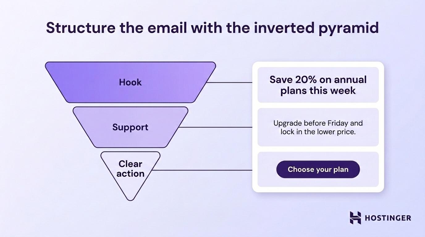
4. Structure the email with the inverted pyramid
The inverted pyramid puts the most important information first.
In a marketing email, that means starting with the main message, adding only the support the reader needs, and ending with one clear CTA. This keeps the email easy to understand, even when the reader only scans it.
Use this order:
- Hook – why this email matters.
- Support – why the reader should act.
- CTA – what the reader should do next.
Here is how that structure works in a promotional email:
Headline: “Save 20% on annual plans this week”
Support: “Upgrade before Friday and lock in the lower price for the year.”
CTA: “Choose your plan”
The reader sees the value, deadline, and action without digging through the email. That is the goal: the email should still make sense if someone reads only the headline, first sentence, and button.
Structure also affects how long the email feels. A 100-word email in one large paragraph feels heavier than a 200-word email broken into clean sections.
Use these formatting rules to make the body easier to scan:
- Keep paragraphs to one or two sentences.
- Use bullets for lists of three or more items.
- Add subheadings in emails over 250 words.
- Keep one idea per content block.
- Leave enough white space between sections.
A wall of text makes the reader work harder. When the email looks hard to read, many readers leave before reaching the CTA.
5. Place CTAs based on email length
CTA placement should match the length and structure of the email.
A short email should point to one action. A medium email can repeat the same CTA once, so both skimmers and full readers have a clear next step. A longer newsletter can use more CTAs when each one supports a separate section.
Use these CTA placement rules:
- Under 150 words – use one CTA after the hook or short body. This keeps the message focused.
- 150–400 words – place one CTA early in the email and one at the end. This gives both skimmers and full readers a clear action.
- Over 400 words – use up to three CTAs across major sections. This lets readers act from the section that interests them.
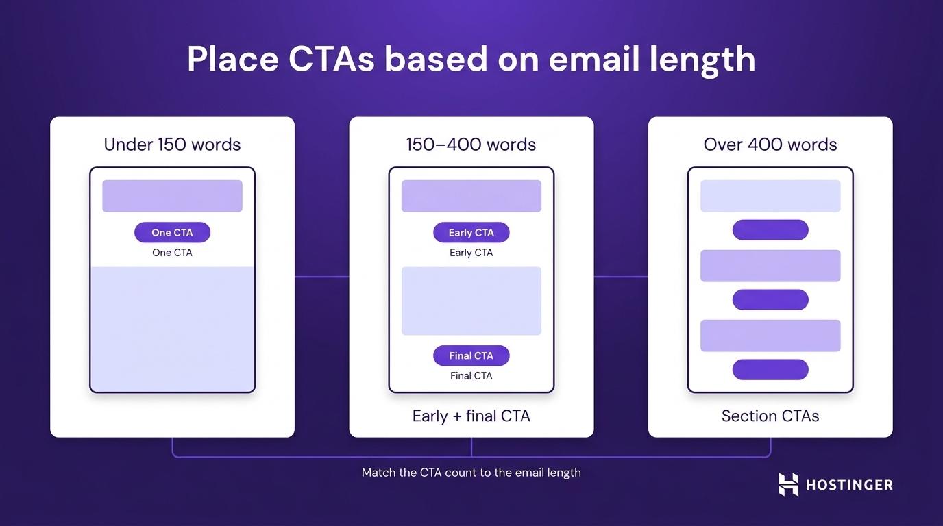
For emails over 150 words, the first CTA should appear before the reader has to work for it. On mobile, that means placing it near the top because a header image, headline, and short paragraph can already fill the first screen.
Use a button for the main action. Use text links for secondary details.
Example:
Main CTA button: “Start free trial”
Secondary text link: “See plan details”
This creates a clear priority. The button shows the main action, while the text link provides additional information without competing with it.
Don’t stack several buttons in a short email. Multiple CTAs force the reader to choose between actions, which slows click-throughs.
6. Test one length variable at a time
A reliable length test changes one variable per send.
Choose one thing to test: subject line length, preheader length, body word count, or CTA position. Testing one variable at a time makes the result easier to trust.
An A/B test compares two versions of the same email. Version A goes to one part of the list, and version B goes to another similar part of the list. If one version has a shorter subject line and a shorter body, you will not know which change caused the result.
Before you run the test, decide which metric will prove the winner. Match each variable to the appropriate email marketing performance metric so you measure the part of the email you changed.
Variable | What to compare | Main metric |
Subject line length | 35 characters vs 55 characters | Open rate |
Preheader length | 45 characters vs 85 characters | Open rate |
Body word count | 125 words vs 250 words | Click-through rate (CTR) |
First CTA position | Early in the email vs after the body | Click-to-open rate |
Total email length | Short version vs long version | Conversion rate and unsubscribe rate |
For example, subject line length should be judged by open rate, since the reader sees it before opening. Body word count should be judged by CTR since the body copy should move the reader toward the CTA. CTA placement should be judged by the click-to-open rate because it shows whether people who opened the email clicked.
Send timing also affects test quality. If one version goes out Tuesday morning and the other goes out Sunday evening, timing can distort the result. Use your audience data to find the best time to send marketing emails, then test the length inside the same send window.
A useful test needs enough recipients to show a real pattern. Small lists can still be tested, but the results should be treated as signals, not final rules.
After the test, write down:
- Email type and goal.
- Variable tested.
- Version A and version B values.
- Audience segment.
- Winning version.
- The metric that decided the winner.
- Date and campaign context.
This prevents the team from repeating the same test later.
7. Build a length playbook from test results
Your length playbook should record the winning range for each email type.
One test gives you a result for one campaign. Several tests give you a pattern. Over time, those patterns show whether your audience responds better to short promos, mid-length newsletters, or longer educational emails.
Record each pattern in a simple note for every recurring email type. Include:
- Email type – promotional, newsletter, welcome, re-engagement, or nurture.
- Current target length – the word count range you use now.
- Last tested – the campaign or month when you last ran a length test.
- Winning metric – the result that decided the winner, such as click-through rate or conversion rate.
- Audience context – the segment, season, or campaign type that affected the result.
For example, a promotional email note could say: “Promotional emails perform best at 75–125 words for discount campaigns. The shorter version won on click-through rate in the March campaign.”
A newsletter note could say: “Newsletters perform best at 300–400 words when split into three short sections. The three-section layout won on click-to-open rate in the April roundup.”
These notes give your team a starting point for future campaigns, rather than forcing every writer to guess from scratch.
Review the playbook every quarter, and update it after major audience changes such as list growth, a new customer segment, or a seasonal shift.
Industry email marketing statistics can help you sense where your campaigns sit against broader trends, but your own results should decide the final range for your list.
A winning length can drift over time. A 100-word promo that worked at 3,000 subscribers can lose strength at 30,000 subscribers because the audience mix has changed.
Watch CTR, conversion rate, unsubscribe rate, and spam complaints. Those numbers indicate whether the email length still aligns with reader expectations.
Mobile-heavy segments need a separate check because small screens affect how much copy readers can scan before reaching the CTA.
How long should a marketing email be for mobile?
A mobile-first marketing email should be 50–125 words.
Mobile readers see less content at once, so the email has to reach the main point quickly. The offer, value, and CTA should appear before the reader has to scroll through several blocks of copy.
Use these mobile limits:
- Subject line – keep it under 40 characters so the main message appears before the cutoff.
- Preheader – use 40–80 characters to add a benefit, deadline, or missing detail.
- Body copy – keep simple campaigns between 50 and 125 words.
- CTA button – make the tap area at least 44 × 44 pixels so it is easy to press.
- Layout – use a single column so the reading order stays clear.
A single-column layout keeps the headline, body, and CTA in the right order on small screens. Multi-column layouts can stack unpredictably, push the CTA too far down, or make the email harder to scan.
Here’s a simple mobile promo structure:
Headline: “Last day for 20% off”
Body: “Upgrade today and save on your annual plan. The offer ends at midnight.”
CTA: “Claim discount”
That is enough for a simple offer. Adding extra background weakens the message because the reader already has a reason to act.
Mobile newsletters need the same discipline, even when they include several sections. Give each section a clear headline, one or two short sentences, and a CTA or link. This helps readers find the item they care about without having to scroll through long text blocks.
Even with the right mobile length, some copy patterns can still make an email feel longer than it is.
Common marketing email length mistakes
The most common marketing email length mistakes make the message harder to scan or the CTA harder to find.
You can spot most of them in campaign data. A drop in clicks, click-to-open rate, or conversions shows where readers lose interest or fail to act.
Mistake | What happens next | What to fix |
Burying the CTA | Readers scroll but do not click | Move the first CTA higher in the email |
Adding several CTAs to a short email | Clicks split across actions | Keep one main CTA |
Writing one large text block | Readers leave before reaching the CTA | Break copy into short sections |
Repeating the same point | The email feels longer than it is | Cut duplicate explanations |
Ignoring the preheader | Open rate stays flat | Add new information after the subject line |
Making the email image-heavy | The message becomes harder to read and deliver | Add enough text and alt text |
Letting newsletters expand over time | Click-through rate drops across sends | Return to the target range |
These mistakes often stack up as campaigns evolve.
A simple promo email might start with a 100-word offer and a single button. After several sends, it can grow into a 350-word email with a founder note, three product blocks, a customer quote, and extra links, even though the goal is still one purchase.
At that point, trimming random sentences will not fix the problem. Restore the email to its purpose: one offer, one reason to act, and one CTA.
Once the copy is focused again, use the right tools to check whether the revised version performs better.
How to check email length and performance
To choose the right email length, check the copy before sending and measure what readers do after they click. Use these four types of checks:
- Word count and readability tools – check body length, sentence length, and reading level before you send.
- Rendering tools – preview the email on mobile and desktop to see whether the CTA appears early enough.
- Email service provider (ESP) testing tools – use your email platform to run A/B tests and compare opens, clicks, unsubscribes, and conversions.
- Analytics tools – track what readers do after they click, so you can see whether the email leads to the right page action.
Here’s a simple setup that works for most small teams:
- Write the email.
- Check the word count.
- Preview it on mobile.
- Send an A/B test.
- Review opens, clicks, conversions, and unsubscribes.
- Record the winning length for future campaigns.
An email marketing platform should support campaign creation, audience management, testing, and performance tracking in one place. Hostinger Reach, for example, helps you create email campaigns, manage your audience, send emails, and review campaign performance without moving between separate email tools.
This is important because length decisions only improve when you can connect each email version to the result it produced.
For example, a short email might win on clicks but lose on conversions if the landing page doesn’t match the email’s promise. Post-click tracking shows whether readers complete the expected action after they leave the inbox.
Use UTM tags on email links to see where each visitor came from. A UTM tag is a short tracking code added to a URL. It tells analytics tools which campaign, link, and email version brought the visitor to the page.

How to design a marketing email
After choosing the target length, design the email around the amount of copy it needs to present.
Short promotional emails work best with a simple layout, one main visual focus, and a clear CTA area. Longer newsletters or educational emails need more structure, with separated sections, enough white space, and a layout that prevents the email from feeling crowded.
The design should support the message length, not compete with it. Too much visual structure can make a short email feel heavier than it is, while too little structure can make a longer email harder to scan.
Use email design best practices to review key elements, including layout, visual hierarchy, image use, CTA placement, mobile spacing, and accessibility.
Choose the layout after you choose the length, so the design supports the message rather than forcing it into the wrong format.
All of the tutorial content on this website is subject to Hostinger's rigorous editorial standards and values.

Alma is an AI Content Editor with 9+ years of experience helping ideas take shape across SEO, marketing, and content. She loves working with words, structure, and strategy to make content both useful and enjoyable to read. Off the clock, she can be found gaming, drawing, or diving into her latest D&D adventure.