10 best Black Friday landing page examples
Nov 04, 2025
/
Jordana A.
/
8 min Read
Black Friday is a major shopping event that takes place the day after Thanksgiving in the United States, usually falling on the fourth Thursday of November. However, Black Friday deals often start early in the month. This event kicks off the holiday shopping season, giving you an opportunity to generate sales by offering discounts on your products.
You can maximize conversions during this high-traffic period with a well-designed Black Friday landing page. These pages should highlight special offers, feature clear calls to action, and provide easy navigation – all to motivate visitors to complete purchases.
Here are the 10 best Black Friday landing page examples to inspire you:
- Lena Layne. Features a warm, personal tone and clear messaging that drives urgency without heavy visuals.
- BIKE24. Uses a countdown to increase conversions with urgency tactics.
- Steam. Highlights best products and how much customers can save.
- Costco. Focuses on customer needs over immediate discounts.
- The North Face. Promotes Black Friday deals and the loyalty program simultaneously to boost immediate engagement and build long-term loyalty.
- Samsung. Showcases an evergreen Black Friday landing page to retain link equity and grow the email list.
- Delsey. Uses SEO-friendly copy with high-traffic keywords, without mentioning the specific year to keep it evergreen.
- WP Rocket. Displays the heading and discount code in the same font size to emphasize immediate value.
- Ghost. Runs one-day events and does a product launch to drive traffic and customer engagement.
- Brooks Brothers. Includes an FAQ section with helpful links to improve the customer experience.
We’ve picked these landing pages based on their strong appeal, compelling calls to action, and effective design elements that drive conversions. Check it out and tell us which one stands out to you the most.
1. Lena Layne
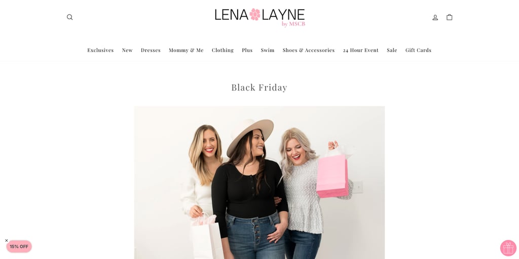
Lena Layne is an online retailer known for its trendy yet modest women’s clothing, focusing on comfort without sacrificing style. This collection is designed to make every woman feel confident, whether she’s lounging at home or attending an event.
The Black Friday landing page is styled like a personal letter, giving visitors all the key details they need: when the deals start, the discount percentage, and which items are up for grabs. The warm, inviting tone perfectly reflects the brand’s friendly, personal image.
Throwing in phrases like “Take the perfect Christmas photos” and “Shopping for a loved one?” adds a nice touch. It appeals to customers’ emotions, creating a sense of urgency and need for their offers.
Lena Layne’s landing page shows that it doesn’t have to be visually heavy to succeed. By focusing on clear, compelling messaging, it can still effectively capture attention and drive conversions.
2. BIKE24
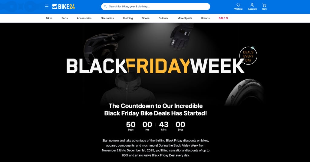
This online retailer specializing in bikes and cycling gear keeps its Black Friday website design straightforward and effective, driving conversions without overcomplicating the message.
BIKE24’s landing page greets visitors with a bold heading, “Black Friday Week,” along with a sticker emphasizing daily deals that make it clear fresh discounts will be available each day. A prominent countdown timer adds urgency – a classic Black Friday marketing tactic.
Additionally, the page invites visitors to sign up for the newsletter, keeping them updated on deals even after Black Friday has ended. This email strategy helps maintain customer engagement and primes them for future offers.
3. Steam
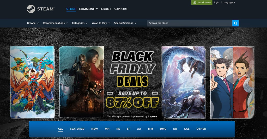
Steam is a popular digital marketplace for games, and its Black Friday landing page for Capcom games is a great example of how to use visuals to drive engagement.
The landing page displays vibrant images of Capcom’s most popular and anticipated games, such as the Resident Evil series and the Ace Attorney Investigations collection. These eye-catching images immediately draw visitors in and highlight the exciting titles on offer.
The middle section of the page highlights the Black Friday deals, offering discounts of up to 87% on various Capcom titles. “Save up to” grabs attention by highlighting significant savings, while non-rounded discounts enhance the perception of a better deal.
This combination of clear messaging and strategic pricing effectively captures the attention of visually driven customers and gets them to act fast.
4. Costco
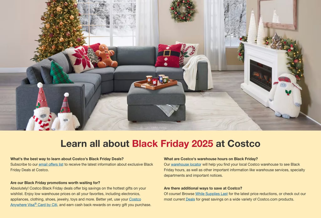
Since many shoppers frequent Costco for their grocery and house essentials, the warehouse retailer makes sure its Black Friday landing page is as informative as possible for their customers during the busy season.
The page opens with a picture of a cozy, holiday-vibe living room, which indirectly creates a sense of need. It’s followed by an FAQ section about the company’s Black Friday offers: the best way to stay updated, items on sale, warehouse hours, and other tips for securing the best deals.
Scrolling down, you’ll find sections promoting holiday items, from house decorations to ideal options for presents and self-gifting. Interestingly, there’s no mention of specific discounts.
By prioritizing customer needs over immediate discounts, Costco creates a sense of brand loyalty and long-term value that can drive purchases without relying on traditional sales tactics.
5. The North Face
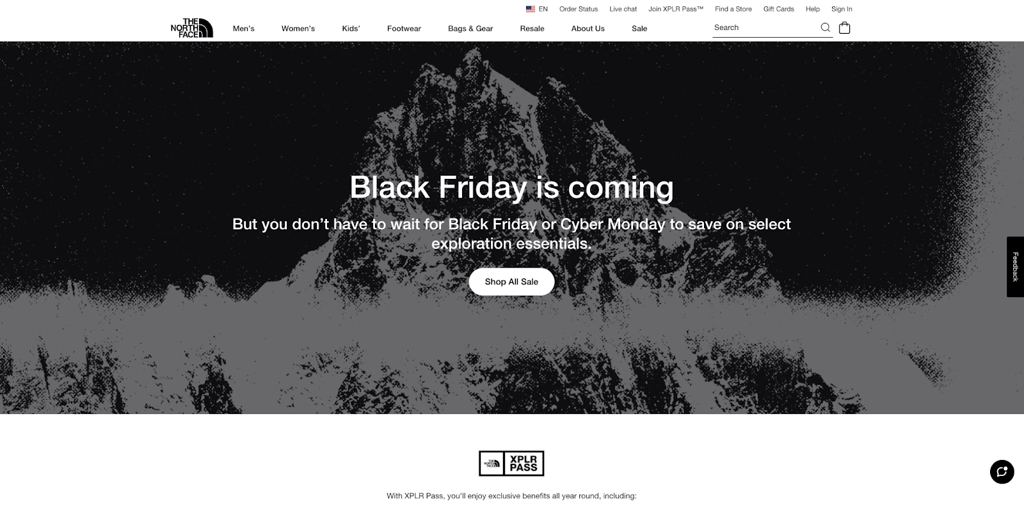
The North Face, known for its high-quality outdoor clothing and gear, takes a minimalist approach to its Black Friday landing page.
A simple, yet effective heading – ”Black Friday is coming” – greets visitors, followed by the reassurance that they don’t have to wait to secure great deals. This immediately grabs attention, letting bargain hunters know they can take advantage of discounts well before the actual Black Friday rush.
The landing page then promotes The North Face’s loyalty program, detailing benefits like early access to sales, members-only events, and free shipping. A clear call to action (CTA) makes it easy for potential customers to sign up and enjoy these perks right away.
This strategy drives immediate engagement while fostering long-term loyalty. By encouraging customers to join the loyalty program, The North Face makes sure they stay connected with the brand beyond Black Friday, turning one-time buyers into repeat customers.
6. Samsung
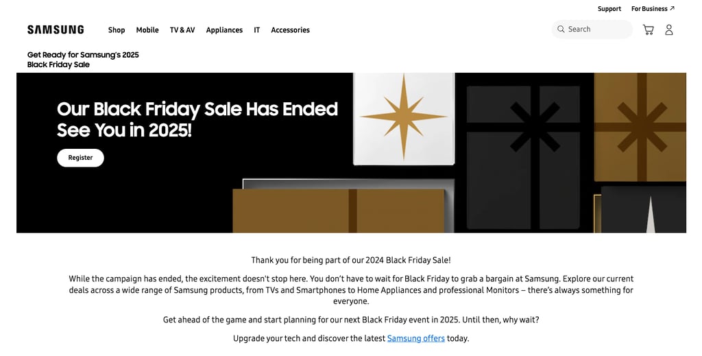
Samsung takes a unique approach with its Black Friday landing page by displaying a message that reads, “Our Black Friday Sale Has Ended, See You in 2025!”
While this might seem unusual, it’s actually a smart SEO tactic. By keeping the landing page live and updated, Samsung makes sure it stays indexed by search engines, continuing to drive traffic well after the event has ended.
What’s more, this type of landing page can be repurposed year-round to promote other sales events or special deals. Samsung also uses the page to build its email list with a signup form at the bottom for easy customer registration.
The lesson? Repurposing landing pages with SEO-friendly content allows brands to stay visible, engage customers long-term, and maximize the value of each page.
7. Delsey
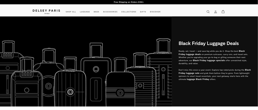
Another effective way to “recycle” a Black Friday landing page is by avoiding the mention of the year, as Delsey does. The luggage and travel accessories brand keeps things simple with an introductory text that includes high-traffic keywords, followed by a catalog of its best-selling products.
The catalog not only showcases popular items but also clearly displays the starting and final prices, allowing customers to see exactly how much they can save by purchasing now. This tactic creates a sense of urgency without relying too heavily on calls to action, subtly encouraging visitors to act quickly.
Want to get your store ready for the busiest shopping season? Read our article on how to create a Black Friday campaign for your eCommerce store.
8. WP Rocket
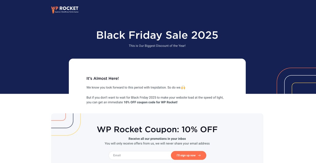
WP Rocket’s Black Friday landing page immediately draws attention to the heading, “Black Friday Sale 2025,” and the discount code, both displayed in the same font size.
This design choice is intentional. By giving equal visual weight to the discount code and sale message, the premium WordPress plugin removes any ambiguity so visitors see the value right away.
Below the discount code, the landing page features a signup form and links to social channels, making it easy for visitors to stay connected with the brand.
If you’re looking to grow your email list, this is a great way to capitalize on the Black Friday rush.
Pro Tip
Browse other Black Friday deals to learn what discounts work best and how to phrase your offers to attract more buyers.
9. Ghost
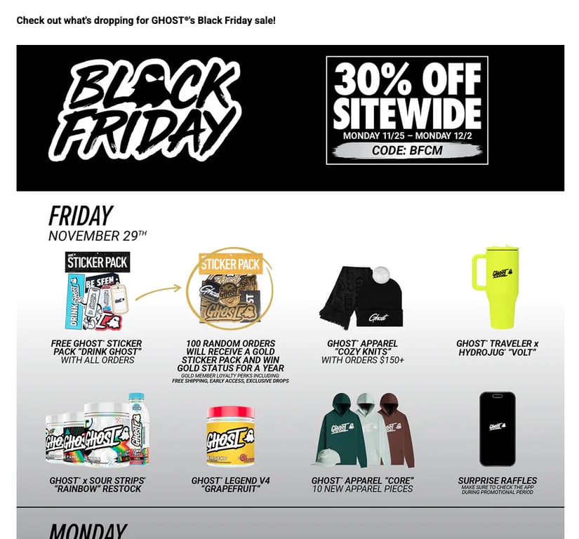
Last Black Friday, Ghost built anticipation by running two one-day events throughout the holiday week.
While discounts applied to purchases made throughout the week, customers who bought on specific days had the chance to enter raffles through the app, receive random freebies, and win newly launched products. On the second day, the fitness supplement brand even launched a secret product lineup.
With just one landing page, Ghost effectively drove traffic to its app, likely gained first-time buyers, and boosted customer loyalty. This is in addition to the traffic and sales already generated through its website.
10. Brooks Brothers
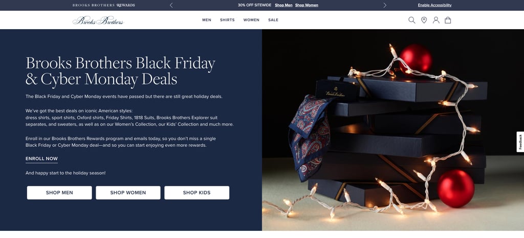
Black Friday is a prime event to attract first-time buyers, and Brooks Brothers takes full advantage of it by designing its landing page specifically for this demographic.
The first part includes the usual Black Friday elements: a compelling hero image, items on sale, and a call to subscribe to a newsletter. What sets it apart, however, is the FAQ section at the bottom.
The fashion company begins by addressing popular questions about Black Friday, then moves on to queries about deals, such as whether it offers a rewards program or credit card promotions. The section concludes with answers regarding payment methods and order processing times.
To make shopping even easier, Brooks Brothers strategically inserts helpful links beneath relevant questions. For example, under the question “Does Brooks Brothers have a rewards program?”, a link to a rewards page is included, allowing visitors to easily apply and start earning.
By anticipating common customer questions and offering direct solutions through clear, accessible links, Brooks Brothers improves the customer experience and builds trust, all while effectively driving conversions.
What are the key elements of successful Black Friday landing pages?
The content of your Black Friday landing page mostly depends on your brand voice and goals. However, the ones that drive conversions usually feature some of the following elements:
- Clear, attention-grabbing headline. The headline should immediately communicate the sale’s key offer, such as “Black Friday Deals Up to 70% Off.” Make sure the font size, type, and color make the headline stand out to drive the message home.
- Urgency indicators. Adding countdown timers or phrases like “Limited Time Only” creates a sense of urgency, encouraging visitors to act quickly before the deals expire.
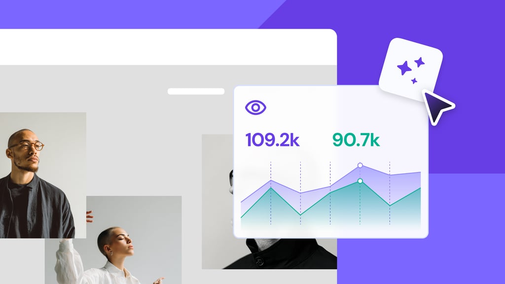
- Eye-catching visuals. High-quality images or graphics that highlight featured products or offers help make the page more appealing and draw attention to the deals.
- Prominent call to action (CTA). A visible and compelling CTA, such as “Shop Now” or “Start early,” guides users to take action right away by leveraging their fear of missing out (FOMO).
- Clearly worded deals. Be specific about the deals you offer – for example: “Save Up to 50%” or “Buy One Get One Free.” Clarity about savings builds excitement and encourages visitors to take advantage of the deals.
- Simple navigation. An easy-to-navigate layout ensures visitors can quickly find the deals they’re interested in without feeling overwhelmed or confused.
- Mobile optimization. With more people shopping on their phones, a responsive design guarantees your page is user-friendly on any device.
- Social proof and trust signals. Including customer reviews, ratings, or trust signals like secure checkout badges reassures visitors and boosts their confidence in making a purchase.
- Post-sale engagement. Adding a section to encourage email signups or social media follows helps maintain customer engagement for future promotions, even after the Black Friday event has ended.
How do I create a highly converting landing page?
To create a converting landing page, start by defining your audience and setting clear goals. Know who you’re targeting and what action you want them to take, whether it’s making a purchase or signing up for your newsletter. Choose a template with a user-friendly layout that aligns with your objectives.
Once you have your template, focus on crafting an engaging headline that captures attention and compelling copy that highlights the value of your offer. Add a clear and action-oriented CTA to drive visitors toward your goal.
Include eye-catching visuals that support your message and add social proof, like customer testimonials or reviews, to build trust. Finally, publish your landing page and run tests to optimize its performance, making sure it meets your conversion goals.
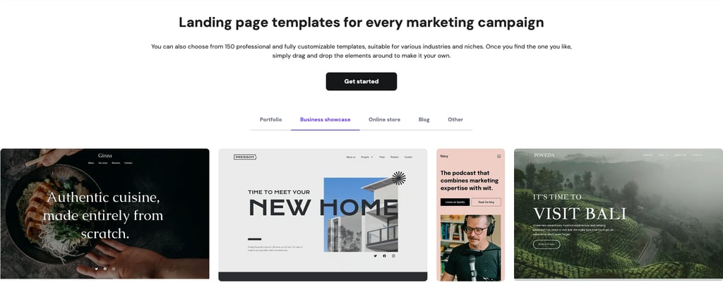
Hostinger’s landing page builder makes the process easy. Let AI create your landing page from scratch or choose from one of our designer-made, mobile-friendly templates. Customize it with a simple drag-and-drop builder, and launch your page in no time.
For just $3.79/month, you’ll get access to all AI tools, a free domain name for the first year, email marketing features, and various marketing integrations. Take advantage of our 30-day money-back guarantee to try it risk-free.
Ready to kick off your Black Friday sale with a high-converting landing page?
All of the tutorial content on this website is subject to Hostinger's rigorous editorial standards and values.

Jordana is a Senior Content Writer with a background in Information Systems. She has over five years of experience in WordPress and is casually dabbling with PHP and MySQL. Her passion for writing and technology drives her to create tutorials for anyone wanting to build their online presence. Follow her on LinkedIn.