Image optimization: What it is and how to improve website performance
Mar 10, 2026
/
Ksenija
/
10 min Read
Image optimization is the process of reducing image file size and delivering images in the right format and dimensions to improve page speed and search visibility without degrading visual quality.
Because images often account for up to three-quarters of a page’s total weight, they have a direct impact on loading time, Core Web Vitals, and user experience. Optimizing them requires balancing file size, visual fidelity, and discoverability.
That means choosing efficient formats such as JPEG, PNG, WebP, and AVIF, applying the right compression method, resizing images to match layout requirements, implementing responsive image techniques like srcset and sizes, using lazy loading strategically, and structuring metadata for search engines.
What is image optimization?
Image optimization means reducing the size of an image file and adjusting it to the appropriate format and dimensions in order to enhance website load times and search engine performance, all while retaining visual sharpness.
Every image carries data related to resolution, color depth, compression level, and embedded metadata. The more data it contains, the heavier the file becomes. The lighter the file, the faster it loads, but beyond a certain point, clarity begins to suffer.
This creates a three-way balance between file size, visual fidelity, and discoverability.
File size affects how quickly a browser can download and render a page. Images are often the largest assets on a webpage, which means they have a disproportionate impact on load time and core performance metrics.
Visual fidelity determines whether an image appears sharp and accurate at the size users actually see on screen. An optimized image preserves essential detail while removing redundant pixel data that does not improve the on-page appearance.
Discoverability refers to how well search engines can interpret and index an image. Beyond pixels, images include descriptive signals such as file names, alternative text, and structured data. These elements help search engines understand context and connect images to relevant queries.
Image optimization aligns these elements. It reduces unnecessary data, preserves the intended visual quality, and ensures images are structured to support search visibility and performance.
What are the benefits of image optimization?
Image optimization delivers four core outcomes: faster loading, smoother user experience, stronger search visibility, and lower resource consumption.
Faster loading speeds improve overall website performance. Over three-quarters of a webpage’s total weight comes from images.
When images are properly compressed and delivered in efficient formats, browsers download fewer bytes and display visible content sooner. In practice, image optimization can improve perceived loading times by around 0.32 seconds on desktop and up to 1.6 seconds on mobile.
This improves key performance metrics such as Largest Contentful Paint, First Contentful Paint, and Time to Interactive, and creates a faster path from page load to user interaction.
A smoother user experience keeps visitors engaged. Large or improperly sized images can cause slow rendering, visible content shifts, and delayed interactivity, especially on mobile devices.
Optimized images load in alignment with the layout and device resolution, which makes pages feel stable and responsive. When visual elements appear quickly and consistently, users are more likely to stay on the page and continue navigating.
Improved SEO increases search visibility. Search engines evaluate page speed and user experience as part of ranking systems, and large images often influence performance metrics such as Largest Contentful Paint.
When images are optimized for size, format, and metadata, they are easier to crawl, index, and associate with relevant queries. This strengthens both standard search rankings and visibility in image search results.
Reduced bandwidth usage supports sustainable and cost-efficient operations. Every unoptimized image increases data transfer between servers and users.
By reducing file sizes and serving images that match device requirements, websites consume fewer resources per visit. At scale, this reduces hosting requirements and lowers the overall energy footprint of delivering content online.
Top image optimization techniques
To reduce image weight without sacrificing quality or visibility, you need to control format, compression, dimensions, delivery behavior, and measurement.
1. Choose the appropriate file format
The file format determines how efficiently an image is compressed, what visual features it supports, and how widely it is supported across browsers. Choosing the wrong format can double the file size without improving visible quality.
Here is how the main image formats compare:
Format | Compression efficiency | Browser support | Pros | Cons |
AVIF | Very high | Modern browsers | Smallest file sizes, strong quality retention | Slower encoding, not supported in very old browsers |
WebP | High | Broad modern support | Strong compression, good balance of size and quality | Slightly larger than AVIF in many cases |
JPEG | Moderate | Universal | Widely supported, fast encoding | Larger files than WebP or AVIF, no transparency |
PNG | Low for photos, lossless for graphics | Universal | Lossless quality, ideal for sharp edges and text | Large file sizes for photographic content |
Each format serves a different purpose:
- AVIF delivers maximum compression efficiency for high-quality photographs and large hero images. It achieves very small file sizes while preserving visual detail.
- WebP provides a strong balance between compression and compatibility, making it suitable for most website images, including product photos and blog visuals.
- JPEG is useful for photographic content when legacy browser support is required and transparency is not needed.
- PNG works best for graphics, logos, icons, and images that require lossless compression or transparency, especially where sharp edges and text must remain crisp.
If your website still relies primarily on JPEG and PNG for all images, switching to modern formats like WebP or AVIF often delivers immediate file size reductions without visible quality loss.
2. Compress your image files
Compression reduces the amount of data an image contains, which directly lowers file size and speeds up delivery without changing its displayed dimensions.
There are two compression methods to choose from: lossy and lossless.
Use lossy compression for photographs and large visual content. Lossy compression removes non-essential data to achieve much smaller file sizes. When applied at controlled levels, the visual difference is minimal to the human eye. This makes it suitable for blog images, product photos, hero sections, and background visuals.
If your website relies on photographic content, do the following:
- Export images in AVIF when you want the smallest possible file size, and modern browser support is sufficient.
- Use WebP format when you need strong compression with broader compatibility.
Lower the quality setting in steps and preview the image at its final on-page size. If you notice blur, banding, or blocky artifacts, increase the quality slightly until the image looks clean.
Use lossless compression for graphics that require pixel precision. Lossless methods preserve every pixel exactly, which is essential for logos, icons, UI elements, and images containing text.
For these cases:
- Use PNG when transparency or sharp edges must remain intact.
- Avoid converting logos or text-heavy graphics to lossy formats if clarity suffers.
Before publishing any image, check that it looks sharp at its actual display size, that the file size matches its on-page role, and that there are no visible compression artifacts at 100 percent zoom.
3. Use the right image dimensions and aspect ratio
Serving images at the correct dimensions prevents unnecessary data transfer and avoids layout instability.
Many websites upload images at their original resolution, even when they are displayed much smaller. If a photo is 4000px wide but appears at 800px on screen, the browser still downloads the full file and then scales it down. That wastes bandwidth and slows rendering.
Start by matching image width to layout requirements.
For example:
- For mobile layouts, images rarely need to exceed 800px in width.
- For standard content areas on desktop, 1200 to 1600px is sufficient.
- For full-width hero sections on large screens, go higher only if the design requires it.
The key rule is simple: the image’s intrinsic width should not significantly exceed its maximum rendered width.
If the browser does not know the aspect ratio (an image’s width and height) in advance, it cannot reserve space during page load. This causes layout shifts when the image finally loads.
To prevent this:
- Maintain consistent aspect ratios across similar images, such as product thumbnails.
- Always define width and height attributes in your HTML.
- Avoid cropping that changes proportions unpredictably across breakpoints.
When your layout adapts to different screen sizes, use responsive image techniques so the browser selects the correct file automatically.
For responsive delivery, implement:
- The srcset attribute to provide multiple image widths.
- The sizes attribute to tell the browser how much viewport space the image will occupy.
Example:
<img
  src="image-800.jpg"
  srcset="image-400.jpg 400w, image-800.jpg 800w, image-1600.jpg 1600w"
  sizes="(max-width: 768px) 100vw, 800px"
  width="800"
  height="600"
  alt="Descriptive alt text">
This tells the browser:
- On screens up to 768px wide, use an image that fills 100 percent of the viewport width.
- Otherwise, assume the image renders at 800px.
The browser then downloads the smallest file that satisfies those conditions.
If your images are larger than their rendered size or lack defined dimensions, you are transferring unnecessary data and risking layout shifts. Match dimensions to layout, preserve consistent aspect ratios, and let the browser choose the right file for each device.
4. Implement image SEO
Image SEO ensures that search engines can understand, index, and rank your images in context with the rest of your page.
To make images discoverable, focus on file names, alt text, and structured data.
File naming
Search engines read file names as contextual signals. A generic name such as IMG_4821.jpg provides no meaning.
To create a descriptive name that reinforces topical relevance, follow these rules:
- Use clear, descriptive words that reflect the image content.
- Separate words with hyphens, not underscores.
- Keep names concise and aligned with the page topic.
For example:
- blue-running-shoes.jpg is descriptive and searchable.
- image1.jpg is meaningless.
If the image supports a specific section, align the file name with that section’s keyword focus.
Alt text
Alt text describes the image for search engines and visually impaired users who use screen readers for browsing the internet.
To improve accessibility and help images rank in search results, write alt texts that:
- Describe what is visible in the image.
- Reflect the image’s purpose on the page.
- Use relevant keywords naturally, without stuffing.
✅ Good: “Men’s blue running shoes with white sole”
❌ Bad: “shoes”
✅ Good: “Line chart showing monthly website traffic growth”
❌ Bad: “chart image”
Avoid repeating the page title or adding phrases like “image of” or “picture of.” If the image is decorative and adds no informational value, use an empty alt attribute so screen readers skip it.
Structured data (Schema.org/ImageObject)
Structured data provides explicit information about an image to search engines. It strengthens how images are interpreted and displayed in search results.
Use Schema.org’s ImageObject markup to define properties such as:
- contentUrl
- description
- name
- width and height
Example in JSON-LD:
{
  "@context": "https://schema.org",
  "@type": "ImageObject",
  "contentUrl": "https://example.com/images/blue-running-shoes.jpg",
  "name": "Men's Blue Running Shoes",
  "description": "Lightweight men's blue running shoes with white sole",
  "width": 800,
  "height": 600
}
This structured data clarifies what the image represents and how it relates to the page content. It can support enhanced search features and improve indexing accuracy.
If your images drive traffic, appear in product listings, or support key landing pages, implement structured data consistently.
Metadata makes images understandable. Structured data makes them explicit.
5. Utilize lazy loading
Lazy loading delays the loading of offscreen images until the user scrolls near them, reducing initial page weight and speeding up the first meaningful render.
If your page includes images below the fold, such as gallery items, related posts thumbnails, or long-article illustrations, lazy load them so the browser prioritizes what the user can see first.
Use native lazy loading in HTML:
<img
  src="team-photo-800.webp"
  srcset="team-photo-400.webp 400w, team-photo-800.webp 800w, team-photo-1600.webp 1600w"
  sizes="(max-width: 768px) 100vw, 800px"
  width="800"
  height="600"
  alt="Team working in an office"
  loading="lazy"
  decoding="async">
Apply these rules:
- Use loading=”lazy” for images that start offscreen.
- Avoid lazy loading the primary above-the-fold image, which is often the Largest Contentful Paint element.
- Keep width and height set so the layout stays stable while images load.
- Use decoding=”async” to reduce main-thread blocking during decode.
If you have a hero image that is likely to be the LCP element, treat it differently:
- Set loading=”eager” (or omit loading) and consider fetchpriority=”high” to fetch it early.
If you are using WordPress, lazy loading is enabled by default starting with WordPress 5.5. The platform automatically adds loading=”lazy” to image tags it generates. This reduces initial load weight without additional configuration.
However, do not assume the default behavior is always correct. Review your templates and confirm that above-the-fold images, especially large hero sections, are not being lazy-loaded. If your main visual is delayed, it can negatively affect Largest Contentful Paint.
6. Test and monitor website performance
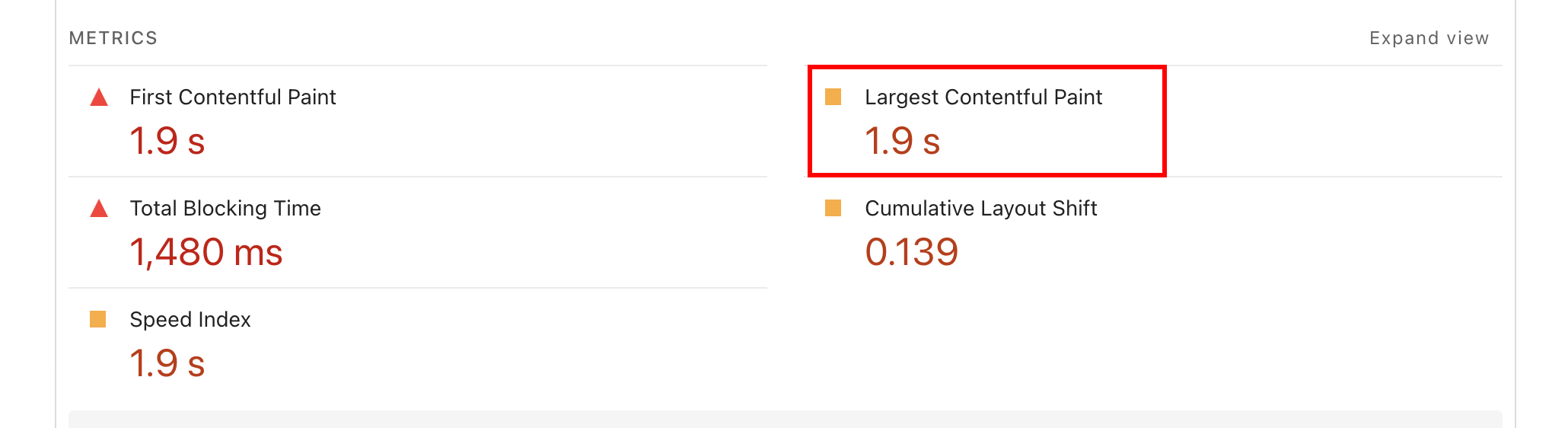
Image optimization directly affects measurable performance indicators, especially Largest Contentful Paint (LCP), Cumulative Layout Shift (CLS), and total page weight.
Largest Contentful Paint (LCP) measures how long it takes for the largest visible element on the screen to fully render. An LCP of 2.5 seconds or less is considered good, between 2.5 and 4 seconds is acceptable, and over 4 seconds is considered poor, as it negatively impacts the user experience and SEO.
On many websites, this element is a hero image or featured visual above the fold. If that image is too large, compressed poorly, or loaded late, LCP increases.
To test LCP:
- Run your page through Google PageSpeed Insights.
- Identify which element is marked as LCP.
- If it is an image, check its file size and format.
- Ensure it is not lazy-loaded.
- Confirm it loads early in the request waterfall.
Cumulative Layout Shift (CLS) measures visual stability by tracking how much content moves during page load. A CLS score of 0.1 or lower is ideal, between 0.1 and 0.25 is acceptable, and over 0.25 is considered poor, as it disrupts the user experience and may hurt search rankings.
When images load without a defined width and height, the browser cannot reserve space in advance, causing elements to shift as they render.
To test CLS:
- Review the CLS score in PageSpeed Insights.
- Inspect flagged elements that shift during load.
- Add explicit width and height attributes to images.
- Maintain consistent aspect ratios across breakpoints.
Total page weight reflects how much data is downloaded when a page loads. Since images often account for three-quarters of the page size, they frequently dominate this metric.
To evaluate page weight:
- Use the GTmetrix speed test to sort resources by file size.
- Identify the largest image files.
- Compare each image’s file size to its rendered dimensions.
- Replace oversized files with properly scaled versions.
For deeper analysis, use WebPageTest:
- Review the waterfall chart to see when images are requested.
- Use the filmstrip view to observe when the largest visible image appears.
- Confirm that the images below the fold load after the initial render.
If one image significantly affects LCP timing or total page weight, optimize that asset first. It usually delivers the most measurable improvement.
Top tools for optimizing images
Image optimization tools handle compression, format conversion to AVIF and WebP, and automated delivery across devices.
Depending on your workflow, you might use a browser-based tool for manual control, a WordPress plugin to automate uploads, a lightweight web compressor for quick edits, or a Content Delivery Network (CDN) that optimizes images at the edge.
Squoosh (Google)
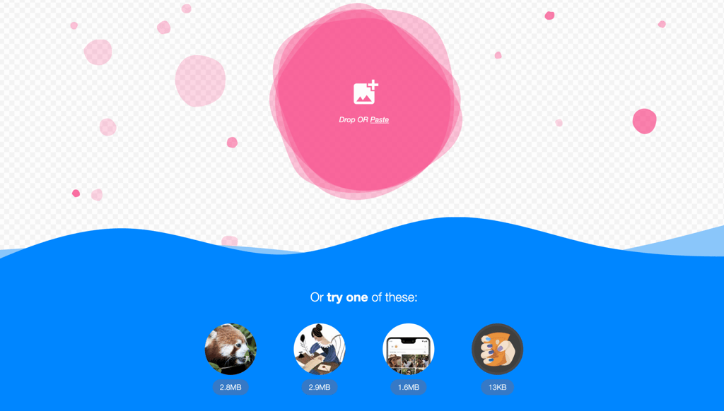
Squoosh is a free, open-source, browser-based tool that provides granular control over compression and format conversion.
It supports AVIF, WebP, JPEG, and PNG, and allows side-by-side visual comparison before exporting. This makes it useful for optimizing critical images such as hero sections or landing page visuals where LCP performance matters.
Pros | Cons |
Full manual control over compression | No automation |
Visual comparison between formats | Requires optimizing images individually |
Supports AVIF and WebP natively | Not integrated into CMS workflows |
ShortPixel
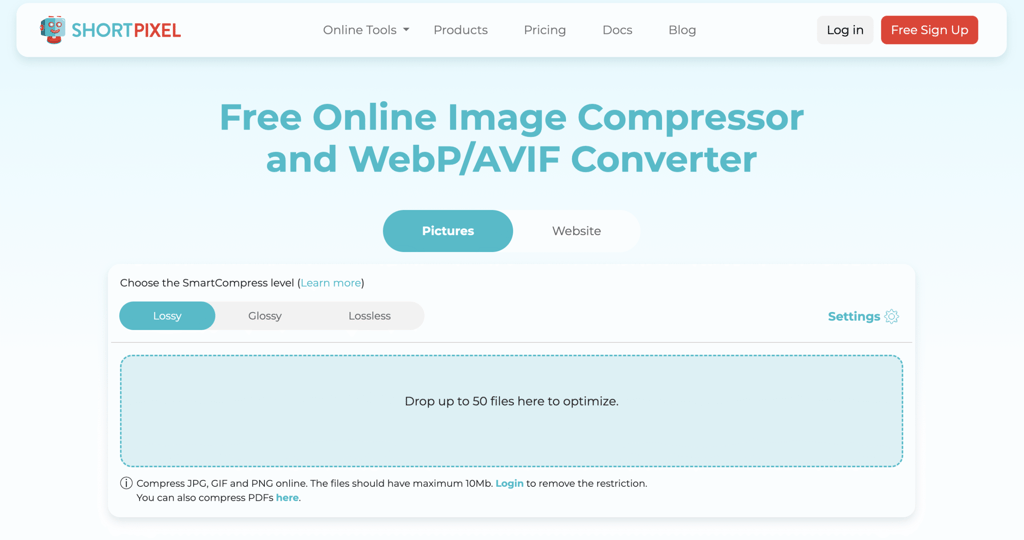
ShortPixel is a WordPress plugin and cloud-based service that automates image compression and next-generation format conversion.
It supports AVIF, WebP, JPEG, and PNG. It can bulk-optimize existing libraries and serve modern formats conditionally based on browser support. This makes it appropriate for content-heavy WordPress sites that require automation.
Pros | Cons |
Automatic compression on upload | Requires WordPress |
Bulk optimization of existing images | Cloud processing dependency |
Conditional AVIF and WebP delivery | Less per-image precision than manual tools |
Imagify
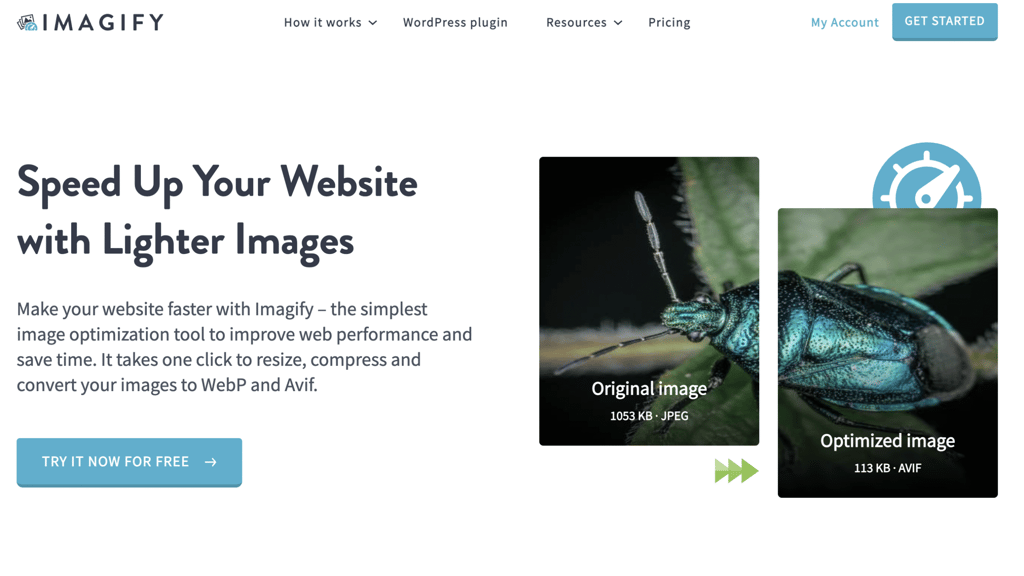
Imagify provides automated compression and resizing within WordPress.
It supports WebP and AVIF in addition to JPEG and PNG. Compression levels are predefined, which simplifies configuration for sites that prioritize consistency over manual fine-tuning.
Pros | Cons |
Predefined compression levels | Limited granular control |
Automatic optimization workflow | WordPress-only |
Supports modern formats | Fewer advanced configuration options |
TinyPNG / TinyJPG
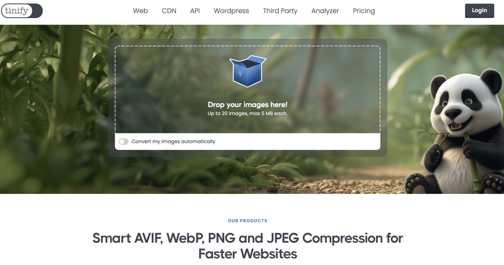
TinyPNG offers fast, drag-and-drop compression through a web interface.
TinyPNG offers fast, drag-and-drop compression through a web interface and supports WebP, JPEG, PNG, and AVIF out of the box. It prioritizes simplicity over advanced tuning, which makes it practical for quick, small-batch optimization.
Pros | Cons |
Quick and easy to use | Limited compression control |
No installation required | No built-in automation |
Suitable for small batches | File size capped at 5MB per image |
Cloudflare Image Optimization
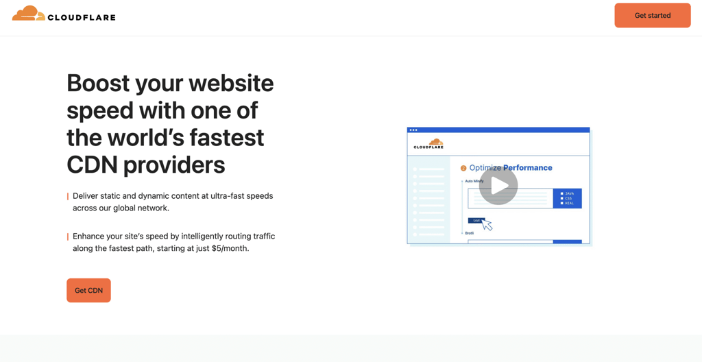
Cloudflare offers CDN-level image optimization through features such as Polish and Image Resizing.
It supports automatic WebP and AVIF delivery, on-the-fly compression, and device-based resizing. This approach centralizes optimization at the edge, which is effective for high-traffic websites or teams that prefer infrastructure-level control.
Pros | Cons |
Infrastructure-level automation | Requires CDN setup |
Automatic format conversion | Configuration complexity |
Device-aware resizing | Increases dependency on external service |
When selecting a tool, prioritize:
- Native AVIF and WebP support.
- Control over compression levels.
- Automation if you publish frequently.
- Integration with your CMS or CDN.
If you optimize images manually, use Squoosh for precision. If you publish at scale, use a plugin or CDN that automates format conversion and compression.
What should you focus on after optimizing your images?
After optimizing your images, focus on the next largest contributors to load time: scripts, CSS delivery, caching, and server response time.
Scripts. JavaScript can delay rendering if it blocks the browser from building the page. Large bundles, unused code, or third-party scripts increase processing time and delay interactivity. Reduce unused JavaScript, defer non-critical scripts, and load essential code first to prevent it from delaying visible content.
CSS delivery. Render-blocking CSS prevents the browser from displaying content until stylesheets are fully downloaded and parsed. Large or unused stylesheets increase this delay. Minify CSS, remove unused rules, and inline critical CSS for above-the-fold content to speed up initial rendering.
Caching. Without proper caching, returning visitors must re-download assets they have already loaded. Browser caching stores static files locally, while server-side caching reduces processing on repeat requests. Configure cache headers and enable page caching to improve load times for repeat visitors.
Server response time. Time to First Byte measures how quickly your server responds to a request. Slow hosting, inefficient backend logic, or missing CDN distribution increases latency before the page even begins rendering. Improve hosting performance, optimize backend queries, and use a CDN to reduce geographic delivery delays.
For a structured breakdown of performance improvements across your entire site, explore our website speed optimization guide.

All of the tutorial content on this website is subject to Hostinger's rigorous editorial standards and values.

Ksenija is a digital marketing enthusiast with extensive expertise in content creation and website optimization. Specializing in WordPress, she enjoys writing about the platform’s nuances, from design to functionality, and sharing her insights with others. When she’s not perfecting her trade, you’ll find her on the local basketball court or at home enjoying a crime story. Follow her on LinkedIn.