15 professional services website examples for your inspiration
Oct 04, 2026
/
By Linda D.
/
9 min Read
Professional services website examples show how businesses in law, consulting, real estate, design, logistics, and beyond use web design to earn client trust. For a service provider, the website is often the first point of contact with a potential client – it determines whether they book or keep searching.
The 15 examples include a Webby-nominated environmental law firm, the self-described largest independently owned design studio in the world, and a Berlin tattoo artist whose gallery pages double as a sales tool. Each one attracts clients through a different combination of navigation, imagery, and calls to action.
A good professional service website pairs specific service descriptions with social proof and a visible next step. Creating one involves choosing a template, structuring the core pages, and testing the experience before launch.
1. C-GEM
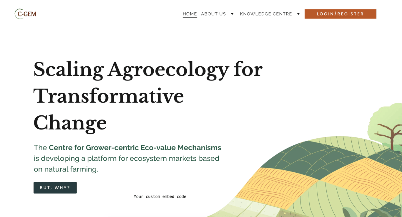
C-GEM – short for the Centre for Grower-centric Eco-value Mechanisms – is developing a platform for ecosystem markets based on natural farming. The homepage leads with a clear mission statement instead of a sales pitch.
The design is clean and minimal: white background, serif typography, and an illustrated farmland graphic that signals the subject without relying on photography. The headline “Scaling Agroecology for Transformative Change” states the goal directly, and the subtext explains in one sentence what C-GEM actually does.
The CTA “But, why?” is an unusual choice that invites curiosity rather than pushing an immediate conversion. The Knowledge Centre in the navigation houses the platform’s educational resources, giving visitors a place to explore more information after the homepage answers the first question.
2. Humaid
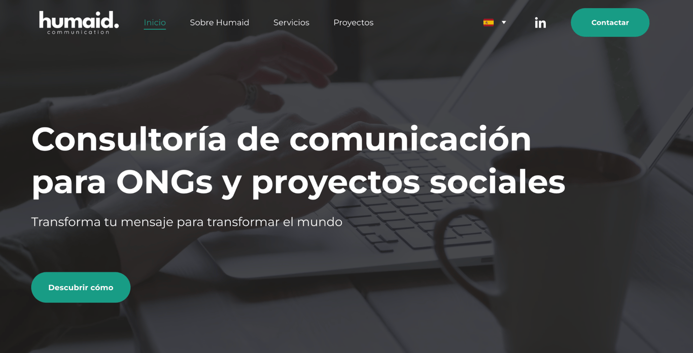
Humaid is a communication consultancy based in Spain, specializing in NGOs and social projects. Its homepage headline reinforces this positioning: “Consultoría de comunicación para ONGs y proyectos sociales” (“Communication consultancy for NGOs and social projects”).
That specificity is the site’s strongest design decision. Rather than presenting itself as a general communications agency, Humaid names its exact client type in the first line, filtering out irrelevant visitors and immediately building relevance with the right ones.
The subheadline reinforces the mission: “Transforma tu mensaje para transformar el mundo” (Transform your message to transform the world).
The dark background and teal accents create a professional tone without feeling corporate, which suits a consultancy working in the non-profit sector. Navigation covers the essentials – Sobre Humaid, Servicios, and Proyectos – with a teal Contactar button as the sole CTA.
3. Sparrow Flies
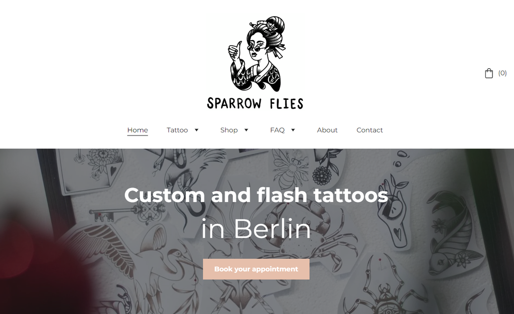
Sparrow Flies, the website of Berlin-based tattoo artist Agnė Žvirblytė, stands apart from typical tattoo studio websites. Its clean, image-first design makes it one of the strongest industry-specific service websites built on Hostinger AI Builder.
The homepage features a distinctive black-and-white logo and a link to a photo gallery that showcases the artist’s work. The website also includes an FAQ page with detailed answers to common tattoo-related questions.
The site features an About page with the tattoo artist’s bio, helping establish trust by giving potential clients more information about the person behind the work.
In addition to the Recent Tattoos photo gallery, the website has a Wanna-dos page. Here, visitors can explore the tattoo artist’s original tattoo designs for future bookings.
The navigation covers Tattoos, Shop, FAQ, About, and Contact, so visitors can reach any part of the site in one click.
Booking runs through a short contact form that asks for the tattoo idea, size, placement, and preferred dates – everything the artist needs to reply with a quote.
An online shop sells the artist’s prints and hand-printed T-shirts, turning the same visual identity into a second revenue stream.
Suggested reading
Want to make your own booking site? This tutorial will walk you through the steps using Hostinger AI Builder.
Overall, the website design perfectly blends edginess and elegance, mirroring the spirit of the tattoo industry and the artist’s unique style.
4. Diplomatic Lawn Care
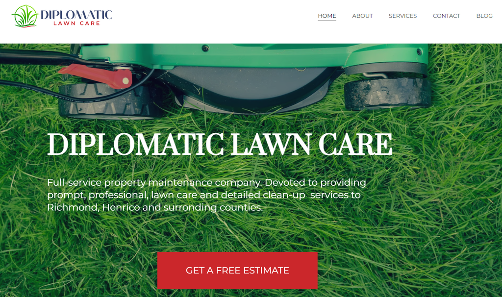
Diplomatic Lawn Care’s site is a showcase of simplicity and functionality. The professional services website design focuses on user-friendliness so visitors can easily access essential information.
On its homepage, you’ll see a vibrant image of a lush, well-manicured lawn, setting the tone for the company’s expertise in lawn care. A simple top navigation (Home, About, Services, Contact, Blog) keeps the site easy to navigate, and the Services page clearly lays out the full offering: mowing and edging, fertilization, debris removal and cleanup, and landscape design and installation.
This growing company uses clear, well-placed calls to action for its web pages that support a smooth user journey.
For example, the GET A FREE ESTIMATE CTA on the homepage redirects a potential client to the Contact page to complete a form. Meanwhile, View Our Services on the About page brings visitors to the Services page.
The site is also responsive, adapting cleanly across devices – convenient for homeowners or businesses researching lawn care on the go.
Suggested reading
Check out our article on the 20 top small business website examples for more inspiration.
5. Givago
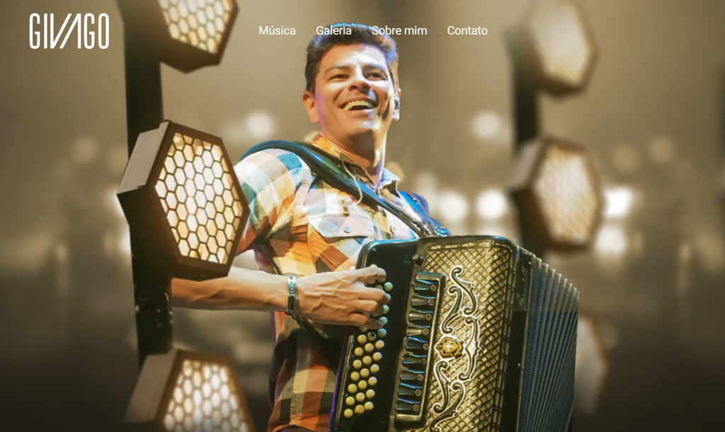
Givago combines music promotion with personal branding through a design that reflects the artist’s style, projects, and creative identity. The website uses vibrant music-themed visuals and light animation to create a dynamic experience that connects with fans and introduces new visitors to the artist’s work.
The Music page organizes releases by type – singles, albums, and songwriting credits for other artists – with direct links to Spotify, Apple Music, Amazon Music, and Deezer for each track.
Additionally, the professional website offers behind-the-scenes content, encouraging visitors to take a more intimate look into the artist’s creative process and life on the road.
6. Naïve Architettura
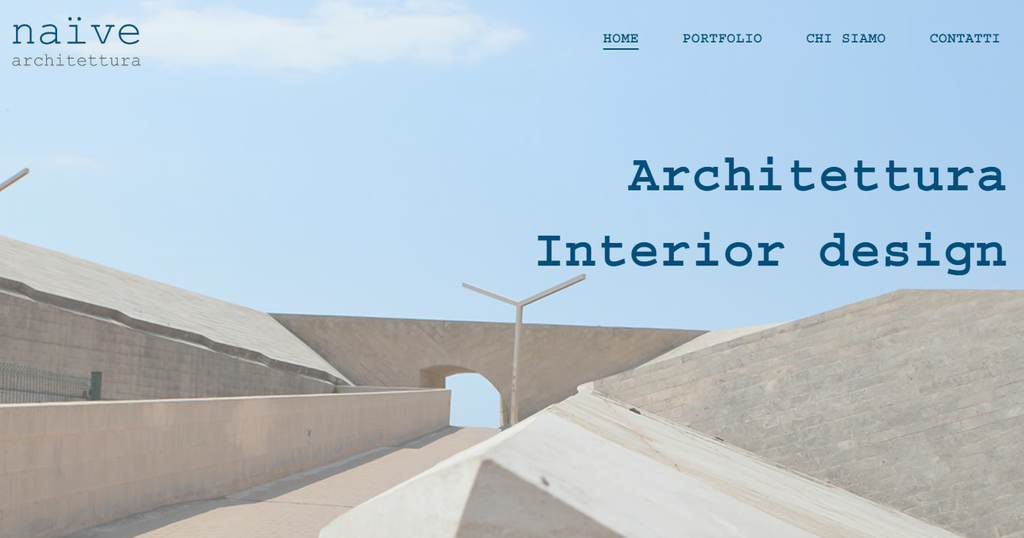
Naïve Architettura showcases clean web design in the architecture and design space. Its website combines white, blue, and beige tones to create a refined visual style, while the homepage features a striking display of the studio’s architectural projects.
The Portfolio page works as a digital gallery showcasing Naïve Architettura’s previous works. Each project, including interior design and renovation, is presented with detailed visuals and descriptions, emphasizing the firm’s commitment to craftsmanship and aesthetics.
Navigation stays consistent across the site, allowing you to easily jump from the homepage to the Portfolio, Who We Are, or Contact page.
This user-friendly approach helps visitors and potential clients easily explore Naïve Architettura’s services and previous projects.
7. Farmacia Gorostizaga
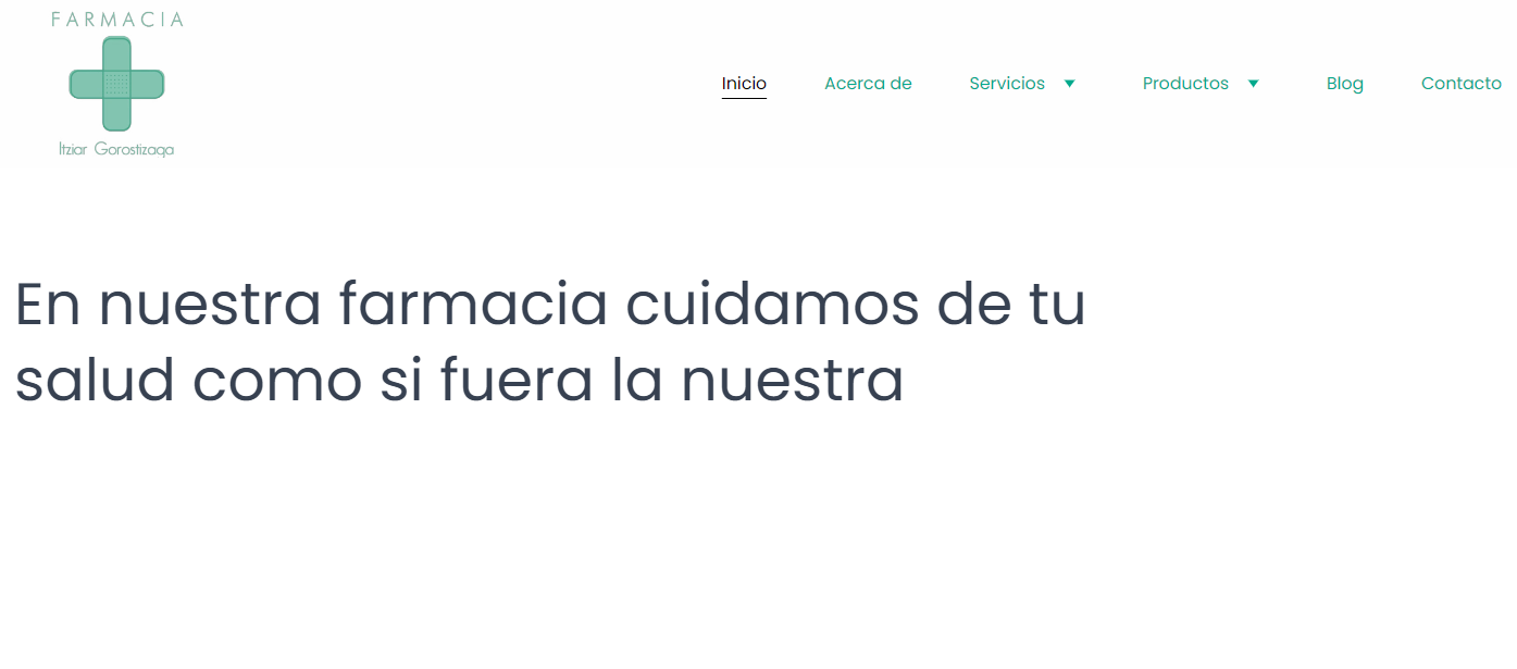
Farmacia Gorostizaga’s website represents a trusted neighborhood pharmacy in Bilbao, offering pharmaceutical expertise and personalized healthcare guidance to local customers.
The professional services website uses a clear layout with ample white space and fresh green accents. Navigation is simple, making it easier for visitors to access its services, product catalog, and store location.
This professional services firm allows patients to place their orders on the website via telephone, WhatsApp, and form.
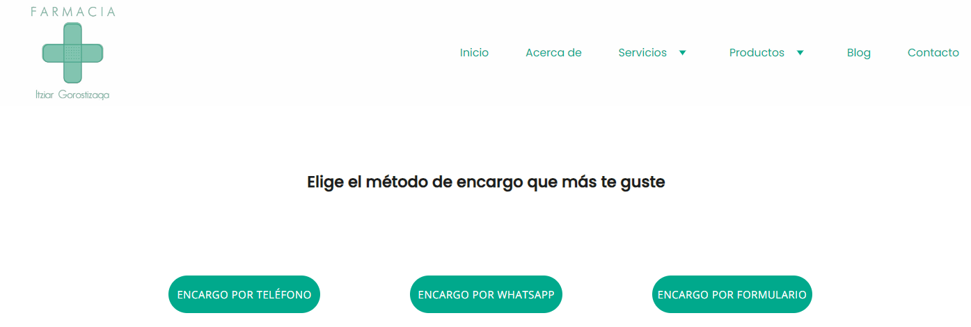
The pharmacy has an informative blog with professional advice on medications and health concerns, reflecting Farmacia Gorostizaga’s commitment to community well-being.
8. Bick Law LLP
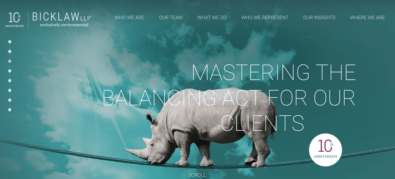
Bick Law LLP is an environmental law firm based in Newport Beach, California. Its logo features the tagline “exclusively environmental”, a positioning statement that the rest of the website reinforces through every design choice.
The homepage hero shows a rhino walking a tightrope, which serves as both a visual metaphor for environmental law and an immediate signal that this is not a generic law firm website. The Webby-nominated site demonstrates how creative concepts can differentiate a professional services brand.
The navigation is structured around the client relationship – Who We Are, Our Team, What We Do, Who We Represent, Our Insights, and Where We Are – rather than generic practice area labels. Each section continues the wildlife theme with scroll-driven animations.
Bick Law proves that a bold, creative concept works when every element of the site commits to it.
9. Pentagram
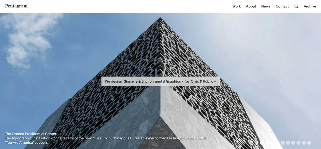
Pentagram is the world’s largest independently owned design consultancy, with offices in London, New York, San Francisco, Berlin, and Austin. The homepage is built around a single interactive element that does the work that most agency sites spend paragraphs explaining.
The hero image is overlaid with a sentence: “We design [discipline] for [sector]”, with each bracketed term being a dropdown. Visitors filter the work by what they need and who they are, rather than scrolling through an undifferentiated portfolio.
One of the current featured projects is the Obama Presidential Center in Chicago, a typographic installation on the building’s façade.
The navigation is minimal: Work, About, News, Contact, and Archive. The site earns its minimalism because the work speaks for itself. For any professional services firm with a deep portfolio, the lesson is the same: give visitors a way to find what’s relevant to them fast.
10. RSM US
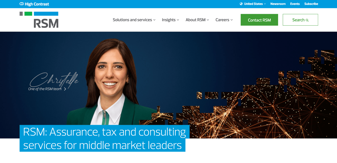
RSM US provides assurance, tax, and consulting services to middle market businesses. The homepage headline states the target client explicitly – “middle market leaders” – so visitors know immediately whether they’re in the right place.
The hero features a named RSM team member, Christelle, with a link to her profile. Putting a real person’s name and face at the top of the homepage humanizes a large professional services firm in a way that abstract imagery often cannot. A network visualization graphic sits alongside, reinforcing the firm’s global connectivity without relying on text alone to explain it.
A High Contrast accessibility toggle sits in the utility bar, a small detail that signals inclusive design and supports users with accessibility needs. The Contact RSM button is a distinct green, the only color element in an otherwise restrained header, helping the next step stand out.
11. Prophet
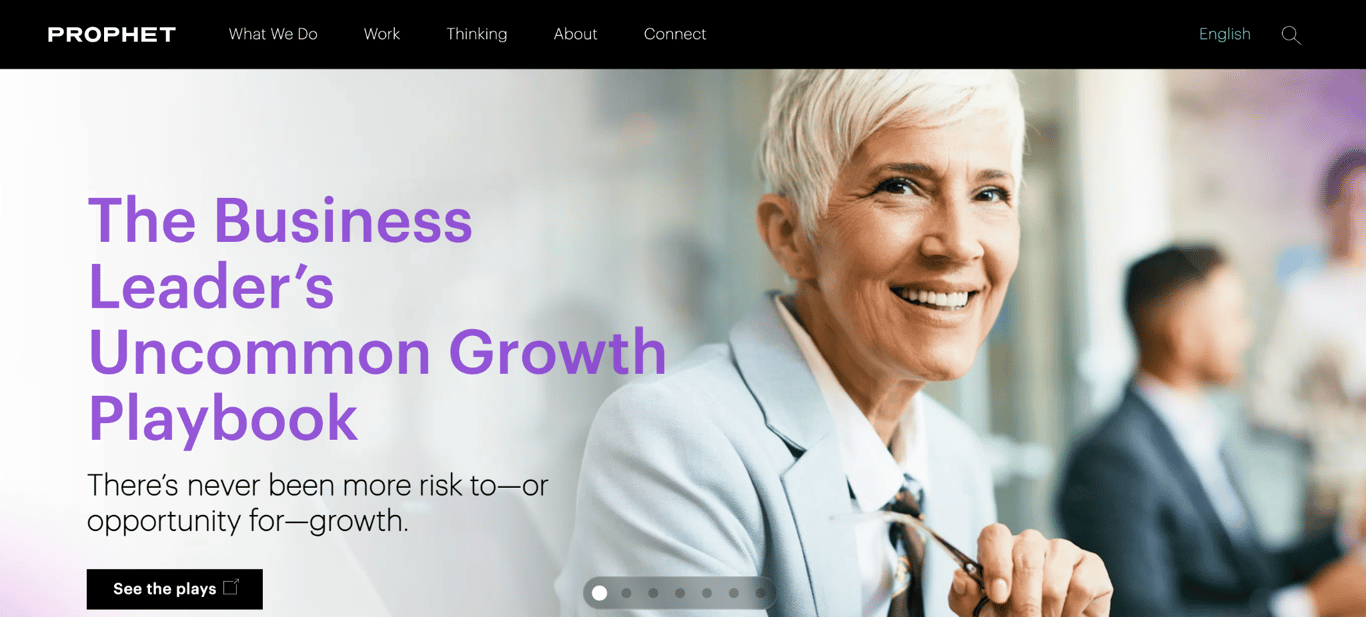
Prophet is a brand and growth consultancy with offices across the Americas, Europe, and Asia. Its homepage makes an unusual choice: instead of leading with services or case studies, the hero section highlights a thought leadership piece, “The Business Leader’s Uncommon Growth Playbook”, with the CTA See the plays.
The approach signals confidence. A consultancy that leads with its ideas rather than its services positions itself as an authority before a visitor has read a single service description. The Thinking tab in the navigation reinforces this: it focuses on intellectual output rather than using a generic label such as “Resources” or “Blog.”
The black-and-purple color scheme and bold typography give the site an executive tone that suits the target audience. For any professional services firm whose clients buy expertise rather than deliverables, leading with ideas is a stronger opening move than leading with credentials.
12. Wealthspire Advisors
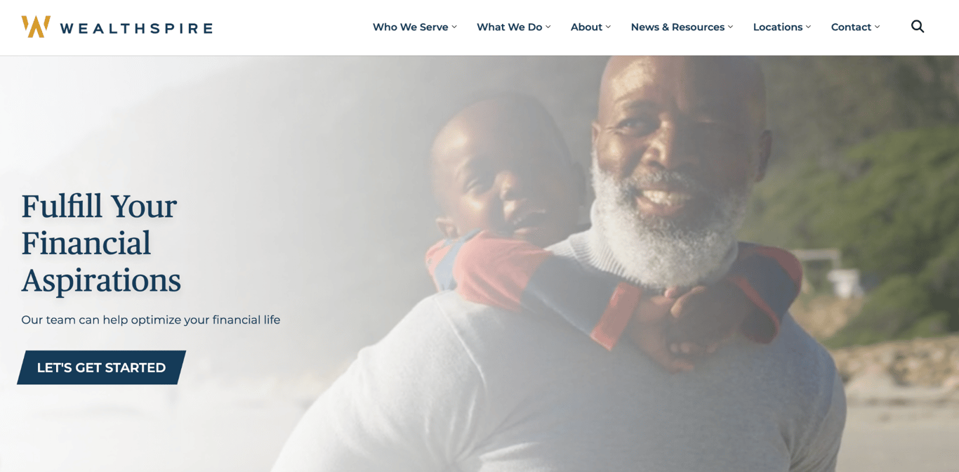
Wealthspire Advisors is a wealth management firm serving individuals, families, and institutions across the US, Canada, and the UK. Its navy and gold visual identity signals stability without feeling cold or corporate.
The navigation is structured around the client rather than the firm: Who We Serve and What We Do appear before About, which reverses the usual order and immediately signals a client-first mindset. The hero leads with aspirational lifestyle photography of real people rather than the handshake or stock-graph imagery that fills most financial websites.
A single, high-contrast Let’s Get Started button anchors the hero. There’s no secondary CTA competing with it, which keeps the conversion path clean.
13. RXO

RXO is a freight brokerage connecting shippers with one of the largest carrier networks in North America. The homepage resolves a structural challenge most logistics sites handle badly: serving two completely different audiences at once.
The main navigation splits immediately into Shippers and Carriers, giving each user type a direct path rather than requiring them to go through a generic homepage.
Two CTAs reinforce the same logic: Track a shipment serves existing customers who need a fast utility, while Get Started targets new business. Both sit above the fold without competing.
The hero photo skips the usual warehouse stock imagery or abstract motion graphic in favor of a specific highway with specific trucks – the service, shown plainly. The headline “Smart solutions to move your freight” follows the same logic: direct, benefit-led, and without jargon.
14. Avantgarde International Properties
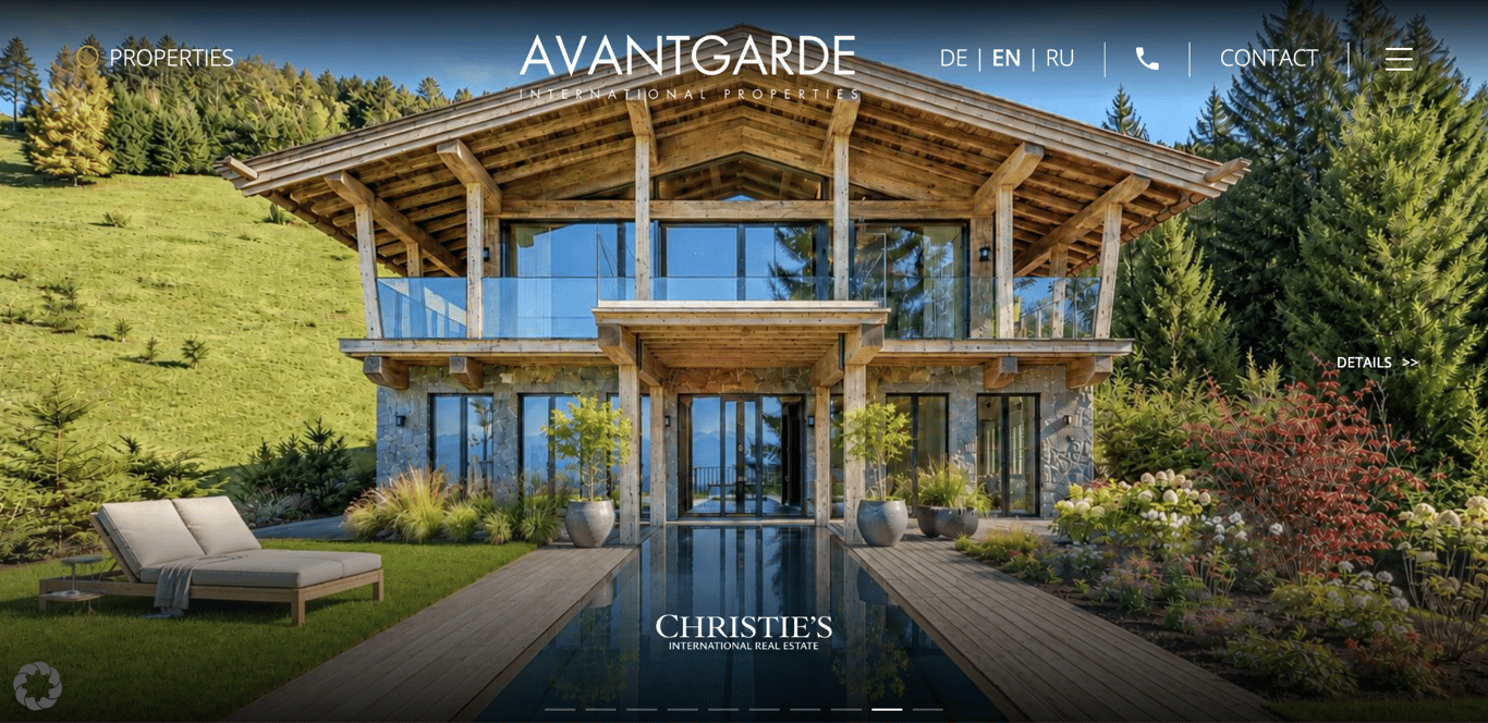
Avantgarde International Properties is a Vienna-based luxury real estate agency and Christie’s International Real Estate affiliate. Its website makes a deliberate choice that differs from many real estate sites: there is no headline, no CTA button, and almost no visible interface elements on the homepage.
The entire above-the-fold experience is a single full-bleed photo of a listing – a rotating carousel of properties, each one filling the screen. A Details >> link appears in the corner. The navigation is reduced to Properties, a language switcher, and Contact.
The Christie’s logo anchors the bottom of the hero, creating an immediate trust signal without relying on lengthy explanations.. For a luxury agency, the implicit message is that the properties speak for themselves – and the design enforces that completely.
15. Maid Marines
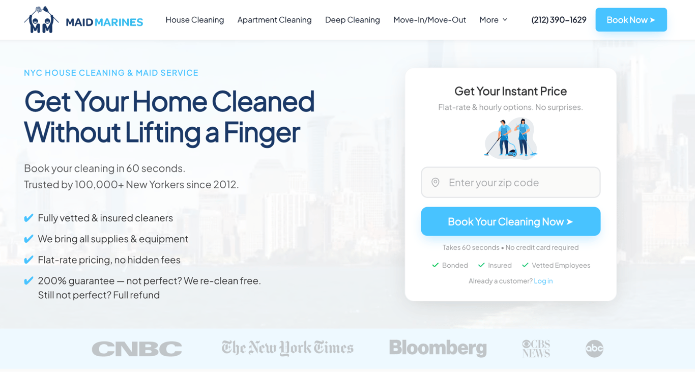
Maid Marines is a cleaning company serving New York City, and their homepage is built entirely around removing friction from the booking decision.
A pricing widget sits in the hero: visitors enter their zip code and get an instant price without clicking to another page. “No credit card required” sits directly below the Book Your Cleaning Now button, eliminating the last hesitation point before committing.
The navigation is structured by service type: House Cleaning, Apartment Cleaning, Deep Cleaning, and Move-In/Move-Out. Visitors can quickly identify the option that applies to them, while four trust indicators address common questions potential customers have: vetted cleaners, supplies included, flat-rate pricing, and a 200% guarantee.
Media logos from CNBC, The New York Times, and Bloomberg anchor the bottom of the hero, providing an immediate credibility signal without relying on additional supporting text.
What makes a good professional service website
A good professional service website answers three client questions fast: what you do, why you’re credible, and how to hire you. Six elements handle those questions:
- Specific service descriptions. Vague “solutions” copy loses clients. RSM US states its target market in the homepage headline (“middle market leaders”), so the right visitors know immediately they’re in the right place.
- A visible call to action. Every page should make the next step obvious, whether that’s booking an appointment, requesting a quote, or viewing a portfolio. Visitors who have to hunt for a point of contact rarely convert.
- Social proof where doubts appear. Maid Marines places media logos from CNBC, The New York Times, and Bloomberg directly in the hero, answering credibility questions before a visitor reads a single service description. Testimonials, press mentions, and client logos all serve as trust signals; the key is placing them at points where visitors may need additional reassurance before taking action.
- A portfolio or case studies. Naïve Architettura presents each project in detail, demonstrating craftsmanship rather than claiming it. Finished work sells services better than adjectives.
- An about page with real people. Sparrow Flies uses the artist’s bio to build trust before the first appointment. Clients hire people, not logos, especially for personal services.
- Fast, mobile-friendly performance. Most local service searches happen on a phone. A site that loads slowly or breaks on mobile sends clients straight to a competitor.
How to make a professional service website
Building a professional service website starts with the basics: register a domain name, choose a hosting plan, and pick a website building platform that fits your budget and skills. Hostinger AI Builder offers all three in a single plan, with business templates and a drag-and-drop editor.
From there, build the site around your brand. Choose a template that matches your industry, then create the pages clients expect: a homepage with a strong headline and call to action, a services page with specific descriptions, an about page, and a contact page with a form or booking option.
Finish with the details that turn visitors into clients. Add high-quality images of your work, connect your social media profiles, apply basic SEO to every page, and test the site on mobile before publishing. Our guide on how to make a small business website walks through each step in detail.
Take one element from each example that fits your business – Pentagram’s interactive work filter, Maid Marines’ zero-friction booking widget, Bick Law’s committed creative theme – and your website will already work harder than most competitors’.

This article is a localized version of 15 professional services website examples for your inspiration, originally published in English.

Linda is a seasoned Content Writer specialized in website creation. With her passion for the written world and obsession with helping others, her goal is to deliver resourceful content pieces for all skill levels. When she’s not writing, Linda likes to cross stitch and watch films. Follow her on LinkedIn.