25 best portfolio website examples for personal brands, photographers, artists, and creatives
Aug 28, 2026
/
By Bruno S.
/
11 min Read
A portfolio website showcases your best work to win clients, jobs, and collaborations. The strongest examples share the same fundamentals regardless of profession: clear positioning, strong visuals, and easy navigation.
We’ve put together 25 real portfolio websites from a range of professions, each with a breakdown of what makes it work, to help you get inspired and build your own.
As you browse, pay attention to three things: the layout, the homepage’s first impression, and how each person presents their work.
Building your own portfolio website comes down to five steps: define your goal, curate the work that supports it, pick a builder and template, add the key pages, and publish.
1. Alice Lee
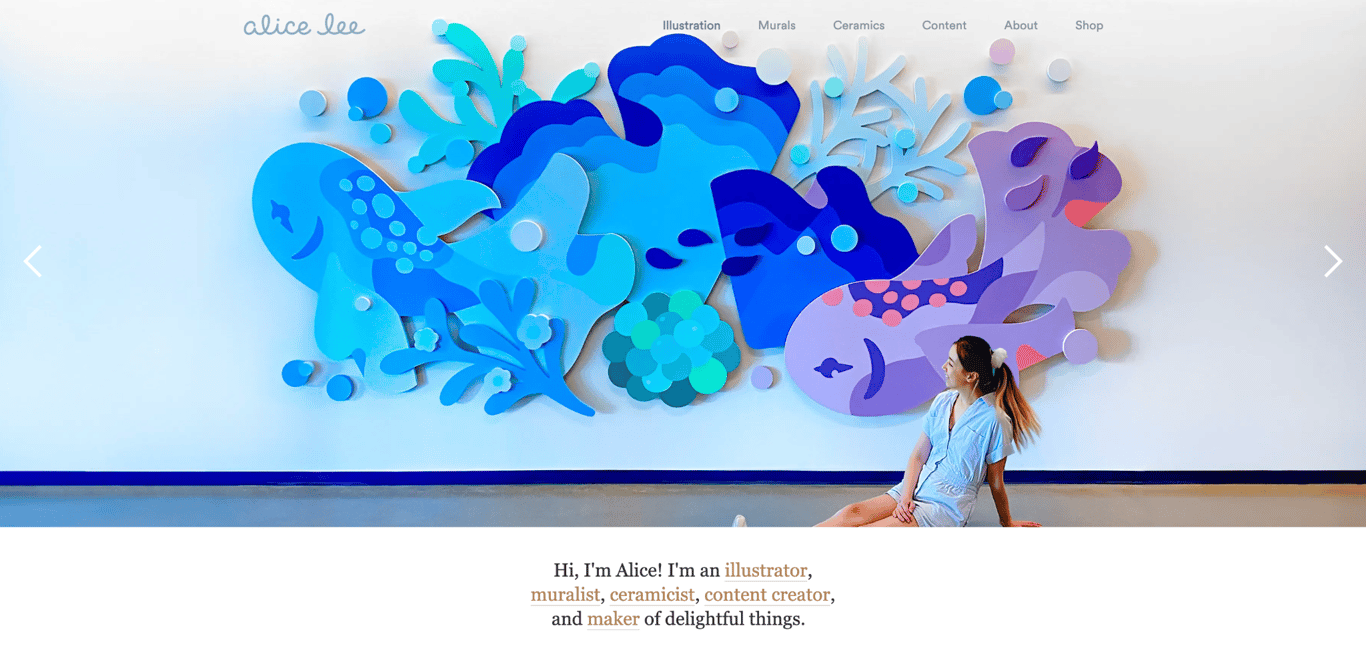
- Why it’s special: a minimalist design for illustration portfolios.
One of the strongest art portfolio website examples around, Alice Lee’s site showcases her work as an illustrator, muralist, ceramicist, and content creator in a simple, effective design.
The navigation mirrors her disciplines – Illustration, Murals, Ceramics, Content – guiding visitors directly to the work most relevant to them.. Her projects sit on a clean white layout that keeps every element out of the work’s way.
Each project includes a description and process drafts, giving potential clients a clear view of how ideas develop into finished pieces.
2. Enrico Deiana
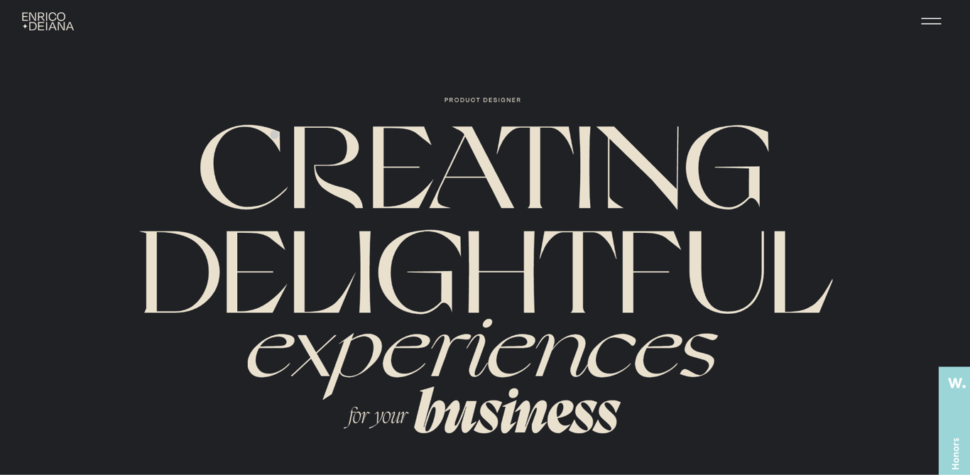
- Why it’s special: multiple micro-interactions.
Enrico Deiana is an Italy-based product and web designer. His hero immediately states what he offers – “creating delightful experiences for your business” – in oversized typography that fills the screen.
As you browse, subtle micro-interactions enhance the experience, including cursor changes over links and background shifts when visitors hover over portfolio sections.
These micro-interactions make the website feel more dynamic, keeping visitors engaged as they explore the portfolio.
3. Sean O’Brien
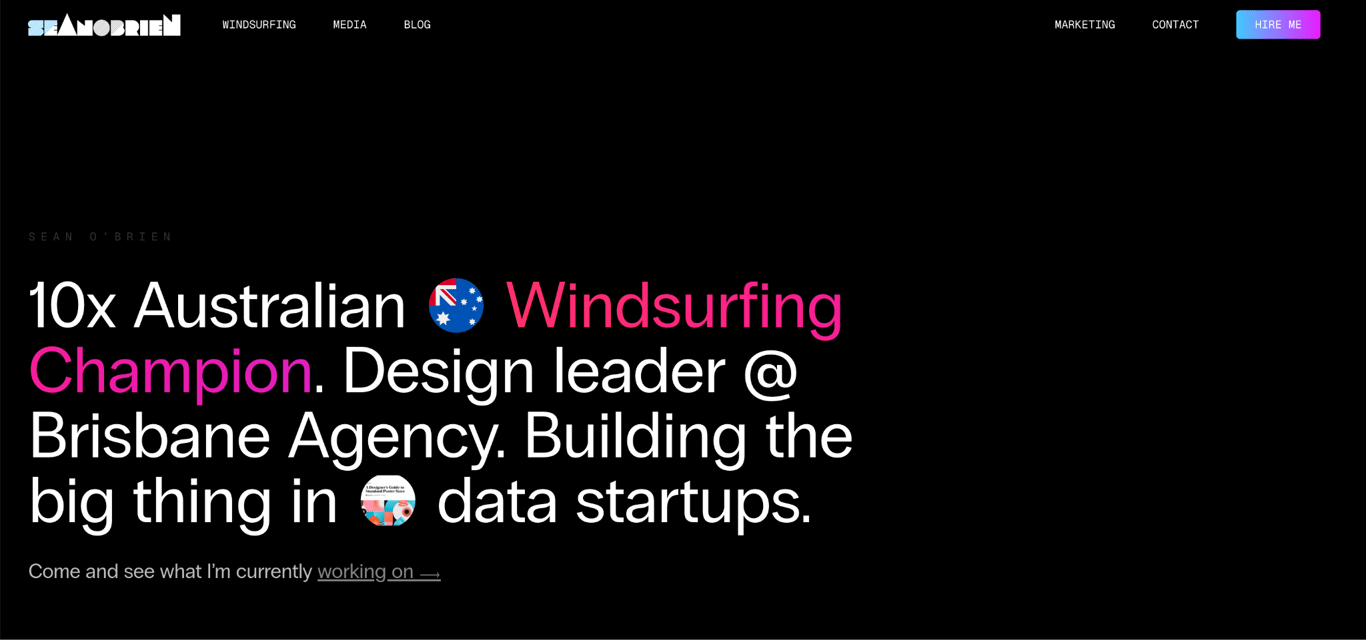
- Why it’s special: a strong personal brand and a country-code domain name.
Sean O’Brien is a championship-winning windsurfer who immediately communicates his identity on the homepage with bold text above the fold. Visitors quickly grasp who he is and what he has accomplished.
The bold, colorful design reflects Sean’s passion for windsurfing. Various photos of him and large, simple fonts make the content easy to digest.
As an Australian athlete, he uses the .au country-code TLD, signaling to search engines and visitors that his website has a local focus.
4. Ali Abdaal
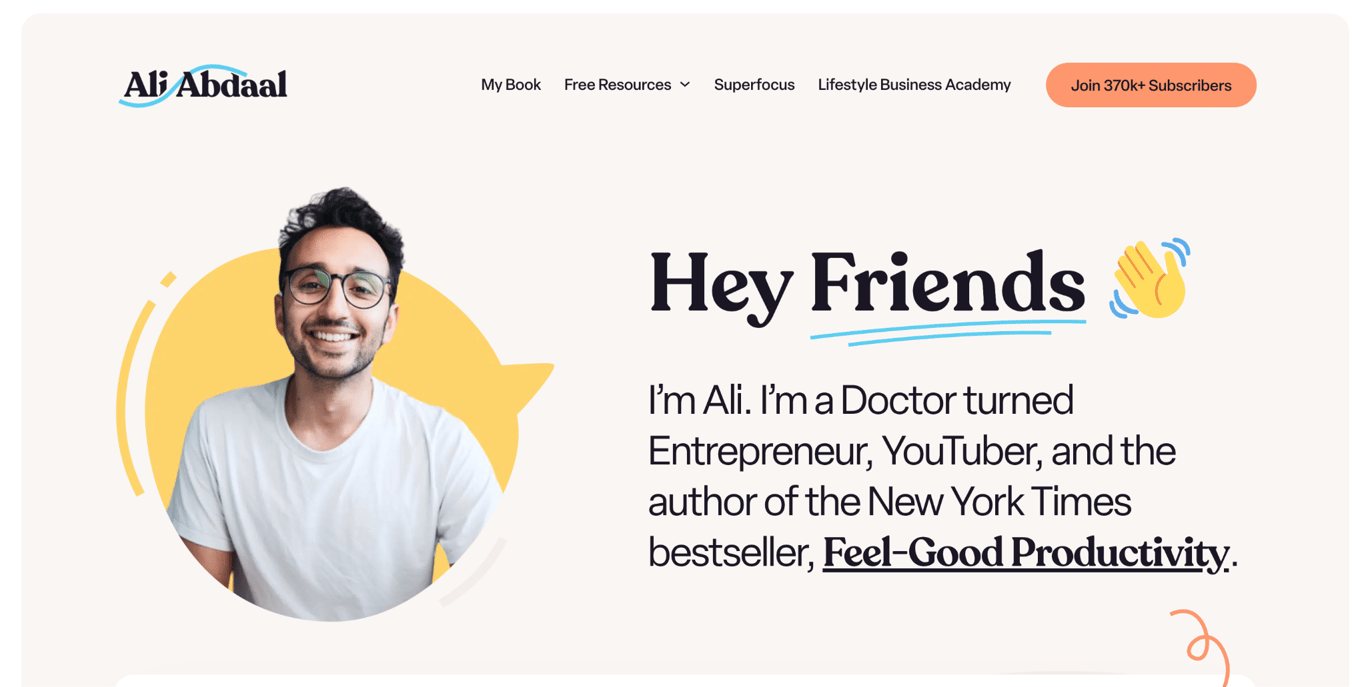
- Why it’s special: a newsletter-first personal brand.
Ali Abdaal is a doctor turned YouTuber, author, and podcaster with more than 6 million subscribers on his main channel. His website is built to turn that social following into something he controls directly: sign-up forms for his LifeNotes newsletter, read by over 443,000 people, appear from the hero section to the footer.
Social platforms can change their algorithms overnight, but an email list doesn’t. That’s the logic behind making newsletter sign-ups the site’s primary conversion goal, and it’s one any creator-led business can apply.
The site organizes his ventures clearly: the YouTube channel, the Deep Dive podcast, his book Feel-Good Productivity, and online courses each have their own page and structure.
5. Cristiano Ronaldo
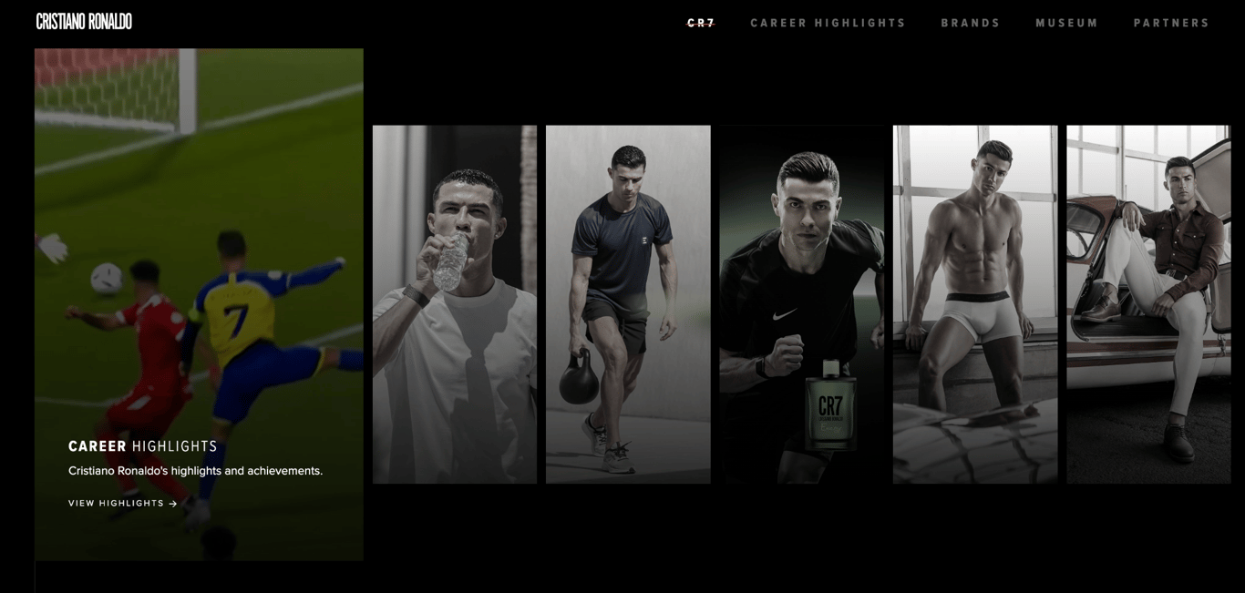
- Why it’s special: career highlights.
Cristiano Ronaldo’s portfolio website is a great example of an effective one-page layout. It showcases his diverse projects and career highlights.
The top section features his ventures, from soccer to fashion, with a card-based layout linking each image to its respective online store. As you scroll, a horizontal slider outlines his career journey, with each slide featuring a short video of his contributions to different clubs.
In addition to career highlights, the page includes a newsletter sign-up form and links to brands he partners with.
6. Bill Gates
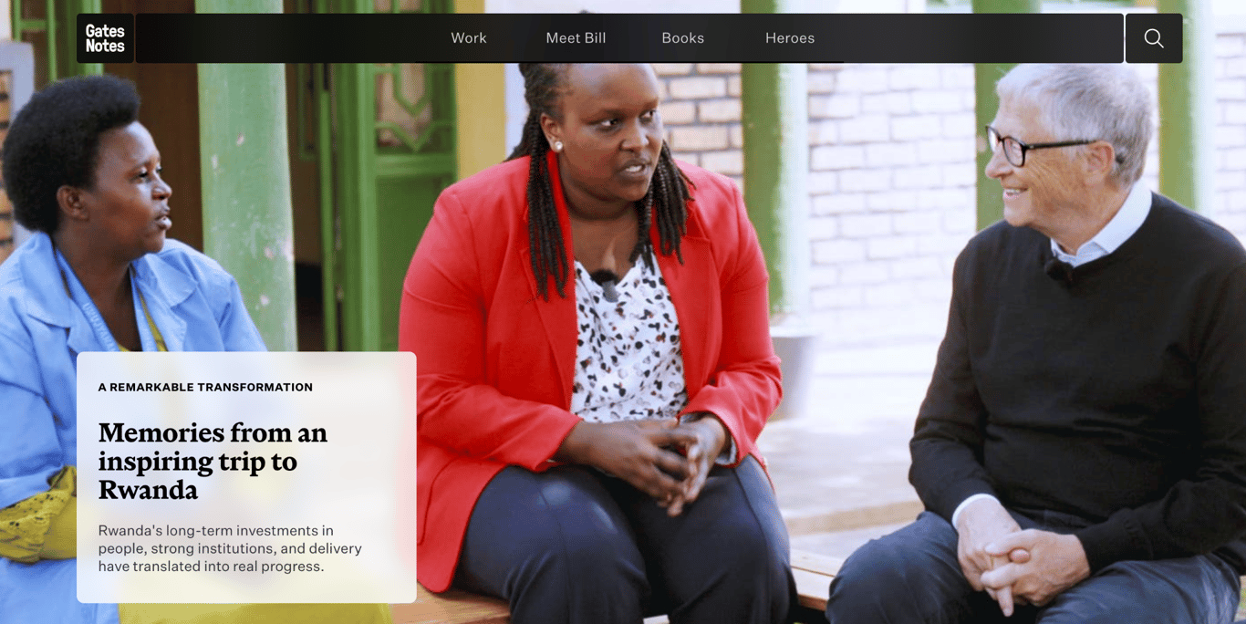
- Why it’s special: mission-driven navigation and magazine layout.
Gates Notes, Bill Gates’ personal website, is a strong example for personal brands that want to share work, build an audience, and make knowledge publicly accessible.
The navigation organizes his world into four areas: Work, Meet Bill, Books, and Heroes. The Work section groups content by mission – saving lives, energy innovation, education, and Alzheimer’s research – so visitors immediately understand what he’s focused on, not just what he’s done.
The homepage is video-heavy and editorially driven, surfacing whichever story is most current rather than a static layout.
7. Tamara Sredojevic
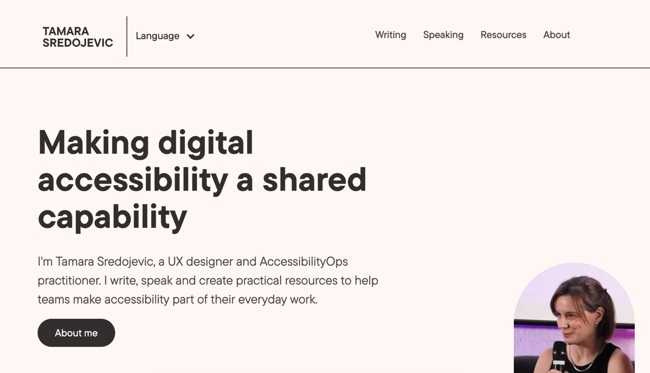
- Why it’s special: unique value proposition and focus on accessibility.
Tamara Sredojevic’s portfolio is a strong example of how personal values show up in the design itself, not just in the copy. Her specialty is accessible and sustainable UX design, and the site practices what it preaches: large shapes, thin lines, and muted colors make it easy to navigate for users with visual or cognitive differences.
Hers is among the most purposeful about me page examples in any design portfolio. It highlights her core values, and the footer links to an Accessibility Statement that reinforces her commitment to her niche.
8. Demas Rusli
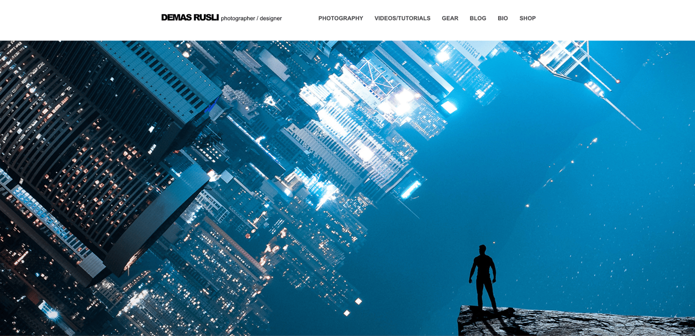
- Why it’s special: a photography portfolio that sells.
Demas Rusli shoots urban, architectural, and aerial photography, and his website does more than display the work – it’s a business platform. A dedicated gear section earns commissions through affiliate links, a tutorials section builds his authority as a working photographer, and visitors can buy prints and presets directly from the site. None of that exists on his social media.
The homepage features full-width images that rotate every five seconds, capturing visitors’ attention immediately. His homepage is organized around three key elements: a hero image, photo categories, and his Instagram feed, giving visitors an easy way to explore his photography style and portfolio.
He divides his portfolio into six categories: Commissions, Urban, Aerial, Architecture, Nature, and Fantasy. This makes it easy for clients to explore specific themes.
Each gallery layout is tailored to the category, with a grid format for commissions featuring images or GIFs and buttons for seamless navigation between categories.
9. Lauren Hom
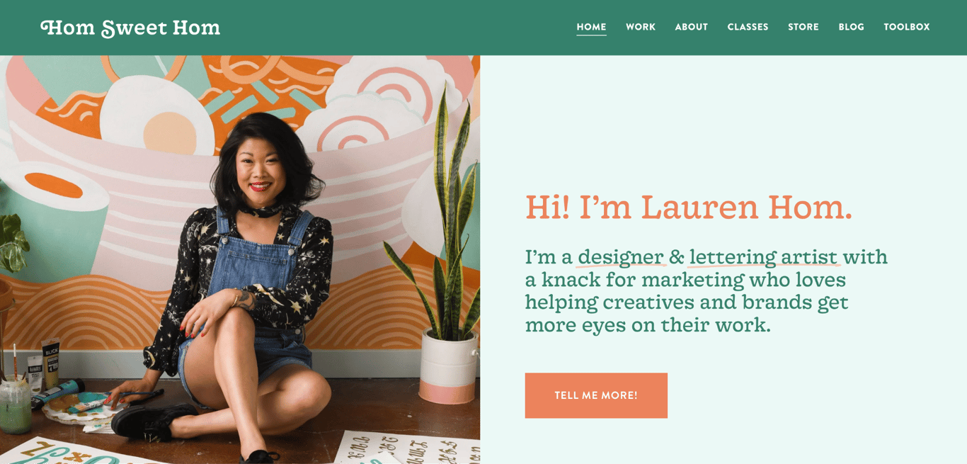
- Why it’s special: behind-the-scenes content and educational blog.
Lauren Hom is a designer and lettering artist with a knack for marketing. She’s known for bright color palettes and playful letterforms.
Her website puts that color sense to work: a green background and orange accents for links and CTAs create contrast that guides the eye without competing with the artwork. The Work page pairs final projects with behind-the-scenes photos, showing clients not just what she delivers but how she works.
The blog, the artwork, and the process content all serve the same goal: selling her courses. By showcasing her expertise across murals, lettering, and freelancing, she builds the authority that makes someone want to buy from her.
10. Todd Clarke
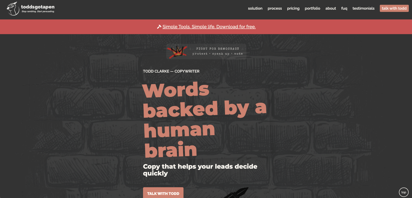
- Why it’s special: simple design, strong messaging.
Todd Clarke, who brands himself as Toddsgotapen, demonstrates that an engaging portfolio website doesn’t need complex animations. As a copywriter, he keeps the design simple, relying on his words to grab visitors’ attention.
His copy is direct and catchy, using large headings to structure the content and bold statements with icons to highlight key points. The Portfolio page uses clickable categories for easier navigation, with images linking to live websites or full-screen project previews. To build credibility, Todd also includes a dedicated Testimonials page.
In the footer, he crosses out every social media icon and instead lists in plain text a phone number, a contact link, his Upwork profile, and his LinkedIn – a dry, on-brand joke from someone who writes for a living.
11. Muriel Vega
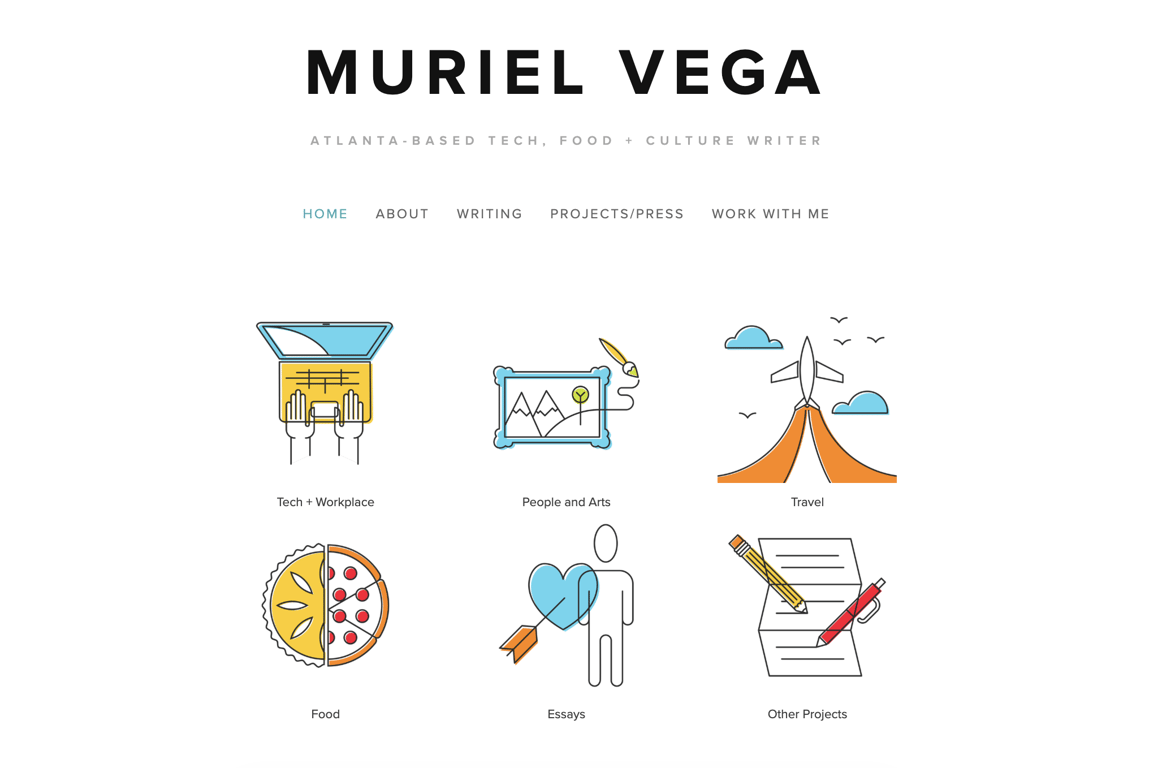
- Why it’s special: straightforward navigation.
Muriel Vega’s portfolio is a clean, focused showcase of her work as a freelance tech, food, and culture writer. She has written for outlets such as The Washington Post and Eater, while also creating copywriting work for brands like Patreon.
The homepage is a model of clear website navigation: her job title, a clean menu, six linkable illustrations to differentiate her projects, and a LinkedIn icon make it easy for visitors to explore her work.
Her portfolio is arranged in a grid layout, with each image, article title, and company listed to visually emphasize her diverse writing experience and credibility.
Muriel’s About page is concise, focusing on her prior writing experience to give potential employers a clear understanding of her background.
12. Helena Bowen
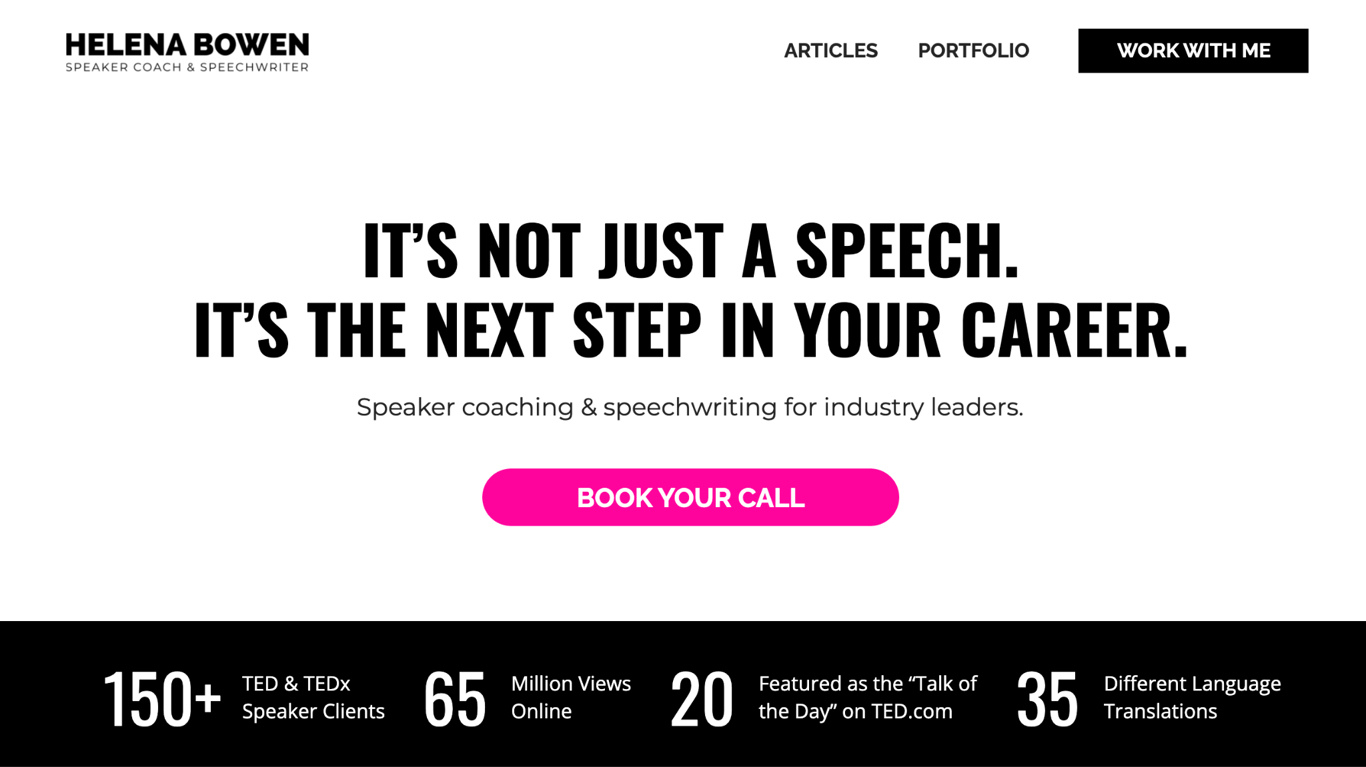
- Why it’s special: strong above-the-fold section.
Helena Bowen is a top speaker, coach, and speechwriter who has worked with over 150 TED and TEDx speakers, garnered millions of online views, and been featured on platforms like TED, CNN, and National Geographic.
She uses the above-the-fold section of her homepage to immediately attract potential clients by showcasing her impressive stats, including the number of clients, language translations, and views.
Her website design is simple, with ample whitespace and professional photos that keep the focus on content. Intense colors highlight key information for a polished, professional look.
13. Duygu Mühürdar
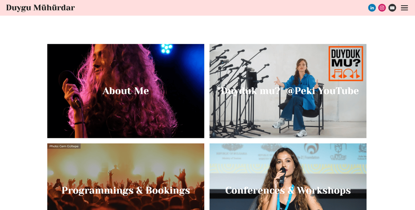
- Why it’s special: thumbnail-first layout for a multi-discipline career.
Duygu Mühürdar is a music programmer, booker, curator, and ethnomusicologist. Her portfolio effectively balances written and visual work using clean thumbnails on the homepage.
Each thumbnail follows a minimalist design with ample white space, keeping the homepage clean despite covering four distinct areas of her work. Social media links sit alongside the content, adding context without cluttering the layout.
Her Posts page, written in Turkish, includes a search and sorting feature, making it easy for visitors to find articles by publication type.
14. Marino Franulovic
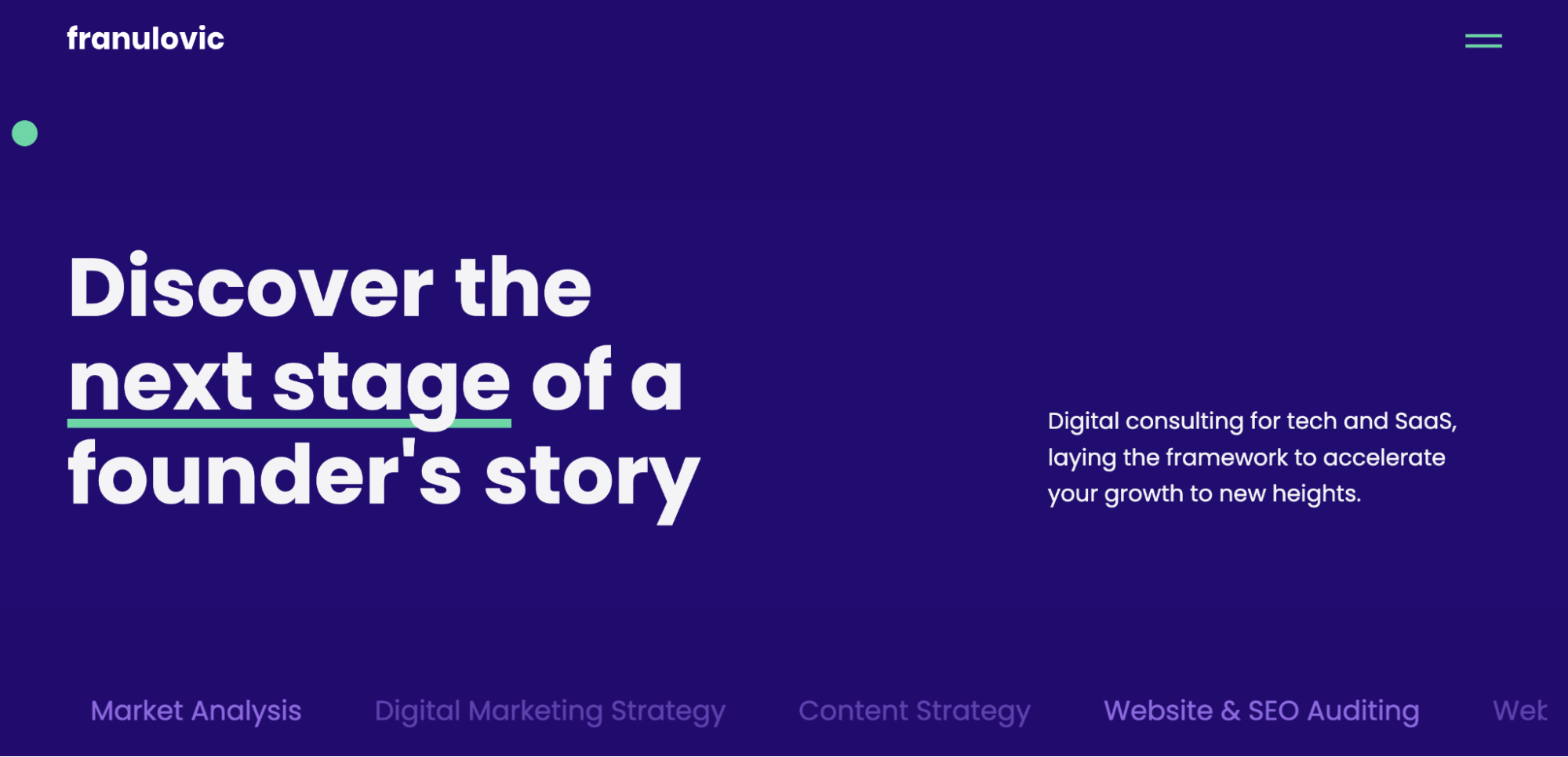
- Why it’s special: subtle animations across the homepage.
Marino Franulovic, a digital marketing consultant, presents his expertise through a well-structured portfolio website.
The above-the-fold section features a large heading, a concise bio, and animated text that immediately grabs attention, effectively drawing visitors in. As visitors scroll, subtle float-in effects accompany his service descriptions, which include marketing planning and development, adding visual interest without overwhelming the page.
Further down, an About section with contact details and a photo rounds out his background, while client testimonials build trust and a blog demonstrates ongoing expertise.
15. Steph Smith
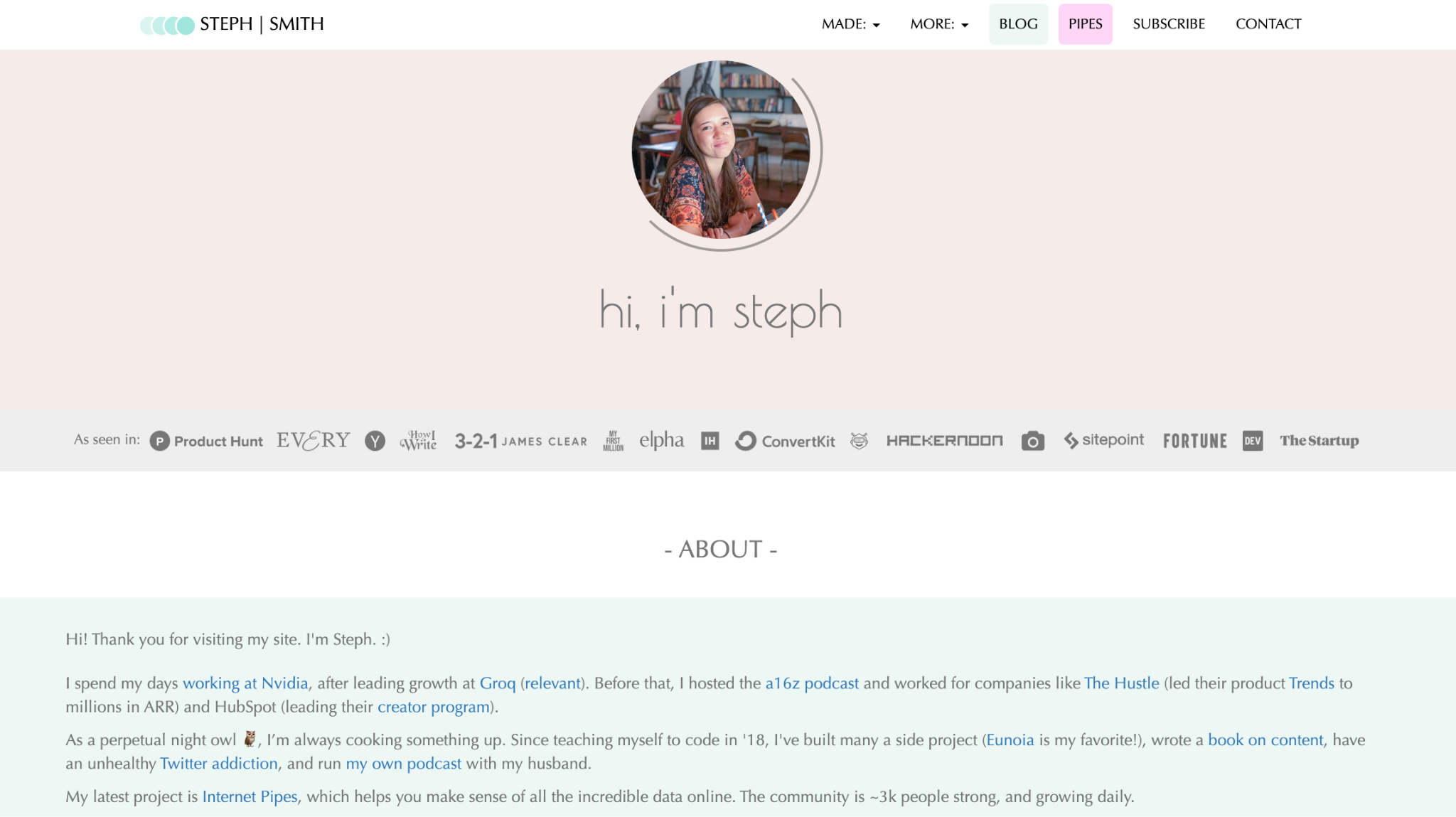
- Why it’s special: a credibility-first layout for non-visual professionals.
Steph Smith is a writer, builder, and tech professional at Nvidia who grew The Hustle’s Trends product to millions in ARR, led HubSpot’s creator program, and previously hosted the a16z podcast.
Her homepage opens with a row of logos from publications and podcasts that have featured her work, highlighting the range of platforms she has been featured on. A short, candid bio follows, and a Projects section below lists her ventures in one sentence each: a book on content writing, a data newsletter, a podcast, and an app for untranslatable words.
That structure suits any professional whose work spans multiple domains: featured publications at the top of the page, a plain-language bio, and projects organized as a simple list rather than detailed case studies.
16. Caroline Li
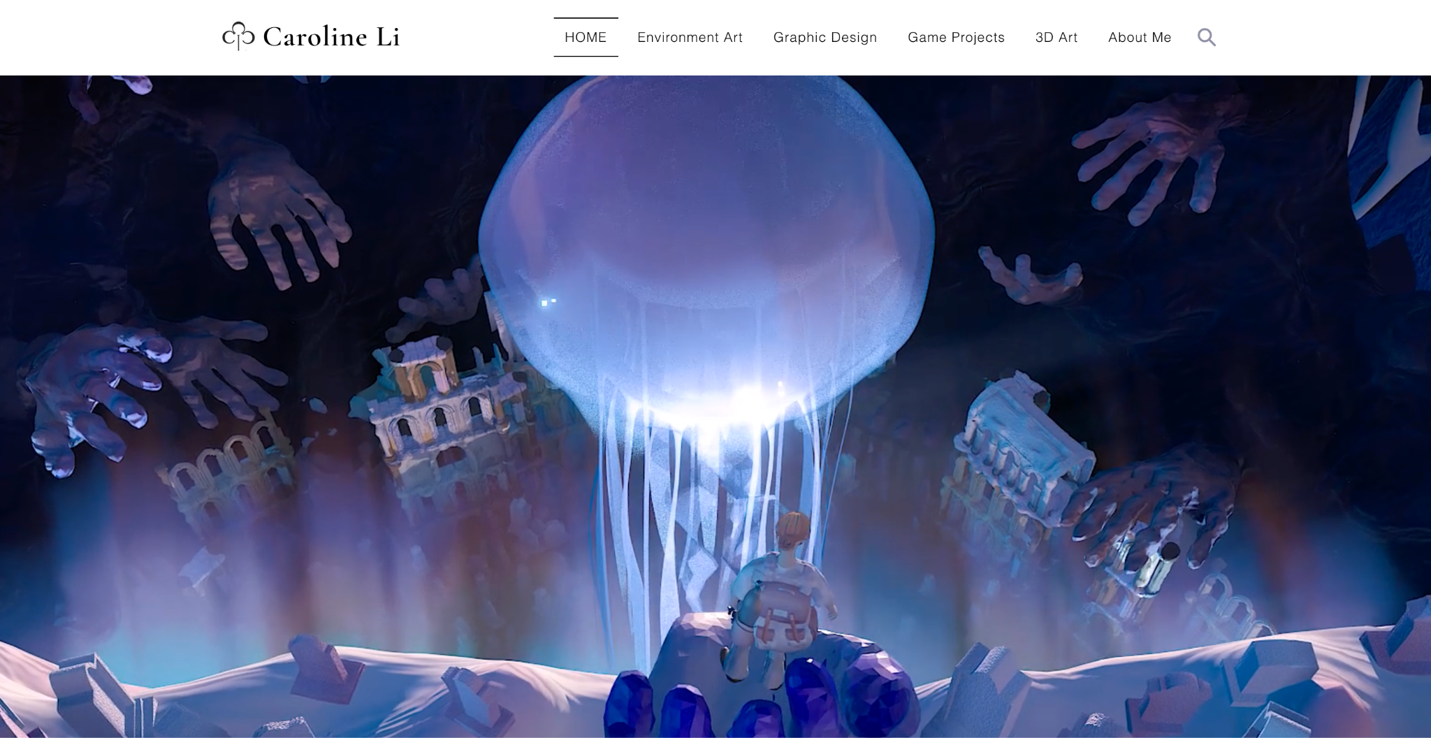
- Why it’s special: a student portfolio built on projects, not job titles.
Caroline Li is a digital media student and 3D artist whose portfolio shows that strong personal projects can create a convincing website, even without years of client work.
Instead of an employment history, the site leads with self-initiated work, and each discipline gets its own page in the main navigation: environment art, graphic design, game projects, and 3D art. The Game Projects page shows four titles – Ice Cream Farm, Under Pressure, Saint or Ain’t, and Great New Ones – each with her specific role, from 3D modeling to 2D art direction.
If you’re a student or early in your career, copy the structure: organize by discipline, name your tools (she lists Blender, Adobe Creative Suite, Figma, Logic Pro, Creo, and Procreate), and let finished projects stand in for the job titles you don’t have yet.
17. Tobias van Schneider
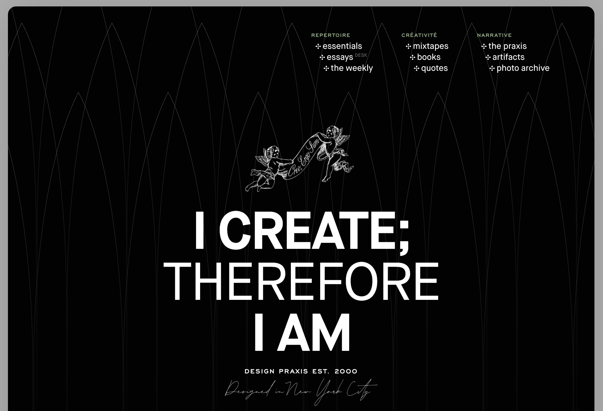
- Why it’s special: case studies that show the brief, not just the deliverable.
Tobias van Schneider is a New York-based creative director who spent two and a half years as Art Director at Spotify. He co-founded Semplice, a portfolio tool used by thousands of designers, and now runs his own studio, HOVS.
The Praxis, his portfolio section, presents each project with the original brief, the visual development process, and real-world context, showing how the work was commissioned, what decisions were made, and where it ended up in the world.
The site extends beyond client work into essays, a photo archive, playlists, and artifacts. His positioning line reads “I create; therefore I am.” By showing personality alongside professional output, the portfolio gives visitors a stronger sense of his perspective and creative approach.
18. Bruno Simon
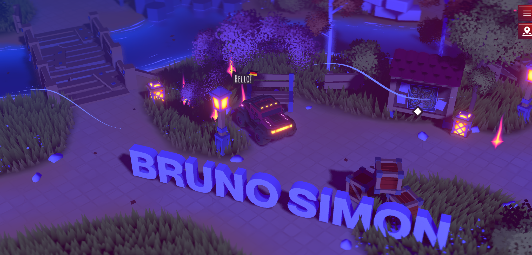
- Why it’s special: a portfolio you play like a game.
Bruno Simon is a Paris-based creative developer, and his portfolio is a browser game: you drive a small red car through a 3D world, knocking over props and bowling pins to uncover his projects and skills.
The concept won Awwwards Site of the Day, and the source code of the first version drew over 4,700 stars on GitHub. It works because the medium proves the message: nothing demonstrates WebGL expertise better than a physics-driven world running smoothly in a browser tab.
Simon rebuilt the site in 2025 to support both WebGL and WebGPU, and visitors now leave short public messages inside the world. For technical creatives, the website itself can become a demonstration of their skills.
19. Brittany Chiang
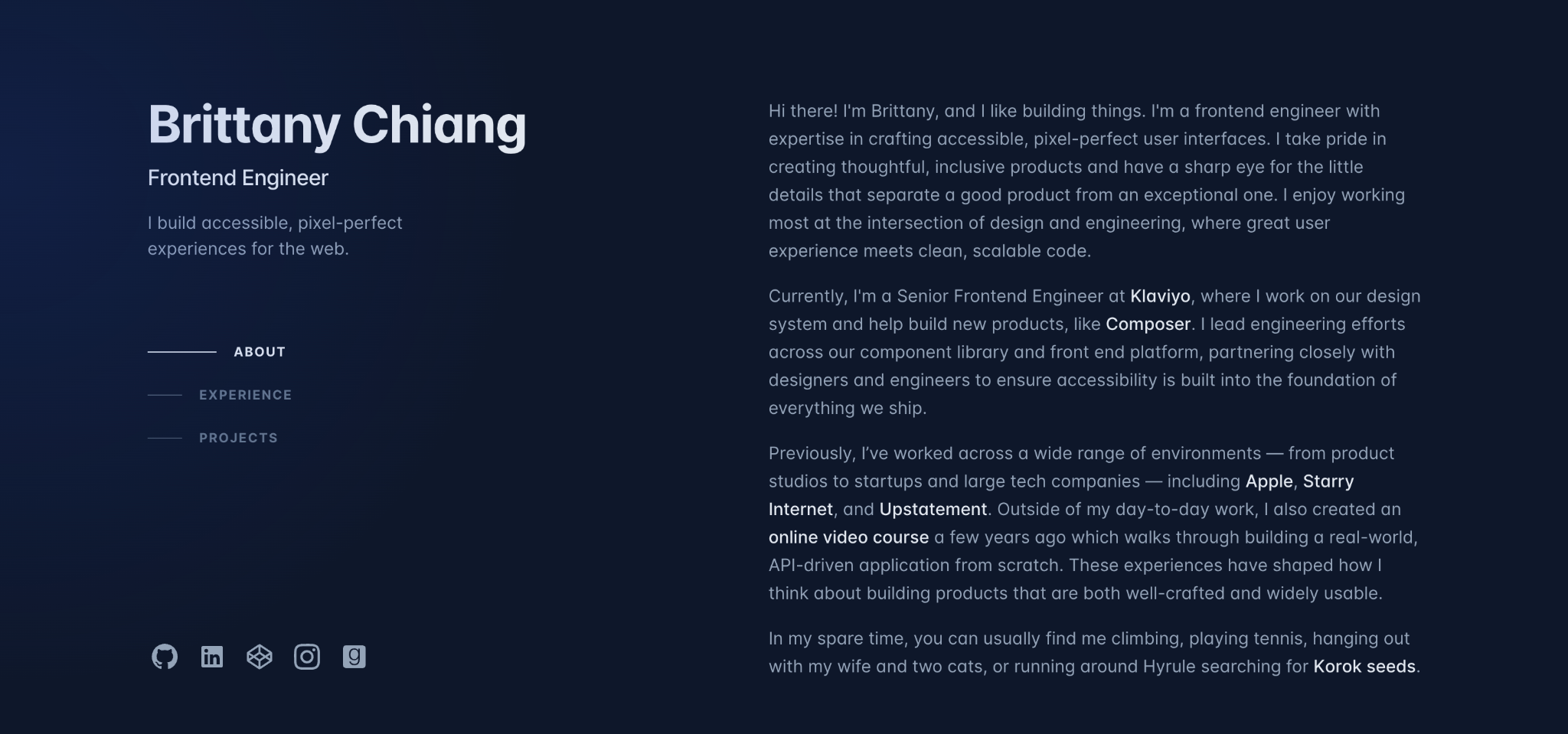
- Why it’s special: a single-page layout with a pinned bio.
Brittany Chiang is a senior frontend engineer at Klaviyo whose dark, single-page portfolio has become a reference point for developer sites – the open-source code behind an earlier version has more than 8,000 stars on GitHub.
Her name, title, and one-line pitch stay pinned on the left while work experience and projects scroll past on the right, so the essentials never leave the screen. Each role lists dates, position, and tech stack in plain text, with subtle hover effects and a spotlight that follows the cursor.
She also links to every previous version of the site, dating back to 2014. The archive quietly demonstrates a decade of growth – something a resume line never shows.
20. Adham Dannaway
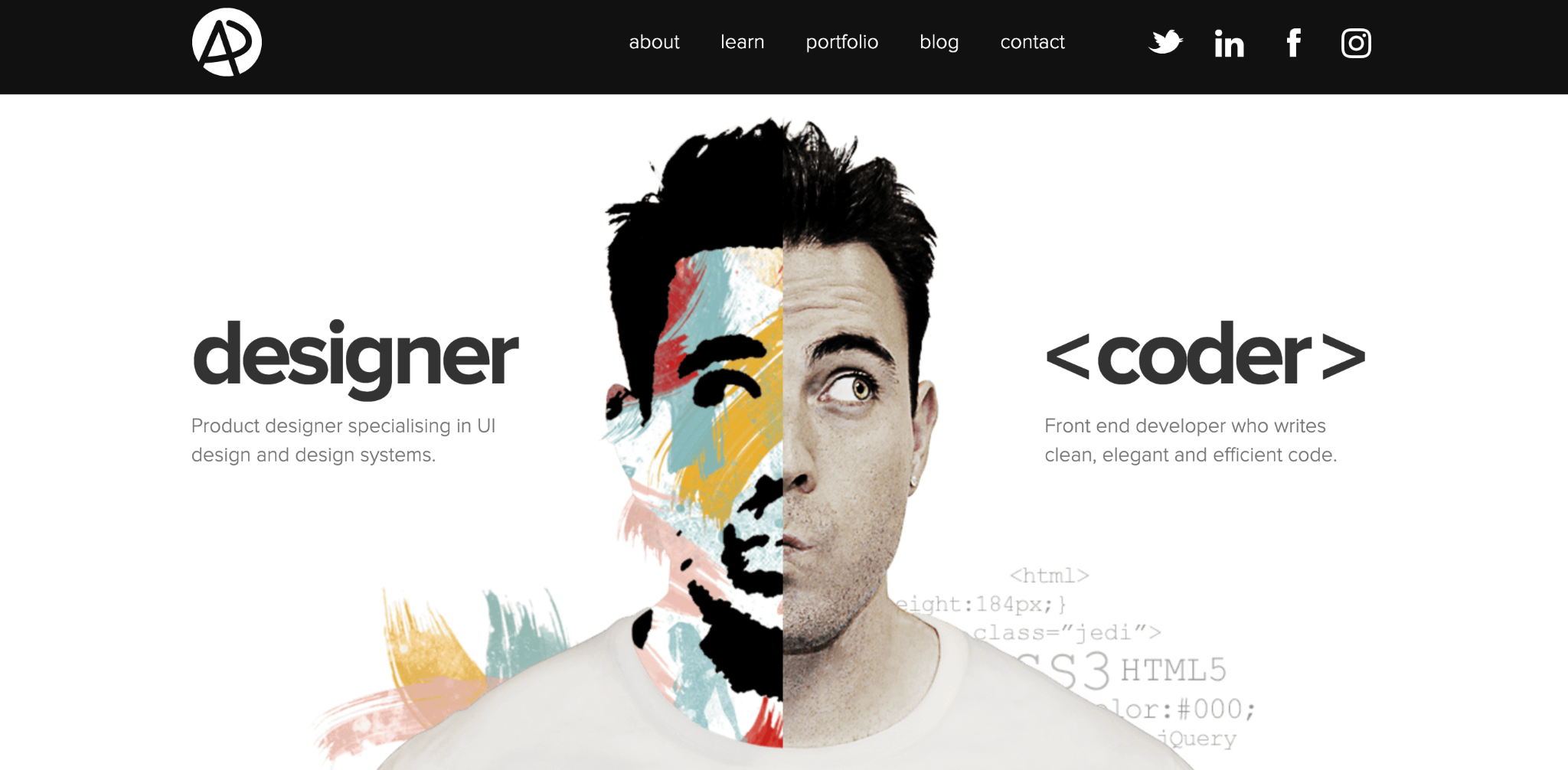
- Why it’s special: a split-screen hero that sells two skills at once.
Adham Dannaway is a Sydney-based product designer and front-end developer, and his homepage communicates both skills in a single image. The portrait is split down the middle, one half polished design, the other raw code.
Visitors understand his hybrid positioning before reading a word. The rest of the site backs it up with case studies spanning design systems, websites, and apps for clients including Qantas.
Dannaway also promotes his UI design book, Practical UI, on the site – proof that a portfolio grows beyond client work as your career does.
21. Robby Leonardi
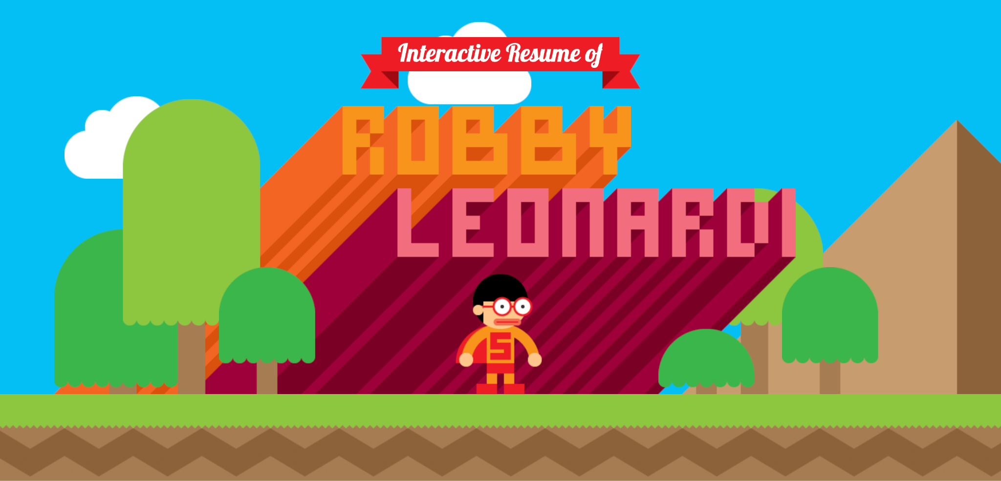
- Why it’s special: a resume built as a side-scrolling game.
Robby Leonardi is a New York-based multidisciplinary designer whose interactive resume plays like a retro platform game: scroll, and his character runs, jumps, and swims through colorful levels presenting his skills, experience, and awards.
The site launched in 2013, and design publications still reference it more than a decade later – few portfolios hold up that long. A traditional PDF resume can be easy to overlook; an interactive portfolio creates an experience people are more likely to remember.
The format fits Leonardi’s field of illustration and animation. Take the principle, not just the visual style: make the site’s experience match the work you want to be hired for.
22. Emanuele Colombo
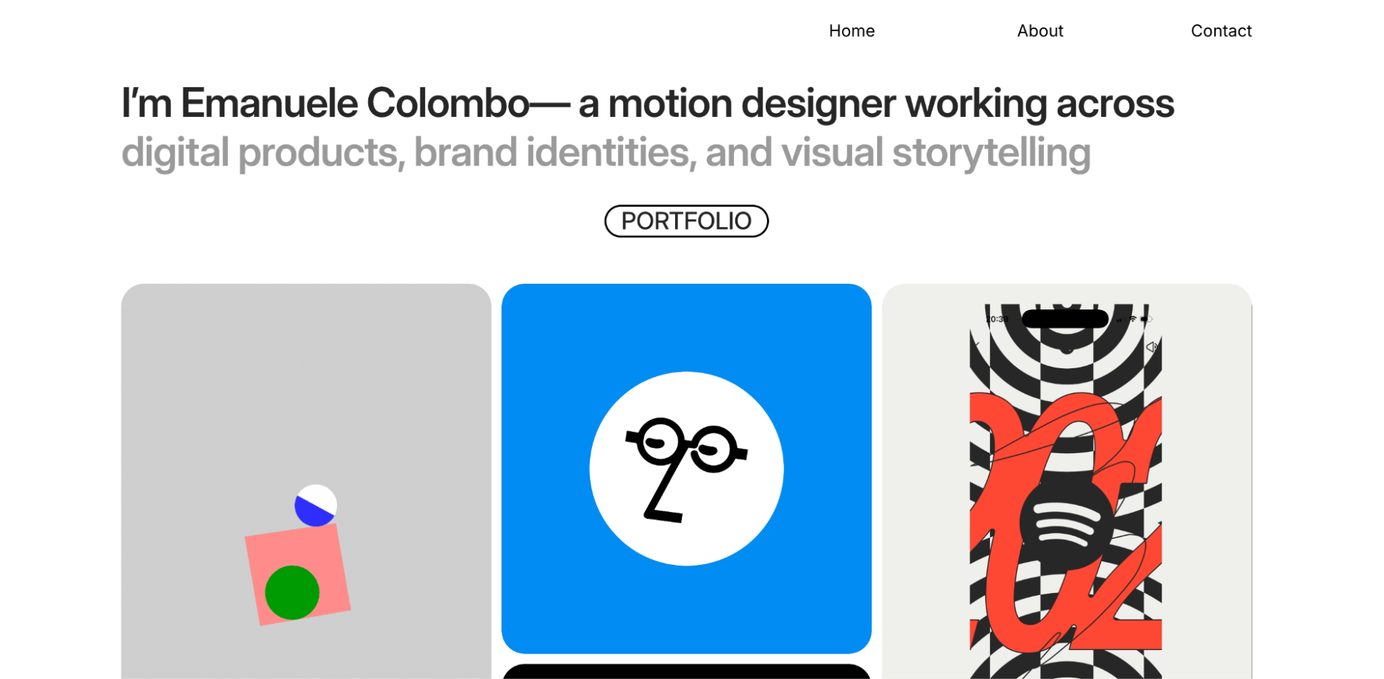
- Why it’s special: animation does the talking.
Emanuele Colombo is an Italian motion designer who has created animations for Google and Notion. His portfolio lets the work speak first – the homepage is stripped back to a single introduction line, with the animations taking center stage.
Each project pairs the finished animation with a short note on the brief, like designing the personality of Notion’s AI assistant character.
Colombo also assembles dedicated pages for individual pitches, hand-picking the projects most relevant to one client. It is a tactic worth considering: a hidden page and curation can turn a generic portfolio into a more personalized pitch.
23. Peter Tarka
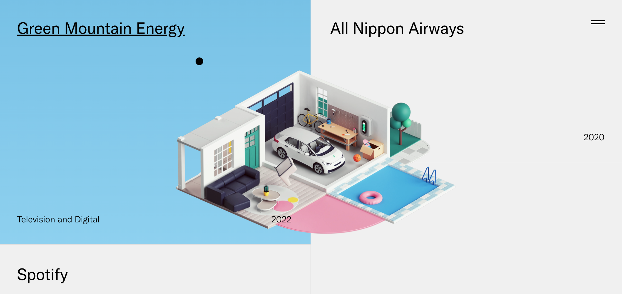
- Why it’s special: full-screen work organized by client.
Peter Tarka is a London-based art director and 3D artist whose client list, including Apple, Google, Nike, Spotify, doubles as his site’s navigation. The homepage is a stream of full-width renders labeled only with the brand and project name.
Almost no interface separates the visitor from the work: no lengthy bio, no service menu, just image after image in his colorful, instantly recognizable style.
The structure works because the client names carry the credibility on their own. If you’ve done work for recognizable brands, put those names where nobody misses them.
24. Malika Favre
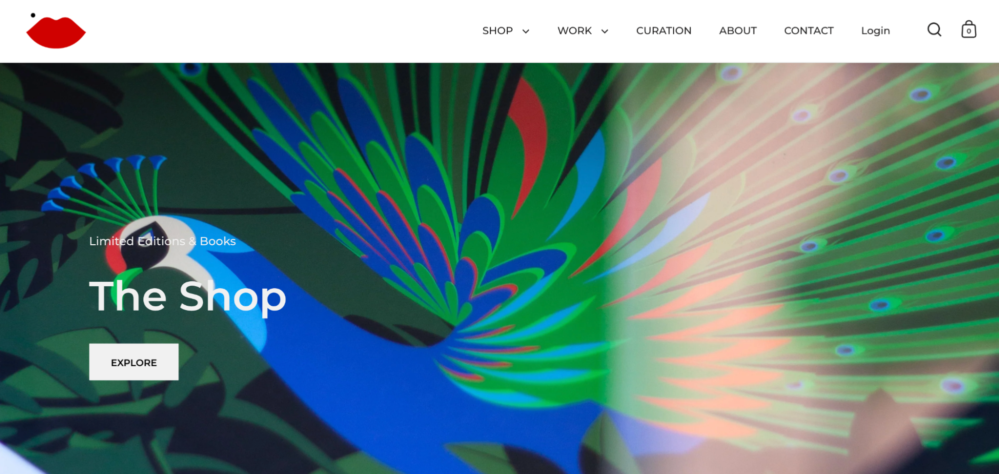
- Why it’s special: a portfolio that doubles as an online shop.
Malika Favre is a French artist based in Barcelona whose bold, minimal illustrations have appeared on The New Yorker covers and in campaigns for brands like Louis Vuitton. Her site reduces everything to a clean grid of work in her signature style.
The same site sells limited edition prints and books, shipped weekly from Barcelona, with a 10% discount for newsletter sign-ups.
That combination turns a portfolio from a brochure into a revenue channel: commissions come in through the work, and the shop monetizes the audience it attracts.
25. Benjamin Von Wong
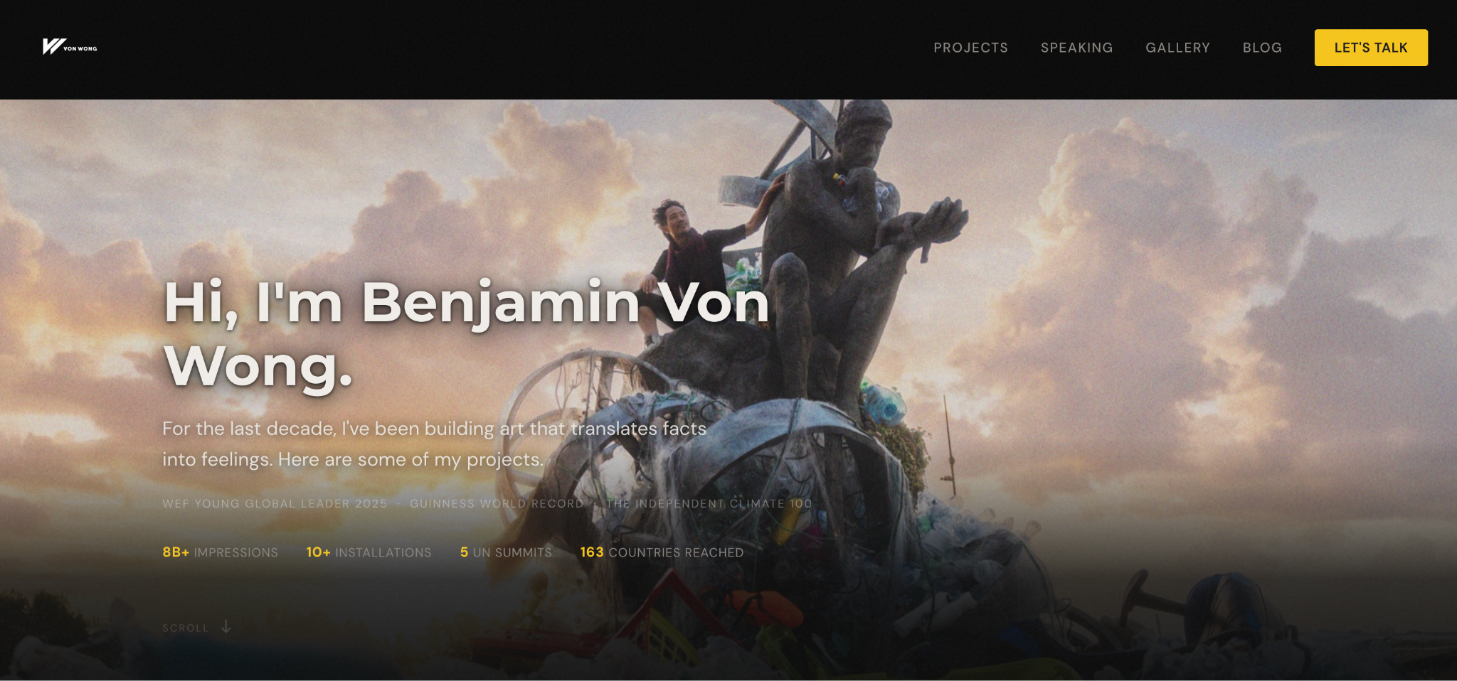
- Why it’s special: projects presented as stories with measurable impact.
Benjamin Von Wong is a Canadian photographer and environmental artist who builds large-scale installations from waste, including Strawpocalypse – a Guinness World Record piece made from 168,000 plastic straws.
His portfolio presents each project as a story rather than a gallery: the problem, the build, the campaign it fueled, and the results. The featured work includes United Nations showcases and collaborations with Nike, Dell, and Starbucks.
The takeaway for any creative: context multiplies an image’s value. A photo impresses; a photo attached to a world record and a UN installation gets remembered and shared.
How to create the best portfolio website
Building a portfolio website comes down to five steps: define your goal, curate your work, pick a builder and template, add the key pages, and publish. Hostinger’s AI portfolio maker can shortcut most of that – describe your profession, your goals, and your target client, and it generates the page structure, copy, and layout for you.
To learn how to make an online portfolio, you’ll need to:
- Define your goal and audience. A site built to land a job looks different from one built to win freelance clients.
- Gather and curate your best work. A dozen strong pieces beat 40 average ones.
- Choose a website builder and the portfolio website template that fit your profession.
- Add the key pages: work, about, and contact.
- Publish your portfolio, then share it, and keep it updated as new work comes in.
This article is a localized version of 25 best portfolio website examples for personal brands, photographers, artists, and creatives, originally published in English.

Bruno is a Content Writer at Hostinger, focused on creating and optimizing helpful, engaging articles about web development and marketing. With a background in journalism, he combines storytelling with practical insights to make complex topics easier to understand. He has also contributed to publications like MacMagazine and Jornal A Tarde. Outside of work, Bruno enjoys exploring art, cooking, and technology.