10 best practices to make a website mobile-friendly
May 20, 2026
/
Kotryna K.
/
9 min Read
Ensuring your website is as user-friendly on any mobile device as on a traditional desktop is key to standing out against the competition.
This is because making your website responsive enables you to reach a wider audience – both mobile and desktop users.
Additionally, search engines such as Google prioritize mobile indexing first, making these websites appear higher in search results and drive more traffic.
In this article, we deep-dive into how to make a website mobile-friendly in 10 simple steps.
How to Make a Website Mobile-Friendly
Here’s a 10-step plan for you on how to make a website friendly the hassle-free way:
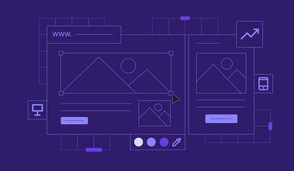
1. Implement a Responsive Layout
Layout is the foundation of your mobile website design. That’s the structure where all the text blocks, images, buttons, and other elements appear.
A responsive layout displays all these elements correctly on both small and large screens. The text will be readable, the buttons will be clickable, and the images and icons will adapt to the screen size to be optimal for your visitor’s eye.
The easiest way to go around this is using a website builder.
With Hostinger Website Builder, you can dip your toes into the world of AI and ask our AI Builder to generate a website for you. It will be mobile-friendly by default, and you’ll get bonus points for a unique design.
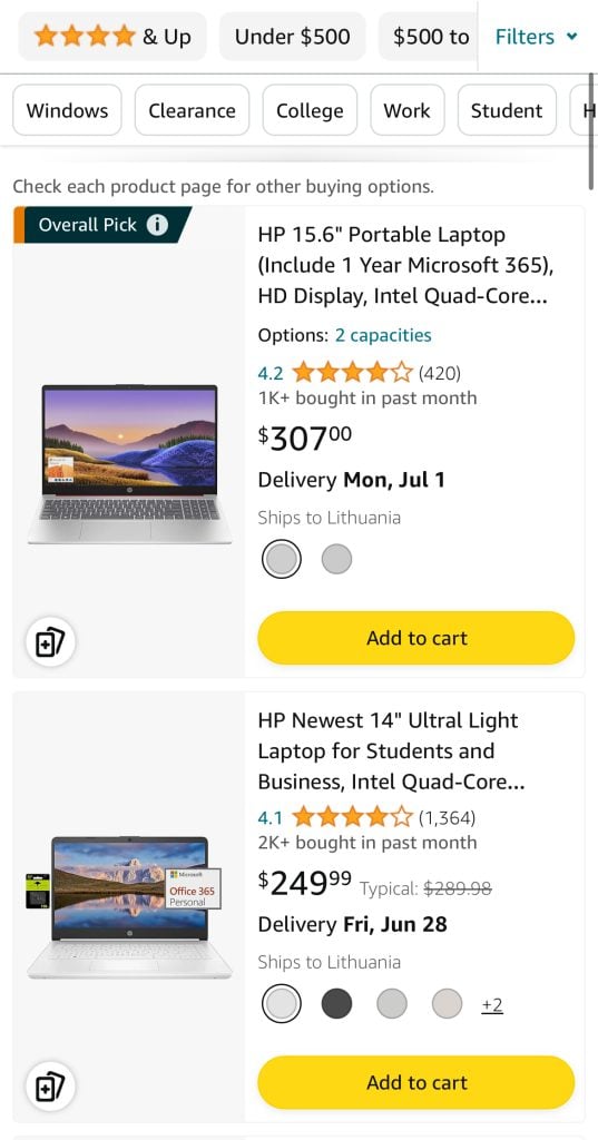
Alternatively, browse 150 professionally designed and mobile-optimized templates. Choose one that matches your website’s needs and simply fill it with your content.
No matter which method you choose, keep in mind eye predictability. Depending on the content type, our eyes typically follow these two patterns:
- F-shaped pattern – usually used for text-heavy pages like blog posts. Visitors can the first words of the paragraphs looking for keywords they are interested in. They will only continue horizontally if something catches their eyes.
- Z-shaped pattern – often used in conversion-focused pages with more visuals. Visitors first scan the navigation bar horizontally, continuing on to the middle section diagonally, and finally reaching the second horizontal line, usually filled with important information and click-to-action (CTA) buttons.
Neither pattern is better or worse – each has a use depending on your goal and content type. For example, the F-shaped pattern is more suitable for informational blog posts, while the Z-shaped pattern will better serve your landing pages.
To sum it up, make sure that the key information and your CTA buttons follow the predictable layout for your visitor.
Finally, after implementing the best practices layout-wise, you can check if everything works as it should on different screens. FOr this, we recommend the following online tools:
- Hostinger Website Builder – check how your page looks on a mobile with the Preview functionality.
- Free Responsive Test Tool – choose from dozens of different screen sizes or enter custom ones.
- Google’s free Lighthouse – get insights into your website’s mobile-friendliness, performance, SEO, and more.

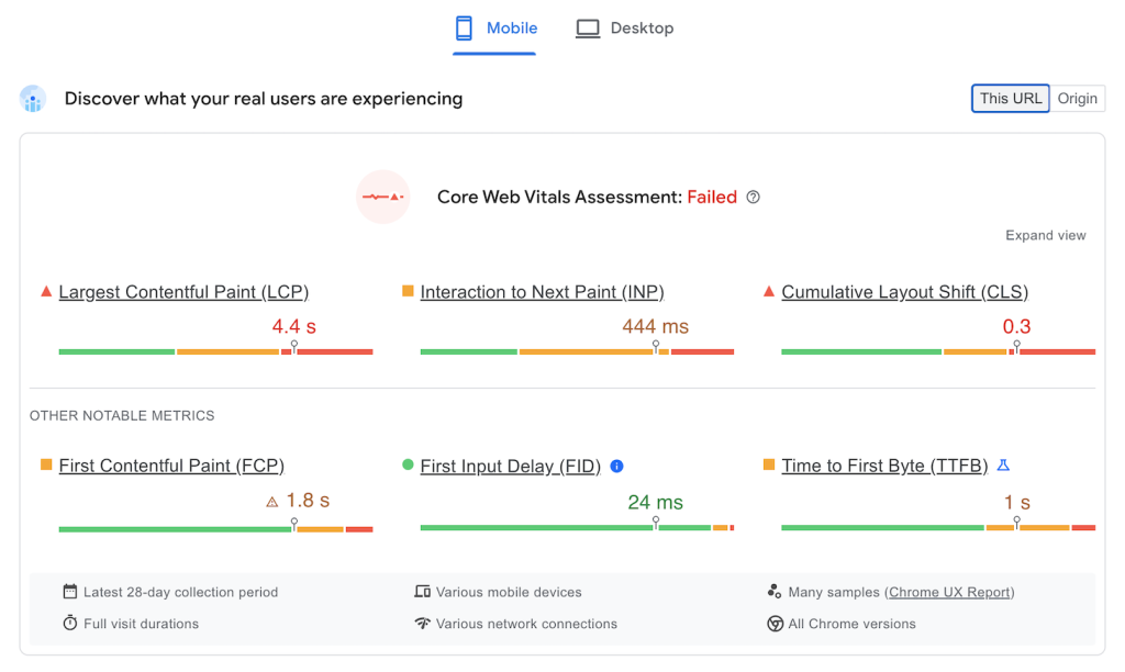
2. Optimize Website Speed
Website loading speed has a huge impact on user experience and SEO. To illustrate, the bounce rate probability increases by 32% as page load time goes from one to three seconds.
Even if a website loads fast on a desktop, it might struggle on mobile. That’s why we always recommend checking both Mobile and Desktop performance.
To avoid this, here are the best website optimization practices you can quickly implement on your site:
Compress Images
Images are by far the heaviest item to load on any website. However, you don’t need to avoid them completely. Simply compress the images before uploading them with tools like compressor.io and jpeg-optimizer.com.
Lazy-Load the Images
This ensures that only the images that are currently visible to your visitor are loaded instead of the whole page. As they scroll down, the images continue to load. This significantly reduces the load your website is facing and improves page speed.
Implement a Content Delivery Network (CDN) for Image Optimization
CDNs cache and store images on different servers worldwide to deliver them to the visitor’s browser faster than it would take to travel from the website’s original server. Our in-house CDN, available with Business and higher-tier plans, increases your website speed by up to 40% with no additional expenses or subscriptions.
Minimize CSS and JavaScript
Unnecessary code characters result in longer website loading time. Thankfully, if you build your site with Hostinger Website Builder, the code is optimized by default. For WordPress sites, you can use online tools like cssminifier.com and javascript-minifier.com or plugins to remove unnecessary characters and improve your website speed.
Leverage Browser Caching
Caching allows temporarily storing important items, such as images, in the browser’s cache instead of loading them from the original server. So when the visitor enters a certain page, all the data will delivered much faster. For your convenience, our Managed WordPress hosting plans include the object cache.

3. Use the Viewport Meta Tag for WordPress
The viewport meta tag controls how your website looks on mobile devices. Most content management systems (CMSs) will set the optimal viewport meta tags automatically. However, you can easily do it yourself by editing your website’s codw.
A viewport meta tag is HTML code that goes into the page’s <head>.
A typical page will include this line:
<meta name="viewport" content="width=device-width, initial-scale=1">
The content attribute controls how the page appears when it loads. You can adjust your site’s look by changing the device-width and initial-scale properties.
The width attribute controls the viewport’s width. You can set a specific value like width=500 or use device-width to automatically match the device’s width for a better user experience.
The initial scale sets the zoom level when the page loads, from 0.1 to 10, with the default being one.
4. Optimize Images
Sometimes, elements on mobile are resized too much, resulting in a broken layout. To avoid this, optimize images and other heavy content like videos for mobile.
Using Hostinger Website Builder, you can skip this step completely – it does the work for you. However, using WordPress or a different content management system, it’s best to double-check:
First, use a free online tool like Responsive Test Tool to see how images are displayed. Make sure people on both small and large screens can understand what’s in the picture.
Most modern templates do a good job at scaling the content, yet if there are any hiccups, you can easily solve them:
- Optimize images. Use appropriate file formats, such as JPEG 2000 and WebP, that are compressed.
- Check the image size. 1:1 images easily scale and look best on mobile devices. Meanwhile, vertical, like 2:3, or horizontal, such as 16:9, visuals might cause more issues.
- Check the code for required rules. Usually, CSS media queries create different layouts for different screen sizes. You can choose the screen width at which the layout changes and define different CSS rules for each breakpoint. A good practice is to start with 320px, 480px, 768px, and 1024px resolutions with unique rules for each. This ensures that images will scale the way you intend.
5. Avoid Pop-Ups
Pop-ups can generate leads and improve conversion rates. However, they often disrupt the user experience on mobile devices. Accidental clicks that direct users away from your site can frustrate visitors and cause them to leave completely. Additionally, intrusive pop-ups can result in Google penalizing your site, lowering your search engine ranking and reducing organic traffic.
To create a more user-friendly experience and still gather leads, consider these alternative methods:
- Call-to-action (CTA) buttons – replace pop-ups with interactive CTA buttons placed strategically. For instance, use a short CTA with a small widget for email input to increase click-through rates effectively.
- Slide-in banners – display them after a user has scrolled a certain distance or spent a specific amount of time on the page. These banners are effective for promoting offers without disrupting the user experience.
- Lead magnets – offer valuable freebies, such as PDFs, ebooks, or newsletters, in exchange for contact information to fill your email list or gather leads. This method provides value to users, encouraging them to willingly share their details.
By avoiding intrusive pop-ups and using these alternatives, you can enhance the mobile user experience while effectively gathering leads and delivering messages.
6. Enhance Visual Appeal for Mobile
Creating an optimal reading experience on mobile devices involves several key factors: font size, line height, and contrast. Here are some best practices for each:
Font Size
- Minimum size – use a minimum font size of 16px for body text to ensure readability without zooming.
- Hierarchy – ensure a clear hierarchy by using larger font sizes for headings and subheadings.
Line Height
- Optimal line height – set the line height between 1.5 to 1.75 times the font size. This improves readability by providing enough space between lines.
- Consistent spacing – maintain consistent line height throughout the text to avoid cluttered and confusing layouts.
Contrast
- High Contrast – ensure high contrast between text and background. Use dark text on a light background or light text on a dark background.
- Accessibility – Web Content Accessibility Guidelines (WCAG) recommend at least a 4.5:1contrast ratio for regular text and 3:1 for large text.
In addition to more technical requirements, you can also make your websites easy to read by focusing on content:
- Implement bullet points – as users often only scan for information they need, bullet points help them find it easier and focus better.
- Use short paragraphs – stick with one idea per paragraph to keep your content engaging and easy to read.
- Add headings – for each bigger topic or question you cover, implement a heading that summarizes the section best. Make sure you are clear on answering the question the heading suggests.
7. Space out Links and Buttons
Touch-friendly links and buttons are crucial for a seamless user experience. It’s easy for users to accidentally tap the wrong link when using small screens and touch-based navigation. Properly designed touch-friendly elements enhance usability and accessibility, making it easier for users to interact with your mobile site without errors.
Here are a few guidelines you can follow on your mobile-friendly website:
- Minimum touch target size – use 44×44 pixels as a minimum touch target size. It ensures that users can comfortably tap buttons and links without accidentally hitting adjacent elements.
- Spacing between elements – provide at least eight to 10 pixels of space between touch targets. Doing so helps prevent misclicks and improves overall usability.
- Link to mobile-friendly pages – ensure that all linked pages are mobile-friendly to provide a consistent and seamless user experience. A non-optimized page can disrupt the user flow and cause frustration.
- Descriptive links – use descriptive link text like Learn More About Us that clearly indicates the destination. Avoid vague terms like Click Here.
- Accessible labels – make sure your buttons and links have accessible labels that screen readers can interpret correctly. This helps users with disabilities navigate your site more effectively.
- Focus states – design clear focus states for keyboard navigation to improve accessibility for users who rely on keyboards or assistive devices.
8. Optimize Button Size and Placement
Visitors intuitively scan the pages for buttons and other clickable elements when scrolling mobile websites. Placing buttons strategically ensures a smooth user experience and good click-through rates.
Here are the tips for designing and placing buttons on your website:
- Size – make buttons and links large enough to tap easily. Avoid using small text links that can be difficult to select on touchscreens.
- Padding – add sufficient padding around text links and buttons to increase the touchable area, making it easier for users to interact with them.
- Visual indicators – use visual cues such as color changes, underlines, or buttons that change appearance when tapped to indicate that an element is interactive.
- Thumb zone – place primary action buttons, like Submit or Next, within the thumb zone. It is the screen area that you can easily reach with a thumb when holding the phone in one hand. Typically, this is the lower center to lower right portion of the screen for right-handed users and the lower center to lower left for left-handed users.
- Consistency – keep button placement consistent throughout the site to avoid confusing users. Primary buttons should be in the same location on each page.
9. Declutter Web Design
As a website owner, you play a crucial role in ensuring that websites offer a clutter-free and intuitive browsing experience. Here’s how to achieve a functional and clean design:
Streamline the Navigation
- Cluttered websites overwhelm users and make it challenging to find what they need. Prioritize critical functions and avoid overcrowding pages with unnecessary elements.
- Present only essential functions upfront, as users typically seek these first. A minimalist approach to design streamlines navigation and enhances user satisfaction.
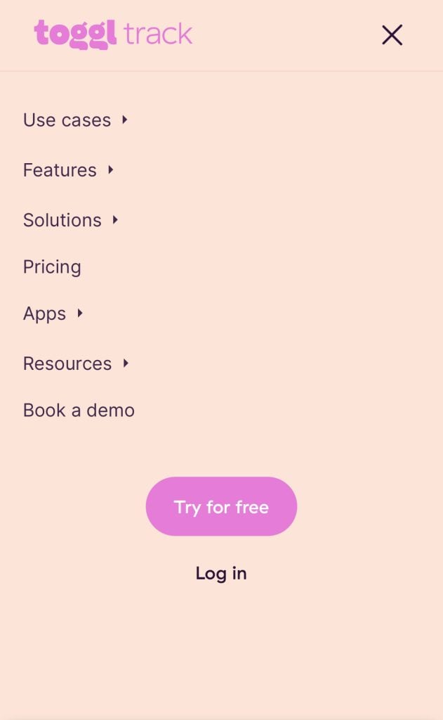
- The hamburger menu is an example of a great navigation element. With a single click, mobile users can access the entire menu, enhancing ease of navigation and fostering a cleaner visual presentation.

Utilize White Space
- White space, or negative space, is essential for creating visual breathing room between elements. It helps guide users’ attention and prevents the website from feeling crowded.
- Incorporate ample white space around text, images, and interactive elements to improve readability and visual clarity.
Regular Content Review
- Periodically review and update your website content to ensure relevance and accuracy. Remove outdated content, redundant pages, and irrelevant information to maintain a streamlined user experience.
- Avoid presenting long lists of links or overwhelming users with excessive information. Instead, prioritize quality over quantity to keep users engaged.
By embracing clean, minimalist design principles and prioritizing user-friendly navigation, web developers can create websites that leave a lasting impression and keep visitors engaged. Remember, simplicity is key to an exceptional browsing experience.
10. Test the Website on Real Devices
The only way to find out if your website is truly mobile-friendly and works as it should is to test it on real devices. Testing should be done regularly and after all updates and changes during your website maintenance.
There are multiple tools available that allow testing your website in real conditions. A couple of great examples include Lambda and BrowserStack, which allow you to test your website using plenty of different devices.
At the end of the day, testing and not testing can be the difference between converting a customer.
Conclusion
With mobile traffic taking over half of all web traffic, having a responsive website is not a question but a requirement. Thankfully, you can easily achieve it.
To recap, here are the 5 most important steps to make a website mobile-friendly:
- Implement a responsive layout – ensure that the foundation of your website is already mobile-friendly.
- Optimize website speed – stay ahead of the competition with a fast, mobile-optimized website.
- Enhance visual appeal for mobile – make sure the design is as user-friendly for mobile users as it is for desktop.
- Space out links and buttons – ensure your visitors can click the links and buttons without issue.
- Test the website on real devices – check yourself if your site works smoothly for users with both small and big screens.
If you have any more questions, check out the FAQ section, and be sure to leave your feedback in the comment section below.

Kotryna is a Content Editor responsible for delivering quality articles. The combination of her Master's degree in linguistics and interest in IT helps make every text easy to follow. During her free time, Kotryna enjoys building websites and climbing the mountains. Follow her on LinkedIn.