How to design a website
Mar 10, 2026
/
Simon L. & Linda D.
/
10 min Read
Website design is the overall process of creating the look, feel, and functionality of a website. It involves creating the visual elements, as well as the technical structure that supports a positive user experience.
A well-designed website looks good, makes your content accessible, and guides visitors toward the information they need or actions you want them to take.
Providing a positive user experience (UX) is crucial because it directly impacts the usability of your site, which in turn determines whether visitors stay, engage, and find what they’re looking for.
Here’s the flow of the design process you should follow:
- Identify your website’s purpose and audience. Determine what the site needs to accomplish and who it aims to serve.
- Map out your structure. Organize the content with a sitemap and define how users will move through the pages.
- Plan the layout. Create basic blueprints of your pages to establish layout and spacing.
- Establish a design system. Define the visual rules that ensure brand consistency, like colors and fonts.
- Develop site mockup. Create visual designs of all key pages, paying close attention to responsive layout.
- Build interactive prototypes. Make your mockups clickable to simulate the user experience before development starts.
- Test and fine-tune. Get user feedback and make necessary adjustments to the design.
- Prep for handoff. Package all the design assets and documentation for the development team.
1. Define your purpose and audience
The first step in any successful website design process is knowing why you’re building a website and who you’re building it for.
Determine your goals
Start by identifying the website’s core design goals. What is the one thing the site must accomplish?
- Is the purpose to generate leads?
- Is it to sell a product?
- Is it to provide information (like a blog)?
Specify your primary goals, and then list the secondary ones. This clarity serves as your North Star for every design decision.
For example, if your goal is to sell a product, your design should prioritize clear product pages and an easy checkout flow.
Create user personas
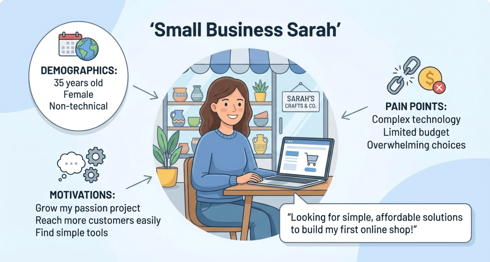
To identify your target audience, create detailed user personas. These are fictional, generalized representations of your ideal users.
You should base personas on real data about demographics, behaviors, motivations, and pain points. Here’s how you can find this information:
- Check forums and social media. Look at places like Reddit, industry-specific forums, or Facebook groups where your target audience is likely to congregate. See what questions they ask and what solutions they complain about.
- Conduct interviews. Talk directly to people who fit your target profile to uncover their specific motivations and pain points.
- Analyze competitor reviews. Read both positive and negative reviews of similar products or services to discover what users love and what major issues drive them to frustration. This reveals unmet needs.
For example, a persona named “Small Business Sarah” might be 35, non-technical, and looking for simple, affordable solutions to build her first online shop. Knowing this tells you that the design needs to be intuitive and not rely on complex jargon.
Align design with user intent
The design of each page should map directly to the audience’s needs and expectations. This is the heart of a good UX strategy.
Here’s how it works: For every page, define the primary user intent – what is the visitor trying to accomplish? Then, ruthlessly strip away elements that distract from that goal.
- Example 1. If someone lands on your contact page with the intention of finding customer service, the contact information or a clear chat widget needs to be immediately visible. Don’t hide it behind a dozen FAQ links.
- Example 2. If they are looking to compare two products, the design should offer a side-by-side comparison feature right at the top, not buried in text descriptions.
Every element on the page should help the user achieve their goal faster and easier. You achieve this by placing the most critical actions (buttons, links, forms) in the most prominent areas using your visual hierarchy.
2. Plan your site structure
Once you know the who and why, you need to define the what and where. This is all about information architecture, which is a fancy way of saying you need to organize your content so users can easily find what they need.
Here’s what you should do:
Create a sitemap
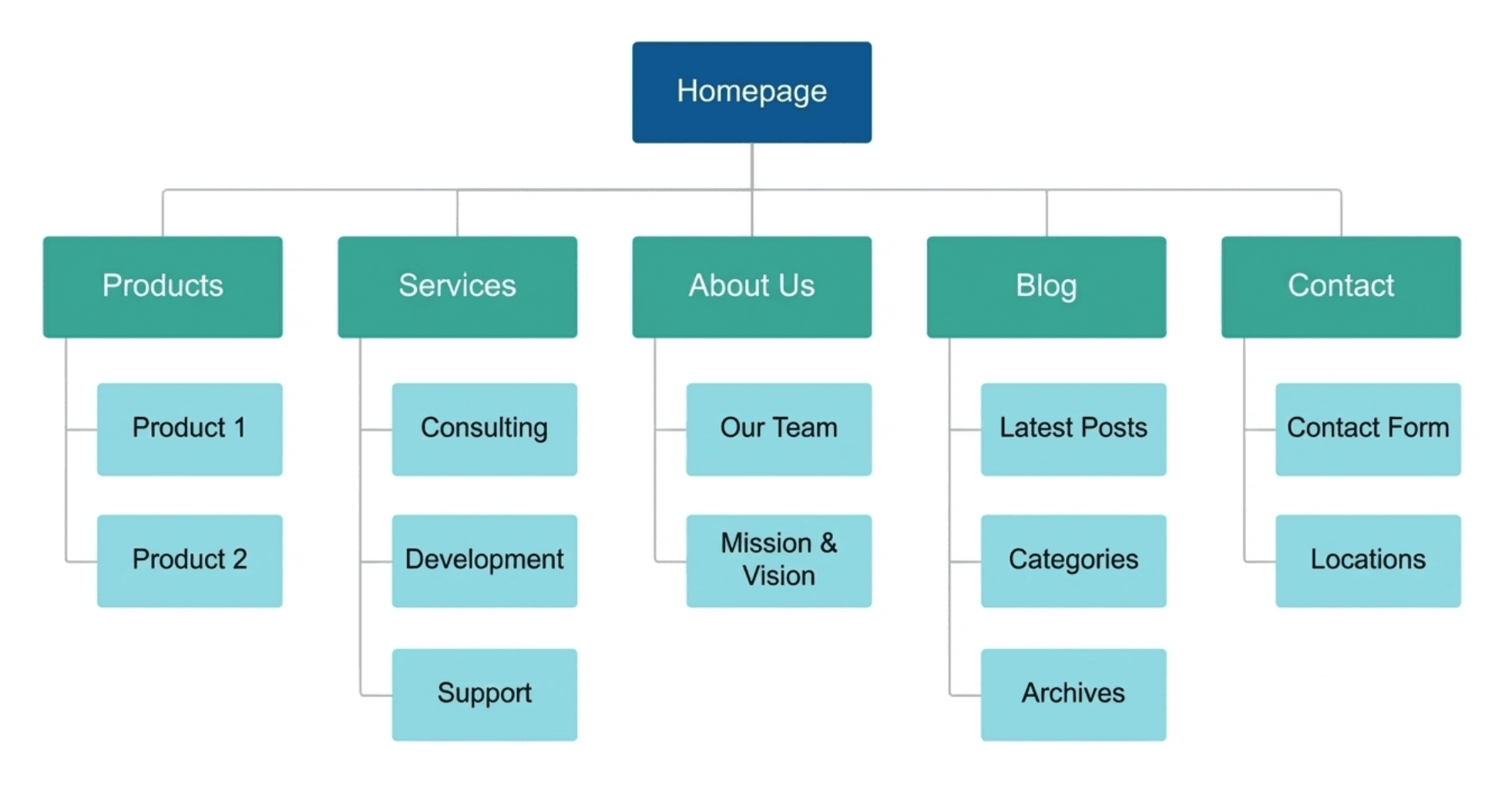
A sitemap is a blueprint of your entire website, listing all the pages and showing how they connect.
Start with your homepage (the top level) and branch out into main categories (second level), followed by individual pages (third level).
This helps ensure that all critical content is covered and prevents orphaned pages – pages that are inaccessible because they aren’t connected to any other content on the site.
Have clear navigation
Your site navigation should be simple, logical, and categorized in a way that makes immediate sense to a first-time visitor.
Stick to a shallow hierarchy. Aim for most pages to be accessible within three clicks from the homepage. A deep content hierarchy forces users to dig too deep and can lead to them getting lost.
Use clear, concise labels and avoid overly clever names. For example, using “Our offers” or “What we do” instead of simply “Services” or “Products” is fine. But avoid anything too ambiguous that doesn’t clearly tell the user what they will find on that page. Clarity must always come first.
Create user flows
User flows are diagrams that map out the path a user takes to complete a specific task.
For example, mapping the checkout flow shows the sequence from a product page to the cart, then to the shipping details, and finally to payment and confirmation.
This can help you test how easy it is to navigate your planned structure by asking questions like:
- Are there too many steps between the start and the goal?
- Are all the necessary decision points (like “log in” or “checkout as guest”) clearly provided?
If a flow has too many steps, the structure is likely too complex and needs simplifying. Always strive to have the most direct path to achieve your desired outcome.
3. Create wireframes
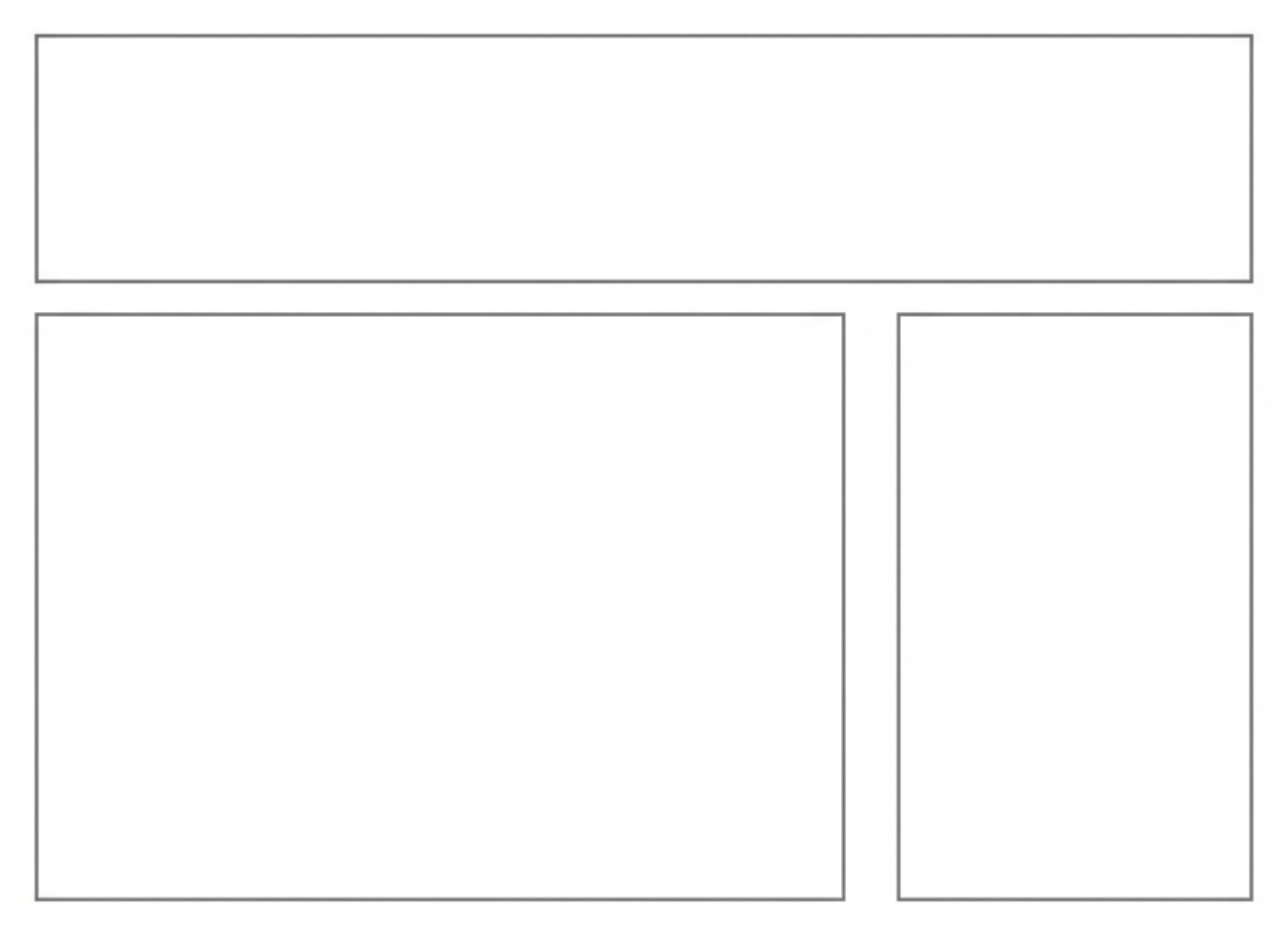
A wireframe is the basic, low-fidelity blueprint of a web page, similar to the floor plan for a house. This lets you focus purely on the structure and content hierarchy before getting distracted by colors or images.
Low-fidelity design refers to the use of grayscale, basic shapes, and dummy text to represent elements. You aren’t worried about typography or images yet.
The purpose is to map out the placement of elements, such as buttons, images, and headings, define the content hierarchy, and establish the main calls to action.
You’re defining where things go, not how they look.
In this phase, you set the layout design, define the boundaries of sections, and allocate space for content. You can use simple boxes and lines to represent where an image will go versus where text will go.
For example, on a standard blog post, a wireframe might show a large box for the header image, a long column for the text, and a smaller column to the side for the social share buttons.
Here’s what that might look like. As you can see, it really doesn’t need to be anything groundbreaking.
This is an ideal moment to conduct user flow testing, even with these simple wireframes.
Ask a few people to complete a basic task, such as finding the pricing page, just by looking at the wireframes.
Identifying problems with the flow or confusing UX patterns is easy to fix at this stage, as it simply involves redrawing some boxes and lines. Changing a box is much faster than changing a finalized visual design after development.
4. Build your design system
A design system is the foundation of your brand’s look and feel. It’s a comprehensive set of standards that determines the design of your site, ensuring every element is consistent.
Here’s what you need to do to build one:
- Define your color palette. This includes your primary brand colors, secondary accent colors, and functional colors, like red for error messages or green for success indicators.
- Establish the typography. Specify the font family, font size, line height, and weight for every level of text – from H1 to body copy and captions.
- Set the rules for spacing, corner radius, and icons. Consistency in these tiny details makes a site feel professional and easy to use.
- Define voice and tone guidelines. Specify the language, grammar, and persona your content uses across all interfaces, including error messages and success alerts.
- Document motion and interaction. Define the specific speed and style of transitions, hover effects, and animations to ensure movement is consistent and purposeful.
- Ensure accessibility and contrast. Your design must meet Web Content Accessibility Guidelines (WCAG) standards for color contrast, ensuring a sufficient difference between text and background colors for people with visual impairments.
- Structure a reusable component library. This is a library of pre-made parts, such as a button component, that defines how it looks in every state (default, hover, disabled), allowing developers to reuse it everywhere.
5. Design high-fidelity mockups
With your design system in hand, the next step is to create the visual representations of your pages.
This is where you apply the colors, typography, and spacing defined in the previous step to the wireframes using tools like Figma or Adobe XD.
Here’s what you need to focus on:
- Grid layout. Use a defined grid layout (often 12 columns) to align your UI elements. Grids create order and make the page feel structured and professional.
- White space. White space (or negative space) is the empty area around elements. It helps guide the reader’s eye, improves readability, and makes your content feel less cluttered.
- Pay attention to the details. Ensure all text blocks adhere to the defined line heights and font sizes, creating a clean and cohesive look across all pages.
- Visual hierarchy. This is the arrangement of elements to show their order of importance. The most important elements, such as the main heading or a primary call-to-action, should be larger, brighter, or positioned more prominently to draw the viewer’s attention first.
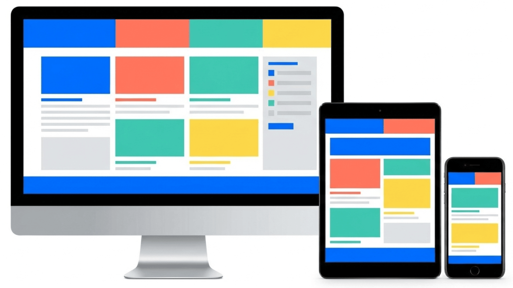
- Responsive design. Your site needs to look and function perfectly, whether a user is on a massive monitor, a tablet, or a smartphone. Create mockups for multiple device sizes to ensure buttons, images, links, and text are large enough to be easily seen on mobile devices.
6. Build interactive prototypes
While mockups are static images, an interactive prototype allows you to simulate the actual user experience. This lets you test the feel of the website before it’s created.
With Figma or Adobe XD, you can turn your high-fidelity mockups into a working model by linking the “click areas” on one mockup, like a navigation link or a button, to the next corresponding page mockup.
This can help you create an interactive prototype that feels like a real website, allowing you to simulate real user actions.
Test basic user flows, such as how easy it is to add an item to a cart or locate a specific resource. Then simulate micro-interactions, like what happens when a menu slides out or when an image expands. These details are vital to a polished user experience.
The beauty of these tools is that they offer a low-stakes way to test your site’s functionality before you spend time creating it.
7. Test and refine your design
Even the best-laid plans need real-world validation. Usability testing and gathering feedback are non-negotiable steps to ensure your design actually works for the people who need it.
There are two ways to test your design, depending on your budget and timeline:
- Moderated tests. This is where you watch a user navigate the prototype and ask questions in real-time.
- Unmoderated tests. This is where you give users a set of tasks to complete, such as “Find the refund policy”, and record their screen and audio as they complete it.
As you gather user feedback, don’t get caught up in personal aesthetic preferences. Instead, focus on the issues that repeatedly prevent users from completing their key tasks.
Use a severity scale to prioritize fixes. For example, a broken checkout button is a high-priority fix, but an error message that is technically correct but confusing to a new user is a low-priority fix focused on clarity.
The final step is making the necessary changes. This involves making tweaks to the issues that were found, such as clarifying a confusing button label or making a larger refinement to the layout.
Always test the changes after you make them, even if it’s just checking the fix yourself on different devices to prevent new errors.
8. Prepare your design for handoff
The design isn’t done until the developers have everything they need to build it exactly as you intended. This final stage is all about clear communication and providing developers with clean and easy-to-navigate assets.
Clear documentation minimizes developer questions and reduces the chance of design errors in the final product.
Here’s what you need to do to ensure a smooth design handoff:
- Organize files and layers. Organize all your files logically and name your layers clearly. Ensure that all the UI components from your design system are clearly labeled and grouped within your design tool.
- Specify exact spacing. Don’t assume a developer can simply eyeball the spacing. Specify the exact pixel measurements for margin and padding between elements.
- Define breakpoints. Define the specific screen widths where the layout shifts. Specify the exact pixel values, such as 1200px, 768px, 480px, and clearly document how the content rearranges at each shift, for example, “three columns collapse to one.”
- Specify interaction states. For every interactive element, document all states, like default, hover, focus (when tabbed to), active (when pressed), and disabled.
- Provide GIF files. If you have custom animations or micro-interactions, such as a loading spinner, export them as usable assets rather than just static mockups.
- Create dedicated handoff pages. Create a single page within your design file that serves as the source of truth, displaying all colors, typography, and core components along with their corresponding design details.
- Generate code specs. Use the built-in “inspect” modes in your design tools to automatically generate code specs, including hex codes, font sizes, and spacing.
Why good website design works
Good website design works because it creates a sense of immediate trust, guides the user’s attention, and makes finding information effortless.
Visual hierarchy plays on the fact that the human brain craves order. By making the most important information bigger, bolder, or giving it more white space, you instantly signal to the user what they should look at first.
A clear layout also reduces the amount of mental effort required to process a page. If a page is cluttered, users have to work harder, and they often move on to another site.
A design that uses an effective grid layout and clear heading structures makes content easier to scan, which improves user engagement.
Finally, consistency is the cornerstone of the best web design examples. When your elements look and behave the same way on every page, it builds trust and reinforces your brand identity.
Types of website design
Different types of website design cover three main focus areas: the visual presentation of the site, how easy the website is to use, and how the entire site adjusts its layout based on the screen size.
Visual design
Visual design is all about the aesthetic elements that shape the look and feel of your site, tying back to your brand. This includes the use of color, imagery, and overall composition. It also defines the mood of your site – is the site fun and playful, or serious and professional?
UX design
UX design is the process of enhancing the usability and effectiveness of a website. The focus is on how the site works, not how it looks, and includes elements like information architecture and interaction design.
Responsive design
Responsive design ensures the site’s layout seamlessly adapts to the size of the user’s screen. The design is organized around breakpoints – specific screen widths where the layout shifts.
This approach is often tied to mobile-first design, where the constraints of the smallest screen are considered first, simplifying the design before scaling it up for desktops.
What are the most common website design mistakes?
The most common website design mistakes include making pages too busy, having navigation that is too confusing, and using poor color choices that are too difficult to read.
Excessive clutter is a primary offender in the design process. A dense page with massive blocks of text or inconsistent spacing can overwhelm the user and hide the key message.
Poor contrast creates serious usability issues and fails accessibility standards. Light gray text on a slightly darker gray background is unreadable for many users.
Confusing navigation is a critical design mistake as well because if users can’t find what they need in seconds, they leave.
Ultimately, testing helps prevent these design missteps, allowing you to fix issues before launch.
What are website design best practices?
The most common website design best practices include consistently creating a visually organized look and drawing the user’s attention to the most important elements first.
Generous use of whitespace is also critical as it frames content and ensures the design is easy to scan and read. This means using short, clear paragraphs, bolding key concepts, and using bullet points for lists.
Adopt a mobile-first approach by focusing on essential content and functionality, and prioritize accessibility from the start, particularly in terms of color contrast and font sizing.
Is there an alternative to web design?
While the comprehensive web design process leads to the most custom and polished results, not every small business has the time or budget for a full design cycle.
The primary difference between design and development is that the design phase focuses on the site’s visual appearance and functionality. In contrast, development involves writing the code that makes the site functional.
For individuals and small businesses, a great alternative that makes the design and development stages easier is using an AI-powered, drag-and-drop website builder.
These tools come pre-loaded with professionally designed templates, built-in responsive design, and simple interfaces. This lets you focus on your content and business goals without worrying about breakpoints or design documentation.
If you want to have a website up and running fast, you can use a website builder to make a website.


Simon is a dynamic Content Writer who loves helping people transform their creative ideas into thriving businesses. With extensive marketing experience, he constantly strives to connect the right message with the right audience. In his spare time, Simon enjoys long runs, nurturing his chilli plants, and hiking through forests. Follow him on LinkedIn.

Linda is a seasoned Content Writer specialized in website creation. With her passion for the written world and obsession with helping others, her goal is to deliver resourceful content pieces for all skill levels. When she’s not writing, Linda likes to cross stitch and watch films. Follow her on LinkedIn.


Comments
October 28 2023
The information in this blog about website designing is very useful and informative. It gives accurate information. It provides good services about website designing. Thanks for this useful information. I like this blog. This information is very helpful.
November 07 2023
Hi there! Thank you for your kind words. If you have any more questions or need further assistance, feel free to ask! ?
August 01 2024
Please I want to create a website
August 07 2024
Hi Fawas! You're in the right place. Check out the steps in our tutorial to get started ;)