How to design newsletters that drive clicks
Jun 22, 2026
/
Ksenija
/
9 min Read
To design a newsletter that drives clicks, start with a clear goal, organize your content in a logical order, and make it easy for readers to find the next action you want them to take.
A well-designed newsletter uses a simple layout, strong visual hierarchy, readable formatting, and clear calls to action to guide readers from the subject line to the click.
While branding, colors, and images help create a professional look, structure and clarity have a bigger impact on engagement.
When readers can quickly scan your content, understand the message, and identify what to do next, they’re more likely to stay engaged and trust your brand.
Newsletters must be easy to read, mobile-friendly, and optimized to generate more clicks.
1. Define the newsletter goal
Every newsletter should have one primary goal, whether that’s reading a blog post, visiting a product page, registering for an event, downloading a resource, or replying to your email.
Your goal should guide every design decision. For example, if you want readers to visit a blog post, the article link and call to action should be the most prominent elements in the email.
If you’re promoting an event, the registration details and sign-up button should be easy to find without having to scroll through unrelated content.
Avoid building a newsletter around multiple competing actions. Asking readers to read several articles, browse products, register for an event, and follow your social media accounts in the same email can make the design feel cluttered and difficult to scan.
A focused goal creates a clearer layout, stronger content hierarchy, and a more obvious path to action.
2. Choose a simple newsletter layout
For a short update, announcement, or personal note, a single-column layout works best because it keeps the content focused and easy to read.
For newsletters with several links, such as blog roundups or product collections, a card-based layout can help clearly separate each item.
If your newsletter promotes one main offer, use a hero section with a strong headline, supporting copy, and a clear call to action near the top.
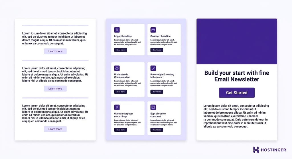
Keep the structure predictable so readers know where to look. A clear newsletter layout includes a lightweight header, a main content area, one primary call to action, and a footer with sender details and useful links.
This familiar structure makes the email easier to scan and helps readers move naturally from the opening message to the next step.
With Hostinger Reach, you can generate layout suggestions based on your campaign goal instead of starting from a blank page. You can also browse newsletter examples to find templates for common use cases, then adapt the structure to your own message, audience, and brand.
3. Create a clear content hierarchy
Instead of presenting everything with equal importance, arrange your newsletter so the most important information appears first and naturally leads readers toward the desired action.
Start with the subject line and preview text, as these are the first elements readers see in their inbox.
Once they open the email, use a strong headline to communicate the main message, followed by a short introduction that provides context.
The main body should expand on the topic with supporting details, while the call to action should remain easy to find and clearly explain what readers should do next.
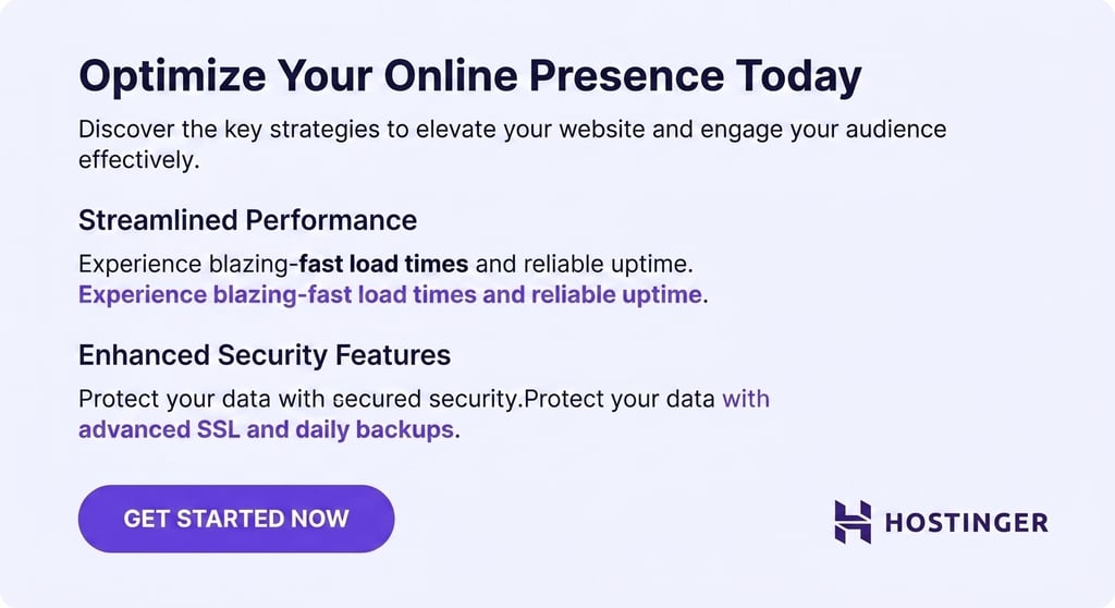
Make your content easy to scan by breaking it into smaller sections. Use headings to introduce key points, keep paragraphs short, and highlight important information with bold text when appropriate.
Consistent spacing between sections also improves readability by preventing the newsletter from feeling crowded.
The easier it is for readers to scan your content, the more likely they are to stay engaged and click through to learn more.
4. Design a recognizable header
Your newsletter header should help readers immediately recognize who the email is from.
Include essential branding elements such as your company name, logo, newsletter name, or a short navigation menu when relevant.

Keep the header simple and lightweight so readers can reach the main message quickly. A compact logo and minimal navigation are enough to establish trust and familiarity without distracting from the content.
If you include navigation links, limit them to key destinations such as your website, blog, or product pages. Too many links can overwhelm readers and pull attention away from the primary call to action.
5. Use readable typography
Follow email design best practices by using web-safe, easy-to-read fonts such as Arial, Helvetica, or Georgia, and keeping body text between 14 –16 pixels so readers don’t have to zoom in on mobile devices.
Maintain sufficient line spacing (around 1.4 – 1.6 times the font size) to prevent text from feeling cramped, and use high-contrast color combinations such as dark text on a light background.
Headings should be noticeably larger than body copy to help readers scan the newsletter and quickly identify key sections.
Keep your typography simple and consistent. Using too many fonts, sizes, or styles can make the newsletter feel cluttered and distract readers from the message.
You only really need one font for body copy and another for headings, or a single font family with different weights.
Avoid decorative or highly stylized fonts for long sections of text, as they can be difficult to read and may not display consistently across email clients.
For more guidance on typography, accessibility, and layout choices, follow these email design best practices.
6. Add images with a clear purpose
The most effective newsletter images help readers understand the content faster by showcasing a product, illustrating a concept, reinforcing your brand identity, or creating visual separation between sections of text.
Large decorative banners, stock photos that don’t add context, and irrelevant graphics can distract attention from the main message and call to action.
They can also increase loading times, especially on mobile devices, which may lead some readers to abandon the email before it fully loads.
Avoid image-heavy newsletters where most of the message is embedded in graphics. Email clients may block images by default, and image-only emails can be difficult to read on mobile devices and less accessible to screen readers.
As a rule, readers should be able to understand the key message and find the call to action without relying on images alone.
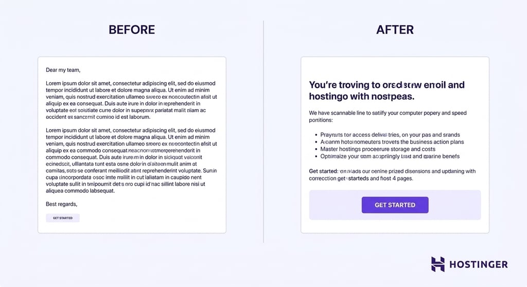
7. Write concise newsletter copy
Newsletter copy should be easy to read and easy to act on. When you write the newsletter copy, instead of trying to include every detail, focus on the information readers need to understand the message and take the next step.
Start with a strong opening line that explains why the email matters, then use short paragraphs and simple language to keep readers engaged. If a section doesn’t support the newsletter’s goal, remove it.
Make each section lead naturally toward the main call to action. For example, if you’re promoting a new product, briefly explain the benefit, provide supporting details, and then direct readers to the product page.
Avoid filler phrases, unnecessary introductions, and long blocks of text that make the email harder to scan.
You can use Hostinger Reach to generate newsletter copy from a campaign prompt, helping you create drafts faster. However, AI-generated content should always be reviewed and refined before sending.
Check the copy for accuracy, adjust the tone to match your brand, and make sure the message is relevant to your audience.
8. Make the call to action easy to find
Every newsletter should make it obvious what readers should do next. Whether you want them to read an article, register for an event, browse a product, or reply to the email, the call to action (CTA) should stand out from the rest of the content and clearly communicate the next step.
Use one primary CTA whenever possible. Multiple buttons competing for attention can dilute the message and reduce clicks.
Place the CTA close to the content it relates to, and use enough white space around the button so it doesn’t get lost among other elements.
The button text should be action-oriented and specific, using phrases such as “Read the article,” “Register now,” or “View the product” instead of generic labels like “Click here.”
In some cases, it can also be helpful to include a supporting text link alongside the main button. This gives readers another way to access the destination without creating a competing call to action.
Regardless of the format, the CTA should remain visible, easy to understand, and aligned with the newsletter’s primary goal.
9. Design for mobile readers
Most newsletters are opened on mobile devices, so your design should work just as well on a small screen as it does on a desktop.
Start with a single-column layout that allows content to stack naturally and eliminates the need for horizontal scrolling.
Use body text that’s large enough to read comfortably, keep sections short, and make buttons large enough to tap with a thumb without accidentally clicking nearby links.
Optimize images for mobile viewing by compressing file sizes and using responsive dimensions that adjust to different screen widths.
This helps newsletters load faster and prevents oversized images from disrupting the layout. It’s also a good idea to preview your newsletter on multiple devices before sending it to make sure the content is easy to read and navigate.
Important! Keep individual images under 1 MB and aim for a total email size below 102 KB. Emails that exceed this threshold may be clipped by Gmail, cutting off your content and call to action before readers reach them.
Avoid design choices that create friction for mobile readers. Wide multi-column layouts, tiny fonts, image-only emails, and small buttons can make newsletters difficult to use.
10. Keep the footer clear and trustworthy
Your newsletter footer should help readers identify the sender, manage their subscription, and find additional ways to connect with your brand.
Include your company name, website, contact email, social media links, and an unsubscribe link.
If you offer subscription preferences, such as choosing topics or email frequency, include a link to those settings as well.
It’s also a good practice to remind subscribers why they’re receiving the email. A short note such as “You’re receiving this email because you subscribed to our newsletter” can reduce confusion and help prevent spam complaints.
Depending on your location and audience, you may also need to include a physical business address to comply with email marketing regulations.
Keep the footer easy to read and separate from the main content. Readers shouldn’t have to search for contact details or unsubscribe options.
A transparent footer builds trust, reinforces your brand’s credibility, and helps subscribers feel confident that they’re receiving emails from a legitimate source.
11. Test the newsletter before sending
Even a well-designed newsletter can lose clicks if something breaks after it reaches subscribers.
Before sending, review the entire email from the reader’s perspective. Check for spelling and grammar mistakes, confirm that every link points to the correct destination, and test each button to make sure it works as intended.
Verify that images load properly, display at the correct size, and include alt text where appropriate.
Next, review how the newsletter appears in different environments. Open it on a mobile device to confirm that the text remains readable, the buttons are easy to tap, and the images scale correctly.
If your email platform supports dark mode previews, check that text, logos, and graphics remain visible against darker backgrounds.
You should also review the subject line and preview text in the inbox to ensure they accurately reflect the content and encourage opens.
Finally, send a test email to yourself and, if possible, a colleague. Open it in different email clients, such as Gmail and Outlook, and on both desktop and mobile devices.
Pro tip
Tools like Litmus or Email on Acid let you preview your newsletter across 90+ email clients and devices simultaneously, saving you from manually testing each one. Most email platforms also offer built-in inbox preview features worth checking before you send.
A few minutes of testing can help you catch broken links, formatting issues, or display problems before they reach your subscribers.
What makes a good newsletter design?
A good newsletter design helps readers understand the message quickly and take the intended action with minimal effort.
Instead of relying on visual effects alone, it combines structure, readability, and branding to create a clear path from the subject line to the call to action.
The key elements of an effective newsletter design include:
- Layout – Organizes content logically and helps readers navigate the email.
- Content hierarchy – Prioritizes information so readers see the most important messages first.
- Spacing – Separates sections and prevents the newsletter from feeling crowded.
- Typography – Uses readable fonts, appropriate font sizes, and sufficient contrast for comfortable reading.
- Images – Support the message, showcase products, reinforce branding, or break up long sections of text.
- Branding – Creates a consistent experience through logos, colors, tone, and visual identity.
- Calls to action (CTAs) – Clearly tell readers what to do next and make it easy to take that action.
Common newsletter design mistakes
Even well-intentioned newsletter designs can make it harder for readers to engage with your content.
Watch out for these common mistakes:
- Using too many columns – Multi-column layouts can become difficult to read on mobile devices and make it harder for readers to follow the main message.
- Adding too much text – Long paragraphs and dense content can overwhelm readers, reducing the chances that they’ll reach your call to action.
- Hiding the CTA – Buttons that blend into the design or appear too far down the email can lower click-through rates because readers don’t know what to do next.
- Relying only on images – If important information is embedded in graphics, readers may miss the message when images fail to load or display incorrectly.
- Ignoring mobile design – Small text, narrow buttons, and layouts that require horizontal scrolling create a poor experience for mobile users.
- Using inconsistent branding – Changing colors, fonts, logos, or tone from one newsletter to the next can make your emails feel less professional and harder to recognize.
Many of these issues happen when newsletters are designed from scratch without a clear structure.
Starting with a proven newsletter template can help you avoid common design mistakes and create a more consistent reader experience.
With Hostinger Reach, you can choose from ready-made templates and campaign-focused layouts that provide a strong foundation for your newsletter design.
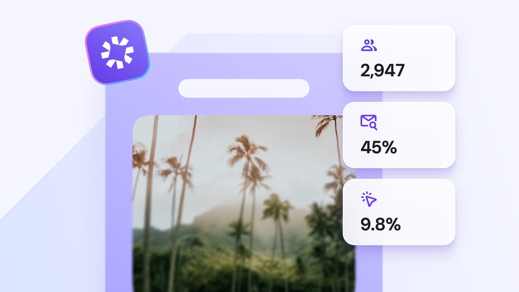
How to measure newsletter design performance
After sending a newsletter, review key email marketing metrics to understand whether the design is helping subscribers engage with your content and complete the intended action.
Pay attention to email marketing performance metrics such as:
- Open rate – Indicates whether your subject line, preview text, and sender branding encourage subscribers to open the email.
- Click-through rate (CTR) – Shows how effectively your layout, content hierarchy, and calls to action guide readers to click.
- Replies – Reveals whether the content resonates with readers and encourages engagement.
- Unsubscribe rate – A sudden increase may indicate that the content, frequency, or overall experience isn’t meeting subscriber expectations.
- Conversions – Measures whether readers complete the desired action, such as making a purchase, registering for an event, or downloading a resource.
For example, if subscribers open the email but rarely click, you may need a stronger CTA or a clearer content hierarchy.
If click-through rates are high but conversions are low, the issue may be on the landing page rather than in the newsletter itself.
Most importantly, make design decisions based on reader behavior rather than personal preference.
Testing different layouts, headlines, images, and CTAs can reveal what works best for your audience. To learn how to track and improve these metrics, explore our guide to email marketing performance.

Ksenija is a digital marketing enthusiast with extensive expertise in content creation and website optimization. Specializing in WordPress, she enjoys writing about the platform’s nuances, from design to functionality, and sharing her insights with others. When she’s not perfecting her trade, you’ll find her on the local basketball court or at home enjoying a crime story. Follow her on LinkedIn.