How to create a logo
Mar 12, 2026
/
Alma
/
14 min Read

A logo is the primary anchor of your brand identity. It’s the visual mark that builds recognition, signals trust, and communicates your brand’s values before a word is read. A strong logo shortens the time it takes to build trust – customers who recognize it already know what to expect from you before you’ve said anything.
To do that job well, a logo needs three things: clarity in its message, scalability across every size and format, and alignment with your brand’s personality. A logo that’s too complex falls apart at small sizes. One that’s too generic never builds a real connection.
A structured design process is what separates a strategic, distinctive mark from one that looks like everyone else in your space. Here’s how to create a logo, from research to final export:
- Establish your brand mission and target users – Clarify your “why” and who you are actually helping.
- Analyze your market and set design benchmarks – See what’s working in your niche and find gaps where you can stand out.
- Pick a format that fits your name and goals – Decide if a wordmark, icon, or combination style best suits your brand.
- Pair a strategic color palette with readable fonts – Use psychology and legible type to set the right emotional tone.
- Draft rough ideas and explore visuals on paper – Use mind mapping and quick sketches to get your concepts out.
- Move your best designs into a digital workspace – Translate your favorite drawings into high-quality vector files.
- Review how your mark holds up across different mockups – Check that your design stays clear on various backgrounds and sizes.
- Package your final versions in every format you’ll need – Organize your files for both professional print and digital use.
1. Define the brand purpose and audience
Before you even touch a pencil, you need to get clear on what your brand purpose is and how it shapes your overall brand identity.
This means defining your mission, your core brand values, and those specific brand personality traits that make you unique. If you don’t know the “soul” of your business, your logo will likely end up looking like a hollow graphic that fails to build recognition or trust.
To turn these abstract ideas into a design filter, follow these best practices:
- Clarify your mission – Write down a simple mission statement to serve as the foundation for your design process.
- Select personality traits – Choose three to five words that describe your brand’s character, such as “reliable,” “approachable,” or “innovative”.
- Identify your target audience – Determine who your ideal customers are and what they expect when they see a brand in your niche. For example, a millennial-focused fintech brand needs a different aesthetic than a luxury wellness brand targeting professionals over 40.
- Establish your brand positioning – Use your audience research to guide your style choices. Your brand positioning determines whether you should look like a bold disruptor or a safe, established industry leader.
The ultimate goal of this phase is to find a way to stand out and differentiate your business from the crowd. When you have a clear understanding of your purpose, you avoid the trap of creating a generic logo that no one will remember.
Write your brand positioning in one sentence before you start designing: "We help [audience] achieve [outcome] by [differentiator]." If you can't summarize it clearly in words, your logo will struggle to communicate it visually.Pro tip
2. Research competitors and industry standards
You don’t want to accidentally look like a clone of your biggest rival. That’s why a competitor logo analysis is important.
Spend time studying the logos of five to ten brands in your space. Look at their logos and ask:
- What’s the common thread?
- What clichés are they all using?
- Are they mostly wordmarks or icon-based?
- Do they share a color palette?
- Do they feel formal or approachable?
Logo research helps you spot gaps where you can stand out. Document what you find – note what works, what feels dated, and what feels like an opening – then build a mood board to translate those insights into a visual direction. Collecting colors, fonts, and images that feel right for your industry branding helps you move from analysis to instinct.
If every competitor in your space uses dark blues and serif fonts to signal authority, a clean sans-serif with a warmer palette could help you stand out without sacrificing professionalism.
A word of advice: avoid jumping on the latest “hot” trend. Trends fade fast, and you want a logo that still looks great five years from now.
3. Choose the right logo type
Not all logos are built the same, and the one you pick depends on your brand name length and how you plan to use it. The right logo types can make or break your brand’s scalability and memorability.
There are six main types, each suited to different brand situations, recognition goals, and use cases:
Logo type | Best used for | Scalability and memorability | Examples |
Wordmark | Short, unique brand names prioritizing recognition | Clean typeface scales well; memorability depends on name distinctiveness | Google, Coca-Cola, FedEx, Visa, Subway |
Lettermark | Long or complex names with long-term brand building | Simple forms scale well at small sizes; low early memorability, builds with exposure | IBM, HBO, NASA, CNN, LV |
Pictorial mark | Brands with strong recognition that can drop the name | Single icon scales at any size; highly memorable once association is established | Apple, Twitter/X, Target, Shell, NBC |
Abstract mark | Creating a distinctive, ownable symbol with no literal meaning. | Scales well; memorability depends on distinctiveness, meaning builds over time. | Nike, Pepsi, Adidas, Chase, Airbnb |
Combination mark | New brands needing both visual identity and name recognition | Flexible – symbol and wordmark work together or separately; practical for most new brands | Burger King, Lacoste, Puma, Slack, Amazon |
Emblem | Seeking a traditional, authoritative feel; common in hospitality, education, or heritage brands. | Complex emblems scale poorly at small sizes; memorable at full size, requires simplification for digital use. | Starbucks, Harley-Davidson, NFL, Stella Artois, Harvard |
Wordmarks and lettermarks are essentially the “voice” of your brand name. They rely purely on logo typography to build recognition, which is a great move if you’re a new business and want people to actually memorize your name. Because they are text-based, they are usually very easy to scale across website headers.
If you want to move beyond text, pictorial marks and abstract symbols use imagery to tell a story. A pictorial mark uses a literal image – like a bird or an apple – while an abstract symbol uses geometry to represent a broader concept or emotion.
Many growing businesses start with a combination mark or an emblem logo because it gives them the best of both worlds: a unique icon paired with a readable name. This provides the flexibility to use just the icon as a social media profile picture or the full logo on a storefront.
Regardless of the style you choose, it must account for logo scalability. A detailed emblem might look impressive on a business card, but those fine lines can “bleed” together or disappear when shrunk to a 32×32 pixel browser favicon.
Always test your shortlisted options at thumbnail size before committing; if the core shape isn’t recognizable when tiny, it won’t be effective for your brand.
4. Select colors and typography
Colors aren’t just for decoration; they are a powerful emotional language that influences how people perceive your brand within milliseconds. Your logo color palette tells people how to feel about you before they even read a word.
While there are no hard rules, most industries follow a loose set of psychological cues:
- Blue – This is the standard for trust, stability, and intelligence. Financial institutions (Visa, Chase), tech companies (Facebook, Dell), and healthcare brands use it because reliability is the first thing they need to communicate.
- Green – This is growth, nature, and health in one color. Organic food brands (Whole Foods) and outdoor gear companies (REI) use it to signal their values the second a customer sees the logo.
- Red – It’s all about energy, passion, and urgency. Fast food (McDonald’s, KFC) and big retailers (Target) use it to grab your attention immediately. It’s high-impact, but it can be a lot to take in if it’s the only color you use.
- Orange – This takes red’s energy and mixes it with a friendlier vibe. Brands like Nickelodeon and Fanta use it because it feels playful and high-energy without being quite as aggressive as red.
- Yellow – It feels optimistic and youthful. Brands like DHL, Hertz, and IKEA use it because it feels welcoming and straightforward rather than exclusive or high-end.
- Violet – This is a creative powerhouse that covers everything from high-tech innovation to imagination. Twitch uses it for their digital-first community, and Viber uses it to stand out in a sea of green and blue apps. At Hostinger, we see it as the color of the future and “artistic daring.”
- Pink – It’s a very flexible color that can feel soft and nurturing or bold and disruptive depending on the shade. T-Mobile and Lyft use deep, saturated pinks because they want to feel energetic and unconventional.
- Purple – This is traditionally linked to luxury, royalty, and wisdom. Brands like Hallmark and Taco Bell use it to feel either established and refined or creative and unexpected.
- Black and gray – These are the go-to colors for power, sophistication, and neutrality. Luxury fashion houses (Chanel, Gucci) and high-end car brands (Mercedes-Benz) use them to show that their quality speaks for itself.
- White – It represents cleanliness, simplicity, and minimalism. Apple and modern skincare brands use it to create breathing room and a sense of precision in their design.
To keep your design professional and versatile, it is best practice to limit your brand colors to just two or three main shades. This prevents the logo from looking cluttered and ensures it remains effective when printed in different formats.
While color sets the mood, your logo typography provides the voice of your brand. The right font selection should match your brand’s personality – for example, a clean, modern sans-serif works perfectly for a tech startup, while a classic serif font is better suited for a luxury boutique.
The golden rule here is readability. You should avoid using overly decorative or swirly typefaces that become unreadable when shrunk down to the size of a business card or a mobile app icon. Clarity should always come before being “clever”.
5. Sketch and develop logo concepts
While you might want to start on a digital canvas immediately, sketching on paper first lets you explore more ideas faster without the friction of design software. You don’t need to be a professional artist to do this; rough shapes and simple drawings are plenty for this stage.
Use mind mapping to connect your brand values to visual symbols, then aim for volume by drafting 20 to 30 quick concepts before you start judging them.
The real secret sauce is to design in black and white first. If a shape doesn’t hold up in plain black, color will only mask a weak concept; a strong black-and-white mark is guaranteed to work anywhere, from embroidered uniforms to tiny browser icons.
Once you have a handful of rough sketches worth developing, refine their shapes, balance, and proportions against your brand positioning to ensure they feel fresh and distinctive
Simple logos are not only easier to remember, but they also ensure your design stays recognizable even at the size of a tiny thumbnail. If a customer sees your logo once and can’t roughly redraw the shape from memory, it’s likely too complex. Pro tip
6. Create the logo using design tools
Now it’s time to go digital. You need to turn those sketches into vector files.
Vector files (SVG, AI, EPS) are made of mathematical paths rather than pixels, which means they scale to any size – from a favicon to a billboard – without losing quality.
Raster files – such as JPG and PNG, the same format used for standard photos – are pixel-based, so they degrade when enlarged. If someone builds your logo in Photoshop and exports it as a PNG, you’ll hit a wall the moment you need it on a large-format banner or sign.
For tools, Adobe Illustrator is the industry standard for professional logo design – it gives you precise control over every vector path, but it has a steep learning curve. Inkscape is a free, open-source alternative with similar functionality.
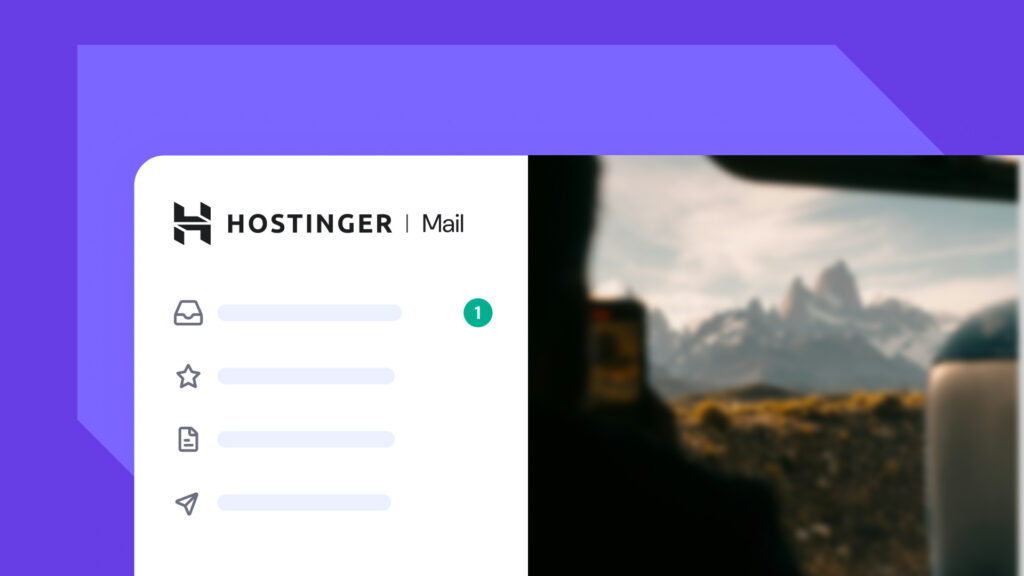
For beginners who need results quickly, Hostinger’s AI Logo Maker generates logo variations from a short brand description in minutes, with editable templates you can customize without any design experience. Just keep in mind that while it’s fast, you’ll have less control over the tiny details than you would with custom design software.
Canva sits in the middle ground – it’s more hands-on than an AI generator, with a large library of logo templates you can edit directly, but without the full vector control of Illustrator or Inkscape.
Regardless of the tool you pick, the process of creating the logo follows these four steps:
- Import or recreate your approved sketch in the design tool, tracing the core shapes as vector paths.
- Construct the logo using vector shapes, adjusting anchor points until proportions feel balanced and intentional.
- Apply your color palette and typography according to the brand rules you defined in steps one and four.
- Refine spacing, alignment, and proportions – ensure the relationship between the icon and wordmark remains visually balanced across sizes.
While moving through this process, keep an eye out for technical errors that can undermine your hard work. The most significant mistake is creating your logo in a raster-only format, which renders it unscalable for future print or large-scale use.
You should also watch for inconsistent spacing – what looks “fine” in a large workspace may appear off-center when viewed at a distance.
Finally, always check your contrast at small sizes; a design with too many thin lines or low-contrast colors at 500px will become a muddy, unrecognizable shape when shrunk down to a 32px mobile app icon.
7. Test the logo in real-world contexts
A logo doesn’t live in a vacuum. It has to survive on website headers, landing pages, social media profiles, and cardboard boxes – real environments with different sizes, backgrounds, and constraints. Logo testing ensures it stays clear and recognizable in all those situations.
The first step in testing is to check your logo’s scalability. Scale the design down to a 16×16-pixel browser favicon, then blow it up to banner size. If the details turn into a blur when it’s tiny, or feel clunky when it’s huge, you likely need to simplify the shapes.
You also need to test how the design holds up on different backgrounds. Place your logo on white, black, and mid-tones to ensure it maintains high visual contrast and remains readable regardless of the background color.
To see how the design feels in action, use logo mockups. Digital and print templates – like business cards, signage, and website headers – reveal issues that aren’t visible in isolation, such as proportions that feel off on a physical product.
Finally, gather feedback from relevant users or colleagues who haven’t been part of the design process. Ask them what the logo communicates at a glance. Fresh eyes are best at catching the small flaws or unintended meanings that you’ve stopped noticing.
8. Finalize and export logo files
A finished logo isn’t a single file – it’s a package prepared for every context where your brand will appear. You need a full kit of logo deliverables to handle any situation.
Start by organizing your files so they’re easy to navigate, ensuring you have these versions of your logo:
- Full-color version – your primary logo in full brand colors
- White version – for use on dark backgrounds, photographs, or colored surfaces
- Black version – for single-color applications like embroidery, stamps, or legal documents
- Horizontal and stacked layout variations – different arrangements for wide versus tall spaces
- Icon-only version – the symbol without text, for favicons, social profile images, and app icons
To ensure your logo is ready for any application, you need to export it in both vector and raster formats. You’ll need SVG, EPS, or AI files for print and large-format use, as well as for future editing, while a PNG with a transparent background is the standard for digital platforms like websites and presentations.
It is also best practice to include a PDF, which provides a print-ready vector format compatible with professional print vendors.
When you export your logo, set up a clear folder structure and name your files descriptively – for example, brandname-logo-primary-color.svg or brandname-logo-white.png. Anyone picking up your brand files in the future should be able to find exactly what they need without having to guess.
Finally, keep your original editable source file separate from the exported assets. If you ever need to update your logo or font, you’ll want to work from that source rather than a flattened export.
Logo design examples to inspire your own logo
The most enduring logos share one trait: they’re simpler than you’d expect. Here are five examples of well-designed logos that effectively convey their brand’s message.
1. Nike
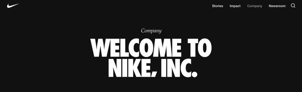
This single curved stroke was designed in 1971 by student Carolyn Davidson. The Swoosh suggests movement and speed without depicting anything literally. Its staying power comes from simplicity – it scales to any size, works in one color, and has no text dependency.
Today, it operates as a standalone symbol because decades of exposure built that instant association.
2. Apple
Designed by Rob Janoff in 1977, the bitten apple was a functional solution to a visual problem: a plain apple silhouette looked too much like a cherry. The “bite” made it unmistakably an apple – and it has often been read as a clever visual pun on “byte”. This logo proves that a design’s durability comes from its restraint.
3. Starbucks
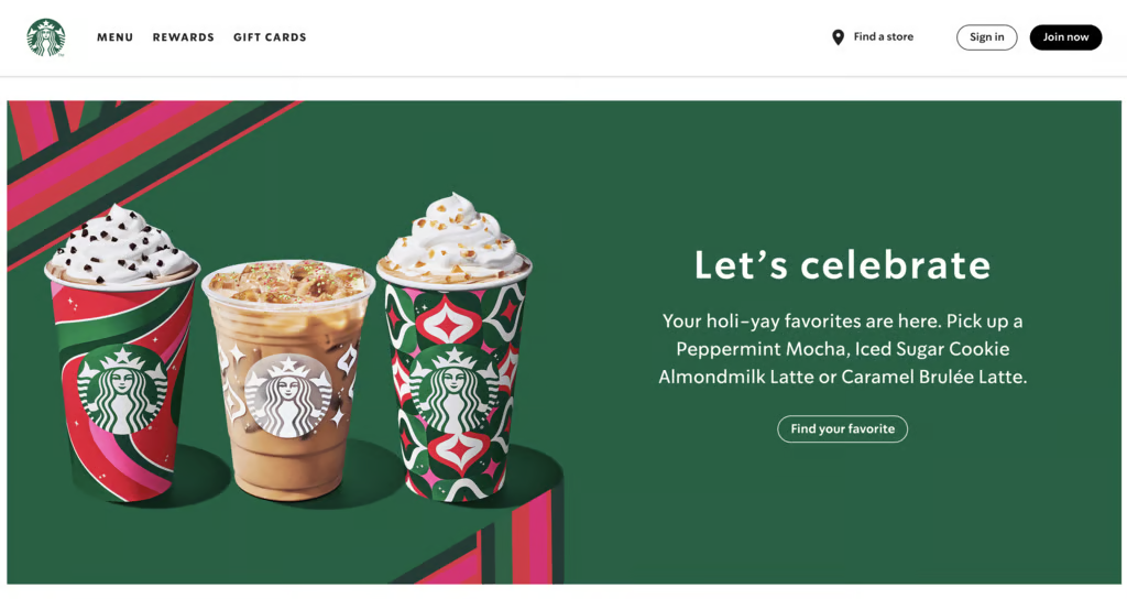
This logo shows that you don’t have to be literal. This twin-tailed mermaid, known as the Siren, was chosen to evoke the seafaring history of the early coffee trade. Your logo doesn’t have to explain what you do – it needs to represent how your brand feels.
4. Coca-Cola
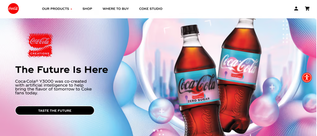
Frank Robinson’s 1886 handwritten script wordmark hasn’t changed meaningfully in over a century. It proves that a strong typeface choice – distinctive enough to be ownable and legible enough to read fast – can outlast every design trend. The flowing script signals warmth and familiarity, which maps directly to the brand’s core messaging.
5. McDonald’s
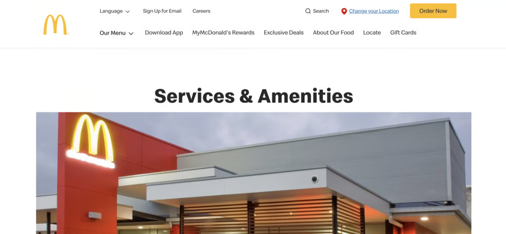
Designed to be spotted from a moving car, the Golden Arches form a distinct “M” that acts as a perfect visual shorthand for the brand. While they actually emerged from the original restaurants’ architecture, their true legacy is high-impact visibility.
A great logo needs to stay recognizable even from a distance – how does your logo read from 30 meters away?
What are the best tips for creating a logo?
While we’ve shared specific tips throughout the design process, there are a few more higher-level principles that help bridge the gap between a “good” logo and an iconic one.
Use this checklist as a final filter to ensure your design is built for the long haul:
- Avoid literal interpretations – Your logo doesn’t need to show exactly what you sell – a bakery doesn’t need a croissant icon, and a law firm doesn’t need a gavel. Focus on communicating your brand’s personality and how it feels, much like how Starbucks built a global coffee empire around a mermaid rather than a mug.
- Stick to one or two fonts maximum – Using multiple typefaces in a single logo almost always creates visual noise that distracts from your brand name. Pick one primary font to do the heavy lifting, and only introduce a second if it genuinely complements the first without competing for attention.
- Don’t let color do all the work – If your logo only stands out because of its palette, the underlying design isn’t strong enough to survive single-color contexts like embroidery or stamping. Ensure the shape and composition carry the design on their own so that the mark remains recognizable even when the color is stripped away.
- Leverage negative space – Some of the most sophisticated logos use the “empty” space between shapes to create a secondary image or hidden meaning, like the arrow in the FedEx logo. This adds a layer of intelligence and depth to your design that makes people look twice without adding unnecessary clutter.
- Trademark your logo once finalized – A strong logo is a business asset worth protecting, and without a trademark, you have limited legal recourse if another brand in your niche uses a similar mark. Consult a trademark attorney or an online filing service to secure your rights – this step is easy to skip, but can be incredibly expensive to regret later.
Tools for creating a logo
Choosing a logo tool depends on your technical skill level, how quickly you need to launch, and how much original detail your brand requires. Here’s how the three main options compare:
Tool | Best for | Trade-off | Examples |
DIY tools or AI logo generators | Zero design experience, tight budgets, fast turnaround, or testing a business idea | Template-based; limited control over details | Hostinger AI Logo Maker, Looka, Tailor Brands |
Template-based design platforms | More control than AI tools without the complexity of professional design software | Template-dependent – exports may not be true vectors; plan limitations apply | Canva, Adobe Express, BrandCrowd |
Professional vector software | Full creative control and completely original logos if you’re willing to learn | Steep learning curve – advanced features often require a paid subscription | Adobe Illustrator, Affinity Designer, Inkscape |
The tools mentioned above are all forms of designing in-house, meaning you’re the one doing the work. If you find you lack the time or design confidence to handle it yourself, bringing in outside expertise is an alternative.
Here’s how to decide which approach fits your current situation:
- Designing in-house makes sense when you’re in the early stages, working with a tight budget, or testing a concept that may evolve. DIY tools and template platforms let you move fast without overcommitting, and they’re more than sufficient for most digital-first businesses at launch.
- Hiring a designer becomes the smarter investment when the stakes are higher: your logo is going on physical products, you’re entering a competitive market, or your brand needs to build trust immediately. A freelancer can deliver a custom logo for a few hundred dollars, while a studio costs more but brings strategic thinking to execution.
The rule of thumb here is to match your investment to your risk. If a rebrand six months from now would be low-cost and low-friction (like changing a website header), start with a DIY tool. But if getting it wrong means reprinting expensive inventory or confusing a crowded market, spend the money to get it right the first time.
How to build a brand around your logo
A logo is the visual “face” of your company, but it is only the beginning of your brand identity. On its own, a logo is just a graphic; it truly comes to life only when it is supported by a complete, cohesive brand system.
This system includes everything from your photography style and tone of voice to the way your chosen typography and colors are applied across every digital and physical touchpoint.
Without this supporting structure, a logo can get used inconsistently – colors might vary between print and web, or fonts may shift between your social media and packaging. These small discrepancies eventually erode the professional trust that a great logo is meant to build.
The most effective way to protect your new investment is to build a brand that feels unified. By moving beyond the logo, you can define a clear brand voice, establish visual guidelines, and develop messaging that resonates with your audience.
Taking this next step ensures that every time a customer encounters your business – whether it’s on a business card or a mobile app – the experience feels intentional, polished, and unmistakably yours.

All of the tutorial content on this website is subject to Hostinger's rigorous editorial standards and values.

Alma is an AI Content Editor with 9+ years of experience helping ideas take shape across SEO, marketing, and content. She loves working with words, structure, and strategy to make content both useful and enjoyable to read. Off the clock, she can be found gaming, drawing, or diving into her latest D&D adventure.