What is a CSS class? A complete guide to using the CSS selector
Mar 10, 2026
/
Aris S. & Ariffud M.
/
6 min Read
A CSS class is an attribute used in HTML to select and style specific elements. It allows you to simultaneously apply the same set of styling rules – like color, font size, or spacing – to multiple elements simultaneously, rather than coding each one individually.
Take these steps to use a CSS class to style your site:
- Open your CSS stylesheet. This is the file (like style.css) where you’ll write the styling rules.
- Define the CSS class. Create a “rule” by giving your class a name, like .my-class, and defining its properties, like color: blue;.
- Open your HTML document. This is the file (like index.html) containing the content you want to style.
- Find the HTML element to style. Identify the element you want to change, like a paragraph <p> or a division <div>.
- Assign the CSS class to the HTML element. Add the class=”my-class” attribute to the element’s opening tag to link it to the style rule you defined.
How does a CSS class work?
A Cascading Style Sheets (CSS) class works by creating a reusable “label” that links your HyperText Markup Language (HTML) structure to your CSS rules.
When you assign a class to an HTML element, you’re telling the browser to find the style definition for that class in the stylesheet and apply it to that specific element.
This creates a powerful separation of concerns. Your HTML file handles the content (the “what”), while your stylesheet handles the presentation (the “how it looks”).
For example, imagine you have five “alert” boxes on your website that all need a red border and bold text. Instead of styling each box individually, you can create a single class named .alert in your CSS.
Then, you just add class=”alert” to each of the five boxes in your HTML. If you later decide to change the border to blue, you only have to make the change once in your .alert class definition, and all five boxes will update automatically.
How to use a CSS class to style an HTML element?
To style an HTML element using a CSS class, open your CSS stylesheet and define the style rules. Then, open your HTML file, find the element you want to style, and apply the CSS class to that element.
1. Open your CSS stylesheet
First, you need a place to write your CSS rules. You have two options:
- Internal CSS. You can place your CSS rules directly inside your HTML document within <style></style> tags, typically placed in the <head> section. This is quick for small projects or testing, but it can make your HTML file cluttered.
- External stylesheet. This is the recommended method for most projects. You create a separate file with a .css extension, like style.css. This keeps your styles organized and separate from your content.
You then link this file to your HTML document by adding a tag inside the section:
<head>
   <link rel="stylesheet" href="style.css">
</head>
For the rest of this tutorial, we’ll assume you are using an external style.css file.
2. Define the CSS class
In your style.css file, define a class by typing a period (.) followed by a name of your choice. This name is the selector. Then, add curly braces {} and place your CSS properties (the rules) inside.
.highlight {
   font-weight: bold;
   color: green;
   background-color: #f0f0f0;
}
This code creates a class named highlight. Any HTML element given this class will have bold, green text with a light gray background.
You can also create more specific selectors. For example, to style only <h1> elements that are inside an element with the highlight class, write:
.highlight h1 {
  /* This rule only applies to h1 tags inside .highlight */
  color: red;
}
3. Open your HTML document
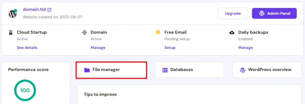
Now, open the HTML file (for example, index.html) that contains the content you want to style. You can do this using any text editor, such as VS Code, or directly through your hosting provider’s file manager.
Hostinger’s managed web hosting customers can access the file manager via hPanel → Websites → Manage → File manager. Then, locate and double-click the HTML file to open the code editor.

4. Find the HTML element to style
Look through your HTML code and identify the element or elements you want to style. For example, you might have several paragraphs (<p>) that serve as warnings, or perhaps you want to style a specific <div> that contains an author’s bio.
Think about which elements share a common purpose or content type. For instance, all <h2> tags could share one class, while all call-to-action buttons could share another. Grouping elements logically is key to using classes effectively.
💡 Pro tip
To check your site's code structure on the front end, use your web browser's inspect element tool. Access it by right-clicking on your screen and selecting Inspect.
5. Assign the CSS class to the HTML element
To apply your CSS rule, add the class attribute to the opening tag of the HTML element. The value of the attribute should be the class name you defined in your CSS file, but without the period.
Use the .highlight class and apply it to a paragraph:
<p class="highlight">This paragraph will be bold, green, and have a gray background.</p>
You can apply this class to as many elements as you want:
<div class="highlight">This whole division gets the style.</div>
<p>This is a normal paragraph.</p>
<p class="highlight">This paragraph also gets the style.</p>
After saving both your HTML and CSS files, open the HTML file in your browser. You will see the styles applied to the elements you tagged with the class.

Benefits of using CSS classes
Using CSS classes offers several significant benefits in web development, primarily centered on efficiency, organization, and maintainability.
- Reusability. This is the biggest advantage. You can define a style rule once (for instance, .button-primary) and apply that class to every primary button across your website. This saves you from writing repetitive code for each button.
- Maintainability. When you need to update your site’s design, classes make it simple. To change the color of all your primary buttons, you only need to edit the .button-primary class definition in your CSS file once. The change will automatically apply to every element using that class.
- Organization and readability. Classes help separate content (HTML) from presentation (CSS). This “separation of concerns” makes your code cleaner, more semantic, and much easier for you or other developers to read, understand, and debug.
- Flexibility. An HTML element can have multiple classes. For example, <button class=”button button-primary”> could inherit base styles from .button and specific color styles from .button-primary. This flexible, modular approach lets you build complex designs by combining simple classes.
Tips to master CSS classes
Mastering CSS classes involves moving beyond just making them work to applying best practices for writing clean, scalable, and maintainable code. Below are tips to help you write CSS like a professional.
Use clear and descriptive names
A class name should describe what the element is or why it’s styled, not how it’s styled. For example, a name like .alert-danger is more descriptive and reusable than .red-text-bold.
If you later decide to make danger alerts blue, the name .alert-danger still makes sense, but .red-text-bold would be confusing. Use clear, logical names that describe the component’s purpose.
Leverage other CSS selectors
Classes are not the only way to select elements. Understanding other selectors helps you write more efficient CSS.
- ID selector. An ID (#my-id) is similar to a class, but it must be unique to a single element on a page. It’s more specific than a class, meaning its rules always win if there’s a conflict.
- Element selector. You can style all elements of a certain type, like p or h2. This is great for setting base styles, like a default font size for all paragraphs.
- Combinators. You can combine selectors to be more specific. For example, .sidebar p selects only paragraphs that are inside an element with the sidebar class.
Minimize properties within a class
Create small, reusable classes that do one thing well. For example, instead of one large class like .page-sidebar-box that defines layout, color, and font, you could create multiple classes: .box (for layout), .sidebar-theme (for color), and .featured-text (for font).
You can then combine them in your HTML: <div class=”box sidebar-theme featured-text”>. This modular approach is highly reusable and maintainable.
Organize CSS classes into groups
As your style.css file grows, it can become challenging to manage. Organize your classes by grouping them with comments.
For example, you can create sections for “Layout,” “Buttons,” “Forms,” and “Typography.” This makes it much easier to find and edit your styles later.
/* --- Button Styles --- */

.button {
  /* base button styles */
  padding: 10px 15px;
  border-radius: 5px;
}

.button-primary {
  /* primary button styles */
  background-color: blue;
  color: white;
}

/* --- Form Styles --- */

.form-input {
  /* input styles */
  border: 1px solid #ccc;
  padding: 8px;
}
Next step in your CSS learning
After mastering the fundamentals of CSS classes, the next steps in your learning journey should focus on responsive design and advanced layout techniques. Users will view your site on phones, tablets, and desktops, so adapting your styles is key.
A crucial part of this is understanding CSS breakpoints, which let you apply different styles based on the user’s screen size. This is the key to making your website look great on any device.
As you continue to build more complex projects, it’s helpful to have a reference guide. Bookmark our CSS cheat sheet to quickly look up properties, selectors, and syntax.

Aris is a Content Writer specializing in Linux and WordPress development. He has a passion for networking, front-end web development, and server administration. By combining his IT and writing experience, Aris creates content that helps people easily understand complex technical topics to start their online journey. Follow him on LinkedIn.

Ariffud is a Technical Content Writer with an educational background in Informatics. He has extensive expertise in Linux and VPS, authoring over 200 articles on server management and web development. Follow him on LinkedIn.

Comments
June 17 2019
Responsive instead of Responsible.
September 26 2019
Hey Hector, We have no idea how we missed this! Thanks, fixed!
December 14 2020
I need More explanation with example on "attribute" and "element in CSS
February 09 2021
Hi there! You can think of element as of your object - a header, for example. An attribute would be font, color, size - they define how your element looks :)
April 06 2023
Pls is there anything like .home [style=background-color:red;] Or p.home[style=background-color:red;] I tried this it isn't working This is the normal one I know .home { background-color: red; padding: 20px; }
April 07 2023
Hey there! Unfortunately only such format is valid:
.exampleone {
  background-color: transparent;
}