What is website usability testing and how to conduct one?
Mar 16, 2026
/
Ksenija
/
11 min Read

Website usability testing is the process of observing real users as they attempt to complete specific tasks on your website to identify usability issues and improve navigation, design, and content clarity.
In practice, you define a goal, recruit representative users, assign realistic tasks, observe their behavior, collect user feedback, and analyze the results. The purpose of website usability testing is to find where users struggle and fix those friction points before they reduce conversions or damage trust.
A typical usability evaluation includes five core components:
- Setting clear objectives and boundaries. Defining a measurable goal and narrowing the test to a specific user flow that directly affects it.
- Selecting representative participants. Recruiting users who match your defined persona and screening them using clear qualifying criteria.
- Creating realistic task scenarios. Writing neutral, goal-focused testing tasks with predefined success conditions.
- Running structured test sessions. Choosing moderated or unmoderated formats, observing behavior without guiding users, and documenting interactions consistently.
- Reviewing and interpreting the data. Combining metrics such as task success rate and error rate with observed friction points to identify patterns.
- Turning insights into improvements. Prioritizing fixes based on impact, assigning ownership, and retesting to confirm measurable progress.
When executed correctly, website usability testing gives you direct evidence of how people experience your site. It shows not just whether users complete tasks, but how easily they do so and where the experience breaks down.
Why is website usability testing important?
Website usability testing is important because small usability flaws directly reduce traffic value, conversions, and revenue. When you design a website that does not function as users expect, they hesitate. That hesitation leads to abandoned carts, incomplete forms, and early exits.
You can invest in ads or SEO, but if the experience is confusing, visitors will not stay long enough to act. As a result, even well-targeted traffic will fail to generate conversions.
Through usability evaluation, you observe how real users navigate your pages, interpret labels, and respond to calls to action.
If they struggle, you have direct evidence that a change is needed. If they succeed smoothly, you gain confidence that your structure and content support user goals.
Beyond validation, user experience testing exposes issues that analytics alone cannot reveal. Data can show where users drop off, but it cannot explain why. User feedback fills that gap.
When you watch users complete tasks, you see confusion over wording, missed buttons, or uncertainty during checkout. These hidden friction points often block conversions more than technical errors do.
By uncovering and fixing them early, you protect revenue and create a clearer, more reliable experience.
What are the key metrics to measure?
The key metrics to measure in website usability testing are task success rate, error rate, task completion time, and user satisfaction.
Together, these metrics show whether users can complete important actions, how much friction they encounter, how efficiently they move through the site, and how they perceive the overall experience.
Task success rate
Task success rate measures the percentage of users who complete a defined task correctly without help. It is the most direct indicator of whether your website supports user goals.
Task success rate = (Number of users who completed the task ÷ Total number of users who attempted the task) × 100
If 18 out of 24 users successfully complete the sign-up process, your task success rate is 75%.
To measure it accurately, define what counts as success before the test, have every participant complete the same task, and record each attempt as either a success or a failure.
This metric tells you whether your core flows work. A low success rate signals structural problems such as unclear navigation, confusing instructions, or missing feedback messages.
A high success rate confirms that users understand what to do and can do it without friction.
Error rate
Error rate measures how often users make mistakes while attempting to complete a task. An error can include clicking the wrong button, entering invalid information, misinterpreting instructions, or getting stuck and needing clarification.
Error rate = (Total number of errors ÷ Total number of error opportunities or attempts) × 100
For example, if 20 errors occur during 100 form submissions, the error rate is 20%.
To measure it properly, define what counts as an error before the session starts, track each mistake consistently across participants, and relate errors to a specific task or step. This keeps the data objective and comparable.
This metric tells you where your interface creates confusion. A high error rate often points to unclear labels, poor form design, misleading buttons, or missing feedback messages.
Even if users eventually complete the task, frequent errors indicate cognitive strain and weak usability.
Task completion time
Task completion time measures how long it takes users to finish a specific task from start to finish. It reflects efficiency. Even if users eventually succeed, long completion times often signal confusion, hesitation, or unnecessary steps.
Average task completion time = Total time spent by all users on the task ÷ Number of users who attempted the task
So, if 10 users spend a combined 50 minutes completing a checkout process, the average task completion time is 5 minutes.
To measure it accurately, start timing when the user begins the task, stop when they either complete or abandon it, and exclude unrelated delays. Compare results across participants to identify patterns rather than focusing on individual outliers.
This metric tells you how streamlined your user flows are. If the completion time is longer than expected, users are struggling to find information, interpret instructions, or decide what to do next.
If it is short and paired with a high task success rate, your interface likely supports clear and efficient decision-making.
User satisfaction
User satisfaction measures how users feel about their experience after completing a task. While the other metrics track performance and efficiency, this one captures perception.
A user may complete a task successfully and quickly, yet still feel frustrated or uncertain. Satisfaction reveals whether the experience feels smooth and clear
To measure it, ask participants to rate their experience immediately after the task. You can use a simple post-task question, such as “How easy was this task to complete?” rated on a scale from 1 to 5, or use a standardized survey like the System Usability Scale, a 10-question usability questionnaire that produces a score from 0 to 100. Calculate the average score across all participants to identify trends.
This metric tells you how users perceive your website beyond raw performance data. Low satisfaction scores often signal hidden friction, lack of confidence, or unclear messaging, even when task success rates appear high.
High satisfaction scores indicate that users not only complete tasks but also feel comfortable doing so.
What are the common methods of website usability testing?
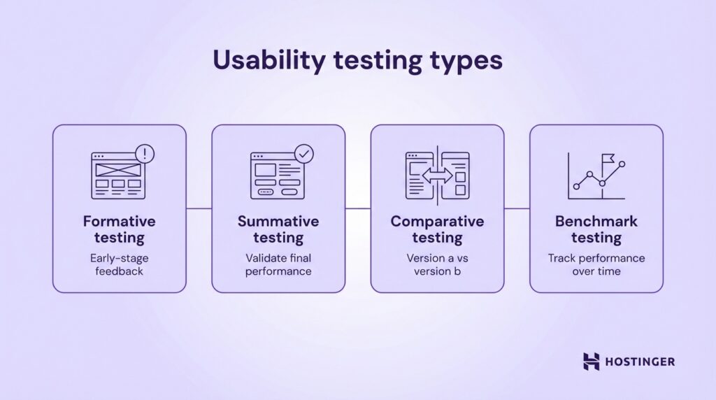
The most common methods of website usability testing include formative, summative, comparative, and benchmark testing. Each method serves a different purpose depending on whether you are improving a design, validating a finished version, or comparing alternatives.
Formative usability testing is conducted during the design or development phase. Its goal is to identify usability issues early, before the product is finalized. You test prototypes, wireframes, or early versions of pages to uncover confusion, navigation problems, or unclear messaging.
For example, an ecommerce business might test a new checkout layout before launch to see whether users understand shipping options.
Summative usability testing happens after a design is complete or near completion. Its purpose is to evaluate overall performance and confirm that usability goals are met.
Instead of exploring problems broadly, you measure defined metrics such as task success rate and completion time.
For instance, a SaaS company may run summative usability testing on its onboarding flow to confirm that new users can set up their accounts without assistance. This method validates whether the final experience meets expected standards.
Comparative usability testing evaluates two or more versions of a page or feature to determine which performs better. You assign users different versions and compare metrics such as success rate, errors, and satisfaction.
An online store might compare two product page layouts to see which one leads to faster purchase decisions. The version with stronger usability metrics becomes the preferred option.
Benchmark testing establishes a performance baseline that you can track over time. You measure usability metrics for key tasks, document the results, and use them as a reference point for future improvements.
A content website, for example, might benchmark how long it takes users to find a specific article. After redesigning the navigation, the team can retest and compare results against the original benchmark to measure improvement.
To conduct these methods effectively, you can use specialized usability testing tools that record sessions, collect user feedback, and analyze user behavior patterns.
Common usability testing tools include:
- Lookback. Records live moderated sessions and captures user interactions and screen activity.
- UserTesting. Connects you with participants and provides recorded task-based feedback.
- Hotjar. Offers heatmaps, session recordings, and on-site surveys to identify friction points.

The right method and tools depend on your goal. If you are refining a prototype, choose formative testing. If you need performance validation, use summative or benchmark testing. Match the method to the decision you need to make.
What are the steps to conduct website usability testing?
To run website usability testing effectively, follow a structured usability testing process. You need to define what you are testing, recruit the right users, design realistic testing tasks, run the sessions, analyze usability results, and act on what you learn. Each step builds on the previous one. If you skip one, your results become less reliable and harder to apply.
1. Define goals and scope
Start by writing a single, measurable objective for the test. Avoid vague goals like “improve usability.” Instead, define what success looks like. For example: “Increase checkout completion rate from 60% to 80%” or “Reduce onboarding setup time to under 5 minutes.”
If you cannot measure the outcome, the goal is too broad.
Next, map the objective to a specific user persona. Write down who you are testing in one sentence: “First-time visitors buying a product,” or “New SaaS users setting up their first project.”
Include relevant traits such as device type, experience level, and intent. If the test participant does not match this profile, exclude them. Testing the wrong audience produces misleading results.
Then narrow the scope to one flow or feature that directly affects your objective. Do not test your entire website. Choose a specific journey, such as product search to checkout, homepage to sign-up, or blog article to newsletter subscription.
List the exact pages involved in that flow. This forces clarity and makes it easier to connect findings to changes. If a page does not support the defined objective, remove it from the test.
Pro Tip
Define a failure threshold before you start. For example, “If task success rate falls below 70%, we will redesign the flow.” This prevents teams from rationalizing poor results after the test.
2. Recruit participants
Recruit participants who match the persona you defined, not people who are simply available. Start by creating a short screening checklist with three to five qualifying criteria.
For example: “Has purchased online in the past three months,” “Uses mobile for shopping,” or “Manages a small business with fewer than 10 employees.” Use this checklist to approve or reject candidates.
If you want feedback from existing users, recruit from your customer database or email list. Segment users based on behavior, such as frequent buyers or new sign-ups, and invite only those who match your test goal.
If you need fresh users, recruit through social media groups, niche communities, or usability testing platforms such as UserTesting, Respondent, or User Interviews. When recruiting publicly, include screening questions in the sign-up form to filter out unqualified participants.

Aim for 5 to 8 participants per persona for qualitative usability testing. This range is usually enough to reveal repeated friction points without creating unnecessary analysis work. More participants do not automatically produce better insights. Relevance matters more than volume.
3. Design tasks and scenarios
Design testing tasks that mirror real user goals, not internal feature checks. Do not ask participants to “explore the homepage” or “test the navigation.”
Instead, frame tasks around outcomes your users actually care about, like “Find and purchase a black running shoe under $100” or “Create an account and set up your first project.”
Write tasks in neutral language and avoid leading instructions. Do not tell users where to click or which menu to use. The task should describe the goal, not the path.
So, instead of saying “Use the top navigation to find pricing,” say “Find out how much the premium plan costs.” This allows you to observe whether your structure and labels guide users naturally.
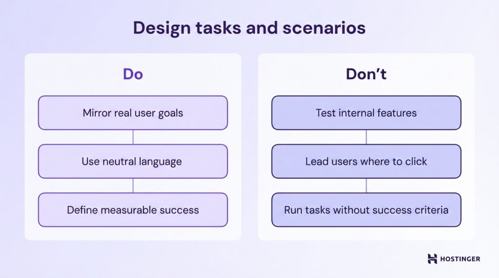
Ensure every task has a clear and measurable outcome before the session begins. Define what counts as success, what counts as failure, and how you will record completion.
If a user must reach a confirmation page to succeed, document that. If submitting a form with valid data is required, specify it in advance. A task without a defined success condition cannot produce reliable metrics.
4. Conduct the test
Choose the testing mode based on your goal, budget, and timeline. Use moderated testing if you want to ask follow-up questions and probe deeper into user behavior. This format allows you to clarify confusion in real time and understand why users make certain decisions.
Use unmoderated testing if you need faster results or larger sample sizes. Participants complete tasks independently, and you review recordings afterward. Then decide between remote and in-person sessions.
Remote testing reflects real-world environments and is easier to scale. In-person testing gives you more control over distractions and technical variables. Select the format that aligns with your objective, not just convenience.
During the session, focus on observation, not instruction. Ask participants to think aloud so you can understand their reasoning. Do not guide them toward the correct action or explain the interface. If they get stuck, note where and why.
Your role is to facilitate the session, keep it on track, and ensure each testing task is completed or clearly abandoned.
Record everything systematically. Capture screen activity, clicks, navigation paths, time on task, errors, and verbal comments.
Log observable behaviors rather than interpretations, like “User hovered over pricing for 10 seconds” instead of “User was confused.”
Consistent documentation allows you to analyze usability results objectively in the next step. If you do not record interactions accurately, you will rely on memory instead of evidence.
Pro Tip
Pay attention to pauses, cursor hesitation, and repeated scrolling. Users often do not verbalize confusion, but their behavior reveals uncertainty.
5. Analyze results
Analyze usability results by combining quantitative metrics with qualitative observations. Start by aggregating your numerical data, such as task success rate, error rate, and task completion time.
Calculate averages, percentages, and patterns across all participants. Do not review sessions one by one in isolation. Look for repeated trends. If 6 out of 8 users fail at the same step, that is a structural issue, not an individual mistake.
Next, layer qualitative insights on top of the numbers. Review screen recordings, written notes, and user comments. Identify moments where users hesitated, expressed confusion, or verbalized frustration.
Group similar observations together. For example, if multiple participants say pricing is unclear, categorize that under “pricing clarity issue.” This makes patterns visible and easier to prioritize.
Identify concrete pain points and usability issues tied to specific steps in the user flow. Avoid vague conclusions like “navigation needs improvement.”
Instead, write precise findings such as “Users did not recognize the checkout button because it blends into the background” or “Participants misinterpreted the ‘Start free trial’ label as requiring payment details.”
Each issue should link directly to observed behavior or measurable data.
Before moving to the next step, confirm that every major usability issue is supported by either repeated user behavior, measurable performance drops, or direct user feedback.
If a finding is based on opinion rather than evidence, remove it. Your analysis should make it clear what is broken, where it happens, and why it affects performance.
6. Report and act on findings
Complete the usability testing process by turning your findings into clear decisions. Start by summarizing what you tested, who you tested with, and which testing tasks were included. Then present the key results from your analysis in plain language.
For each issue, describe what users attempted to do, what happened, and how it affected performance. Avoid long transcripts or raw notes. Focus on patterns that emerged after you analyze usability results.
Pair every usability issue with a specific recommendation. Do not write “Improve navigation.” Instead, write “Rename ‘Solutions’ to ‘Pricing Plans’ to match user expectations” or “Increase contrast on the checkout button to make it visually distinct.”
Each recommendation should clearly connect to observed behavior or measurable data. If you cannot link a fix to evidence from your sessions, remove it.
Next, prioritize fixes based on impact and effort. Start with issues that block task completion or significantly reduce success rates. Then address problems that increase the error rate or slow task completion time.
Lower-impact refinements such as visual polish can come later. If you recruited usability testers who match your real audience and tested high-value flows, the most repeated issues should directly align with business risk.
Before closing the test cycle, assign ownership and deadlines for each approved fix. A report alone does not improve usability. Action does. Once changes are implemented, schedule a follow-up test to measure whether the metrics improve.
If task success rate increases and errors decline, your usability testing has delivered measurable progress.
Is there another test I can run to improve my website?
Yes. Website usability testing is only one method you can use to optimize your website. It shows how real users interact with your interface and where they struggle, but it does not measure every performance variable or uncover every strategic weakness.
One complementary method is A/B testing. With A/B testing, you compare two versions of a page to see which one performs better based on a specific metric, such as click-through rate or conversions.
While usability testing helps you understand why users struggle, A/B testing helps you quantify which variation drives better results at scale. Use it when you want to optimize headlines, layouts, calls to action, or pricing presentations.
Another option is a UX audit. A UX audit is a structured evaluation of your entire website experience, including navigation, content clarity, design consistency, accessibility, and conversion flows.
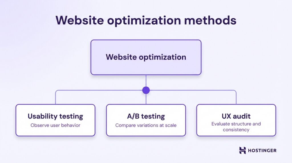
Unlike usability testing, which focuses on observed user behavior during defined tasks, a UX audit systematically reviews your site against usability principles and best practices.
It helps you identify structural weaknesses, inconsistencies, and missed optimization opportunities across the full user journey.
These can include confusing navigation hierarchies, unclear value propositions, inconsistent calls to action, accessibility gaps, or friction between landing pages and checkout flows.


Ksenija is a digital marketing enthusiast with extensive expertise in content creation and website optimization. Specializing in WordPress, she enjoys writing about the platform’s nuances, from design to functionality, and sharing her insights with others. When she’s not perfecting her trade, you’ll find her on the local basketball court or at home enjoying a crime story. Follow her on LinkedIn.