What is Bootstrap: A complete guide to the front-end framework
Dec 02, 2025
/
Ariffud M.
/
5 min Read

Bootstrap is a free and open-source front-end framework that uses pre-written HTML, CSS, and JavaScript to let developers build responsive, mobile-first websites quickly.
In programming, Bootstrap acts as a toolkit, providing a foundational structure so you don’t have to code common web components from scratch.
The bootstrap framework helps developers by offering:
- A responsive grid system. It simplifies the creation of layouts that automatically adjust to different screen sizes, such as desktops, tablets, and phones, reducing the need for custom CSS.
- Pre-built components. You get ready-to-use UI elements, such as buttons, forms, carousels, modals, and navigation bars, to save time and add consistency to your designs.
- JavaScript plugins. It includes components like popovers and tooltips that offer interactive features and enhanced website functionality without complex programming.
- Extensive customization. While it provides a default theme, you can use Syntactically Awesome Style Sheets (Sass) variables and custom stylesheets to modify the design to fit a specific brand.
Using Bootstrap significantly speeds up the web development process. By assembling pre-built elements, you can create functional and visually appealing user interfaces much faster.
This approach also promotes design consistency throughout the entire project, resulting in a more professional and cohesive user experience.
How does Bootstrap work?
Bootstrap works by providing a collection of precompiled CSS and JavaScript files that you add to a web project.
These files form its technical architecture, containing all the code for its responsive grid system, UI components, and interactive plugins.
To use it on a website, link to Bootstrap’s CSS stylesheet in your HTML’s <head> and its JavaScript file before the closing </body> tag.
From there, you can apply Bootstrap’s predefined classes to your HTML elements. For example, adding a simple class instantly styles a button or creates a complex navigation bar.
The browser reads these classes and applies the corresponding styles and behaviors from the linked Bootstrap files.
This modular system separates a site’s structure (HTML) from its presentation (CSS) and behavior (JS), making it a powerful and efficient way to develop a website.
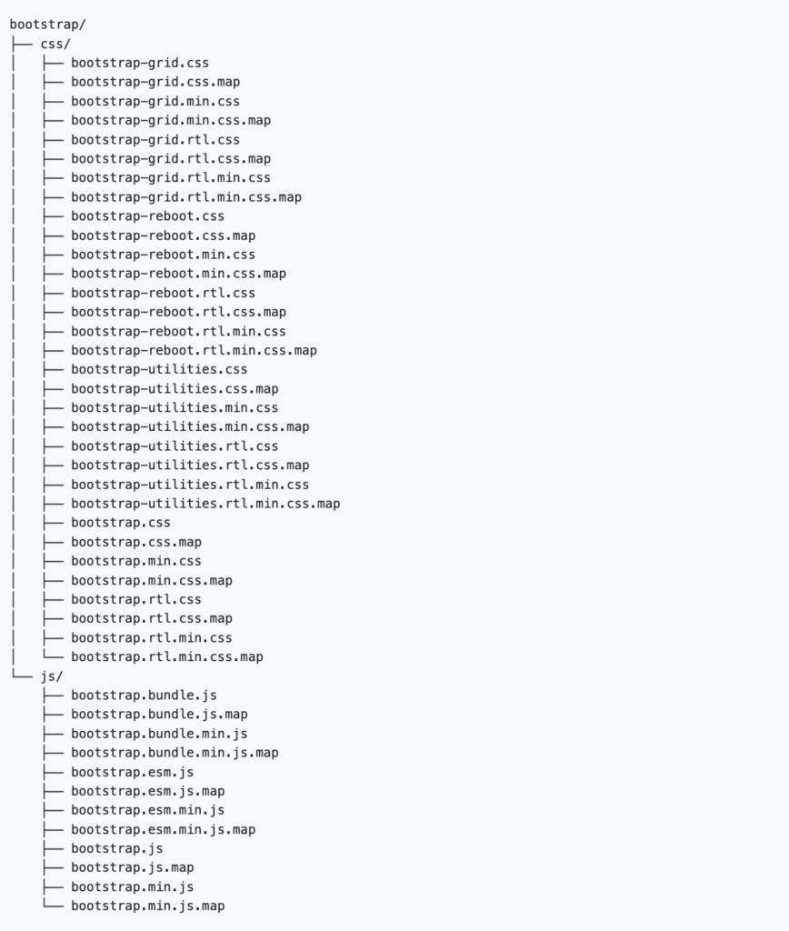
What are the core Bootstrap files?
The core Bootstrap files are its compiled CSS and JavaScript, which work together to provide the framework’s styling and interactivity.
- bootstrap.min.css. This is the main stylesheet file that contains all the pre-written CSS for Bootstrap’s responsive grid, components, and utilities. Including this single file in your project applies all of Bootstrap’s visual designs.
- bootstrap.bundle.min.js. This file contains the custom JavaScript required for interactive components like dropdowns, modals, and carousels. It also includes Popper.js, a library that facilitates element positioning, such as tooltips and popovers.
Why should you use Bootstrap?
You should use Bootstrap to accelerate web development, create responsive designs, and maintain visual consistency across a project with minimal effort.
The main Bootstrap benefits for developers stem from its extensive library of pre-built components for anything from alerts to carousels, as well as a robust mobile-first grid system, which eliminates the need to code common interface elements from scratch.
This lets teams focus on a project’s core functionality, knowing the framework handles cross-browser compatibility and that the design will adapt seamlessly to any screen size.
Core concepts and key features of Bootstrap
Bootstrap’s key features are a responsive grid system, pre-styled components, interactive JavaScript plugins, and broad customization options.
Responsive grid system
The Bootstrap grid system is the foundation for achieving responsive design within the framework.
It provides a powerful, mobile-first grid based on a 12-column layout, which lets you precisely control how content is structured across different screen sizes.
You manage this using grid breakpoints – predefined widths that trigger layout changes. Bootstrap’s breakpoints include sm (small), md (medium), lg (large), xl (extra-large), and xxl (extra-extra-large).
For example, to make a content block span all 12 columns on a phone but only four on a large screen, you would apply classes like col-12 col-lg-4. This system is built upon the core principles of CSS breakpoints.
Pre-styled components
Bootstrap’s pre-styled components are a library of 20+ reusable UI elements that you can quickly add to any web project.
These styled components include everything from a basic Bootstrap button or card to a complex, responsive Bootstrap navbar.
Using these ready-made Bootstrap components saves significant development time by letting you build a functional interface without writing extensive custom CSS for common elements.
JavaScript utilities
Bootstrap’s JavaScript utilities are a collection of custom plugins that add website interactivity.
These add interactive behavior to components like dropdowns, modals, and carousels.
As of Bootstrap 5, all Bootstrap JavaScript is written in vanilla JS and no longer requires jQuery, making the framework more lightweight and modern.
Broad customization
Bootstrap offers design flexibility through customization. You can customize Bootstrap in two main ways: through its built-in Bootstrap theming system or by writing your own CSS.
Theming lets you modify Bootstrap Sass variables to change global properties like colors and fonts.
For more specific adjustments, you can override Bootstrap styles with a separate stylesheet, giving you precise control over any element.
How do you use Bootstrap in a project?
To use Bootstrap in a project, you add its CSS and JavaScript files to your HTML. You can do this by linking to a content delivery network (CDN) or by downloading the source files directly.
The CDN method is the fastest and most common way to get started.
Here’s an overview of the process using a CDN:
- Set up an HTML file. Start with a basic HTML5 template. It’s important to include the responsive viewport meta tag in the <head> section so that Bootstrap’s mobile-first styles work correctly.
- Link the CSS. Add the <link> tag for Bootstrap’s CSS inside the <head> section of your document. This loads all the styling for the framework’s layout and components.
- Link the JavaScript. Place the <script> tag for the Bootstrap JavaScript bundle just before the closing </body> tag. This bundle includes Popper.js and is required for all interactive components.
Below is a starter template with the latest, verified CDN links that you can copy and use:
<!doctype html>
<html lang="en">
<head>
<meta charset="utf-8">
<meta name="viewport" content="width=device-width, initial-scale=1">
<title>Bootstrap demo</title>
<link href="https://cdn.jsdelivr.net/npm/bootstrap@5.3.8/dist/css/bootstrap.min.css" rel="stylesheet" integrity="sha384-QWTKZyjpPEjISv5WaRU9OFeRpok6YctnYmDr5pNlyT2bRjXh0JMhjY6hW+ALEwIH" crossorigin="anonymous">
</head>
<body>
<h1>Hello, world!</h1>
<script src="https://cdn.jsdelivr.net/npm/bootstrap@5.3.8/dist/js/bootstrap.bundle.min.js" integrity="sha384-YvpcrYf0tY3lHB60NNkmXc5s9fDVZLESaAA55NDzOxhy9GkcIdslK1eN7N6jIeHz" crossorigin="anonymous"></script>
</body>
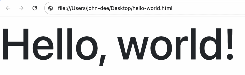
</html>This is the expected look when you open it in a browser:
For more advanced customization, you can download the source files from the official Bootstrap website and host them on your own server.
Once set up, you can start building your layout by applying Bootstrap’s predefined CSS classes directly to your HTML elements.
Pros and cons of Bootstrap
Bootstrap’s main pros include quick prototyping, built-in responsiveness, consistency, and extensive documentation, while its cons are the potential for a generic design, code bloat, and complex overrides.
Bootstrap pros
- Rapid prototyping. Bootstrap is ideal for quickly building functional prototypes. Its ready-to-use components let you assemble a working interface in a short time, making it easier to test ideas and gather feedback early in the development cycle.
- Responsive by default. The framework is built with a mobile-first approach, making it easy to create layouts that adapt seamlessly to various screen sizes.
- Consistency. It provides a consistent design language and functionality across all modern web browsers, reducing cross-browser compatibility issues.
- Strong community and documentation. Bootstrap has extensive documentation and a massive community, making it easy to find solutions, tutorials, and third-party themes.
Bootstrap cons
- Generic design. Without significant customization, websites built with Bootstrap can look very similar to one another, lacking a unique visual identity.
- Potential bloat. The framework includes a large amount of CSS and JavaScript to cover all its components. If you only use a few features, the unused code can increase your site’s file size and slow it down.
- Complex overrides. While Bootstrap is customizable, overriding its default styles for highly unique designs can sometimes be complex and require deep CSS specificity.
Is Bootstrap the right tool for your project?
Bootstrap is the right tool if your project prioritizes rapid development, design consistency, and mobile-first responsiveness.
It is less suitable for projects that require a highly unique, custom design or where minimal file size is a critical priority.
When to use Bootstrap
Bootstrap is an excellent choice for projects where speed and a reliable foundation are more important than a unique brand identity. It’s ideal for:
- Prototypes and projects with tight deadlines.
- Admin dashboards and internal tools.
- Standard marketing or corporate websites.
If you have limited front-end resources or a team with varying CSS skills, Bootstrap’s pre-built components and extensive documentation provide a huge advantage.
When to consider a Bootstrap alternative
If your project’s success depends on a highly specific or unconventional design, you might find yourself fighting Bootstrap’s default styles.
In these cases, a utility-first framework like Tailwind CSS might offer more creative freedom.
For very simple websites, the entire framework can be overkill, adding unnecessary weight where a lighter library or custom CSS would be more efficient.
Ultimately, evaluate your project’s priorities. If you value speed, consistency, and a proven, responsive foundation, Bootstrap remains one of the best tools available.

Ariffud is a Technical Content Writer with an educational background in Informatics. He has extensive expertise in Linux and VPS, authoring over 200 articles on server management and web development. Follow him on LinkedIn.