Prompt engineering for designers: How to create better AI prompts
May 10, 2026
/
Alma
/
14 min Read
Prompt engineering for designers is how you get AI tools to produce wireframes, layouts, and visual concepts that are close enough to bring into a real project. You describe what to build, how it should look, and what limits to follow. The AI then generates a starting point you can refine.
But how good that starting point is depends on your prompt. A vague prompt gives you a vague result. But when your prompt includes a role, a goal, visual details, and boundaries, you get something close to the output you need. It works the same way as writing a creative brief for a teammate, except the teammate is an AI tool.
Getting your prompt right comes down to a few things:
- What design prompting means and how it differs from general prompting
- The five parts of a strong design prompt
- A step-by-step process for writing prompts that produce outputs close to your vision
- Techniques like few-shot, multi-modal, and step-by-step prompting
- Ready-to-use prompts for UI/UX (user interface and user experience) design, visuals, product pages, brainstorming, and UX research
- How to fix prompts that miss the mark and avoid common mistakes
What is prompt engineering for designers?
Prompt engineering for designers is the practice of writing specific, clear prompts that tell AI tools what visual or UX output to create. You write a brief, but for a machine instead of a person.
With general prompting, you focus on text outputs like answers or summaries. Design prompting uses the same ideas, but you also describe how something should look, feel, and work. So you add visual context, layout needs, style cues, and audience details that a text-only prompt wouldn’t include.
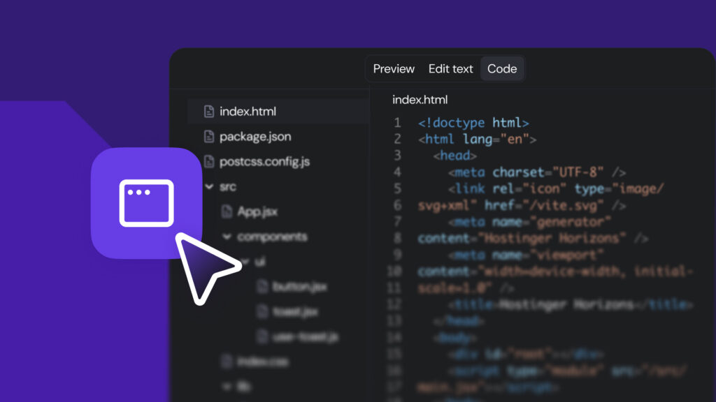
You can apply this skill with tools like ChatGPT (for wireframe ideas, UX copy, or design system logic), Midjourney or DALL-E (for visual concepts and images), or Figma’s AI features (for layout and component ideas).
No matter which tool you use, the underlying prompt engineering skill is the same: you describe what you want, give the AI enough context, and set clear limits.
Compare these two prompts.
- Vague prompt – “Design a landing page.”
- Detailed prompt – “Create a landing page layout for a meditation app targeting working professionals aged 25–40. Use a clean, minimal style with soft blues and whites. Include a hero section with a headline, a short subheading, a CTA (call-to-action) button, and three feature cards below. Mobile-first layout.”
The first one gives the AI almost nothing to work with. The second tells it who it’s for, what it should include, and how it should look. That second prompt is prompt engineering applied to design.
What are the benefits of prompt engineering for designers?
Good prompts speed up your design work and open up more creative options:
- Faster brainstorming. You create 5–10 concepts in minutes instead of drawing each one by hand.
- Wider creative range. You test styles, layouts, and directions you might not try on your own because the cost of experimenting drops to almost zero.
- Better visual control. Clear prompts give you results closer to your vision on the first try, so you spend less time re-prompting.
- More consistent outputs. When you add brand details and style guides to your prompts, the results stay on-brand across every output.
- Less grunt work. Tasks like creating icon sets, filler content, or social media templates become faster and more repeatable.
- Quicker feedback loops. You get a visual draft to react to, share with your team, or test with users early on.
Vague prompts flip all of that. If you type “make a nice website design,” you might get a layout with the wrong colors, wrong structure, and a style that’s nowhere near what you had in mind. You end up spending more time fixing the output than you saved by using AI in the first place.
What makes a good design prompt?
Good design prompts are specific, visual, and structured. You tell the AI what to create, give it a clear visual direction, and set boundaries for what to include and avoid. The clearer you are, the closer the output matches what you have in mind.
Every strong design prompt covers five things: a role, a goal, visual details, constraints, and style and mood.
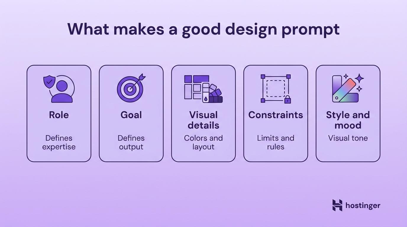
Clear AI role
The role tells the AI what type of designer to act as, and it changes the focus of everything the AI produces.
A “Senior UX Designer” prompt focuses on usability, user flows, and accessibility. A “Visual Designer” prompt leans toward color, typography, and composition. A “Brand Strategist” prompt focuses on identity and positioning. Choose the role based on the outcome you want.
Example: “Act as a Senior UX Designer specializing in mobile apps for healthcare. Your focus is accessibility and ease of use for users over 60.”
Well-defined design goal
The goal is the specific output you’re asking for.
A “low-fidelity wireframe” and a “high-fidelity mockup” of the same screen look completely different. So do “a logo concept” and “a full brand identity.” A wireframe prompt gets you structure and layout. A mockup prompt gets you colors, fonts, and polish. If you’d hand it to a developer or a teammate, name it in your prompt.
Example: “Design a mobile app home screen for a personal finance tracker. The screen should show account balances, recent transactions, and a quick-send money button.”
Visual details
Visual details are the colors, layout, arrangement, and style cues that tell the AI how the design should look.
The more visual context you give, the less the AI guesses. Include hex codes for colors, font names, layout types, and a reference style when you can.
Example: “Use a dark theme with deep navy (#1A1A2E) as the primary background and electric teal (#00D4AA) for accent elements. Two-column card layout with rounded corners and soft shadows. Clean, geometric sans-serif typography.”
Constraints
Constraints are the boundaries for format, size, and what to avoid. Without them, the AI picks its own screen sizes, aspect ratios, and visual elements. Setting clear limits is one of the most common prompt engineering best practices, and designers have a head start here.
Designers already think in constraints every day: responsive breakpoints, brand guidelines, accessibility standards, device sizes. You bring those same limits into your prompt, like screen dimensions, color restrictions, elements to exclude, and platform rules.
Example: “Mobile-first layout, 375×812px (iPhone 14 size). No stock photos. Use abstract geometric shapes only. Maximum three colors. No serif fonts.”
Consistent style and mood
Style and mood are the emotional layer of the prompt. Words like “minimalist,” “playful,” “corporate,” “retro,” or “futuristic” steer the visual direction.
Pairing a mood word with a real-world reference helps even more. “Clean and minimal, similar to Apple’s product pages” gives the AI a clearer target than a mood word alone.
Example: “Modern and professional with a calm, trustworthy feel. Generous white space, muted tones, and subtle hover effects, like Stripe’s design style.”
Say you want to create a SaaS (software-as-a-service) dashboard for a small- to mid-sized team that includes a task list. A weak prompt would just say, “Design a SaaS dashboard.”
But keeping in mind role, goal, visual details, constraints, and style, a better prompt would be:
“Act as a Senior UI Designer for B2B SaaS products. Design a dashboard home screen for a project management tool used by teams of 10–50 people. Include a left sidebar navigation, a top metrics bar with 4 KPI cards (key performance indicators, like total users or monthly revenue), and a main content area with a task list and a calendar view. Use a light theme with white backgrounds, soft gray borders, and blue (#2563EB) as the primary accent. Clean, modern style with Inter or a similar sans-serif font. Desktop-first, 1440×900px. No illustrations or decorative graphics. Keep it functional and data-focused.”
You’ll spend less time re-prompting because you gave the AI enough detail to match your intent on the first try.
How to write prompts for design in 5 steps
You write a design prompt the same way you write a creative brief. Start with the outcome, then layer in the details. If you’re new to structuring prompts, the same steps for writing AI prompts apply here, with extra attention to visuals.
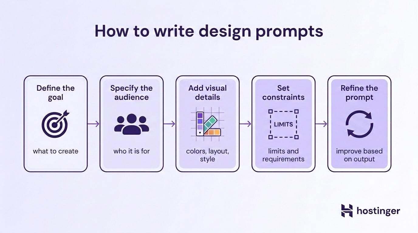
- Start with the design goal. Everything else depends on this. A wireframe needs different details than a brand concept, so naming the output first tells you what kind of visual details, constraints, and mood to add in the next steps. Example: “Create a hero section for an online course platform’s landing page.”
- Specify who it’s for. Your audience shapes your visual decisions. A finance app for retirees needs larger text and simpler layouts than one for college students. If you’ve already done persona work or user research, pull from that. Example: “The target audience is first-time entrepreneurs aged 25–35 who want to launch an online course but have no tech background.”
- Layer in the visual and stylistic details. Now that you know the goal and audience, describe what the design should look like. The colors, fonts, and layout you pick here should follow from the first two steps. Example: “Use a gradient background from soft coral to warm peach. Large, bold headline text. Simple geometric illustrations. Friendly and inviting, not corporate.”
- Lock in the constraints. With the creative direction set, add the boundaries: screen size, file format, what to avoid, and platform needs. If you’re working within a design system, mention it here. Example: “Desktop layout, 1440px wide. Follow our existing design system with 8px grid spacing. No photography, illustrations only. Include a CTA button and a short subheading. Keep it above the fold.”
- Refine based on output. Your first result is a draft. Look at what the AI made, spot what’s off, and adjust your prompt. Maybe the color feels too cold, or the layout is too packed. Change those parts and run it again. Example: “Keep the layout from the last version, but swap the gradient for a solid white background. Make the headline text larger and left-aligned instead of centered.”
Prompt techniques designers should know
Beyond writing better prompts, there are four specific prompt techniques that give designers better control over what AI produces.
Few-shot prompting
Few-shot prompting means you give the AI a few examples of what you want before asking it to produce something new. The examples show the AI the pattern, style, or format you’re after.
For designers, this is like showing a junior designer two finished screens and saying, “Make me a third one that matches.” You describe existing parts, past design patterns, or style rules in your prompt so the AI stays in line with work you’ve already done.
Example:
“Here are two card component descriptions from our design system:
- Feature card: White background, 16px padding, 8px border radius, gray (
#E5E7EB) border, bold title on top, body text below, icon on the left. Max width 320px. - Pricing card: Same as feature card but with a highlighted header bar in brand blue (
#2563EB), price in large text, and a CTA button at the bottom.
Now describe a testimonial card component that matches this same design system. Include layout, spacing, and visual details.”
Multi-modal prompting
Multi-modal prompting means you mix text with other inputs like images, sketches, or screenshots. “Multi-modal” just means “more than one type of input.” Instead of putting everything into words, you upload a visual and add written notes on top.
You’ll find this useful when you have a design you want to build on, a rough sketch you drew on paper, or a competitor’s layout you’d like to rework in your own style.
Example:
Upload a screenshot of a competitor’s pricing page along with this prompt: “Redesign this pricing page layout for a pet care subscription service. Keep the three-tier card structure, but use rounded shapes, pastel greens and warm yellows, and playful icons instead of the corporate look shown here.”
Step-by-step prompting
Step-by-step prompting asks the AI to break a big task into smaller parts and work through them in order. Some people call this “chain-of-thought” prompting because the AI walks through its logic step by step, which often leads to better output.
Designers already work in stages: research, wireframes, visual design, and polish. You can mirror that same workflow in your prompt. Instead of asking for a finished product in one go, you walk the AI through each phase.
Example:
“I need to design a mobile onboarding flow for a language-learning app. Walk me through it step by step:
- First, suggest what information to collect from new users (goals, experience level, preferred language).
- Then, outline 4 onboarding screens with what each screen should show.
- Finally, describe the visual style and transitions between screens.”
Generating multiple design options
You ask the AI for variations instead of a single output. You get three or four options from a single prompt, instead of writing each one separately.
You can request different layouts, color schemes, or visual directions from a single prompt. It’s especially useful when you’re still exploring and haven’t locked into a direction yet.
Example:
“Generate 3 different hero section layouts for a fitness app landing page. Each variation should use a different visual approach: one image-heavy, one illustration-based, and one typography-focused. All should include a headline, a subheading, and a CTA button.”
Examples of prompts for different design tasks
Here are ready-to-use prompts for five common design areas. Each one follows the same structure: role, goal, visual details, limits, and mood. Replace the placeholders with your own project details.
UI/UX design prompts
Wireframe prompt – Great for mapping out a screen before you add any visuals.
“Act as a UX Designer. Create a low-fidelity wireframe layout for a food delivery app’s order tracking screen. Include a map showing driver location, an estimated delivery time, order details, and a ‘Contact Driver’ button. Mobile layout, 375px wide. Keep it simple: boxes and labels only, no colors or styling.”
App screen prompt – Try this when you’re building a screen with multiple clearly separated sections.
“Design a settings screen for a project management app. Include sections for profile, notifications, integrations, team management, and billing. Use a clean list layout with toggle switches where appropriate. Light theme, left-aligned, with clear section dividers. Desktop view, 1440px wide.”
Dashboard prompt – Works well when your project needs to display multiple data types on a single screen.
“Act as a UI Designer for a SaaS analytics platform. Design a reporting dashboard that shows website traffic over time (line chart), top pages (table), traffic sources (pie chart), and conversion rate (KPI card). Use a left sidebar with navigation. Cool gray background, blue accent color, Inter font. Desktop, 1440×900px.”
Visual design prompts
Brand concept prompt – Reach for this when you’re starting a brand identity and need a visual direction to build from.
“Create a visual brand concept for a sustainable fashion startup called ‘Rethread.’ The brand is earthy, modern, and minimal. Suggest a color palette (3–4 colors), typography pairing (one headline font, one body font), and a mood direction. Tone: premium but not pretentious.”
Social media prompt – Good fit for recurring content series that need a reusable template.
“Design an Instagram post template for a coffee brand’s weekly ‘Brew Tip’ series. Square format (1080×1080px). Include a photo placeholder at the top, a headline area, a short tip section, and the brand logo at the bottom. Colors: warm browns, cream, and a pop of burnt orange. Friendly and warm.”
Illustration prompt – Best for when you need a matched set of illustrations that all share the same style.
“Generate a set of five spot illustrations for a fintech app’s empty states (no transactions, no connections, no messages, first-time use, error). Flat style with soft gradients, rounded shapes, and a limited palette of navy, teal, and light gray. Each illustration should work at 200×200px.”
Product design prompts
Landing page prompt – Handy when you’re planning a full landing page and need every section mapped out.
“Act as a Product Designer. Design a landing page for a new AI writing assistant tool. Include a hero section with a headline and demo animation area, a three-column feature section, a testimonial carousel, a pricing comparison table, and a final CTA. Modern and clean, white background with purple (#7C3AED) accents. Desktop-first.”
Feature page prompt – Try this when you need to show how a single product feature works.
“Design a product feature page for an email marketing platform’s automation builder. Show a visual workflow diagram as the centerpiece, with supporting text blocks that explain each automation step. Include a ‘Start free trial’ CTA. Minimal design, dark mode, neon green highlights.”
Design ideation prompts
Concept brainstorm prompt – Works well early in a project when you want several visual directions to pick from.
“Suggest 5 different visual concepts for a travel booking app’s homepage. For each concept, describe the layout approach, color mood, and one unique design element that sets it apart. Target audience: budget-conscious travelers aged 20–30.”
Creative direction prompt – Great for presenting distinct creative options to your team or client.
“I’m redesigning a fitness brand’s website and need to explore visual directions. Suggest 3 distinct creative directions: one bold and high-energy, one minimal and premium, and one warm and community-focused. For each, describe the color palette, typography style, imagery approach, and overall mood.”
UX research and user flow prompts
User persona prompt – Reach for this when you need a persona to anchor your design decisions.
“Create a detailed user persona for a meal-planning app. Include name, age, occupation, goals, frustrations, tech comfort level, and a typical day scenario. The persona should represent a busy parent who wants to eat healthier but struggles with time and planning.”
User flow prompt – Good fit for mapping a full flow and spotting where people might drop off.
“Map out the user flow for signing up and completing a first purchase on an online plant shop. Start from the landing page and include every screen and decision point until order confirmation. Flag any steps where users might drop off and suggest one fix for each.”
Which AI tools can designers use for prompt engineering?
Designers use three types of AI tools for prompting, and the same core skills (clear role, goal, visual details, constraints, mood) work across all of them. Text tools help with structure and planning, image tools help with visual exploration, and design-native tools let you prompt inside your existing workflow.
Text-based AI tools like ChatGPT and Claude work best for wireframe outlines, UX copy, design system docs, user personas, and user flow maps. You type what you need, and the AI gives you text you can bring into your design tool.
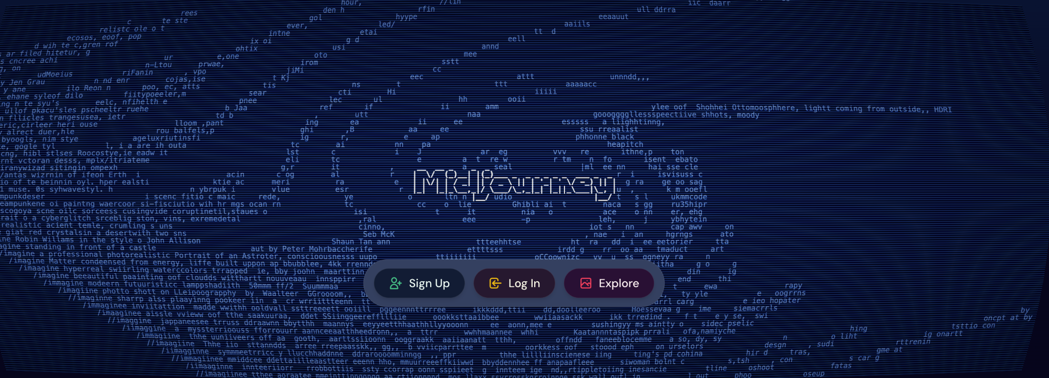
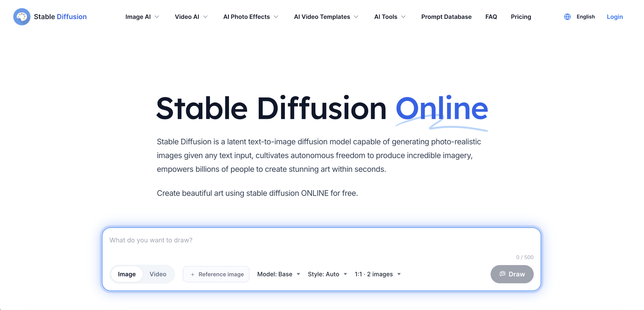
Image tools like Midjourney, DALL-E, and Stable Diffusion turn visual prompts into images, art, and design concepts. They’re strongest for early-stage work like mood boards, brand direction, art styles, and concept art.
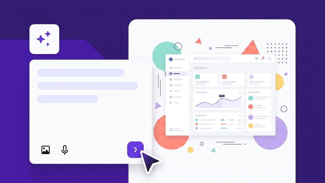
Design-native AI tools bring prompting right into your workflow. Figma’s AI features let you build layouts and components directly in the tool. Framer, Relume, and Uizard use prompts to quickly generate full-page layouts or clickable prototypes that you then refine.
How to refine and improve design prompts
You improve prompts the same way you improve a design: by iterating. The first result won’t be perfect, but each round gets you closer. Adjust specific parts of the prompt based on what you see. It’s the same process as refining a layout in Figma.
Here’s what to adjust when the result isn’t quite right:
- Add more visual detail. If the output looks too plain, you were too vague. Add hex codes for colors, font names, spacing notes, or a style you want to match.
- Change the style and tone. “Modern” means different things to different models. Pair it with a real example: “Modern and minimal, like Linear’s design.”
- Tighten your limits. If the output is the wrong size or has items you didn’t want, spell out your bounds more clearly. Name what to leave out.
- Test rewrites. Write the same prompt three ways and compare. Small wording changes can make a big difference in the output.
- Keep what works. When a result is 80% right, don’t start over. Tell the AI what to keep and what to change: “Keep the layout but swap the colors to warmer tones and make the headline bolder.”
Say you wrote this prompt for a pricing page:
First attempt – “Design a pricing page for a B2B project management tool. Three tiers: Starter, Pro, and Enterprise. Include a feature comparison table. Desktop layout, modern and clean.”
The AI gives you something usable, but the colors feel too harsh, the “Pro” tier doesn’t stand out, and there’s no clear visual hierarchy between the tiers. So you refine:
After seeing the output – “Keep the three-tier layout and the feature comparison table. Soften the color palette: white background, light gray card borders, and blue (#2563EB) for CTAs. Highlight the Pro tier as ‘most popular’ with a raised card and a colored header bar. Make the CTA buttons larger on Pro than on the other two tiers. 1440px wide. Professional and trustworthy, no playful elements.”
The first prompt was already decent. The second one fixes specific problems you spotted in the output. That’s what iteration looks like. Small wording changes can have a big effect on output quality, and prompt tuning explains how models respond differently to even minor phrasing adjustments.
Common prompt engineering mistakes in design
In most everyday design tasks, weak AI outputs come from vague or incomplete prompts. These are the six most common mistakes and how you fix each one:
- Vague prompts. “Design something nice” produces output that doesn’t match your project because the AI has nothing specific to work from. Name the output, the audience, and what the design needs to contain.
- No visual detail. When you leave out colors, fonts, and layout info, the AI fills in the blanks with default choices. You end up with bland results that could belong to any brand. Add at least a color scheme, layout type, and one style reference.
- No limits. Without boundaries, the AI decides on screen sizes, ratios, and visual elements for you. You might get a desktop layout when you needed mobile, or a photo-heavy design when you wanted illustrations. State the dimensions, format, platform, and what to leave out.
- Fuzzy style direction. “Make it look good” could mean a hundred different things. The AI has no way to know if you want minimal and clean or bold and playful, so it guesses. Use real style words paired with a reference: “Minimal and modern, like Notion’s interface.”
- Too much in one prompt. When you ask for a full site with branding, copy, and animations in one go, the AI tries to do everything and does none of it well. Break big projects into small, focused prompts. Do the hero first, then the feature block, then the footer.
- No follow-up. Running a prompt once and accepting whatever comes back means you’re settling for a first draft. The output almost always needs at least one round of adjustment. Review the result, identify what’s off, and update your prompt before running it again.
How can designers improve their prompt engineering skills?
You get better at design prompting by practicing with real projects. The good news: you already know how to think about layouts, color, hierarchy, and user needs. Prompting is just translating that into words.
The easiest way to start is to pick a task from your current work and write a prompt for it, rather than opening Figma from scratch. Compare the AI output to what you’d create on your own.
When a prompt works well, save it. Over time, you’ll build a template library with ready-made starting points for wireframes, landing pages, brand concepts, and more.
Once you have a few templates, try running them in different AI tools. A prompt that works in ChatGPT might need small changes in Midjourney. Each tool teaches you something new about describing design decisions in words.
Through all of this, pay attention to your outputs. If the layout is wrong, your structure description needs work. If the colors are off, your visual detail wasn’t clear enough. Building prompt engineering skills beyond design work makes you even more versatile, because the same prompting logic applies to copywriting, research, and strategy tasks too.

Alma is an AI Content Editor with 9+ years of experience helping ideas take shape across SEO, marketing, and content. She loves working with words, structure, and strategy to make content both useful and enjoyable to read. Off the clock, she can be found gaming, drawing, or diving into her latest D&D adventure.