Con la ayuda de código personalizado, puede añadir varios banners a su sitio web.
Estos banners no serán visibles en el editor, pero sí en la vista previa y en el sitio web activo 💡
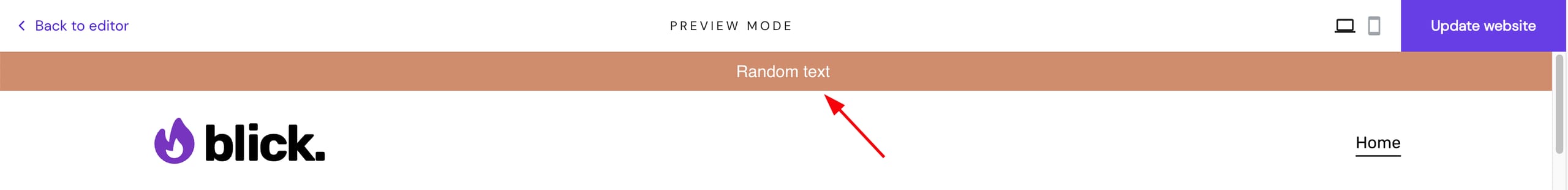
Banner con texto estático encima del menú de navegación
Este banner tiene el siguiente aspecto:
Copie el código siguiente y péguelo en el campo Código personalizado de la configuración de integraciones de su sitio web.
NOTAS
-
Sustituye la frase This is the text inside the banner por tu propio texto antes de guardar los cambios
-
Si sabes CSS, también puedes personalizar el tamaño y los colores del banner editando atributos específicos
<script>
    const bannerText = 'This is the text inside the banner';
    const topBanner = document.createElement('div');

    topBanner.id = 'bannerTop';
    topBanner.insertAdjacentHTML("afterbegin", `<p>${bannerText}</p>`);

    setTimeout(() => {
        requestAnimationFrame(() => {
            document.body.append(topBanner);
        })

        setTimeout(() => {
            requestAnimationFrame(() => {
                topBanner.classList.add('visible');
            })
        }, 50);
    }, 1500);
</script>

<style>
    header {
        animation-delay: 1.5s;
        animation-duration: .4s;
        animation-iteration-count: 1;
        animation-fill-mode: forwards;
        animation-timing-function: ease;
        animation-name: addPadding;
    }

    @keyframes addPadding {
        to {
            padding-top: 4.9vh;
        }
    }

    #bannerTop {
        z-index: 20;
        position: fixed;
        top: 0;
        width: 100%;
        height: 5vh;
        display: flex;
        justify-content: center;
        align-items: center;
        background-color: #CF8D6D;
        overflow: hidden;
        opacity: 0;
        transform: translateY(-100%);
        transition: all .3s ease;
    }

    #bannerTop.visible {
        opacity: 1;
        transform: translateY(0);
    }

    #bannerTop p {
        color: #fff;
    }

    @media screen and (max-width: 920px) {
        #bannerTop {
            height: 10vh;
            flex-direction: column;
        }

        @keyframes addPadding {
            to {
                padding-top: 9.9vh;
            }
        }
    }
</style>
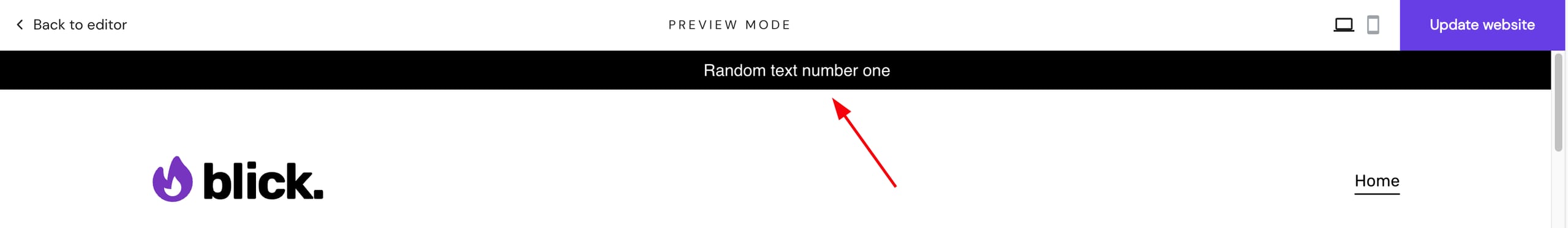
Banner con texto corrido encima del menú de navegación
Este banner tiene el siguiente aspecto:
Copie el código siguiente y péguelo en el campo Código personalizado de la configuración de integraciones de su sitio web.
NOTAS
-
Sustituye las frases This is the first text y This is the first text por tu propio texto antes de guardar los cambios
-
Si sabes CSS, también puedes personalizar el tamaño y los colores del banner editando atributos específicos
<script>
    const bannerTextOne = 'This is the first text';
    const bannerTextTwo = 'This is the second text';
    const topMovingBanner =  document.createElement('div');

    topMovingBanner.id = 'movingBannerTop';
    topMovingBanner.insertAdjacentHTML("afterbegin", `<p id="bannerTextOne">${bannerTextOne}</p><p id="bannerTextTwo">${bannerTextTwo}</p>`);

    setTimeout(() => {
        requestAnimationFrame(() => {
            document.body.append(topMovingBanner);
        })
        setTimeout(() => {
            requestAnimationFrame(() => {
                topMovingBanner.classList.add('visible');
            });
        }, 50);
    }, 1500);
</script>

<style>
    header {
        animation-delay: 1.5s;
        animation-duration: .4s;
        animation-iteration-count: 1;
        animation-fill-mode: forwards;
        animation-timing-function: ease;
        animation-name: addPadding;
    }

    @keyframes addPadding {
        to {
            padding-top: 4.9vh;
        }
    }

    #movingBannerTop {
        z-index: 20;
        position: fixed;
        top: 0;
        width: 100%;
        height: 5vh;
        background-color: #CF8D6D;
        overflow: hidden;
        display: flex;
        align-items: center;
        opacity: 0;
        transform: translateY(-100%);
        transition: all .3s ease;
    }

    #movingBannerTop.visible {
        opacity: 1;
        transform: translateY(0);
    }

    #movingBannerTop p {
        color: #fff;
        display: inline-block;
        white-space: nowrap;
        padding-left: 100%;
        position: absolute;
    }

    #bannerTextOne {
        animation: bannerAnimationOne 20s linear infinite;
    }

    #bannerTextTwo {
        animation: bannerAnimatioTwo 20s linear infinite;
    }

    @keyframes bannerAnimationOne {
        0% {
            transform: translateX(0);
            visibility: visible;
        }

        50% {
            transform: translateX(-100%);
            visibility: hidden;
        }

        100% {
            transform: translateX(-100%);
            visibility: hidden;
        }
    }

    @keyframes bannerAnimatioTwo {
        0% {
            transform: translateX(0);
            visibility: hidden;
        }

        50% {
            transform: translateX(0);
            visibility: visible;
        }

        100% {
            transform: translateX(-100%);
            visibility: visible;
        }
    }

    @media screen and (max-width: 920px) {
        @keyframes addPadding {
            to {
                padding-top: 9.9vh;
            }
        }

        #movingBannerTop {
            height: 10vh;
        }

        #bannerTextOne {
            animation: bannerAnimationOne 15s linear infinite;
        }

        #bannerTextTwo {
            animation: bannerAnimatioTwo 15s linear infinite;
        }
    }
</style>
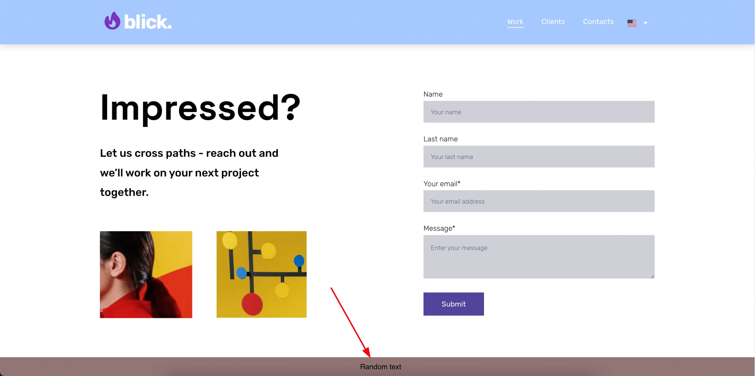
Banner con texto estático en la parte inferior del sitio web
Este banner tiene el siguiente aspecto:
Copie el código siguiente y péguelo en el campo Código personalizado de la configuración de integraciones de su sitio web.
NOTAS
-
Sustituye la frase This is the text inside the banner por tu propio texto antes de guardar los cambios
-
Si sabes CSS, también puedes personalizar el tamaño y los colores del banner editando atributos específicos
<script>
    const bannerText = 'This is the text inside the banner';
    const bannerBottom = document.createElement('div');
    const bannerCloseButton = document.createElement('span');

    bannerBottom.id = 'bottomBanner';
    bannerBottom.append(bannerCloseButton);
    bannerBottom.insertAdjacentHTML("beforeend", `<p>${bannerText}</p>`);

    bannerCloseButton.addEventListener('click', () => {
        bannerBottom.style.display = 'none';
    })

    setInterval(() => {
        if (!document.querySelector('#bottomBanner')) {
            document.querySelector('main').append(bannerBottom);
        }
    });
</script>

<style>
    #bottomBanner {
        background-color: rgba(255, 0, 0, 0.7);
        position: fixed;
        bottom: 0;
        display: flex;
        justify-content: center;
        align-items: center;
        width: 100%;
        height: 5vh;
        z-index: 15;
    }

    #bottomBanner p {
        color: #000;
    }

    #bottomBanner span {
        position: absolute;
        top: 50%;
        transform: translateY(-50%);
        left: 1rem;
        width: 30px;
        height: 30px;
        cursor: pointer;
        transition: .2s;
    }

    #bottomBanner span:hover {
        background-color: #fff3;
    }

    #bottomBanner span:before {
        transform: rotate(315deg);
    }

    #bottomBanner span:after {
        transform: rotate(45deg);
    }

    #bottomBanner span:before,
    #bottomBanner span:after {
        background-color: #000;
        position: absolute;
        top: 14px;
        left: 6px;
        width: 20px;
        height: 2px;
        content: '';
        border-radius: 2px;
    }

    @media screen and (max-width: 920px) {
        #bottomBanner {
            height: 10vh;

        }
    }
</style>